How the L.A. Times tracked down and visualized every congressional statement on James Comey’s firing
Earlier this month, the Los Angeles Times visualized the U.S. Senate’s response to President Donald Trump’s firing of FBI director James Comey. To retrieve the statements, the Times used ProPublica’s Congress API, which was released last month. Want to do it yourself? We’ve replicated their work in a Storybench tutorial here.
Storybench caught up with Priya Krishnakumar, a graphics and data journalist at the Times, about how she and Chris Keller put together the Comey piece as well as her philosophy towards structuring data, optimizing for mobile, and designing graphics for breaking news.
How did you and Chris Keller start thinking about the first Comey story on where U.S. senators stand?
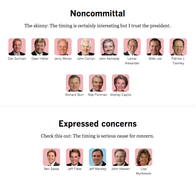
The inspiration behind this was a project before the election where there were all these senators fully behind Trump and some hedging. We wanted to show the variance. We came up with an idea of plotting them along a spectrum. We had that going up until the election and that served as our primary inspiration.
For this story, you saw this deluge of people releasing statements, some of them making a strong condemnation and some of them hedging. If you can find structure in a lot of the “unstructure” found in a lot of politics stories, it makes it easier for readers to digest.
With the Comey story, ProPublica’s Congress API really worked well because we were looking for statements that were put out for this one instance: Comey’s firing.
Tell us about the design of the piece.
We wanted a very simple, clean, digestible design which I think is really important. The second version we did for the Comey memo had a lot more lawmakers and it was getting hairy. I wanted to make it sparse so readers could click it, see the text and link out to the statement.
We also thought it was really important for readers to see the cutouts with the colored background so they could quickly distinguish who was Democrat and who was Republican. It’s important, especially with this many images, to have a top-level design first and then allow for a deeper dive. Readers should be able to get to the page and understand the overarching point without having to spend a ton of time. Then, for those that want to stick around, we should have that deeper level available to them.
What considerations did you have to make for optimizing this for mobile?
This one lent itself really well to a phone because of it’s small, modular components. With breaking news like this, it’s super important to think of mobile. That’s where the readers are.
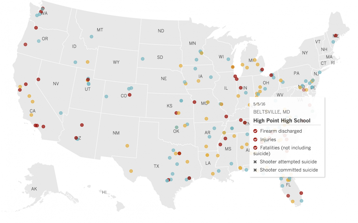
Speaking of mobile, the desktop and mobile versions of your map on shootings since Sandy Hook are very different. What went into that decision?
I really hate tooltips. For that map, the tooltips are pulling from a JSON and on desktop you hover over the map and see them. If you’re on a phone, though, there’s just no way. It’s an insane expectation to expect your readers on a phone to zoom in, click on a tooltip, zoom out, etc. For mobile, I made the graphic into a static image and put the data into a table at the bottom. The less extraneous tapping the you can ask of your readers the better.
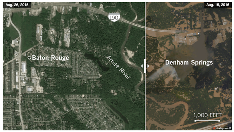
We really liked how you used Northwestern Knight Lab’s JuxtaposeJS in your piece on flooding in Louisiana. What’s your approach to out-of-the-box tools versus hand-coding?
I have to mention that I’m a Knight Lab alum and I was there when it was made. I love using Knight Lab tools, especially for really visual things like the Louisiana flooding story. If something like that exists, free and works well, I don’t see why we should take the time to build our own thing that does the same thing.
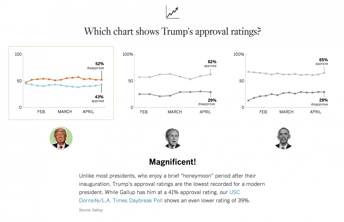
Tell us about your Trump quiz and the data and reporting you used to build it.
We had already done so much reporting about Trump in the past 100 days that all of that data existed. I was able to work with our staff librarian to see what we had covered in the past and what we’d given importance to. A lot of the reporting for Obama and Bush was kind of already done for me. In terms of our Senate and House maps the template for those formats we’ve been using those for a while. I just had to grab them, color them in appropriately and kick them out. It was nice.
What tools are in your toolkit?
Adobe Illustrator, QGIS for mapping, HTML, Javascript. That’s pretty much it.
Where do you go for inspiration?
Flowing Data is a really good blog. In terms of design inspiration, the Post is doing amazing things and Bloomberg, too. They’re exciting and fresh. I’d recommend Alberto Cairo’s book The Truthful Art.
Any advice for our students trying to do the impressive data and graphics work you’re doing?
Pick good side projects. Pick a few that you’re really passionate about. Keep tweaking those until you feel comfortable with the skills you used. With that practice, the faster you’ll get. Once you get fast, then you’re helpful on deadline.

