How Sosolimited built a headline explorer to compare every NYT and WSJ headline of 2016
Earlier this year, Sosolimited, a design studio that creates digital and physical data experiences for the websites and lobbies of companies like Qualcomm, Google and LG, put on a workshop for students at the Maryland Institute College of Art. The idea was to get MICA designers thinking about different ways to explore, analyze and visualize newspaper headlines.
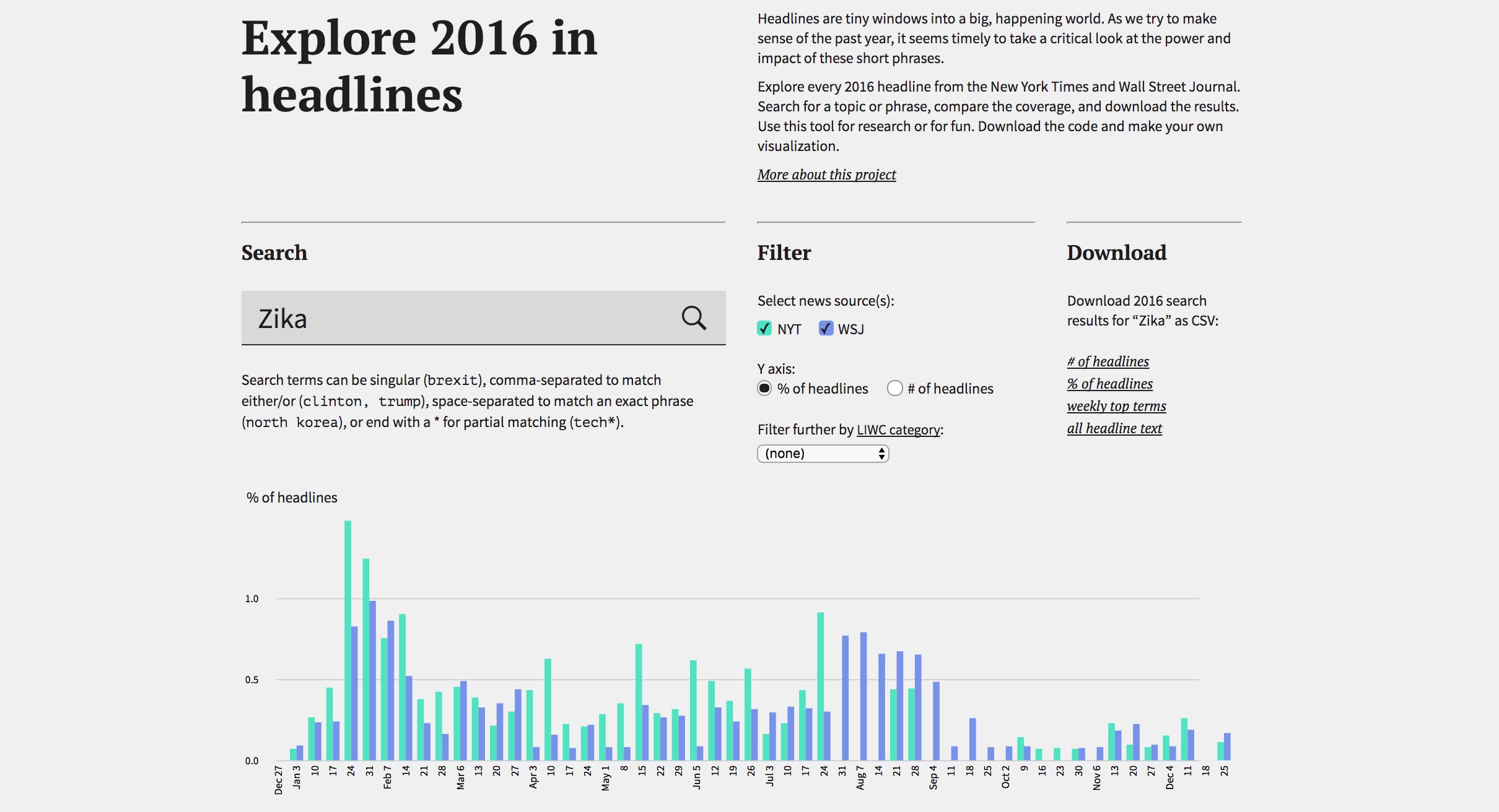
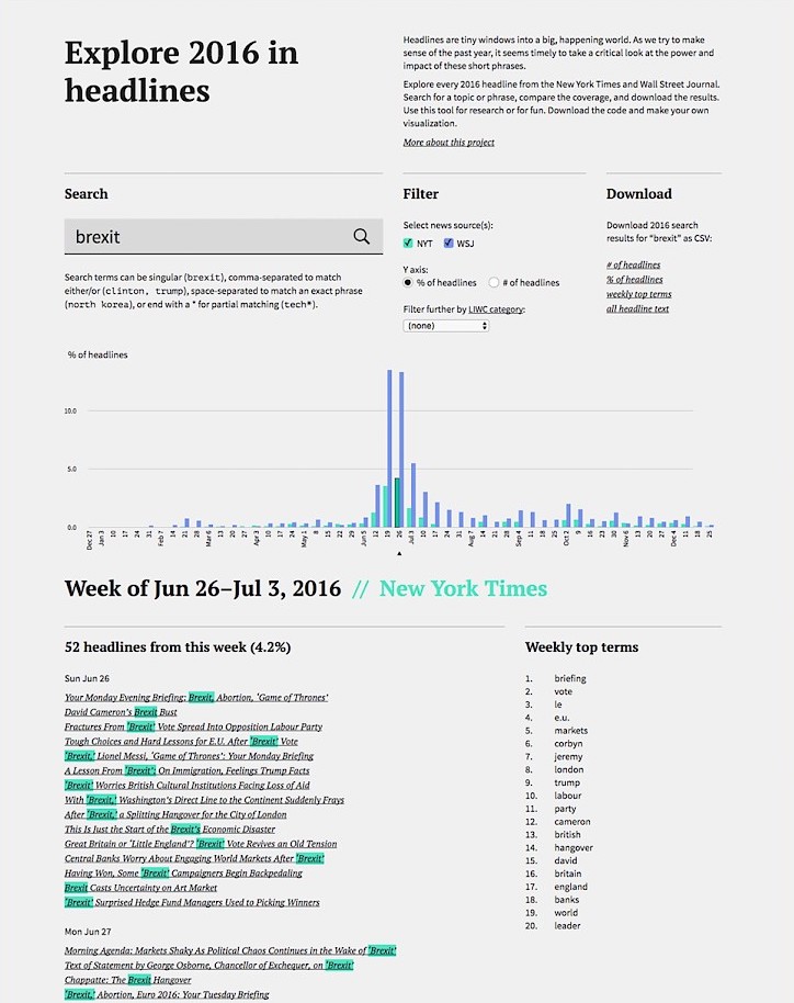
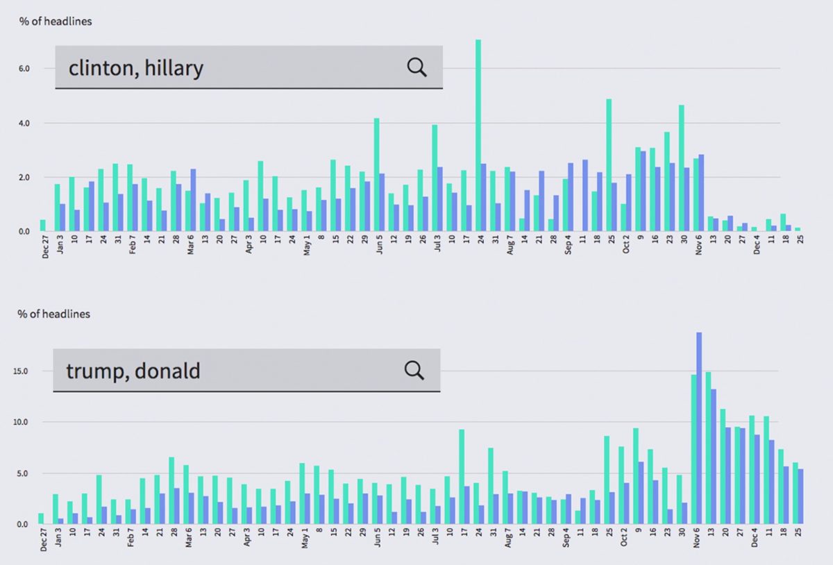
To prepare for the workshop, Sosolimited built a headline explorer that plumbed every 2016 headline from the New York Times and the Wall Street Journal. By entering terms like “Trump,” “Orlando shooting” or “Zika” into its search bar, the MICA students could compare the papers’ coverage of certain topics or phrases and visualize the waxing and waning of those terms over time. After students presented their posters and the workshop concluded, Sosolimited’s designers improved the headline explorer and released it – and its code – to the public.
Storybench sat down with designer Jackie Littman and designer/coder Wes Thomas to discuss the headline explorer and Sosolimited’s approach to data visualization, both offline and on the screen.
How did you start developing the headline explorer?
Wes Thomas: The first step was identifying sources we wanted to use. The New York Times has a nicely documented API. We applied for an API key and got that. That was easy. We also decided to use the Wall Street Journal and they don’t have an official API. So we wrote custom Javascript to scrape their archives, parse their formats and get them in a single useful format. Once we had this structured data in JSON format, we started to build out the actual app with HTML and Javascript. The chart is in D3.
How does the search function work?
Thomas: The basic way the search works is that each headline is split into interesting tokens. Alongside each headline is an array, or list, of each word in the headline. We pre-generated all of those lists. There’s a simple method you can do to tokenize text, all in Javascript. The tokenized list is the core of the application. That’s what you’re searching through.
Why release it to the public? What are you hoping people build?
Thomas: We wanted to make it instantly available for anyone to plug in anything they wanted to and to see how we structured the data. It’s always great to pull from the public these kinds of ideas that we couldn’t possibly think of ourselves.
Tell us more about Sosolimited.
Jackie Littman: We create digital installations and interactive experiences that go beyond the screen. We specialize in using live content and transforming data into engaging stories. Our goal is to inspire curiosity and wonder through our work, whether it’s an interactive sculpture, an algorithmic clothing line, or a social-media-powered light show.
Thomas: We do a lot of web experiments. We do data visualization on the web, bespoke web pages that focus on a single topic. Often we’re analyzing language for sentiment.
How do you approach companies?
Littman: So many companies have data now, they’re collecting all of these statistics. It’s sitting somewhere. When we pitch them, we tell them how they could better tell their story with data, not so much how they could improve their processes with data. We’re more on the story and narrative side of things, less on the improving your company with data.
Tell us about the offline, in-person data installations.
Littman: A lot of our installation work that’s data-driven [results in] a conversation piece when you walk into company headquarters to show visitors. It’s something powerful, memorable. A lot of what we do is create shareable, memorable experiences where you can use data as the underlying story but that helps cement and distinguish the company.
What are the challenges to designing those offline experiences?
Thomas: Typically you’re working with units of technology that’s much smaller resolution than what you use for screen-based interactives. You have to be o.k. with the fact that what you’re going to communicate may not immediately be obvious. Maybe it’s powered by some secondary display. It’s a little scary when you know how low resolution you’re going to be and have to convey complex information. For example, we had a kinetic sculpture in Kendall Square go up recently [in Shire’s offices] whose movement was based on a digital flock of birds.
Littman: For a physical installation we end up collaborating with a lot of experts from inside or outside Soso. Engineers, robotics, electronics.

What are your favorite tools, code languages and libraries?
Thomas: We try to keep it pretty simple. D3, Jquery.
Littman: When I try to delve into code, I like starting with something open-source, seeing something built and tweaking. Finding something similar to what I want to do and tweaking it. It’s really hard to go through a book from step one without a goal in mind.
Do you have any advice for our students?
Thomas: Not being afraid to reach out and ask people for help. Even people you don’t know. Seek out their advice. I have a background in architecture. How did I learn to tokenize text? I learned how to do that because Soso has dealt with text for a decade. Taking ugly source text and making sense of it. I sat down with [a colleague] to work on a Twitter analysis project. I had a basic coding language but then I learned the algorithm and how to build it.
Littman: You don’t need to know code to make amazing visualizations that tell interesting stories with data. There are great resources out there to expand your idea of what data visualization can be, like the Data Flow book series from gestalten or the online gallery of the Kantar Information is Beautiful Awards. Master bar charts and line graphs, then move beyond them.
As far as process goes when starting a new project, begin by looking for patterns in the data: trends, peaks, repetition, anomalies. Then figure out what story you want to tell with your visualization and what you intend to communicate. This will help you make all sorts of design decisions along the way, from choosing a format to determining how much information to include.