Mapping search data from Google Trends in R
This is a quick introduction on how to get and visualize Google search data with both time and geographical components using the R packages gtrendsR, maps and ggplot2. In this example, we will look at search interest for named hurricanes that hit the U.S. mainland and then plot how often different states search for “guns.”
Load packages
First, we load the required packages. Note that we use devtools to download a developer version of gtrendsR from Github. (A restart of R Studio might be required for gtrendsR to function properly. To restart: fn + command + shift + F10.)
devtools::install_github('PMassicotte/gtrendsR')

library(gtrendsR)
library(maps)
library(ggplot2)
library(lettercase)
library(viridis)
library(pals)
library(scico)
library(ggrepel)
library(tidyverse)
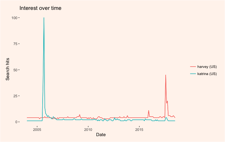
Let’s first look at how the impact of hurricanes Katrina (August 2005) and Harvey (August 2017) are reflected in how Americans have used these names as google search items over time. We’ll also add change some of the plot settings by creating our own ggplot theme.
my_theme <- function() {
    theme_bw() +
    theme(panel.background = element_blank()) +
    theme(plot.background = element_rect(fill = "seashell")) +
    theme(panel.border = element_blank()) +                     # facet border
    theme(strip.background = element_blank()) +                 # facet title background
    theme(plot.margin = unit(c(.5, .5, .5, .5), "cm")) +
    theme(panel.spacing = unit(3, "lines")) +
    theme(panel.grid.major = element_blank()) +
    theme(panel.grid.minor = element_blank()) +
    theme(legend.background = element_blank()) +
    theme(legend.key = element_blank()) +
    theme(legend.title = element_blank())
  }
The gprop argument controls whether we want general web, news, image or Youtube searches.
The time argument is set to “all” and will gather data between 2004 and the time the code is run.
Focusing on searches made in the U.S., we’ll set the geo argument to “US.” The glimpse() function will summarize the results stored in hurricanes.
hurricanes <- gtrends(c("katrina","harvey"), time = "all", gprop = "web", geo = c("US"))
hurricanes %>% glimpse()
Plot the output using plot().
plot(hurricanes) +
  my_theme() +
  geom_line(size = 0.5)
Plotting more cyclical data
The above plot shows clear spikes around the time when Katrina and Harvey hit the U.S. To understand what is actually measured on the y-axis, have a look here. We could also plot more cyclical data.
cycles <- gtrends(c("spring break","vacation"),
                 time = "2008-01-01 2018-01-01",
                 gprop = "web",
                 geo = c("US"))
This finds us ten years' worth of search data for "spring break" and "vacation." We can plot it like so:
plot(cycles) +
  my_theme() +
  geom_line(size=0.5)
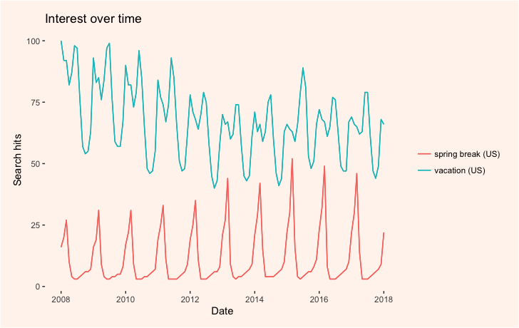
As you can see in the output below, the gtrends function actually returns a list of data frames with various kinds of data. There's a lot of data here we can plot.
hurricanes %>% glimpse(78)

List of 7
 $ interest_over_time :'data.frame':	350 obs. of  6 variables:
  ..$ date    : Date[1:350], format: "2004-01-01" "2004-02-01" ...
  ..$ hits    : chr [1:350] "0" "0" "0" "0" ...
  ..$ keyword : chr [1:350] "hurricane katrina" "hurricane katrina" "hurricane katrina" "hurricane katrina" ...
  ..$ geo     : chr [1:350] "US" "US" "US" "US" ...
  ..$ gprop   : chr [1:350] "web" "web" "web" "web" ...
  ..$ category: int [1:350] 0 0 0 0 0 0 0 0 0 0 ...
 $ interest_by_country: NULL
 $ interest_by_region :'data.frame':	102 obs. of  5 variables:
  ..$ location: chr [1:102] "Louisiana" "Mississippi" "Alabama" "Arkansas" ...
  ..$ hits    : int [1:102] 100 84 38 29 25 24 24 24 24 23 ...
  ..$ keyword : chr [1:102] "hurricane katrina" "hurricane katrina" "hurricane katrina" "hurricane katrina" ...
  ..$ geo     : chr [1:102] "US" "US" "US" "US" ...
  ..$ gprop   : chr [1:102] "web" "web" "web" "web" ...
 $ interest_by_dma    :'data.frame':	420 obs. of  5 variables:
  ..$ location: chr [1:420] "Biloxi-Gulfport MS" "New Orleans LA" "Baton Rouge LA" "Hattiesburg-Laurel MS" ...
  ..$ hits    : int [1:420] 100 83 62 57 50 47 46 42 38 33 ...
  ..$ keyword : chr [1:420] "hurricane katrina" "hurricane katrina" "hurricane katrina" "hurricane katrina" ...
  ..$ geo     : chr [1:420] "US" "US" "US" "US" ...
  ..$ gprop   : chr [1:420] "web" "web" "web" "web" ...
 $ interest_by_city   :'data.frame':	150 obs. of  5 variables:
  ..$ location: chr [1:150] "New Orleans" "Metairie" "Baton Rouge" "Hattiesburg" ...
  ..$ hits    : int [1:150] 100 NA 65 NA NA 50 NA NA NA NA ...
  ..$ keyword : chr [1:150] "hurricane katrina" "hurricane katrina" "hurricane katrina" "hurricane katrina" ...
  ..$ geo     : chr [1:150] "US" "US" "US" "US" ...
  ..$ gprop   : chr [1:150] "web" "web" "web" "web" ...
 $ related_topics     : NULL
 $ related_queries    :'data.frame':	100 obs. of  6 variables:
  ..$ subject        : chr [1:100] "100" "99" "95" "56" ...
  ..$ related_queries: chr [1:100] "top" "top" "top" "top" ...
  ..$ value          : chr [1:100] "new orleans hurricane katrina" "hurricane new orleans" "new orleans" "what was hurricane katrina" ...
  ..$ geo            : chr [1:100] "US" "US" "US" "US" ...
  ..$ keyword        : chr [1:100] "hurricane katrina" "hurricane katrina" "hurricane katrina" "hurricane katrina" ...
  ..$ category       : int [1:100] 0 0 0 0 0 0 0 0 0 0 ...
  ..- attr(*, "reshapeLong")=List of 4
  .. ..$ varying:List of 1
  .. .. ..- attr(*, "v.names")= chr "value"
  .. .. ..- attr(*, "times")= chr "top"
  .. ..$ v.names: chr "value"
  .. ..$ idvar  : chr "id"
  .. ..$ timevar: chr "related_queries"
 - attr(*, "class")= chr [1:2] "gtrends" "list"
Now, let’s compare the amount of interest in Hurricane Harvey for each U.S. state.
harvey <- gtrends(c("Harvey"),
                 gprop = "web",
                 time = "2017-08-18 2017-08-25",
                 geo = c("US"))
HarveyInterestByRegion <- as_tibble(harvey$interest_by_region)
HarveyInterestByRegion <- HarveyInterestByRegion %>%
  dplyr::mutate(region = stringr::str_to_lower(location))

statesMap = ggplot2::map_data("state")

harveyMerged <- merge(statesMap, harvey, by = "region")
harveyMerged <- HarveyInterestByRegion %>% dplyr::left_join(x = .,
                                                            y = statesMap,
                                                            by = "region")
Why don't we take a look at our new dataframe using harveyMerged %>% dplyr::glimpse(78)?
## Observations: 15,539 ## Variables: 11 ## $ location"Texas", "Texas", "Texas", "Texas", "Texas", "Texas", "... ## $ hits 100, 100, 100, 100, 100, 100, 100, 100, 100, 100, 100, ... ## $ keyword "Harvey", "Harvey", "Harvey", "Harvey", "Harvey", "Harv... ## $ geo "US", "US", "US", "US", "US", "US", "US", "US", "US", "... ## $ gprop "web", "web", "web", "web", "web", "web", "web", "web",... ## $ region "texas", "texas", "texas", "texas", "texas", "texas", "... ## $ long -94.50, -94.48, -94.48, -94.46, -94.45, -94.42, -94.41,... ## $ lat 33.67, 33.66, 33.63, 33.62, 33.60, 33.60, 33.58, 33.57,... ## $ group 50, 50, 50, 50, 50, 50, 50, 50, 50, 50, 50, 50, 50, 50,... ## $ order 12203, 12204, 12205, 12206, 12207, 12208, 12209, 12210,... ## $ subregion NA, NA, NA, NA, NA, NA, NA, NA, NA, NA, NA, NA, NA, NA,...
With statesMap, we fetch an empty map for plotting our geographical data. With harveyMerged, we merge our Google Trends data with the underlying map data. Both datasets contain a column called “region” which will be used to merge the data frames. Note that the region labels need to be identical. Therefore we change the capitalized state names to lowercase using the stringr function. Now we can plot the data! But first we’ll modify our ggplot theme for plotting maps.
my_theme2 = function() {
  my_theme() +
    theme(axis.title = element_blank()) +
    theme(axis.text = element_blank()) +
    theme(axis.ticks = element_blank())
}

harveyMerged %>%
  ggplot(aes(x = long, y = lat)) +
  geom_polygon(aes(group = group,
                   fill = log(hits)),
               colour = "white") +
  scale_fill_gradientn(colours = rev(scico(15,
                                           palette = "tokyo")[2:7])) +
  my_theme2() +
  ggtitle("Google search interest for Hurricane Harvey\nin each state from the week prior to landfall in the US")
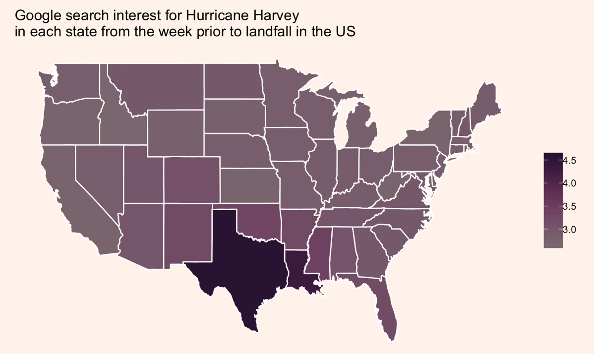
Note that we have plotted the log-transformed hits variable.
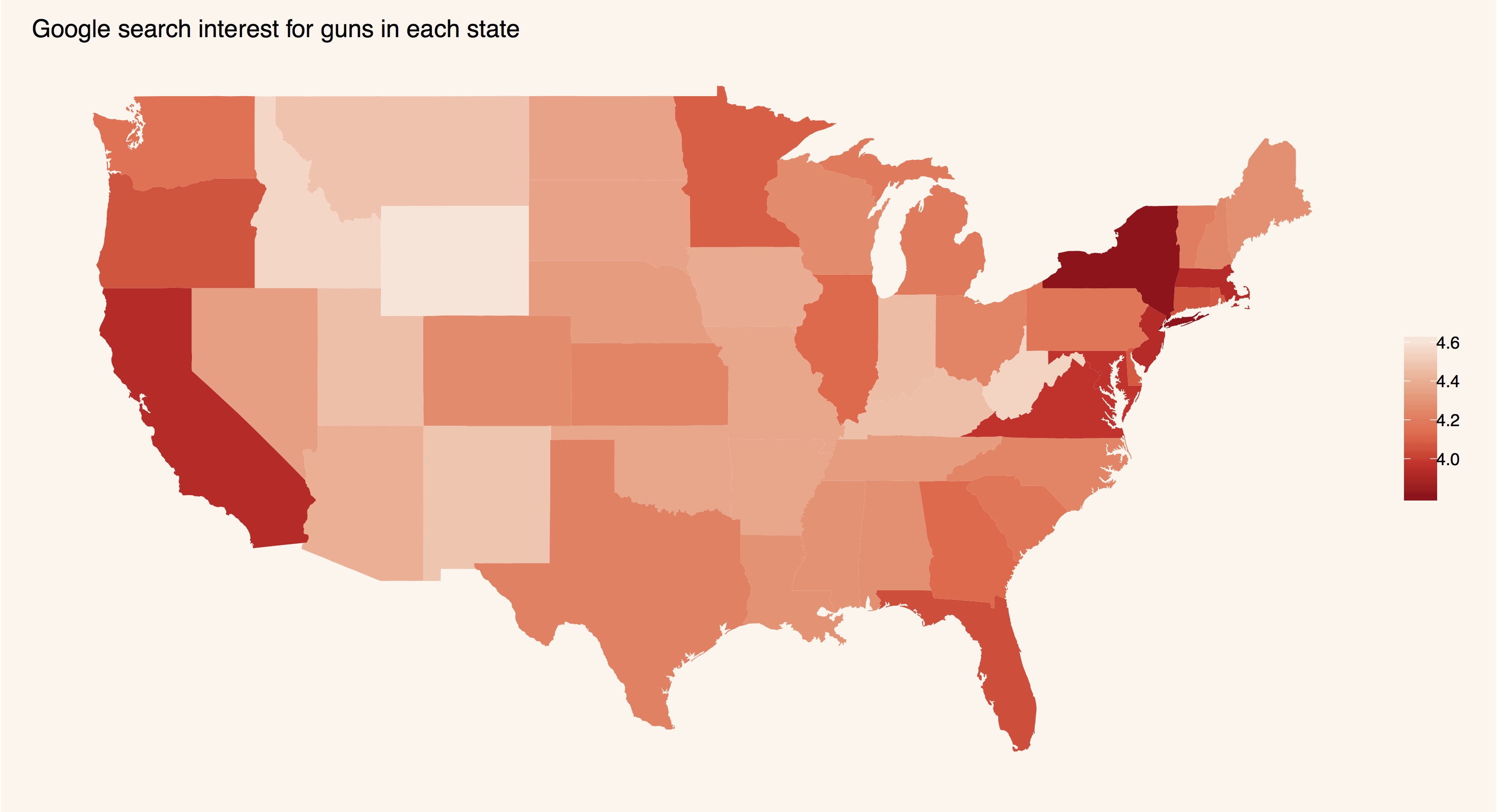
Take the tutorial for a spin yourself! What other Google Trends searches might you want to map? Here's a map of "guns" searches.

That was built with the following code:
guns = gtrends(c("guns"),
               gprop = "web",
               time = "all",
               geo = c("US"))

gunsInterestByRegion <- dplyr::as_tibble(guns$interest_by_region)
statesMap = map_data("state")
gunsInterestByRegion <- gunsInterestByRegion %>%
  dplyr::mutate(region = stringr::str_to_lower(location))
gunsMerged <- gunsInterestByRegion %>%
  dplyr::left_join(., statesMap, by = "region")
gunsMerged %>% glimpse(78)
## Observations: 15,539 ## Variables: 11 ## $ location"Wyoming", "Wyoming", "Wyoming", "Wyoming", "Wyoming", ... ## $ hits 100, 100, 100, 100, 100, 100, 100, 100, 100, 100, 100, ... ## $ keyword "guns", "guns", "guns", "guns", "guns", "guns", "guns",... ## $ geo "US", "US", "US", "US", "US", "US", "US", "US", "US", "... ## $ gprop "web", "web", "web", "web", "web", "web", "web", "web",... ## $ region "wyoming", "wyoming", "wyoming", "wyoming", "wyoming", ... ## $ long -109.1, -110.0, -110.1, -111.1, -111.1, -111.1, -111.1,... ## $ lat 41.00, 41.00, 41.00, 41.00, 41.23, 41.58, 42.00, 42.52,... ## $ group 63, 63, 63, 63, 63, 63, 63, 63, 63, 63, 63, 63, 63, 63,... ## $ order 15532, 15533, 15534, 15535, 15536, 15537, 15538, 15539,... ## $ subregion NA, NA, NA, NA, NA, NA, NA, NA, NA, NA, NA, NA, NA, NA,...
gunsRegionLabels <- gunsMerged %>%
  dplyr::select(region,
                long,
                lat) %>%
  dplyr::group_by(region) %>%
  dplyr::filter(!is.na(lat) | !is.na(long)) %>%
  dplyr::summarise(lat = mean(range(lat)),
                   long = mean(range(long))) %>%
  dplyr::arrange(region)
gunsRegionLabels %>% head()

gunsMerged %>%
  ggplot2::ggplot(aes(x = long, y = lat)) +
  ggplot2::geom_polygon(aes(group = group,
                            fill = log(hits))) +
  my_theme2() +
  ggplot2::coord_fixed(1.3) +
  ggplot2::scale_fill_distiller(palette = "Reds") +
  ggplot2::ggtitle("Google search interest for guns in each state")
Ed note: Thanks to Martin Frigaard for "tidyverseifying" this post.
- Mapping search data from Google Trends in R - July 23, 2018


