Newsroom infographic portfolios
Visualoop has just compiled 30 must-see infographic galleries from newsrooms around the world.
Another source for great infographics is the New York Times’ 2013 year in interactive storytelling.
Here’s a presentation from Alastair Dant, formerly of the Guardian (h/t Chrys Wu‘s blog Ricochet).
Want resources for creating your own? Here’s 10 from Creative Bloq including Visualize.me, Infogr.am, Visual.ly, and Easel.ly.
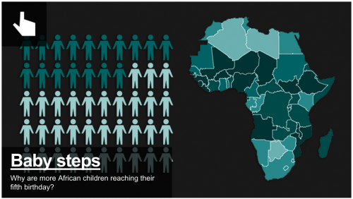
And of course, WTF Visualizations shows us what not to do. A sample from WTF:
Aleszu Bajak was the founding editor of Storybench. He is currently the director of data visualization at the Urban Institute. Previously, he was a senior data reporter on USA TODAY's data team, part of the newspaper's national investigative unit. He is a former Knight Science Journalism Fellow at M.I.T., was a founding senior writer at Undark magazine and founding editor of Esquire Classic, a project resuscitating the magazine's archives. His work has appeared in The New York Times, The Washington Post, M.I.T. Technology Review and Nature.
Latest posts by Aleszu Bajak (see all)