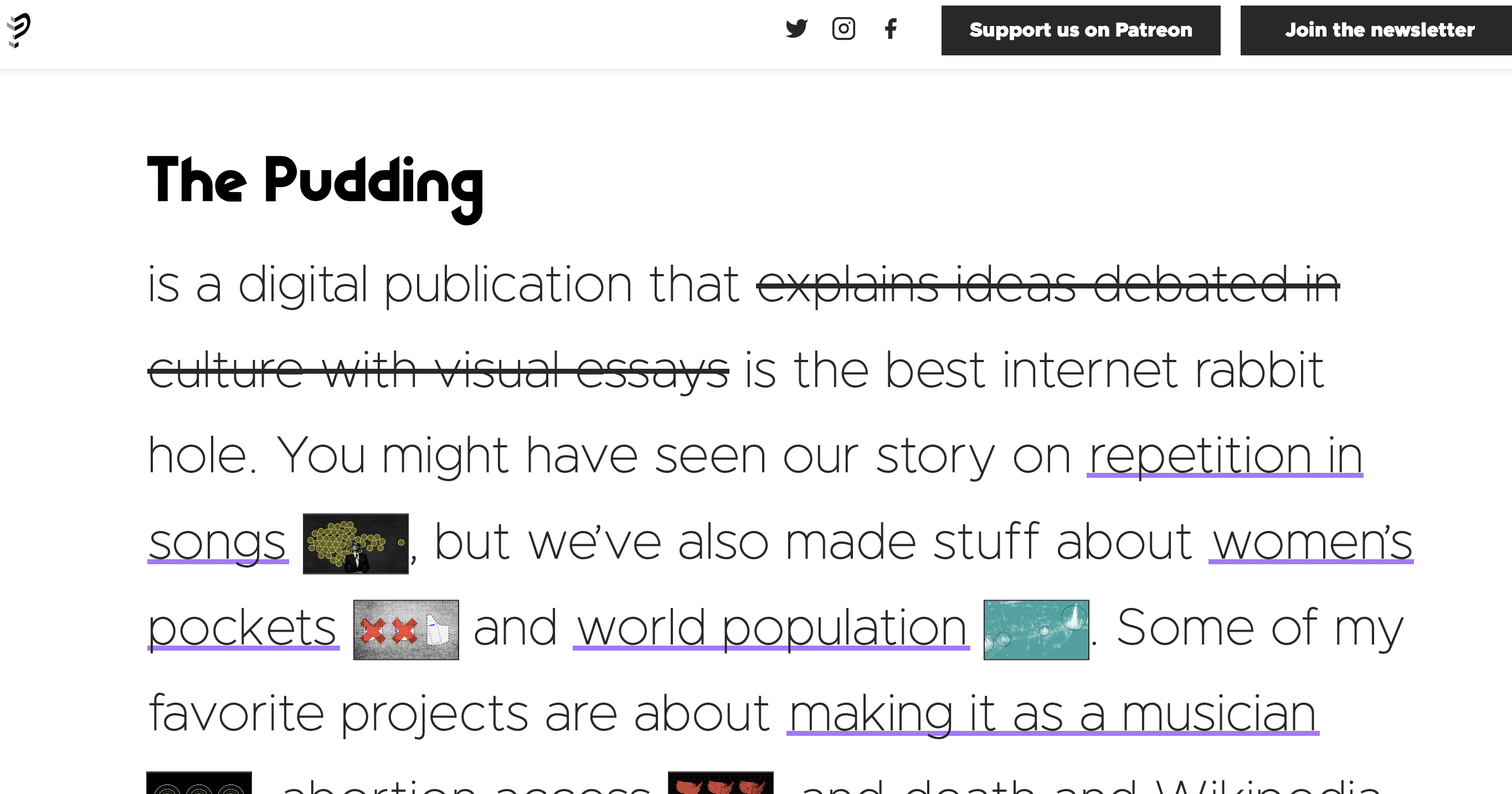
Founder of The Pudding and Polygraph, Matt Daniels, on the shift in content consumption and digital storytelling
Consumer behavior is dynamic and ever-changing. Recently, content consumption within society has shifted from traditional news outlets to smaller newsletters and short, video-based content. Publishers must constantly reconsider the best way to go about their work.
Matt Daniels, a writer and founder of The Pudding, an award-winning digital publication, and Polygraph, a data journalism agency within the Pudding, shared his insights with Storybench on how content and the art of storytelling is adapting — and what the future holds for the content creation industry.
The interview has been edited and condensed for clarity.
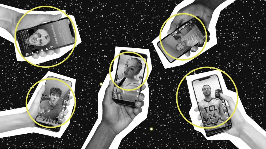
What factors resulted in you writing “The Unlikely Odds of Making it Big on Tik Tok”?
That was sort of a companion piece to a project that I did with Vox. It was a 20-minute long video which had a lot of narrative behind it. There were also definitely a lot of charts. I felt like there was a need to communicate the story in a way which allowed for deeper data exploration.
So basically, the driving force was to create a companion article that goes a little bit more into the data and presented it in a way that would be more searchable, digestible and not just flying across the screen as people would experience when watching a video.
You used various data visualizations within this article. Can you tell me more about your thought process when considering which form of data visualization is the most effective form to use for your writing?
For data visualization, it’s not too dissimilar from digital storytelling. To start, you have some point that you’re trying to communicate to the readers and, of course, you have your typical approach which involves writing text.
However, sometimes the traditional text approach can be really hard to describe an idea or phenomenon or a datapoint — it’s much easier to depict it through data visualization. Once you decided that this is an idea that’s better depicted rather than described [through text], you would start to debate what is the best visual approach.
So you have the arsenal of typical chart types — bar charts, line graph, pie charts, scatterplots. However, if you’re realizing that the point is not as easy to explain with those typical charts types, you’re probably going to reach for something that’s a bit more customized, more unique.
Then you would be sketching out what would be the best, novel way to communicate the idea, and that is tailored to the kind of data that you are working with. Overall, that is an overview of my thought process.
What did you see was missing from traditional digital publications that led you to start your own?
It was less about what was missing and more about what I had in terms of what I wanted to do for my own creative projects. In other words, it was less about what was missing in the marketplace and websites that do similar work; it was about what would be the right way to work on projects that I had interest in working on and having the space to do that independently.
Besides The Pudding, you also founded Polygraph. In your opinion, what constitutes good editorially focused visualization?
Editorial here would mean story-led content. A visual-led editorial piece would be one where the central ideas are depicted rather than described. Readers’ primary way of absorbing information is visually, so that’s why it’s important to include such elements. I don’t know if I necessarily have a perspective on what is good versus bad. But that’s at least what I would think about when I’m looking to create a visual editorial versus a more text- or video-led piece.
Do you think data visualization is becoming more important and, if so, how will that affect publications?
We don’t know if data visualization will be important in the future. However, there are vectors and plenty of signals that is saying that data visualization is becoming less important. I don’t know if I have an idea of what future content will look like, especially editorial, news-led content — whether it will be more visual or not is unsure.
However, if data visualization was to be more important, we can expect to see more teams of graphic folks working in news rooms. I am not sure if that would pan out because a lot of content is moving and shifting forms to newsletters and videos on social media. In this content posted on social media, you would be working less with text and more on static images or video-based content. There’s definitely an argument that data visualization will not become more popular, as more content will mostly be communicated from video and text.
Overall, I don’t know what will happen with content and data visualization. But if you are reading content from a web browser or in an app where there’s an ability to consume the article at your own pace, then I definitely see those news rooms prioritizing that type of experience, leading more into graphics. But from a larger perspective, I would say it’s still difficult to say whether that would be an increasingly more important way to consume content in stories.
What constitutes good storytelling, and how is technology changing storytelling elements and delivery?
Well, I think it’s less about technology and how that is changing storytelling but more on how consumer behavior is changing in regards to the type of content people consume.
As we already know, a lot of content consumption is moving towards TikTok and that is kind of a “video content consumption” with a lot of asterisks, because it’s got elements of video content but not really. But overall, I think there is a ton of impact on the types of stories people are consuming as a function of the type of medium is changing.
It’s like a Marshall McLuhan type of theory, which says that the medium is the message and that is way more important than the content itself.
So if we are looking at the platforms that people are using, that will tell us much more about the world and the impact on our behavior than actual types of contents within the platform. I think that if we want to look at the important types of stories that will be told in the future, we should probably look at how and where the medium is changing.