Storybench Founder Aleszu Bajak on the moral call of the pandemic and his return to daily data journalism
After running Storybench at Northeastern for many years, instructor and program manager Aleszu Bajak decided to leverage his knowledge of data and passion for journalism into a senior data reporter role at USA TODAY’s data team. He is a long-time science journalist whose work has influenced many at Northeastern.
Bajak has written multiple articles for the New York Times, The Washington Post, The Boston Globe, Undark Magazine, and other outlets.
Storybench spoke with Bajak about his recent work relating to COVID-19, his process of creating visualizations, and his advice for students who are looking to pursue careers in this space.
Trust in COVID-19 Vaccine Grows After Months of Decline, Polls Show
What made you interested in writing about and creating visualizations for COVID-19?
As a science journalist, this pandemic has been a call to arms. This is what we are here to do: report what’s happening and publish in as many formats — text, visualizations, photos, audio, video — that will get the story across.
Visualizations, I believe, help communicate the scale and impact that this virus has had. But it’s important to note that these visualizations hide an uncomfortable truth: that the data is incomplete, and we actually don’t know a lot of things about how this virus and its impact on people.
What was the process for you or your team when creating this infogram?
I was following the meetings of the Advisory Committee on Immunization Practices (ACIP). The meeting had a panel of experts that were assembled by the CDC to come up with recommendations for figuring out how to prioritize who would be able to get the vaccine first and the order that followed. In one of their slides, they had aggregated more than 20 surveys and studies of attitudes towards the COVID-19 vaccine. The surveys showed that there was a downward trend over 2020, so being interested in the topic, I decided to build my own spreadsheet to find out all of the information and add more.
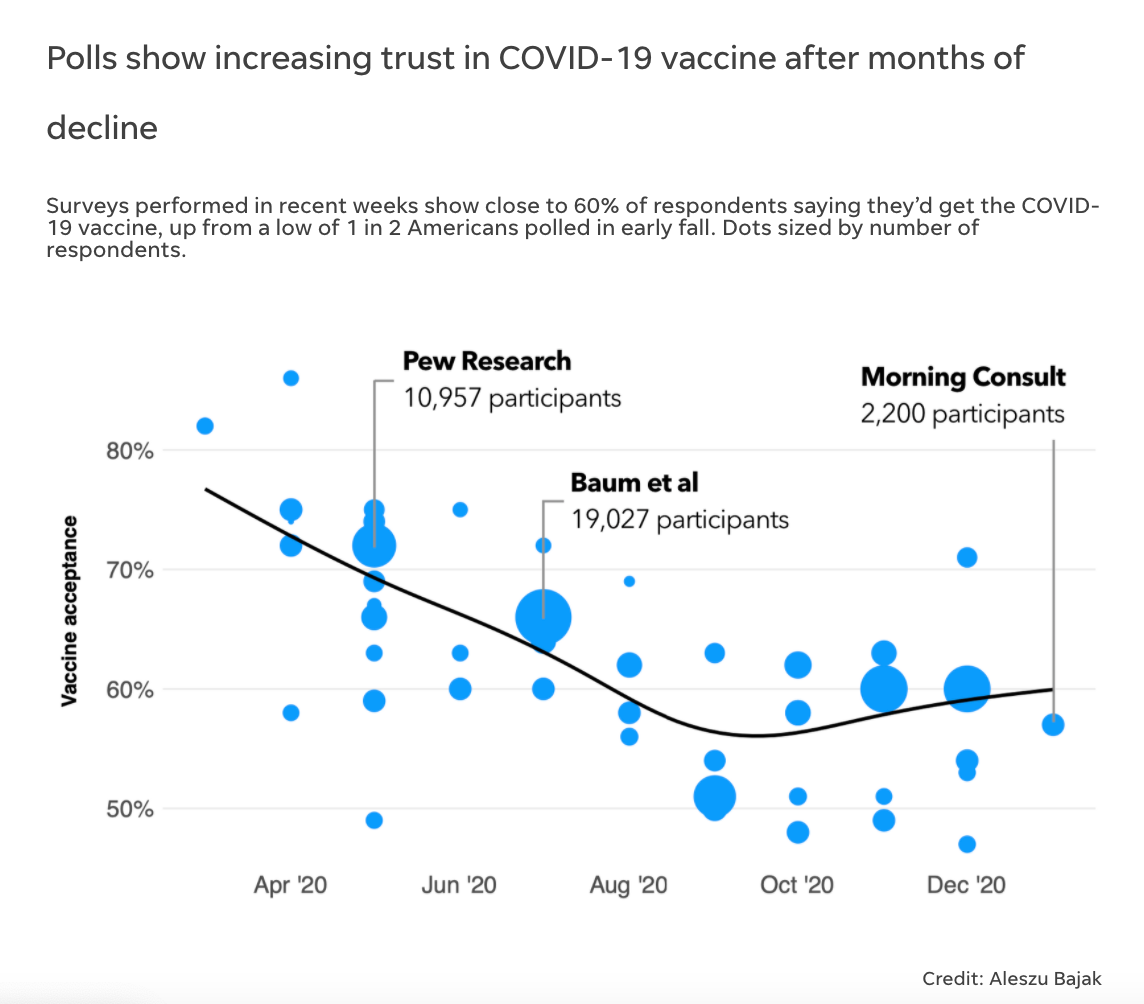
Snapshot of COVID-19 Vaccine Trustworthiness Over Time
Then, I spoke to some researchers at Duke, who had done a similar meta-analysis that ended in late Fall 2020, so I had my quotes. After sending out surveys in October, we realized that people were saying that they were less hesitant to get the vaccine. This was finally a little bit of good news as it was an upswing at the end of a declining curve.
Lastly, using the data that we collected, we built a scatterplot in R and sized the circles by the number of survey respondents. We then asked a couple of academic sources on what their take of the best trend line was to add, and dropped the plot into an infogram.
We talk a lot about the verification of data prior to writing about it. How do you verify data especially in times of crisis?
For starters, definitely go to the source of the data. Jump down the rabbit hole and see if the numbers line up. It will also give you a sense of who collected the data, what processing steps were involved, and maybe what is missing. However, this is a difficult thing, especially with a pandemic raging and pressure to get the information out. A lot of data on this virus, as I said, is incomplete. Think about how many ways death can be recorded and how many steps it takes for that number and its metadata to make it all the way up to the CDC.
Which hospitals in your community are getting hit hardest during the COVID-19 Surge?
What application did you use to create the map of counties reporting an ICU capacity of over 90%?
The data can be found by the U.S. Department of Health and Human Services for the 190 counties that reported an ICU capacity of over 90% from January 29 to February 4, 2021. All the information from that data source is represented in the infogram. For this visualization and data analysis, I used RStudio. For those that are interested in data journalism, Andrew Ba Tran has a great course for using R for journalism.
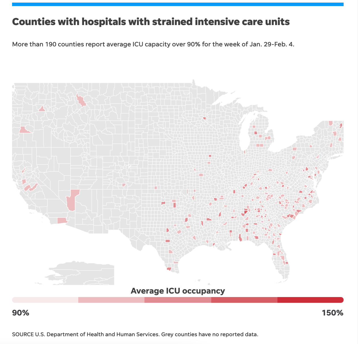
Snapshot of Visualization of Counties with Strained ICUs
Do you recommend students to learn RStudio if they are interested in pursuing data journalism?
Yes, definitely either RStudio or a Jupyter Notebook with python. Those two languages are a common thread in most data journalism teams.
How technologically challenging was the process for gathering information and creating these visualizations?
Once the data was finally released by HHS/CDC in December 2020, it was easy to download from www.healthdata.gov, but getting the analysis right took many days. I called up a couple of doctors and academics that actually work with this data and literally asked them how they divided up the variables for hospitalization rates, ICU capacity, and more. Then, I wrote up a document to myself for how to redo that analysis every Monday when new data was posted.
A Study Said Covid Wasn’t That Deadly. The Right Seized it

Screenshotted from Alex Berenson’s Twitter Account
What was the process of creating the bubble chart to track the misinformation on Twitter?
This visualization was definitely a longer process because it was pulling in data from a preprint archive using keywords and time stamps. Then, I had to use the Twitter API and the URLs to summarize the shared statistics from Twitter and structure them in a data frame. That is how I built those bubble charts or the bee swarm charts. That’s what I did and sent it to the New York Times. They flipped the beeswarm 90˚ and made it a vertical timeline as opposed to the horizontal bee swarm which I had presented to them.
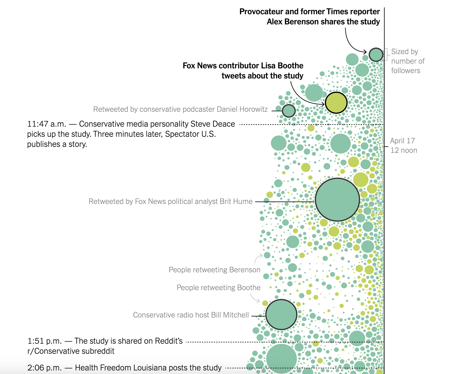
Snapshot of the “beeswarm” chart.
How long did this visualization take?
There is an exploratory data visualization phase and it can take a long time, alongside your analysis. You’re always spitting out graphs and summary tables and other ways of trying to understand your visualization. I also try to answer the question at hand, so I’m cranking out dozens of scatterplots, bar charts, and histograms. A tool I use that allows me to make those is Plotly, which is very compatible with RStudio.
Tell me more about your interest in data/data reporting/visualizations and where the interest stemmed from?
Storybench! Through Storybench, I was able to interview dozens and dozens of data journalists and folks doing podcasts and other newsroom jobs, but Storybench really opened my eyes to the kind of visual and communication side of data journalism. In addition to that, I learned about the analytics and the data-gathering side too.
How does the creation of Storybench at Northeastern tie into the work that you’re doing now?
Everything I learned starting and running Storybench has helped me become the data journalist I am today. It really was a sandbox for me to try out new ideas, talk to the best in the world and learn through the Storybench correspondents.
Did you think Storybench would have been so successful when you created it back then?
When I started it with Jeff Howe and Dina Kraft at the Journalism School, [it was] as a way to build a curriculum for our new graduate program. You definitely don’t want to be behind the times, especially when it comes to something that’s so technologically driven as digital and data journalism. So we figured we basically build a platform that allows students to interview these people and unpack their stories. It did surprise me how widely accepted and valuable it was for people learning these techniques. I think tens of thousands of visitors a month are interested in learning these tools.
What advice or tips do you have for students who want to get into this field of data visualization?
First, go check out all the data visualization and data journalism awards from the last five years. Then, find the people sharing advice, tutorials, and examples of great work, like the Data Visualization Society. I highly recommend all of Alberto Cairo‘s courses and lectures – you can find those online. Jeremy Singer-Vine’s Data is Plural newsletter is great, too. Plus, look beyond journalism and into the work of folks like Giorgia Lupi, Nadieh Bremer, Shirley Wu, and Federica Fragapane – I love each of their approaches to data visualization. There’s also a ton of talent at Northeastern as well specifically in the field of data visualization! Check out Paolo Ciuccarelli, Dan Zedek, Pedro Cruz, Michelle Borkin, Dietmar Offenhuber. There is also a whole MFA program for information design and visualization where a lot of the graduates from that course go into journalism.
Featured Image Credits: Matthew Modoono/Northeastern University