Ten visualizations that depict the state of criminal justice today
Criminal justice is a perpetual focus of media coverage but this past year seemed especially ripe with stories. From the massive reform bill passed here in Massachusetts to the debate over gun rights following the Parkland massacre, journalists and data experts have been kept busy in their attempts to quantify and analyze the criminal justice machine in the United States.
Storybench cut through the noise and pulled out these ten visualizations that best explain the world of criminal justice today.
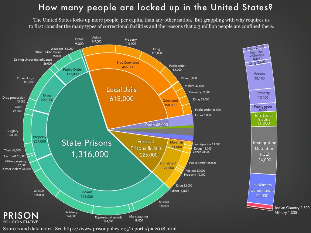
“How many people are locked up in the United States?” – Prison Policy Initiative
The Prison Policy Initiative published a report in March titled “Mass Incarceration: The Whole Pie,” and this mammoth pie chart appropriately heads it. Beyond just showing how staggeringly high the prison population is, the sub-sections within each slice show which offenses claim the most inmates.
“Following the money of mass incarceration” – Prison Policy Initiative
Mass incarceration isn’t just an unfortunate social phenomenon—it’s an economic giant. Billions of dollars are flooding the industry every year, and Vox uses this graphic, from the Prison Policy Initiative, to take you step-by-step through the money flow.
:no_upscale()/cdn.vox-cdn.com/uploads/chorus_asset/file/7870673/mass_incarceration.png)
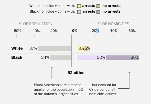
“An Unequal Justice” – The Washington Post
Being black in the U.S. often means you’re at a disadvantage, as numerous studies have shown. This article and bar chart sums up some of the evidence, showing that justice eludes even black homicide victims. Arrests are made at a much higher rate for white homicide victims, despite the fact that black people are the demographic most affected by murder.
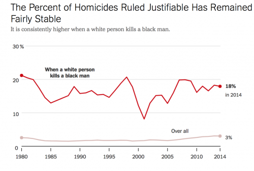
“Killings of Blacks by Whites Are Far More Likely to Be Ruled ‘Justifiable’” – The New York Times
In a similar vein, this line graph from a New York Times article shows that whether or not a homicide is ruled “justifiable” can largely depend on the race of the killer and the victim. Anecdotal evidence, like the Trayvon Martin-George Zimmerman case, backs up the data.
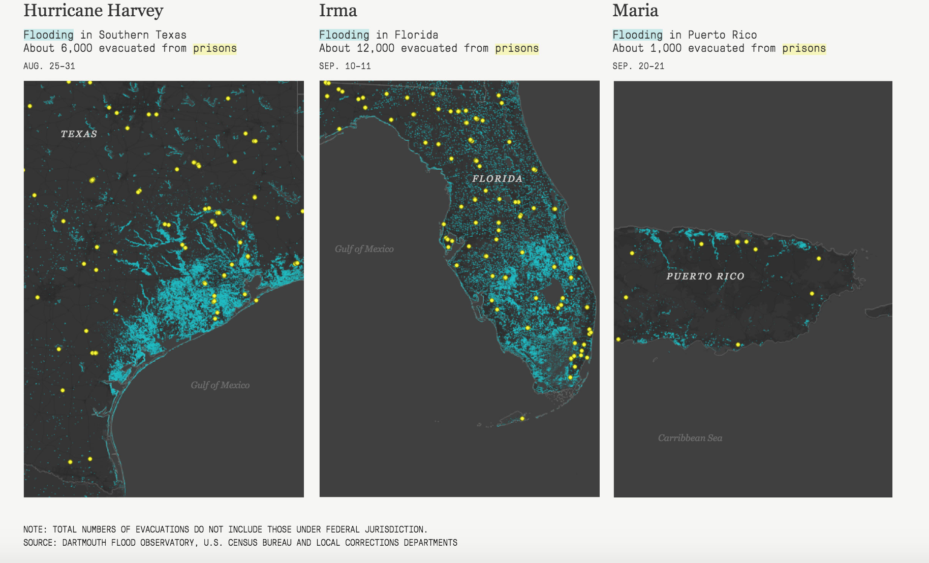
“Prisons and the Deluge” – The Marshall Project
Without freedom of movement, there’s not much that prisoners can do in advance of a hurricane except hope someone evacuates them. This piece overlays prison locations and flooded zones, serving as a reminder of how inmates are at the whim of nature and their corrections officers.

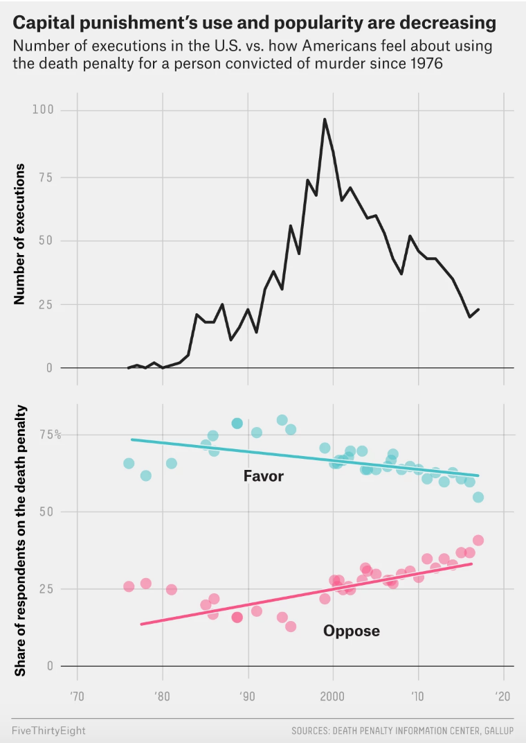
“Capital punishment’s use and popularity are decreasing” – FiveThirtyEight
This scatterplot and line graph combo will please opponents of the death penalty. After a spike of executions in 2000, capital punishment is on the decline, as is the public’s overall approval of it, according to this Jeff Sessions-inspired feature done by FiveThirtyEight.
“Mass incarceration has not touched all communities equally” – The Sentencing Project
A key facet of mass incarceration is sentencing disparities. This visualization (among others in the set) outlines just how unfair those disparities are, with the 1 in 3 rate for black men standing out in particular.

“Bail-setting practices vary widely by judge in New York City” – FiveThirtyEight
Criminal justice activists have set their sights on bail reform as a crucial next step, and this story from FiveThirtyEight shows why. If you ever find yourself arrested in the Big Apple, just how much it will hurt your wallet depends on what judge you get.

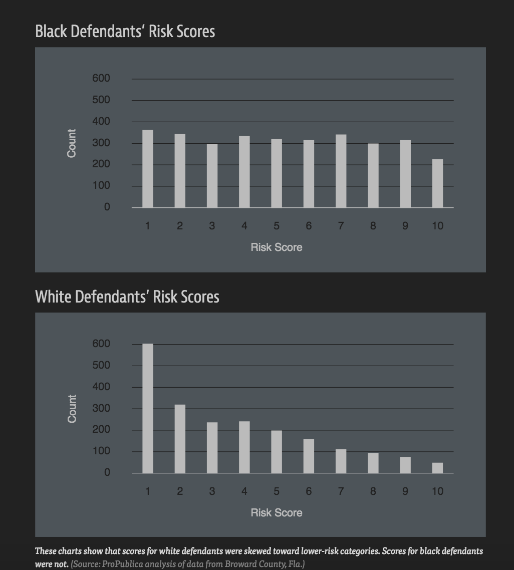
“Machine bias” – ProPublica
Like in most facets of life these days, algorithms are beginning to have an enormous impact on the criminal justice system. While not the most aesthetically appealing, this simple bar graph from a longer ProPublica piece shows how machines determining “risk scores” for future criminality can display bias, just like their human coders.
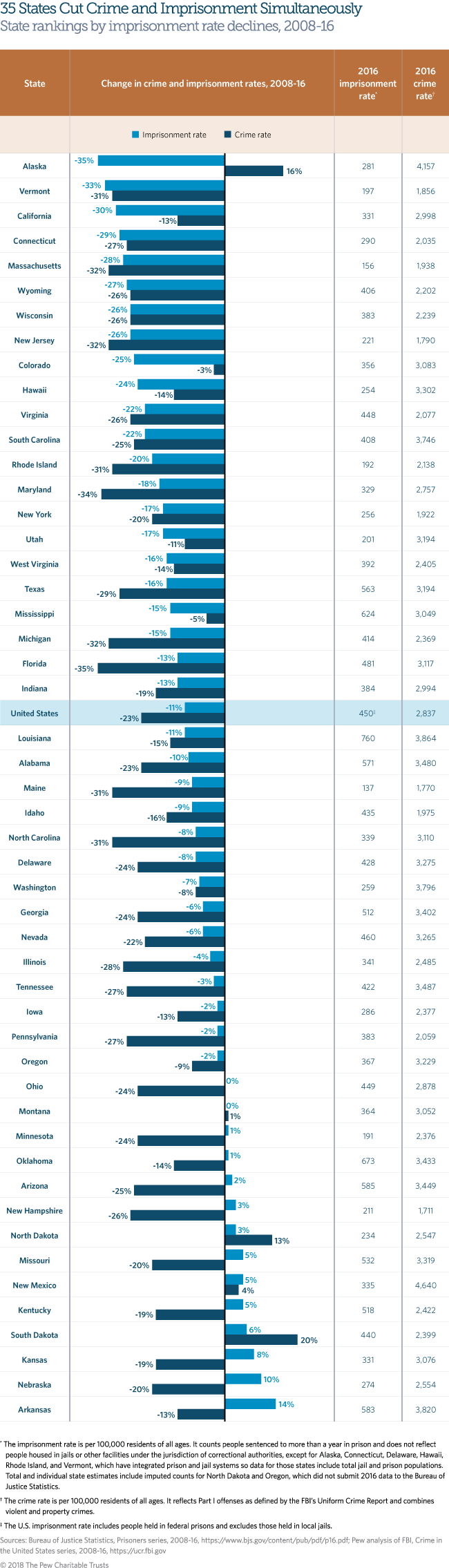
“Here’s one excellent reason to cut prison populations” – The Huffington Post
If there’s concern that cutting inmate populations could lead to further crime, this lengthy graphic might put it to rest. The majority of states have managed to decrease the number of people behind bars while making gains in overall public safety.


Thanks for the list. One correction: The second graphic would more fairly be attributed to the Prison Policy Initiative than to Vox. See https://www.prisonpolicy.org/reports/money.html
Of course! Changes made.