How the Center for Public Integrity is tracking TV ads in the 2016 presidential race
Last month, the Center for Public Integrity launched an interactive feature that tracks where and which political ads are playing across the country for its ongoing series “Buying of the President 2016.”
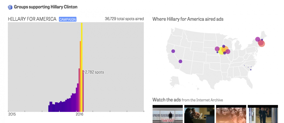
“Tracking TV ads in the 2016 presidential race” allows audiences to see which TV ads are playing, where political groups are spending their money, and who is supporting which candidates across the country.
Storybench spoke with Chris Zubak-Skees, a news developer with the Center for Public Integrity, about how he designed and built the app, which will be updated every Tuesday during the 2016 primary season.
How did you come up with the concept for this project?
We’ve been tracking ads for a bit, first with 2014 Senate races, 2014 state races, and 2015 state races. The Center has a grant to track electoral influence in state races. TV ad tracking is a way we can do that nationally before a shred of campaign finance paperwork is filed or digitized. For the 2016 presidential election, we wanted to provide a nation-wide overview, then allow for detail on the groups advertising, including when, where and what was being broadcast.
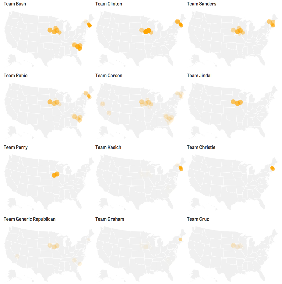
I thought about doing a map for every team or sponsor as a set of small multiples. Here’s an early prototype:
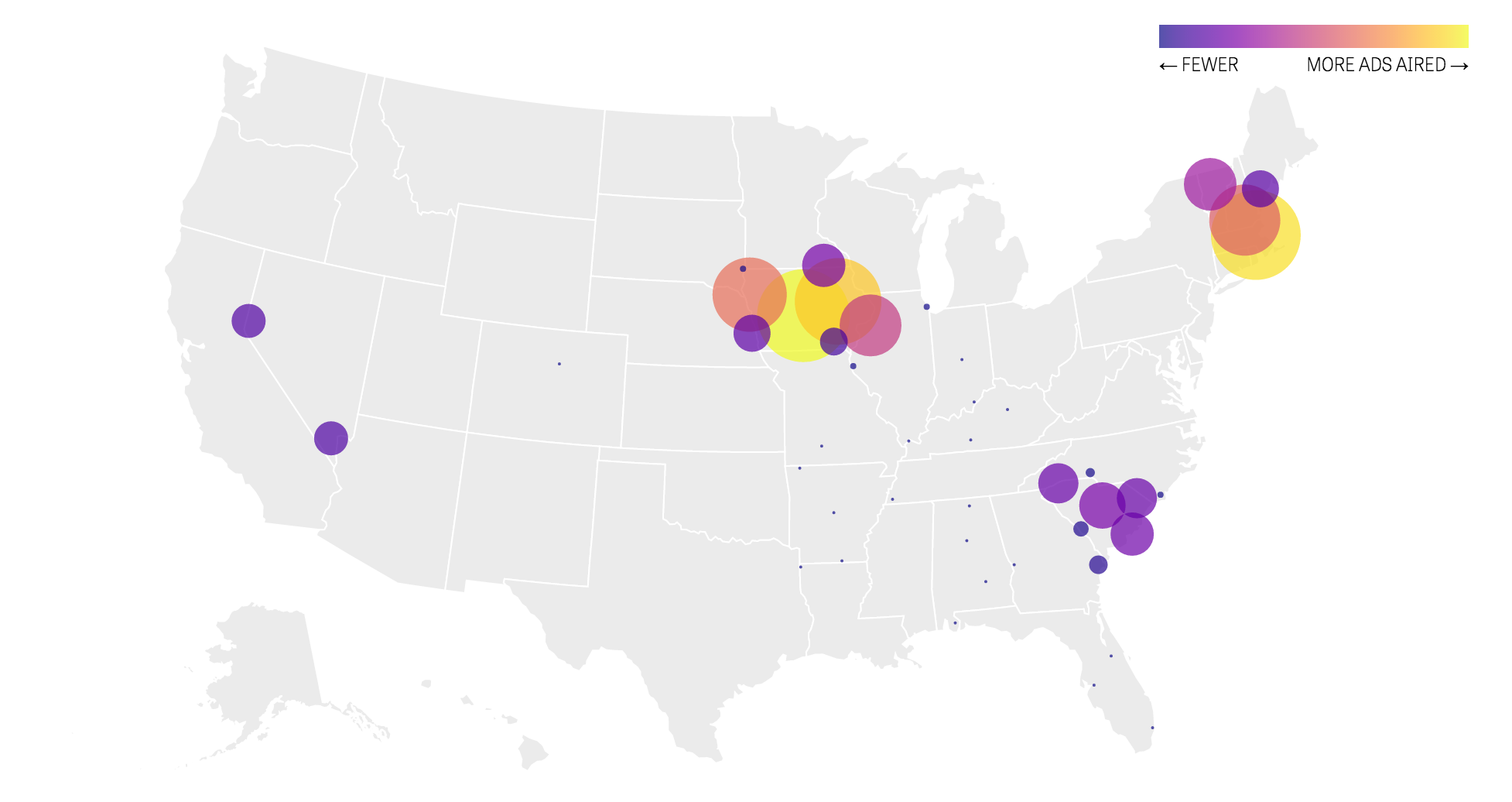
The circles are sized by how far the station broadcasts here, and the number of ads are indicated by the opacity of the orange. Later, I added D3‘s new plasma color scale and sized it based on the number of ads, because differences in color were too subtle to compare such a large range of quantities.
But I was also trying to figure out how to show sponsors over time. Here’s one approach I tried:
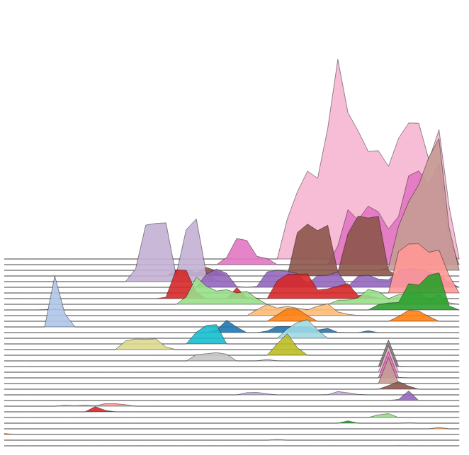
I enjoyed this, but worried about what others would think and whether this would hold up as more data was added. So, I settled for a far more conservative set of bar charts.
But since I was doing weekly bar charts, I ended up with a lot of white space along the right. Could I put my small multiple maps there? Sure. But a map per sponsor would have been too many, and I wanted to show detail at that level. At the same time, I was running up against engineering challenges related to loading a bunch of maps (since solved). So doing one map that scrolled with the user seemed pretty natural. Originally, the large main map came with you and the circle resized.
What tools did you use to build the app?
I used Ractive.js and D3.js, as well as Node, Express.js and MySQL. My code computes totals and assembles the data using a database and web server that I run locally, then it uses a Ractive template to render the data into visuals that we publish. I’m using D3 as a library for scales, projections and to compute paths.
It seems that geo-tagging every ad by state was a monumental task. What was the largest challenge to pulling off this project?
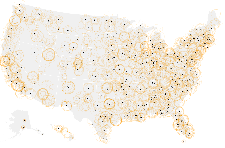
The provider that we bought the data from, Kantar Media/CMAG, records which station and market aired each ad. I pulled that together with an FCC database of where each station transmits, then the code computes a centroid for each market. That was definitely one challenge. Here’s what that FCC data looks on its own:
In general, marrying together a bunch of datasets has been an architectural challenge. We’ve got CMAG, FEC, FCC, Internet Archive ad tracking data, Center research and a couple other datasets besides. It’s all dependent on linking these datasets , which I’m doing by maintaining a database table of IDs for each group in each dataset and by using code to pull it together.
What advice do you have for newsrooms and journalism students that might want to build a similar map-based app using political ad or polling data?
If it’s just a map, CartoDB, Mapbox or QGIS will do. This is an attempt to make a more expansive app to provide more information. It depends a lot on what the student or newsroom is capable of and what their goals are. I tried a lot of approaches and that’s useful whichever method you’re using.
Explore more of this season’s political ads here.