How data helped visualize the family separation crisis
Early this summer, at the height of the family separation crisis – where children were being forcibly separated from their parents at our nation’s border – a team of scholars pooled their skills to address the issue. The group of researchers – from a variety of humanities departments at multiple universities – spent a week of non-stop work mapping the immigration detention network that spans the United States. They named the project “Torn Apart/Separados” and published it online, to support the efforts of locating and reuniting the separated children with their parents.
The project utilizes the methods of the digital humanities, an emerging discipline that applies computational tools to fields within the humanities, like literature and history. It was led by members of Columbia University’s Group for Experimental Methods in the Humanities, which had previously used methods such as rapid deployment to responded to natural disasters.
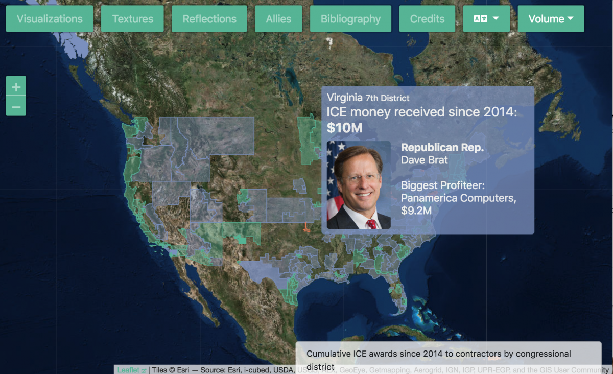
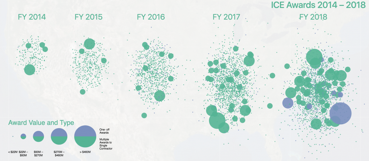
The group has since expanded the project, publishing a second volume that focuses on the $5 billion immigration industry, based largely on public data about companies that contract with the Immigration and Customs Enforcement agency. The visualizations highlight the astounding growth in investment of ICE infrastructure (from $475 million 2014 to $5.1 billion in 2018), as well as who benefits from these contracts, and how the money is spent.
Storybench spoke with Columbia University’s Alex Gil, who worked on both phases of the project, about the process of building “Torn Apart/Separados,” about the design and messaging choices that were made and the ways in which methods of the digital humanities can cross pollinate with those of journalism.
Before we delve into the project, what made you want to work on this issue?
The original team was put together in less than 24 hours. On Father’s Day, me and my colleague, Manan Ahmed, were on chat, and we were looking at what everybody was looking at in the country, about what was happening at the border. We decided right on the spot to put together a team and investigate a way to do something about it.
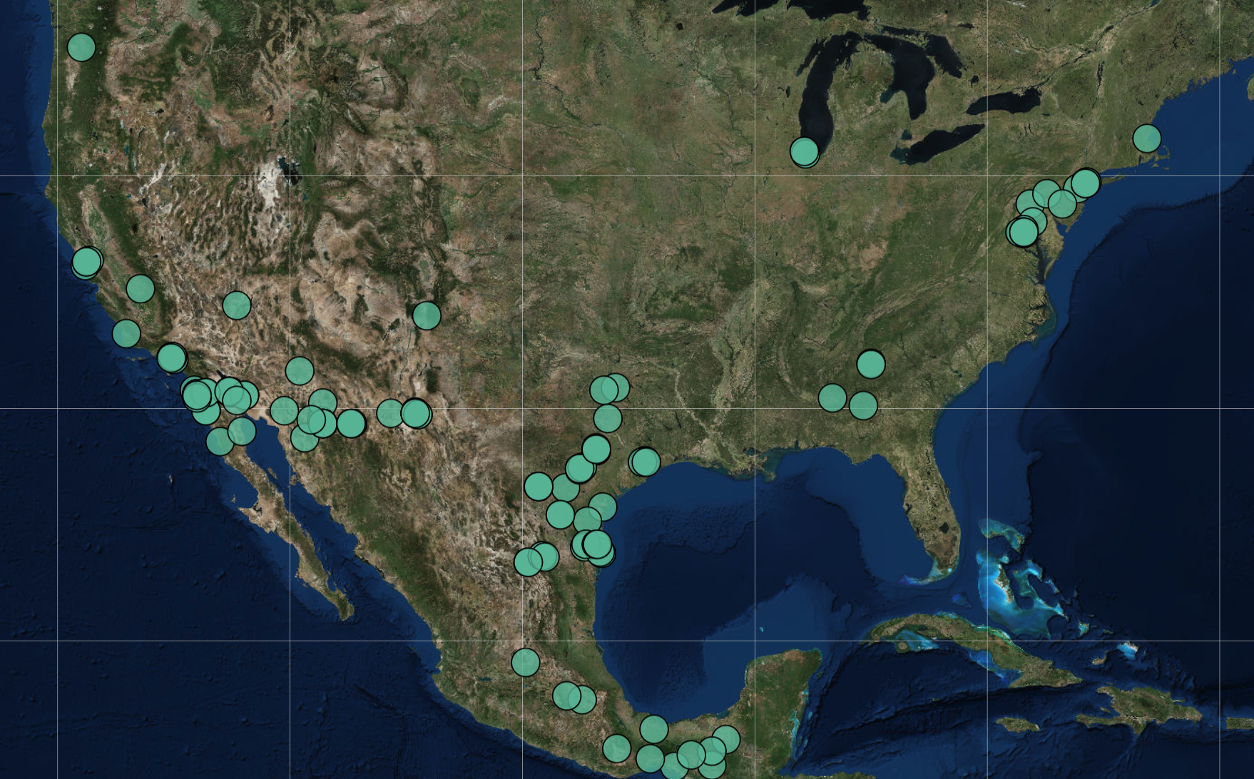
By Monday night, we were already all on the same Telegram chat discussing what was the layout of the land in terms of data and doing research. Everybody was out there trying to find sources and news and information about what was going on. And we were already starting to discuss what we could do with the data. As data sources came in, many ideas were thrown around. I think it was Tuesday that that we found the dataset with all the geographical locations of the detention centers that ICE had contracted with, both buildings that they control completely, or just county jails and things like that. And that’s how that project got started, which eventually became Volume One, and we were done in seven days because everyone really dropped what they were doing and just focused on this project for that week in the middle of summer.
Once that was completed, how did you decide to continue the project and build Volume Two?
While we were doing Volume One, a lot of goodwill came our way, people wanting to get involved. And part of the challenge was to channel that goodwill into places where it could be useful without overwhelming our ability to manage a project with that many people involved.
Right after Volume One published, you attended a conference for the digital humanities in Mexico City, and you used that opportunity to organize a “design sprint” which launched the second phase of the project. How did that come about?
Right after we published, Roopika and I traveled to Mexico for the annual Digital Humanities conference. It happens in a different part of the world every year, and this year it just coincided that it was in Mexico and it was a good coincidence, because there were a lot of people there who cared about this story. So we took advantage of the fact that there were a lot of our colleagues who have similar skills to ours there on the ground. And we organized two parties, and asked people to come to the end of the day to have a beer with us and work on imagining a Volume Two. On Tuesday, we did a design sprint and then with many of our digital humanities colleagues – around 20 or 25 people came – and we came up with eight threads that were possible to pursue. Then on Friday, we tried to implement some prototypes around some of the ideas that were generated on Tuesday to see which ones would be most promising. This kind of rapid prototyping allows us to get a good sense of the overall scope of labor that we have to put into doing this or that.
What exactly is rapid prototyping?
Rapid prototyping is similar to a hackathon, but it’s a lot less time; like three hours. And the idea is that we’re going to build this small working version of an idea, or even this small framework for an idea, to start seeing the contours of the material reality of what it takes to build it. It’s about generating a good conversation around whether it’s effective or not, whether it would accomplish the goals of the project, and about getting a good idea of the amount of hours that it would take, and how many people in a team it would take to build the real thing.
The final version focuses on the business of ICE, based on data from contracts, and what you’ve referred to as the “follow the money” thread. What were some of the other threads that you didn’t end up following?
When we came back from Mexico, we started pursuing four of those lines seriously. One sub-team went to town with ‘follow the money.’ Another sub-team was trying to follow the press, we were trying to study the coverage, getting at the local level and the national level. We got pretty far along with it but we were stopped in our tracks after two weeks because of financial limitations. We didn’t have access to the API that we would have needed in order to tap into the fire hose of all local news and news in the United States. And there was also a technically difficult piece that arose, so we stopped with that and joined the ‘follow the money’ team.
Another team that also started and didn’t come to fruition was a team that was trying to figure out the worst case scenario. Given the current infrastructure and the current data that we have, can we predict what is the worst case scenario for immigrants? We were already seeing the results of the ‘follow the money’ story, which showed us very clearly that there has been an explosive growth in the investment in ICE — 900 percent since the Obama years — and we already saw in Volume One how pervasive ICE infrastructure was in the United States. So, we wanted to calculate it; the way that I formulated it is given what we know how to do now, and the access to the data that we have now, if we were in 1939, what could have we predicted? Of course, that project was very complex and there were some mathematical and data obstacles that were not overcome in time. So, we were pursuing several threads at once to see which one would yield fruits and “follow the money” was yielding very good fruit, so like a month in it was like, ‘Okay, all hands on deck on follow the money.’
What were some of the design considerations that went into the project?
The ‘Lines’ visualization is based on data about people being deported per deportation point, usually in airports. The size of the triangle tells you how many people per exit point are being deported – the bigger the triangle the more people are deported from that particular point. The visual aesthetics of it is a rift through the very fabric of the United States, sort of a wedge which is being hammered in, tearing apart our family, our friends and our communities. A very detailed account of the design choices and what they mean was outlined by Moacir P. de Sa Pereira, our senior developer, in the essay ‘Representation Matters’ included in the ‘Reflections’ section.
Why did you choose to use evocative language, terms like “freezer,” “ice tray” and “rain,” to categorize certain elements of the project?
We want to evoke, and we wanted to defamiliarize as well. We become so accustomed to common words to describe what we’re seeing, and we wanted to create that effect of defamiliarization, to kind of unhinge our habitual way of looking at things. So, we made recourse to evocative language in order to create that sense of unfamiliarity, make our readers, our public ask themselves, ‘What am I looking at?’ But another way of looking at it, is also not receiving taxonomies that have become too institutionalized. You can see this kind of thinking in action the best in the ‘Freezer’ visualization. We avoided using the two taxonomies that the government prefers for many reasons. One of them was of course that there we have contracts that transcend categories. And this is what ‘Murder Board’ tries to communicate, that actually the way that the data of the government is organized is the tangle.
But then we debated: do we want to organize the same way they do? Or do we want to put our own perspective into things? Here around the humanities we talk a lot about ontology – what things are – and so we asked ourselves, ‘What are these different goods and services and doing from the point of view of us?’ And then that’s what we came up with the categories of Surveillance, Stipulated Violence, the Flow of Bodies and Goods, Staples. This is from our point of view, this is that we would categorize these companies as doing.
When you are making these design choices, who is your intended audience? And how does that inform your choices?
One of our audiences is our colleague, fellow scholars, especially those who are versed in data science and digital humanities. The other audiences are journalists because these kinds of microscopic analysis are useful for investigative reporting, and the third audience of course the general public. So of course delivering a product that can cater to all these three audiences, using a visual vernacular that is still not yet 100 percent part of the mainstream, is super difficult. So much thinking went into creating this balance right – and that’s why we included the Textures page which fills in the gaps of what the visual language can never communicate.
- How data helped visualize the family separation crisis - October 12, 2018


