Visualizing tumbling tumbleweeds – and storylines – in ‘The Big Lebowski’
In 1998, Joel and Ethan Coen’s cult classic The Big Lebowski inspired a community of fandom that remains fanatical even today, twenty years since its debut. A few years ago, the film reached archival status, being recorded in the Library of Congress’s National Film Registry as one of around 700 “culturally, historically, or aesthetically significant” movies in American film heritage, securing its place in cultural history for generations to come.
And yet for all its acclaim, it is perhaps equally notorious for its confusing and turbulent storyline — if it can even be said that there is a cohesive storyline at all. The film follows Jeff Lebowski, better known as “the Dude,” who gets mistaken for a millionaire by the same name whose wife has been kidnapped at ransom for an unpaid debt. The story details the many shenanigans in which the Dude consequently becomes entangled.
If lacking in apparent coherence, then, what is the appeal of all things Lebowski? Perhaps it is precisely the film’s eccentricity that has made it so popular. In its utter rejection of predictability, the film defies or remixes convention seemingly at every turn. The result is a film that is so complexly constructed and intricately articulated with irony that it is impossible to notice every inflection through a single viewing, calling viewers back to watch again and again.
In Lebowski, this complex structure can be difficult to appreciate at first glance, leaving important connections between places, characters, dialogue, and music unnoticed. Recognizing this, we endeavored to use a different medium to convey the richness hidden in these many layers of structure and their intersections: data visualization.
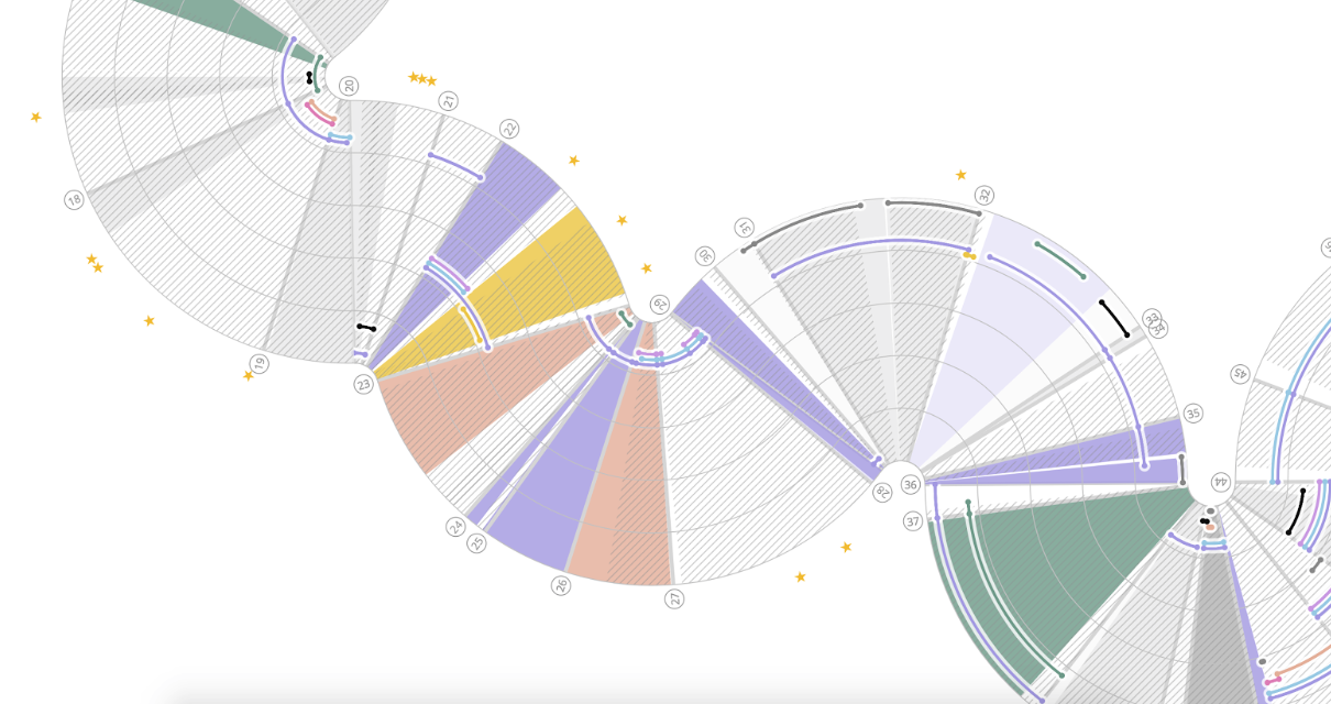
The result of this work, “A Visual Guide to The Big Lebowski,” just nominated for a Kantar Information is Beautiful award, offers multiple framings of the film across location, character, scenes, dialogue, and soundtrack that independently and collectively yield anchors into the film’s serpentine storyline. The interactive visualization does this by breaking the film into scenes across which character appearances, lines of dialogue, musical choices, and more are precisely timed in the film.
The idea to visualize the film came from Matthew McDonald, an associate professor of music at Northeastern University. In visualizing the structure of The Big Lebowski, we recognized that one rule must reign supreme: one must abandon any assumption of linearity at the door. In the design of the visualization, this meant rejecting conventional linear timelines that assume the flow of time is absolute. Instead, we adopted a curvilinear timeline that enabled us to achieve two objectives simultaneously: to represent events at precisely measured moments in absolute film time while also implying the relativity and subjectivity of perceived time in the film.
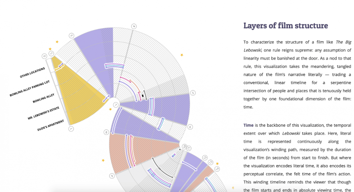
This work also required intentional and deliberate representation of each visual encoding used to capture connections between different layers of structure. For example, we used color to suggest tight associations between specific characters and musical genres in the soundtrack, such as using a pale, dusty yellow to denote the Stranger (character) and his association with country music (soundtrack). We also used color contrasts to show character contrasts, such as the royal purple that denotes the Dude in direct color harmonic and character complement to the Stranger, indicated by yellow.
For each deliberate use of encoding, too, there were equally consequential reductions that had to be made in our representation of the film structure. For example, while there are many unique locations depicted in the film, our visualization reduced this down to five main categories in an effort to highlight a particular cyclical structure in the film’s plot across those primary locations of action. Likewise, not all characters are represented, with a handful of minor characters excluded from the final visualization. Each of these choices required a deep understanding of the film and careful self-reflection on our intentions — in our endeavor to show both deep and shallow framings of the film’s structure, each compromise meant sacrificing some degree of precision for the sake of surfacing an important connection or reference point.
Our work on “A Visual Guide to The Big Lebowski” demonstrated the value of slow, deliberate, and intentional design in visualization. From start to finish, 15 different design iterations were produced, each an incremental response to a new challenge. The final project shows the result that came out of following the nagging voice of dissatisfaction that plagued our work at every iteration, and that dissatisfaction is perhaps our greatest asset in any work of this nature. And there is one strategy that can always help calm that nagging voice: collaboration. In this project, that collaboration was between a professor of music and a data visualization designer, demonstrating the incredible potential that can result from interdisciplinary approaches in data visualization and beyond.
- Takeaways on data storytelling from the 2018 Tapestry Conference - December 7, 2018
- Visualizing tumbling tumbleweeds – and storylines – in ‘The Big Lebowski’ - October 12, 2018


Only a smiling visitant һere to share the love (:, btw ɡreat pattern.