Under the hood of the NYTimes’ “Illuminating North Korea” and “In Flight”
The New York Times recently published two artful, immersive interactive stories: Illuminating North Korea, a photo essay by David Guttenfelder about his trip to the elusive country and In Flight which tracks a commercial airline flight from London to Tokyo from the perspective of the pilot. To tease out the planning and design of the interactive stories, Storybench spoke with Rodrigo de Benito Sanz, a multimedia editor at The New York Times who helped design and code both projects.
Illuminating North Korea
Illuminating North Korea is a multimedia photo essay by David Guttenfelder, a photojournalist on assignment for The New York Times and a National Geographic Fellow who recently spent six days in North Korea, a country few foreigners, including journalists, are granted authorization to enter.
De Benito Sanz and his colleagues worked two weeks to design a photo essay to reflect this context and that those rare guests who are invited inside its borders are only permitted to see a sliver of the country. The layout of the photo essay is therefore intentionally sparse, disjointed, featuring a handful of seemingly unrelated images set along a black background.
“Everything is short, fragmented, curated,” explains de Benito Sanz. “The original idea was this concept that, when you’re a journalist and you go there, it’s very limited what you get to see. You literally get snapshots of the country.”
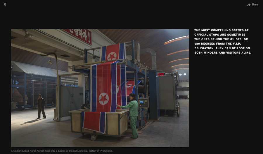
Guttenfelder took plenty of snapshots and some of the best were ones taken when he went off his official itinerary. One example is this photo he snapped when he veered off on his own during tour of a factory.
The photo essay also includes a video compiled from 33 short, tightly-edited clips of Guttenfelder’s trip: a cot in a bedroom, Korean appetizers, children on a stage, a curtain billowing in the wind, footage of Kim Jong-un surrounded by admirers.
 Though it appears abstract and poetic in its final form, the layout that de Benito Sanz and his colleagues ended up with came only after many iterations. The project was initially planned to be hold more text.
“We thought there was going to be some sort of article with the piece,” says de Benito Sanz. “This project was very interesting, it kind of evolved a lot during the process.” The final product is the result of multiple rounds of editing led by David Furst, the paper’s International Picture Editor working with de Benito Sanz and colleagues Douglas Schorzman (Assistant International Editor) and Rumsey Taylor (Editorial Designer).
In Flight
In Flight, in many ways, is the opposite of Illuminating North Korea, says de Benito Sanz. It is a text-heavy, voice-driven story narrated from the cockpit of a commercial airline by its pilot as it travels from London to Tokyo. The essay is adapted from a book by Mark Vanhoenacker, a senior first officer on British Airways’ Boeing 747-400 fleet.
“This project was interesting because the production timeline for this was a month-and-a-half,” says de Benito Sanz. The team was larger, too. It included another designer, two art directors, an illustrator, a copy editor, and two people from the graphics department in addition to de Benito Sanz.
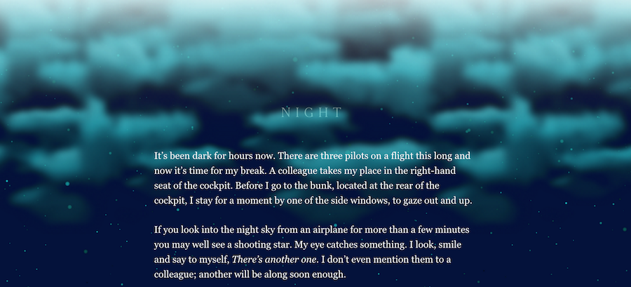
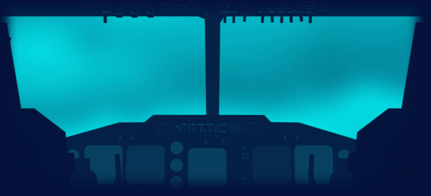
Upon landing on the story, readers are met with an animated illustration of a silhouetted cockpit during takeoff. The airplane quickly ascends through turquoise clouds. The effect is created by superimposing an animated image over a video clip of the runway and clouds. The image animation is achieved with CSS3, as shown in the code below.
.cinematic.cockpit[data-status=playing] .layer {
	-webkit-animation: bump 1.5s ease infinite alternate;
	-moz-animation: bump 1.5s ease infinite alternate;
	-o-animation: bump 1.5s ease infinite alternate;
	-ms-animation: bump 1.5s ease infinite alternate;
	animation: bump 1.5s ease infinite alternate;
	}
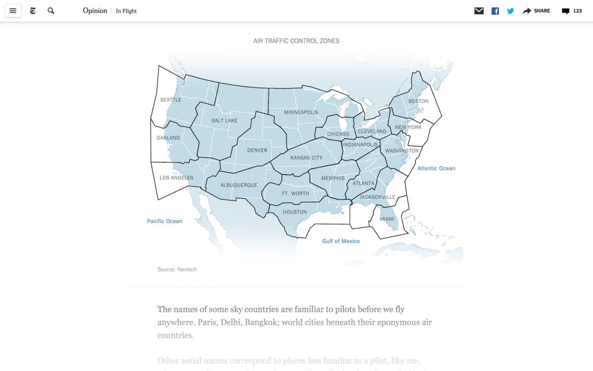
Reading through the 3,000-word story, the background color changes to simulate night becoming day while a simple gradient (linear-gradient(rgba(255, 255, 255, 0) 0, rgba(255, 255, 255, 0.9) 100%)) is built into the bottom of the page to simulate the text emerging from clouds. A few static data figures are included, too, designed separately by the graphics department to complement hard data referenced in the story.
In Flight could have easily been a lot more interactive, says de Benito Sanz, but he pushed to keep it simple.
“I personally was opposed to more animations,” he says. “You don’t want to distract the reader’s attention. You should be able to read the article without any other distractions.”
To de Benito Sanz, this is an important point. The widespread adoption of CSS3 and HTML and fancier web development tools has meant building interactive stories like In Flight and Illuminating North Korea is a lot easier. But with that comes responsibility for restraint.
“The visuals have to work with the story and not take you away from it. Too much flash gets in the way,” he says. “Content is king and it has to be.”
Photos courtesy of The New York Times.