
Six data visualization tools you should know
The following are notes from a BU storytelling with data workshop led by Storybench editor Aleszu Bajak. The full presentation can be accessed here.
Google Spreadsheets
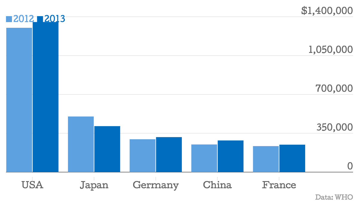
Public health expenditure (top countries)
Digiday, for example, is using embedded interactive charts from Google Spreadsheets.
Chartbuilder
Public health expenditure (top countries)
Plot.ly
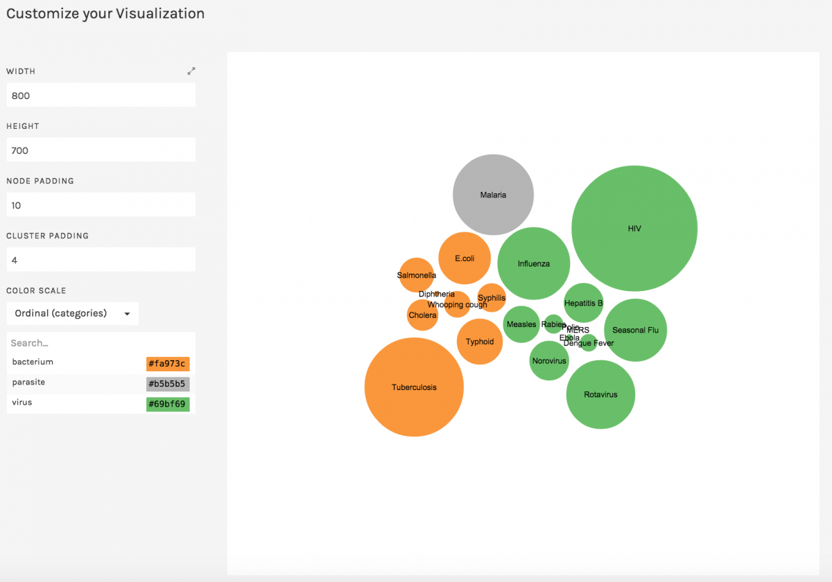
Raw
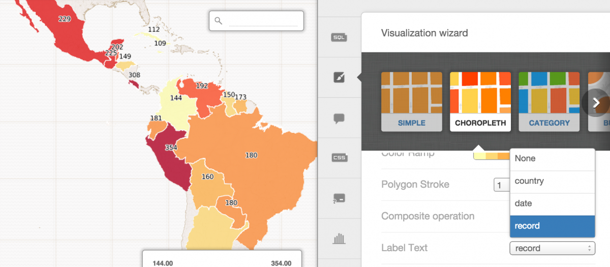
CartoDB
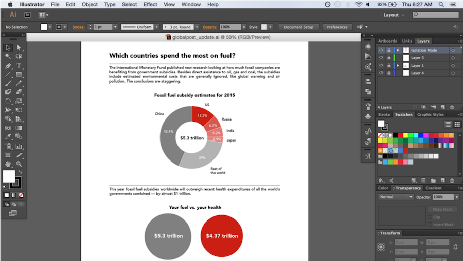
Adobe Creative Suite (free trial)
For more information on data visualization tools and an introduction to the practice, flip through Aleszu’s full presentation here.
Aleszu Bajak was the founding editor of Storybench. He is currently the director of data visualization at the Urban Institute. Previously, he was a senior data reporter on USA TODAY's data team, part of the newspaper's national investigative unit. He is a former Knight Science Journalism Fellow at M.I.T., was a founding senior writer at Undark magazine and founding editor of Esquire Classic, a project resuscitating the magazine's archives. His work has appeared in The New York Times, The Washington Post, M.I.T. Technology Review and Nature.
Latest posts by Aleszu Bajak (see all)