How Colombia’s Datasketch wants to make data visualization easier for Latin American newsrooms
“We live in a world that is drowning in data and getting the stories may actually be harder than ever because the stories are hidden in plain sight in millions of documents and databases.”
That’s how Juan Pablo Marín Díaz, CEO of the Colombian data visualization company Datasketch, describes a problem facing newsrooms across Latin America and around the world.
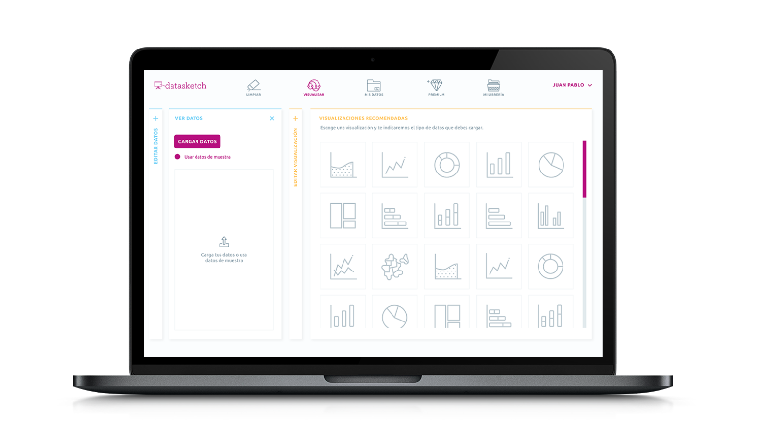
His solution? A web-based data visualization tool now being crowdfunded on Kickstarter designed to help news organizations access public datasets, explore and analyze those data, and create and export visualizations.
Marín has established a track record with his data analysis and visualization consulting, creating an interactive map for the Inter-American Development Bank and a network analysis of Colombian politicians with the news organization Cuestión Pública.
Datasketch also publishes their own ambitious data-driven investigations, including an exploration of gender violence in Colombia, an analysis of the more than 500 Colombian activists assassinated since 2016, and a census of Bogotá’s trees. For their contributions to data journalism, Datasketch was shortlisted for a Data Journalism Award in 2017 and they recently joined the Network of Latin American Journalists for Transparency and Anti-Corruption. Storybench sat down with Marín to talk about Datasketch’s work.
What drew you to data journalism and how was Datasketch born?
As an engineer, I wasn’t really aware of the role journalism played in society. But when I had the fortune to work with an independent newsroom a few years ago, I developed some data analysis and visualization tools to understand circles of power to better inform citizens around elections.
While there, I came to the understanding (with my own engineering bias) that journalism plays a big role as a sensor that measures the multiple facets of society and provides feedback on these measurements for better policy planning. I quickly saw that any journalist would have superpowers if only they were more comfortable working with data, like I was. So I started creating blog posts to teach others about freedom of information rights, data formats and visualizations. And quickly our work moved towards creating better tools for journalists. We currently help smaller organizations to organize and communicate data. We love what we have done and now we want scale it so other organizations worldwide can improve their workflow with data.
How did you get into data visualization?
Studying electrical engineering, I always liked communications and pattern recognition. I feel this give me a real world, hands-on perspective for problem solving. While doing my masters at ETH Zurich, I saw many brilliant engineers and scientists working on improving algorithms so they could run faster and faster, sometimes with too much of a desire for publication but less for solving a real problem. Many times the underlying assumptions were just impractical and that was something I could not easily cope with, especially coming from a place like Colombia, where people actually have other types of problems – problems that are better addressed with politics rather than with faster algorithms.
What could I do with my knowledge to help tackle this issues? That’s where data visualization comes in. With my knowledge I could improve information flows so decision makers would some day make evidence-based decisions, like this example where I collected and visualized the data on the Colombian conflict.
What’s the current state of data visualization in Colombia and Latin America?
Data visualization needs to be more democratized. This can only happen if people get used to it, that is if they see it often in the news and learn to read it in daily life. Take the TreeMap, which was formalized at the University of Maryland in the 90’s. When I started working with journalists a few years ago, they couldn’t really understand how it worked. Now, some years in, many newsroom actually use them regularly. And readers are not scared anymore.
In Latin America, the open data movement has opened many doors but there is still a lot of work to do and we need to work together to make this happen by sharing code, sharing databases and creating new protocols to exchange information.
Why? Take for instance the Odebrecht corruption scandal. Many Latin American countries were actually affected and there is no single person, nor a single newsroom, who will ever get all the intricacies of the facts. It is only working jointly and collaboratively that we will be able to tackle these issues.
Tell us about Datasketch Apps and why you’ve started a Kickstarter.
I actually developed the fist version of the Apps in 2015. Back then it was a simple tool to make maps of the world. In the process I realized that if we ever wanted to make the tools accessible, we should remove the burden on the users of preparing the data they would use. So we started collecting multiple open data sources and thinking about how to make them talk to each other and interact.
In the real world, data is small, incompatible and incomplete. That has been our technical focus in the past few years. On the other hand there has also been a very important human component: it is the communities we build that will make a really usable tool. This is why we have been experimenting a lot with physical ways to interact with data, from analog data visualizations to wearable data journalism. Not only are projects like that fun, but they also help us create tighter networks of data enthusiasts and new collaboration opportunities.
As for the Kickstarter, we want to scale our project internationally and help small organizations in countries like Colombia do a better job and actually reduce the gap between those organizations who can process data from those who cannot. Not everybody is the New York Times or the Guardian.
There are many off-the-shelf data visualization tools out there. How is Datasketch Apps different?
1. Access to data: We understand that more than data visualization, one real challenge is accessing data that is actually well prepared and organized. Data like population estimates for most countries is not something that one can find and process in three clicks. So what happens to the data that has been carefully curated before by journalists? It usually disappears in a sea of links and even in the very same newsroom that published it, it is not reused.
2. Open source for localization: Users really care about their specific context. This is why we need to create localized tools. The only way to do this at scale is by helping developers actually solve their local data problems. Think of geographic information for a small town, or a sentiment analysis tool that works for Chilean Spanish and not only for Mexican Spanish.
3. Export in multiple formats: Most tools allow you only to embed a visualization, you do not have access to the source code. With our apps, you can download the full HTML, tweak it and save it for your needs. Whether you want to host it or use our hosting is up to you.
4. Learn by doing: We are incorporating tips from experts straight into the app. Say you love 3D pie charts. When you use them in our app, we refer you to documentation and comments from experts to advise you not to use them. While using the app we recommend short explainer videos for you to learn more about data journalism.