How to build an interactive county level map like the New York Times
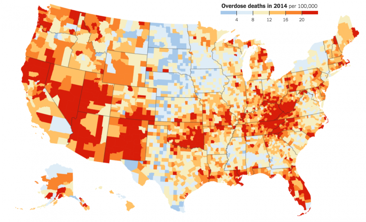
The New York Times, like many newspapers, is fond of building county level maps to display information like census data. Recently, in light of the exploding opioids crisis in the United States, the paper built a series of maps that show drug overdose deaths in counties across the United States. The following tutorial replicates their map and makes it interactive using CartoDB.
Download the drug overdose data
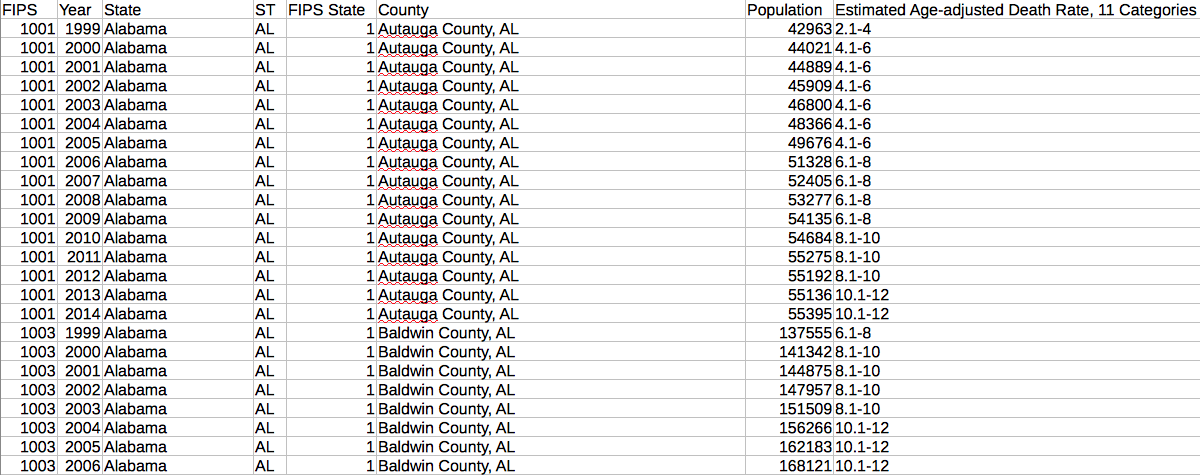
The New York Times based its map off of 1999 to 2014 drug poisoning deaths data from the National Center for Health Statistics. Download the CSV Format county estimates file here. The filename should end in County_Trends__United_States__1999_2014.csv.
Open the csv file using Excel or similar spreadsheet software. It contains more than 50,000 rows. Notice the FIPS column. That’s a federal code that uniquely identifies each county. We’ll need that FIPS number to merge this data with shapefiles of each county.
Download U.S. county shapefiles
ESRI, a mapping service, provides U.S. county shapefiles, which are in essence polygons that define the borders of a county. Download them here. Or from Storybench here.
Upload shapefiles to CartoDB
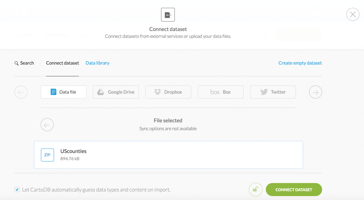
The shapefiles are in a zipped folder. Upload this directly to CartoDB. (Sign up for an account first. It’s free.)
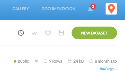
Click “New Dataset” to add the shapefiles.
Browse for and upload the zip file:
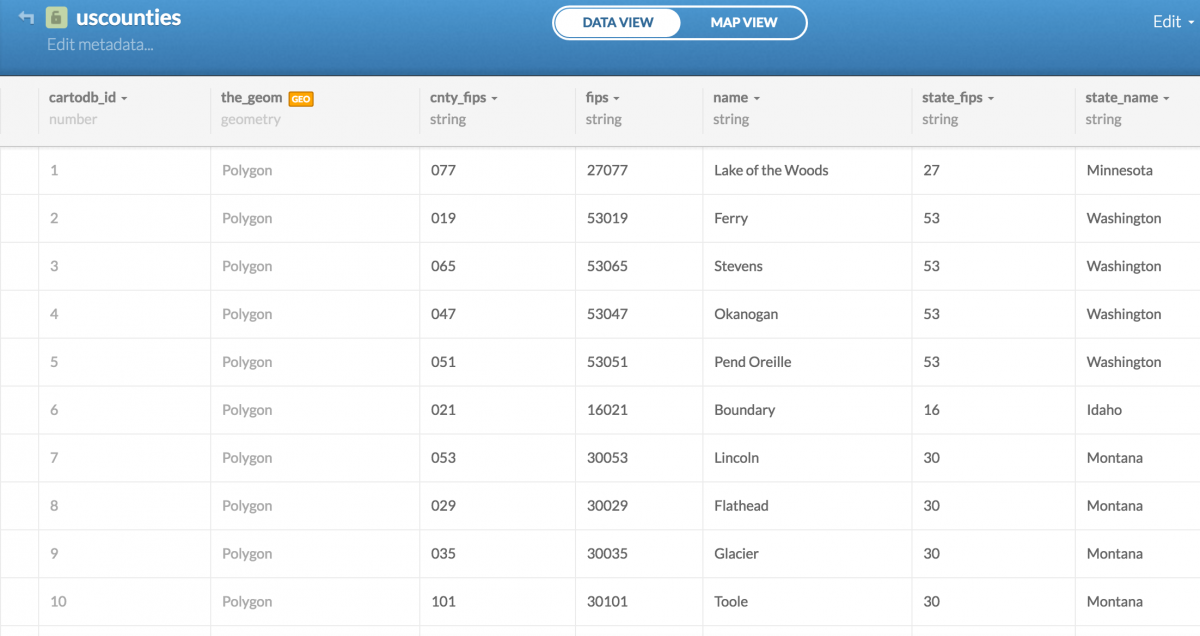
Notice the fips column in CartoDB’s Data View display of the shapefiles. We’ll want to remember that column. (It contains a mashup of the state FIPS and county FIPS numbers.)
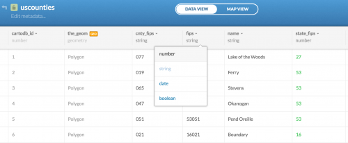
One important thing to notice is that CartoDB hasn’t recognized the fips column as a number. Click string at the top of the column and change that to number. You’ll need this to merge datasets later. Click Ok, Change It when prompted to change the data to numbers.
Cleaning the drug overdose data
The New York Times opted to publish a series of static maps to tell a story about the rise in drug overdose deaths in different parts of the country. We could filter our data by year and create similar maps:
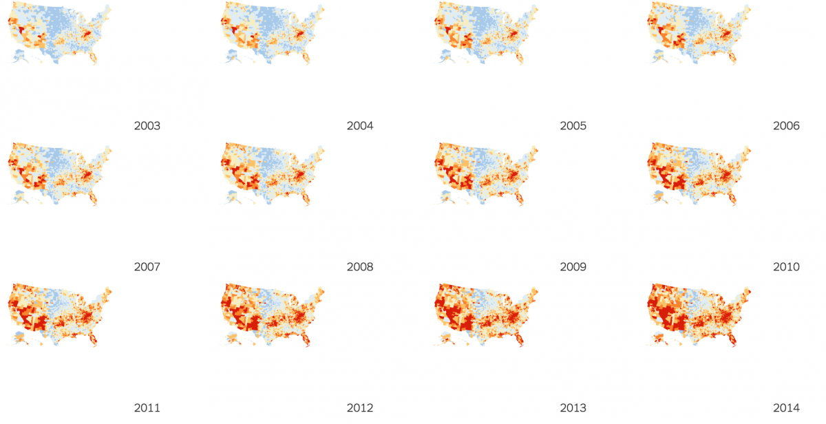
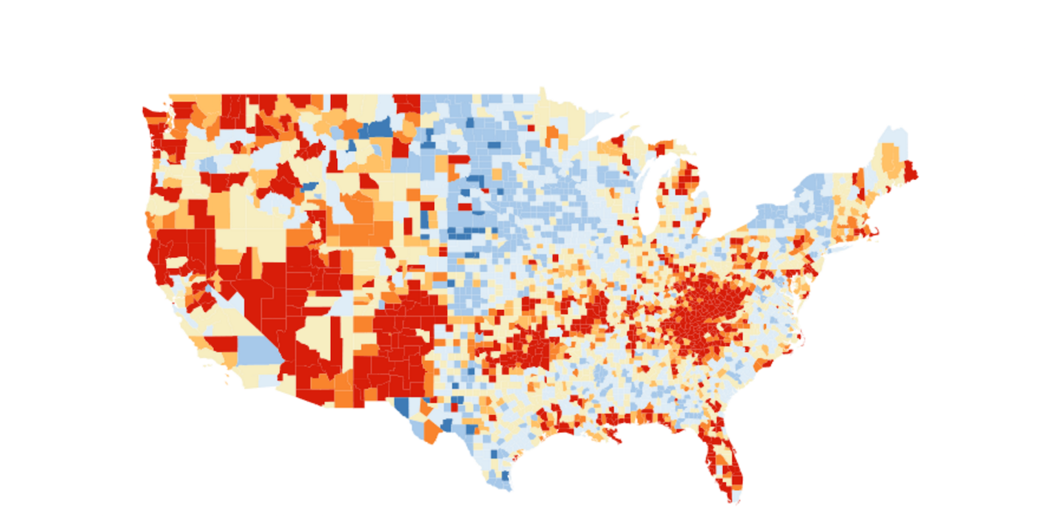
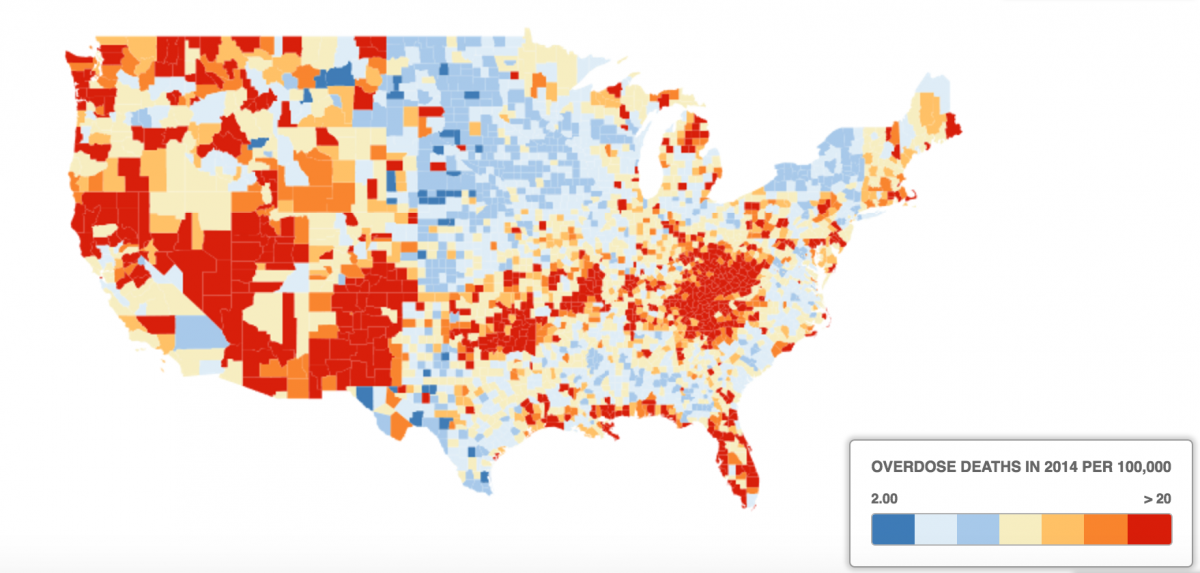
But, for the purposes of this tutorial, let’s focus on the large map the paper created to show drug overdose deaths by county in 2014.
Clean the drug overdose data
Place a filter on your data so you can sort and filter columns. Find the Filter option in the Data tab in Excel or LibreOffice.
By clicking the filter drop-down menu in the Year column, filter your data by the year 2014. Hit Ok.
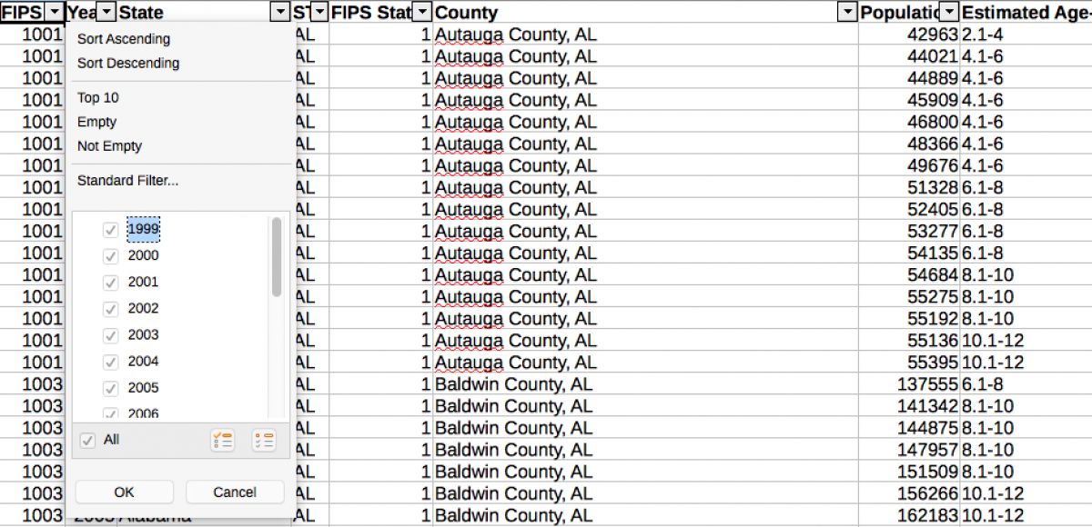
Select all rows and paste into a new sheet. This is a habit of mine and it helps me trace any changes I’ve made between steps. You should now have 3,141 rows.
Now, we need to clean up the Estimated Age-adjusted Death Rate column. CartoDB will not recognize ranges like 6.1-8 and 10.1-12 as numbers and therefore won’t be able to build a choropleth map of the data.
We need to decide how we will distribute this data. Notice the New York Times map has breaks at 4, 8, 12, 16 and 20. So, recognizing that this is an editorial decision, let’s begin replacing every instance of 0-2 with 2, 2.1-4 to 4, 4.1-6 with 6, and so on until >20 and replace that with 20.1. Use the Find & Replace function to semi-automate your process. Save the finished file. Download ours here.
Upload cleaned spreadsheet to CartoDB
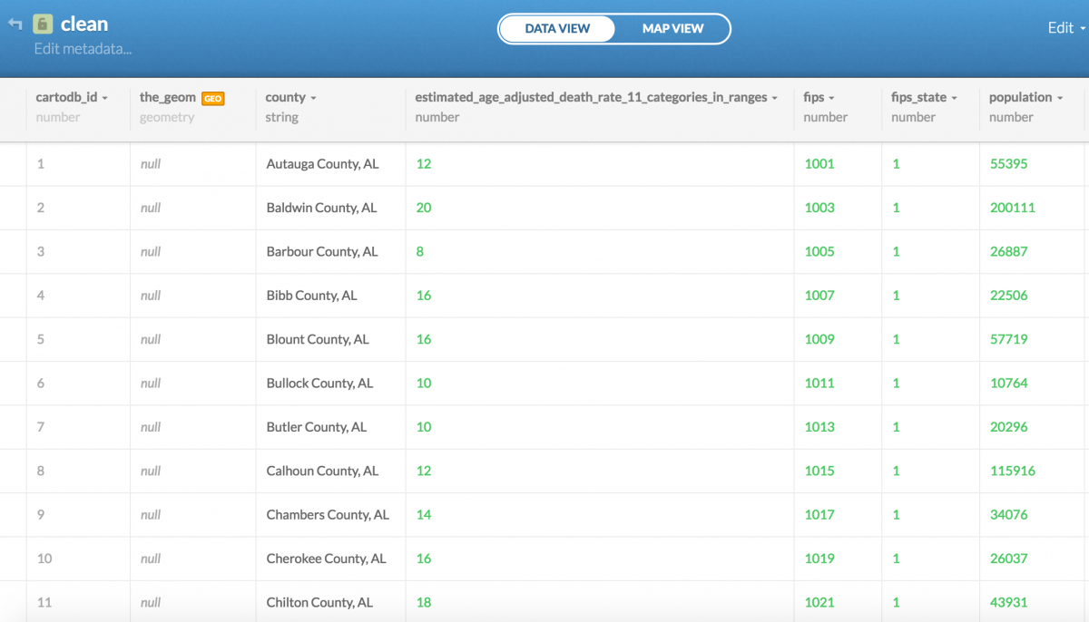
Upload your cleaned spreadsheet to CartoDB using the Connect Dataset function. Notice the estimated_age_adjusted column is recognized as a number and not a string. That’s good.
Merge your drug data with county shapefiles
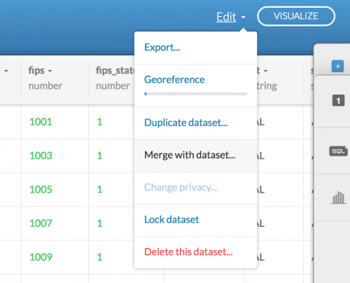
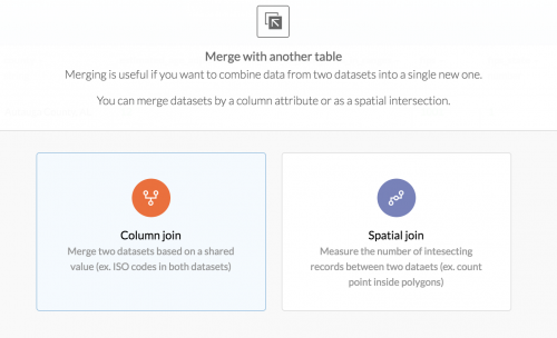
Now for the fun part. In the Data View of your drug overdose dataset in CartoDB, select the Edit menu and click Merge with dataset…
Next, click Column join because we have FIPS codes to join the two datasets using a common column. The FIPS code will allow us to map all county drug overdose data with its corresponding county shapefile.
So in the next step, we want to merge the fips column from the drug overdose dataset to the fips column from the U.S. county shapefiles dataset.
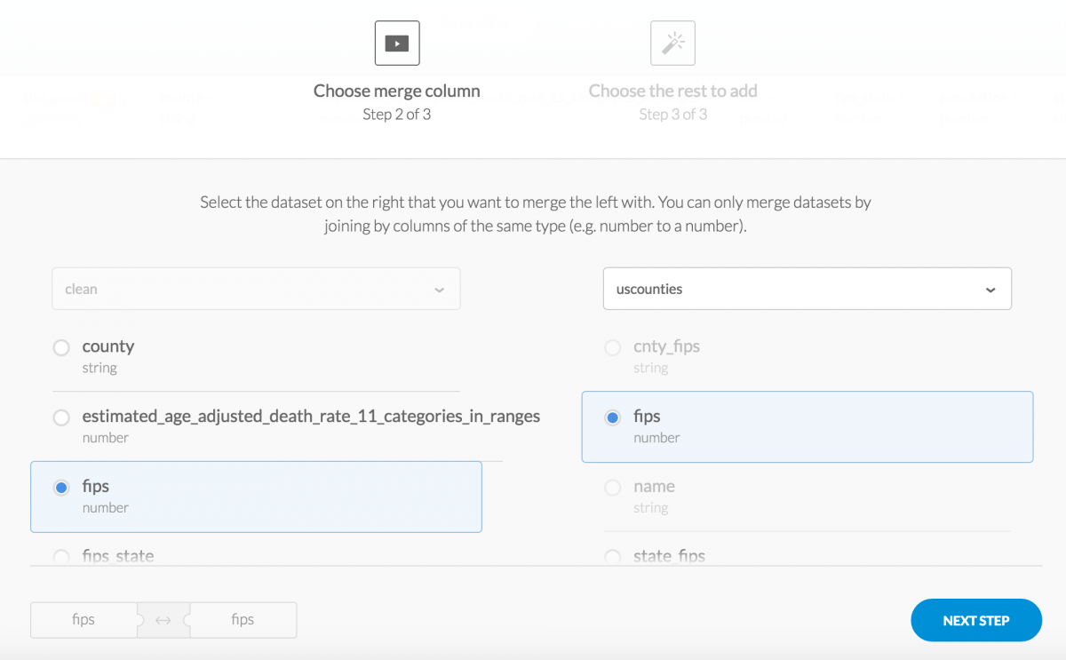
Click Next Step, and make sure you’ve selected the_geom from your U.S. counties dataset in order to port over all information outlining the borders of each county. I have brought in all other columns from the U.S. counties dataset just to make sure I’m not leaving anything out. I may want to refer to ESRI’s county names over the ones used in my drug overdose dataset.
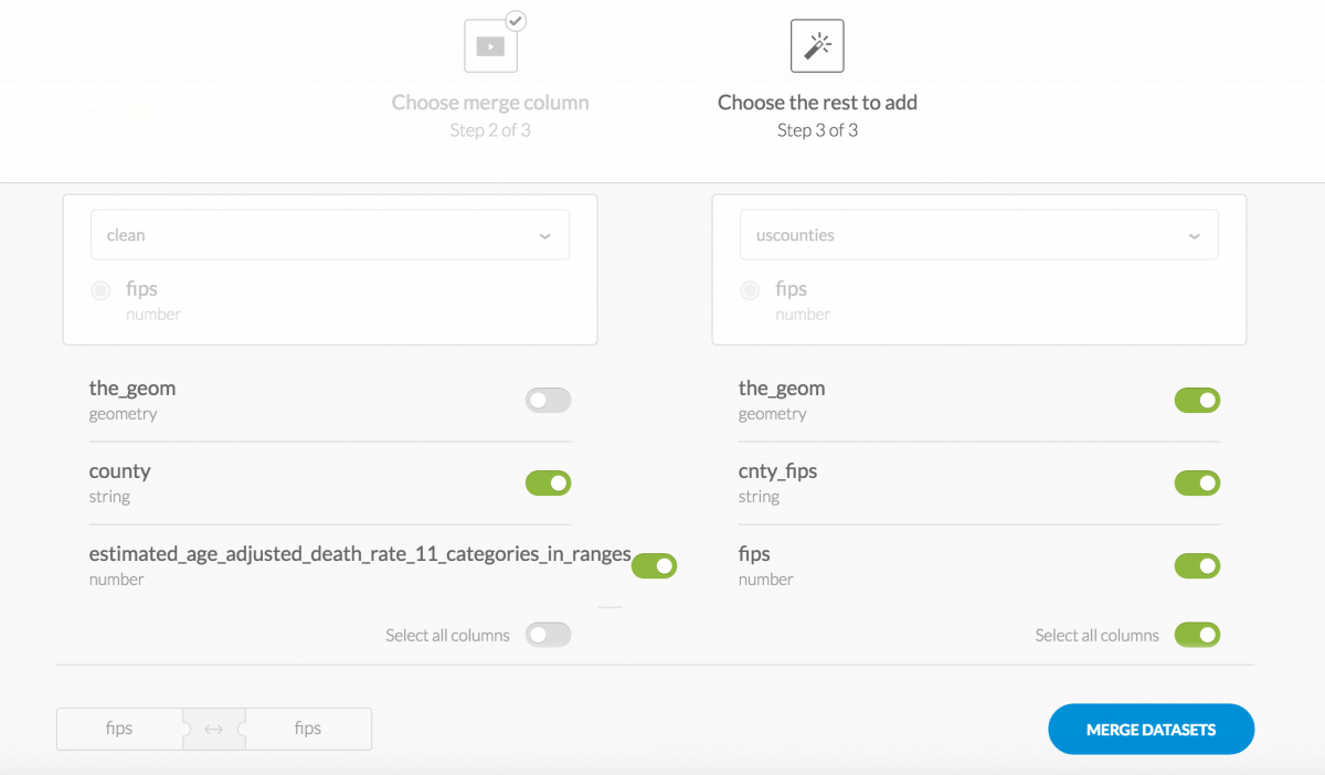
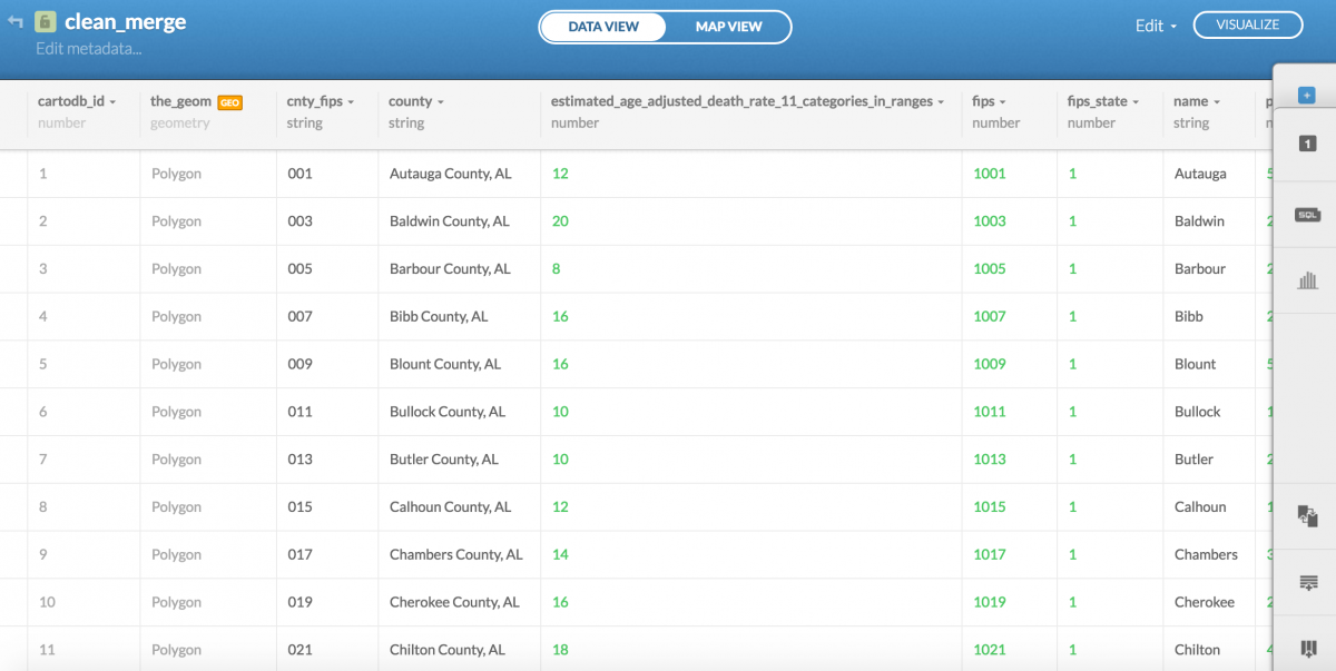
Finally, click Merge Datasets and you’ve successfully merged the data.
Design your county level map
If you click Map View from your merged dataset, CartoDB will begin analyzing your data and suggesting maps for you.
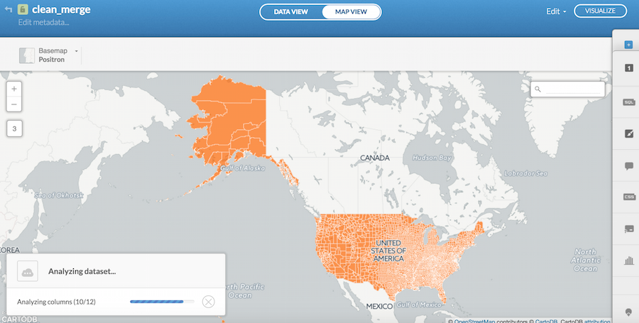
Click Show if you’d like to see CartoDB’s suggestions.
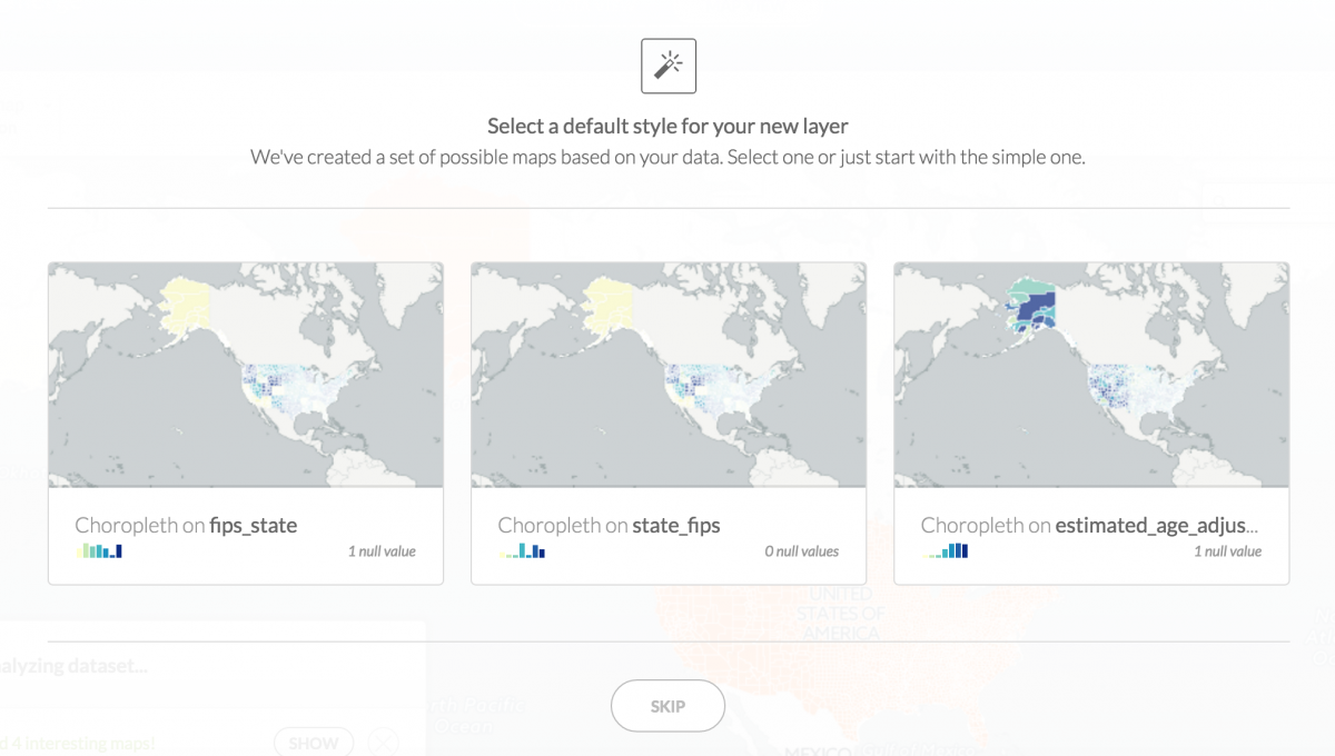
To design a choropleth map, select Choropleth on estimated_age_adjust column from CartoDB’s suggestions menu or go to the wizards tab and select Choropleth.
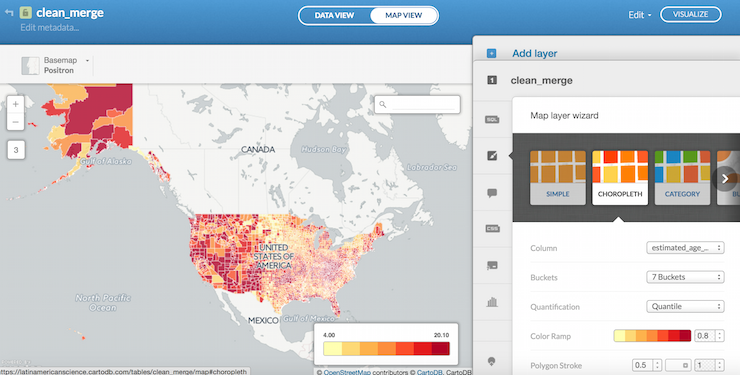
CartoDB has several distributions to choose from in the Buckets function as well as various preselected color palettes in the Color Ramp function.
In trying to replicate the New York Times map, I will remove the thin white border around every county by moving the Polygon Stroke to 0; I will move the Color Ramp opacity to 1; and I set the Quantification function to a clustering method called Jenks. (How data should be distributed in choropleth maps is a challenging matter that is hotly debated).
Next, using Adobe Creative Suite’s eyedropper tool, I will figure out the HTML color codes that the New York Times used in its color palette. From light blue to dark red they are: #dfedf7, #a7c9ea, #f7eec1, #ffc166, #f9842d, and #d81d09.
Open the cartocss tab and paste in your new HTML color codes from darkest red, at the top, on down to light red. Because we have 7 Buckets, we’ll need one more, a dark blue, denoting the lowest drug overdose rate. I used #3e7bb7. I also altered the distribution to most accurately reflect the color choices the New York Times made. You can find that CartoCSS at the bottom of this tutorial or at this Gist here. In short, my breaks were at 2, 8, 12, 16, 18, 20, 20.1.
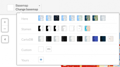
Under Legends, change the colors to reflect the palette you’ve selected for the counties, change the Right label to > 20, and select the Title box and write in Overdose deaths in 2014 per 100,000. Finally, change your basemap to Custom and then chose a white background.
Voilá:
Make your map interactive
To make the map interactive, click Infowindow and select Click or Hover depending on how you want to interact with each county. I generally select and apply my customization to both. I selected population, estimated_age_adjust, and county. You can change the titles by clicking Edit title labels at the top right next to the </> symbol.
Click Visualize and your map will be live.
Finally, to make static versions of your map like the New York Times, you can import images – exported from CartoDB using the Export Image function or taken as screenshots – into Adobe Illustrator, InDesign or Photoshop and mock them up as static files.
Editor’s note: One problem we’ve encountered is that our data won’t map to the Hawaiian counties. We’ll keep working on visualizing those. Sorry to all of our Hawaiian friends.
And here is that Gist of my CartoDB CSS.
Happy mapping!