How to build an animated map of tweets about the NBA finals in R
After beating the Cleveland Cavaliers in four games, the Golden State Warriors have won the 2018 NBA finals. We decided to build an animated map of Twitter mentions of #DubNation and #StrengthInNumbers, two hashtags used by Golden State fans.
This post will walk you through 1) collecting data from a Twitter API using the rtweet package, 2) creating a map with the tweets using the ggmap, maps, and mapdata, and 3) animating a map with the tweets with gganimate.
Set up the twitter app (with rtweet)
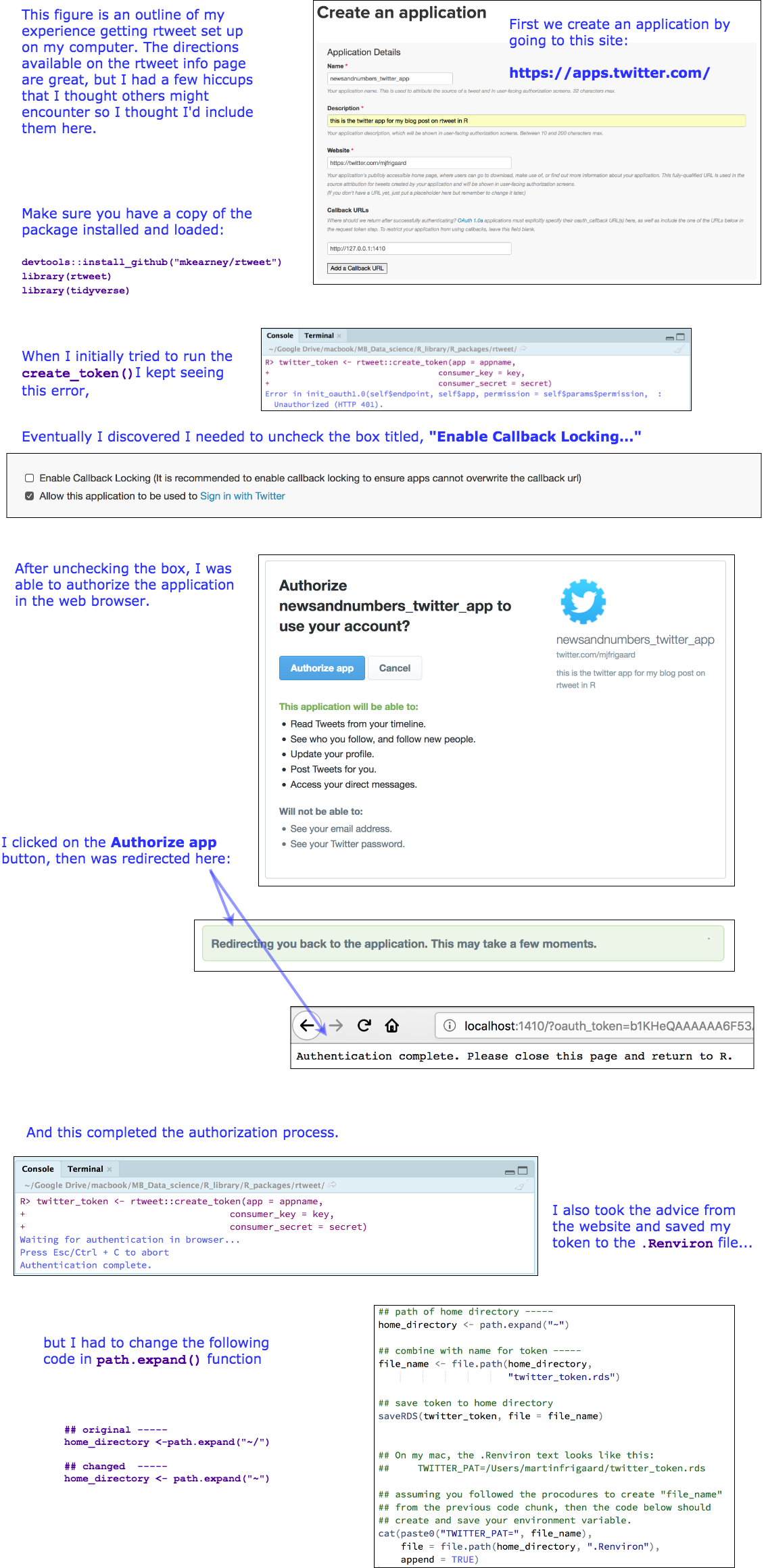
For help setting up Twitter API credentials, there is excellent documentation on the package’s website but I am just going to go into more detail in the image below.
Install and load packages
Install/load the packages:
library(tidyverse)
library(rtweet)
library(ggplot2)
library(ggmap)
library(maps)
library(mapdata)
library(gganimate)
library(ggraph)
library(igraph)
library(hrbrthemes)
library(ggalt)
library(ggthemes)
*To build the GIF animation, you may have to install some of these packages, like imagemagick and ffmpeg, through the command line using the following: “brew install imagemagick –with-fontconfig –with-librsvg –with-fftw” and “brew install ffmpeg –with-fdk-aac –with-ffplay –with-freetype –with-frei0r –with-libass –with-libvo-aacenc –with-libvorbis –with-libvpx –with-opencore-amr –with-openjpeg –with-opus –with-rtmpdump –with-schroedinger –with-speex –with-theora –with-tools.”
.
Searching for word occurrences in tweets
We will start by collecting data on a certain hashtag occurrence. When I am writing this, it is game three of the NBA finals, so I will search for the hashtag #DubNation. The function for collecting tweets is rtweet::search_tweets(), and it takes a query q (our term).
Learn more about this function by typing:
# ?search_tweets
We will use all the default settings in this inital search.
# tweets containing #DubNation
DubTweetsGame3 <- search_tweets("#DubNation")
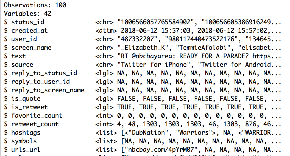
After the rtweet::search_tweets() function has run, I will take a look at this data frame with dplyr::glimpse()
DubTweetsGame3 %>% dplyr::glimpse(78)
Collect data for hashtags
The rtweet::search_tweets2() function works just like the rtweet::search_tweets(), but also “***returns data from one OR MORE search queries.***”
I’ll use rtweet::search_tweets2() to collect data for two hashtags now, #DubNation and #StrengthInNumbers, but set the n to 50000 and the retryonratelimit argument to TRUE.
## search using multilple queries
DubNtnStrngthNmbrs <- rtweet::search_tweets2(
            c("\"#DubNation\"",
              "#StrengthInNumbers"),
            n = 50000, retryonratelimit = TRUE)
The structure for this data frame is displayed below with dplyr::glimpse()
DubNtnStrngthNmbrs %>% dplyr::glimpse(78)

This data frame has 60,035 observations, and adds one additional variable. The query variable contains our two search terms. To find out how many we have of each, we can run:
DubNtnStrngthNmbrs %>% count(query)
# A tibble: 2 x 2
  query                  n
  <chr>              <int>
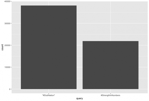
1 "\"#DubNation\""   38112
2 #StrengthInNumbers 21923
To run a quick bargraph of this variable, we can type the following. (Find an introductory tutorial for data visualization with ggplot here.)
ggplot(DubNtnStrngthNmbrs, aes(query)) + geom_histogram(stat="count")
Get user data with rtweet::users_data()
The previous data frame had 88 variables in it, which includes the variables on users and tweets. We can use the rtweet::users_data() function to remove the users variables.
The base::intersect() function allows us to see what variables from DubNtnStrngthNmbrs will end up in the results from rtweet::users_data().
I added tibble::as_tibble() so the variables print nicely to the screen.
tibble::as_tibble(base::intersect(x = base::names(DubNtnStrngthNmbrs),
                y = base::names(rtweet::users_data(DubNtnStrngthNmbrs))))
# A tibble: 20 x 1
   value
   <chr>
 1 user_id
 2 screen_name
 3 name
 4 location
 5 description
 6 url
 7 protected
 8 followers_count
 9 friends_count
10 listed_count
11 statuses_count
12 favourites_count
13 account_created_at
14 verified
15 profile_url
16 profile_expanded_url
17 account_lang
18 profile_banner_url
19 profile_background_url
20 profile_image_url
I’ll store the contents in a new data frame called UsersDubNtnStrngthNmbrs.
# get user data
UsersDubNtnStrngthNmbrs <- rtweet::users_data(DubNtnStrngthNmbrs)
UsersDubNtnStrngthNmbrs %>% glimpse(78)

Observations: 60,035
Variables: 20
$ user_id <chr> "1000017900130861057", "100005959752742093...
$ screen_name <chr> "urqnminJFwPNlPb", "whoismanelabreu", "who...
$ name <chr> "有栖川やい2号", "Manel Abreu", "Manel Abreu", "...
$ location <chr> "", "Manellândia", "Manellândia", "Boston,...
$ description <chr> "", "Manenenenenenenellll", "Manenenenenen...
$ url <chr> NA, "https://t.co/4ZfUzV0DpO", "https://t....
$ protected <lgl> FALSE, FALSE, FALSE, FALSE, FALSE, FALSE, ...
$ followers_count <int> 90, 37, 37, 42, 1, 19, 15, 21, 15, 161, 11...
$ friends_count <int> 251, 39, 39, 122, 9, 135, 166, 72, 114, 17...
$ listed_count <int> 0, 0, 0, 0, 0, 0, 0, 0, 0, 0, 0, 0, 0, 0, ...
$ statuses_count <int> 1824, 454, 454, 272, 20, 35, 124, 755, 54,...
$ favourites_count <int> 2558, 253, 253, 732, 30, 95, 2216, 2866, 7...
$ account_created_at <dttm> 2018-05-25 14:17:01, 2018-05-25 17:02:43,...
$ verified <lgl> FALSE, FALSE, FALSE, FALSE, FALSE, FALSE, ...
$ profile_url <chr> NA, "https://t.co/4ZfUzV0DpO", "https://t....
$ profile_expanded_url <chr> NA, "http://curiouscat.me/whoismanelabreu"...
$ account_lang <chr> "ja", "pt", "pt", "en", "en", "en", "en", ...
$ profile_banner_url <chr> "https://pbs.twimg.com/profile_banners/100...
$ profile_background_url <chr> NA, NA, NA, NA, NA, NA, NA, NA, "http://ab...
$ profile_image_url <chr> "http://pbs.twimg.com/profile_images/10063...
Get tweet data with rtweet::tweets_data()
I can also create another data frame with the tweet information using the rtweet::tweets_data() function. Just like above, I will display the variables in this new data frame (but limit it to the top 20).
I will store these variables in the TweetsDubNtnStrngthNmbrs data frame.
tibble::as_tibble(
    intersect(x = base::names(DubNtnStrngthNmbrs),
          y = base::names(rtweet::tweets_data(DubNtnStrngthNmbrs)))) %>%
          utils::head(20)
# A tibble: 20 x 1
   value
   <chr>
 1 user_id
 2 status_id
 3 created_at
 4 screen_name
 5 text
 6 source
 7 display_text_width
 8 reply_to_status_id
 9 reply_to_user_id
10 reply_to_screen_name
11 is_quote
12 is_retweet
13 favorite_count
14 retweet_count
15 hashtags
16 symbols
17 urls_url
18 urls_t.co
19 urls_expanded_url
20 media_url
TweetsDubNtnStrngthNmbrs <- rtweet::tweets_data(DubNtnStrngthNmbrs)
View the tweets by selecting the text column
The tweets are stored in the column/variable called text. We can review the first 10 of these entries with dplyr::select() and utils::head().
DubNtnStrngthNmbrs %>%
    dplyr::select(text) %>%
    utils::head(10)

# A tibble: 10 x 1
text
<chr>
1 RT @vwphotographer: My favourite #bus from @VdubAtThePub in a little picture …
2 "RT @warriors: 🗣 IT'S #WARRIORSPARADE DAY!\n\nThe fun begins at 11 am 🏆 #Dub…
3 RT @NBA: Klay waves hello at the #WarriorsParade! #DubNation https://t.co/qlV…
4 RT @warriors: 2018 NBA CHAMPIONS 🏆 #DubNation https://t.co/SJrGE7nSBQ
5 RT @JimmyKimmelLive: Tonight on #Kimmel #NBAFinals #MVP Kevin Durant @KDTrey5…
6 "RT @NBA: Championship Klay! \n\n#DubNation\n#ThisIsWhyWePlay https://t.co/PA…
7 RT @NBA: Happy Parade Day! #DubNation https://t.co/3qpgbRihkD
8 "RT @warriors: Can't wait to celebrate this Championship with #DubNation tomo…
9 "RT @warriors: 🗣 IT'S #WARRIORSPARADE DAY!\n\nThe fun begins at 11 am 🏆 #Dub…
10 "RT @warriors: 🗣 IT'S #WARRIORSPARADE DAY!\n\nThe fun begins at 11 am 🏆 #Dub…
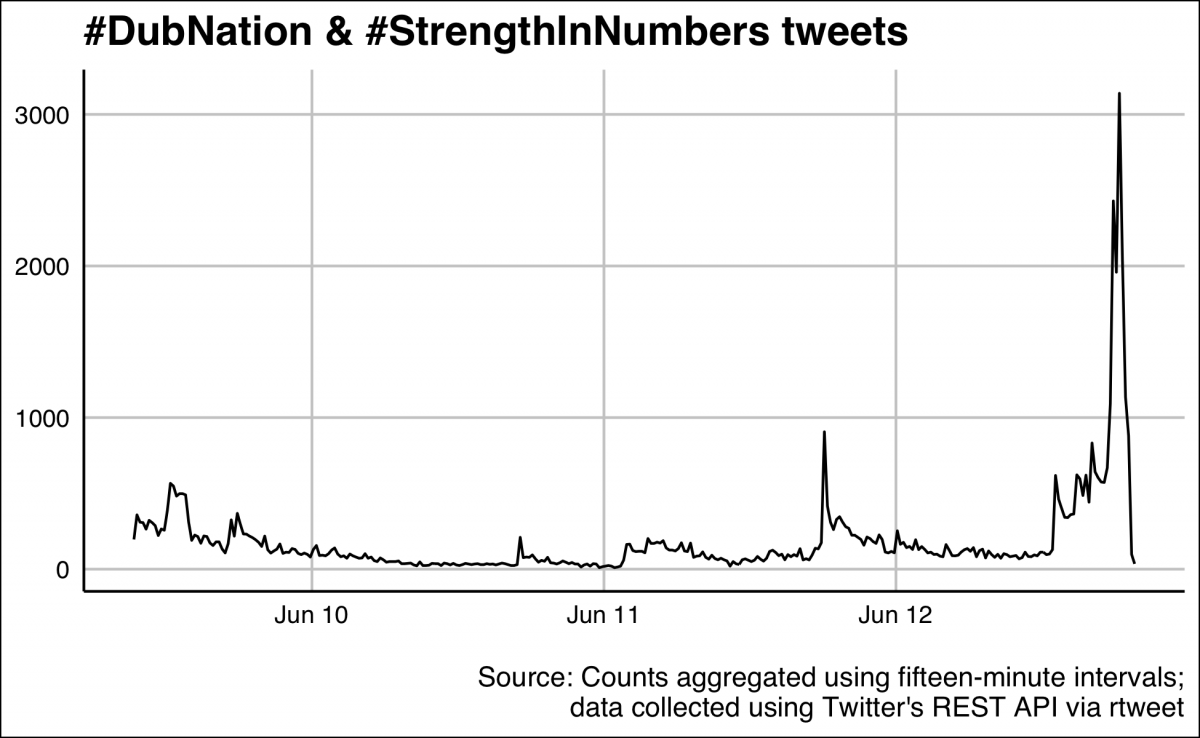
Construct a timeline of tweets with rtweet::ts_plot()
The rtweet package also comes with a handy function for plotting tweets over time with rtweet::ts_plot(). I added the ggthemes::theme_gdocs() theme and made the title text bold with ggplot2::theme(plot.title = ggplot2::element_text()).
gg_ts_plot <- DubNtnStrngthNmbrs %>%
    rtweet::ts_plot(., by = "15 minutes") +
    ggthemes::theme_gdocs() +
    ggplot2::theme(plot.title =
                       ggplot2::element_text(face = "bold")) +
    ggplot2::labs(
            x = NULL,
            y = NULL,
            title = "#DubNation & #StrengthInNumbers tweets",
            caption = "\nSource: Counts aggregated using fifteen-minute intervals;
                        data collected using Twitter's REST API via rtweet")
gg_ts_plot
Get longitude and lattitude for tweets in DubTweets
I can also add some geographic information to the twitter data (i.e. the latitude and longitude for each tweet) using the rtweet::lat_lng() function.
This function adds a lat and lng variable to the DubNtnStrngthNmbrs data frame.
I verify this with names() and tail().
DubNtnStrngthNmbrsLoc <- rtweet::lat_lng(DubNtnStrngthNmbrs)
DubNtnStrngthNmbrsLoc %>% names() %>% tail(2)
[1] "lat" "lng"
I will check how many of the tweets have latitude and longitude information using dplyr::distinct() and base::nrow().
DubNtnStrngthNmbrsLoc %>% dplyr::distinct(lng) %>% base::nrow()
[1] 156
DubNtnStrngthNmbrsLoc %>% dplyr::distinct(lat) %>% base::nrow()
[1] 156
Wow, only 156 of our 60,000 tweets have latitude and longitude information. Bummer! I’ll rename lng to long so it will be easier to join to the state-level data.
DubNtnStrngthNmbrsLoc <- DubNtnStrngthNmbrsLoc %>% dplyr::rename(long = lng)
Create World Map of #DubNation/#StrengthInNumbers
I will use the ggplot2::map_data() function to get the "world" data I’ll build a map with (save this as World).
World <- ggplot2::map_data("world")
World %>% glimpse(78)
Observations: 99,338
Variables: 6
$ long      <dbl> -69.90, -69.90, -69.94, -70.00, -70.07, -70.05, -70.04,...
$ lat       <dbl> 12.45, 12.42, 12.44, 12.50, 12.55, 12.60, 12.61, 12.57,...
$ group     <dbl> 1, 1, 1, 1, 1, 1, 1, 1, 1, 1, 2, 2, 2, 2, 2, 2, 2, 2, 2...
$ order     <int> 1, 2, 3, 4, 5, 6, 7, 8, 9, 10, 12, 13, 14, 15, 16, 17, ...
$ region    <chr> "Aruba", "Aruba", "Aruba", "Aruba", "Aruba", "Aruba", "...
$ subregion <chr> NA, NA, NA, NA, NA, NA, NA, NA, NA, NA, NA, NA, NA, NA,...
The ggplot2::geom_polygon() function will create a map with the World data. The variables that build the map are long and lat (you can see why I renamed the lng variable to long in DubNtnStrngthNmbrsLoc). I added the Warrior team colors with fill and color.
ggWorldMap <- ggplot2::ggplot() +
    ggplot2::geom_polygon(data = World,
                            aes(x = long,
                                y = lat,
                                group = group),
                                fill = "grey82",
                                color = "white",
                                alpha = 0.6)
ggWorldMap +
     ggplot2::theme_void() +
     ggplot2::labs(title = "Basic World Map (geom_polygon)")
ggsave(filename = "ggWorldMap.png",
       width = 6.5,
       height = 4,
       units = "in")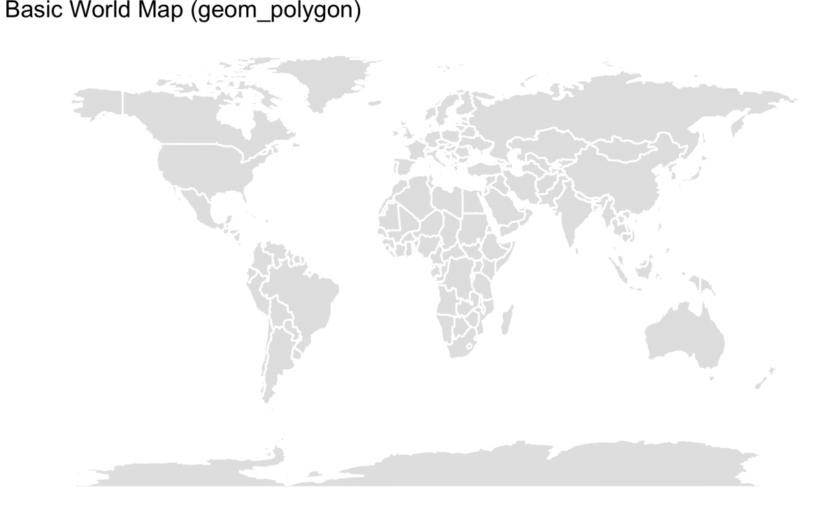
Add the tweet data to the map
Now that I have a basic projection of the world, I can layer the twitter data onto the map with ggplot2::geom_point() by specifying the long and lat to x and y. The data argument also needs to be specified because we will be introducing a second data set (and will not be using the World data).
This is what’s referred to as the mercator projection. It is the default setting in coord_quickmap(). I also add theggplot2::theme_void() for a cleaner print of the map (without ticks and axes) and changed the dimensions of the output PNG file.
gg_Merc_title <- "#DubNation and #StrengthInNumbers tweets worldwide, June 9 - June 12, 2018"
gg_Merc_cap <- "Tweets collected with rtweet the hashtags #DubNation and #StrengthInNumbers"
gg_mercator_dubstrngth <- ggWorldMap +
    ggplot2::coord_quickmap() +
        ggplot2::geom_point(data = DubNtnStrngthNmbrsLoc,
                        aes(x = long, y = lat),
                        size = 0.7, # reduce size of points
                        color = "firebrick") +
    # add titles/labels
        ggplot2::labs(title = gg_Merc_title,
        caption = gg_Merc_cap) +
        ggplot::theme_void() +
gg_mercator_dubstrngth

ggplot2::ggsave(filename = "gg_mercator_dubstrngth.png",
                width = 14.4,
                height = 7.43,
                units = "in")
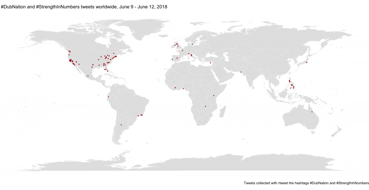
The Mercator projection works well for navigation because the meridians are equally spaced (the grid lines that runs north and south), but the parallels (the lines that run east/west around) are not equally spaced. This causes a distortion in the land masses at both poles. The map above makes it look like Greenland is roughly 1/2 or 2/3 the size of Africa, when in reality Africa is 14x larger.
Build a map of U.S. tweets
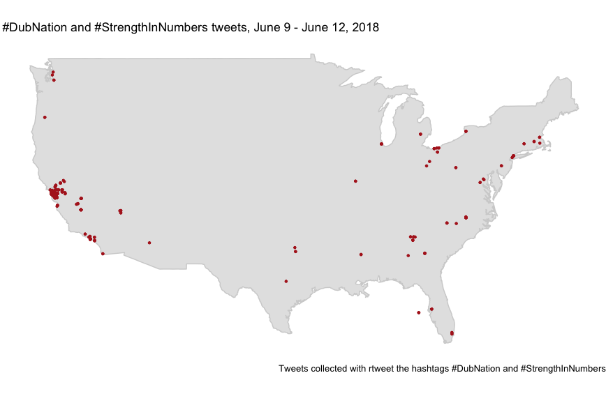
Say we wanted to zoom in on just U.S. tweets. The following code, adapted from above, will display only U.S.-based tweets on a map.
USmap <- ggplot2::map_data("usa") USmap %>% glimpse(78)

ggUSMap <- ggplot2::ggplot() +
  ggplot2::geom_polygon(data = USmap,
                        aes(x = long,
                            y = lat,
                            group = group),
                        fill = "grey82",
                        color = "grey82",
                        alpha = 0.6)
ggUSMap + ggplot2::theme_void()

# filter data down to just U.S. tweets
USfilter <- DubNtnStrngthNmbrsLoc %>% filter(country == "United States")
USfilter %>% glimpse()

gg_USMerc_title <- "#DubNation and #StrengthInNumbers tweets, June 9 - June 12, 2018"
gg_USMerc_cap <- "Tweets collected with rtweet the hashtags #DubNation and #StrengthInNumbers"
gg_usmercator_dubstrngth <- ggUSMap +
  ggplot2::coord_quickmap() +
  ggplot2::geom_point(data = USfilter,
                      aes(x = long, y = lat),
                      size = 0.9, # reduce size of points
                      color = "firebrick") +
  # add titles/labels
  ggplot2::labs(title = gg_USMerc_title,
                caption = gg_USMerc_cap)+
  ggplot2::theme_void()
gg_usmercator_dubstrngth
Mapping with the Winkel tripel projection
An alternative to the Mercator projection is the Winkel tripel projection. This map attempts to correct the distortions in the Mercator map.
This map gets added via the ggalt::coord_proj() function, which takes a projection argument from the proj4package. I add the Winkel tripel layer with ggplot2::coord_proj("+proj=wintri") below.
# convert query to factor (you'll see why later)
DubNtnStrngthNmbrsLoc$query <- factor(DubNtnStrngthNmbrsLoc$query,
                          labels = c("#DubNation", "#StrengthInNumbers"))
# define titles
ggDubWT_title <- "Worldwide (Winkel tripel) #DubNation &\n#StrengthInNumbers tweets"
ggDubWT_cap <- "tweets collected with rtweet the hashtags #DubNation and #StrengthInNumbers  "

#  create world map
ggWorld2 <- ggplot2::ggplot() +
    ggplot2::geom_map(data = World, map = World,
                    aes(x = long,
                        y = lat,
                        map_id = region),
                    size = 0.009,
                    fill = "grey82",
                    alpha = 0.4)
        #  add the twiiter data layer
ggDubWinkelTrip <- ggWorld2 +
    ggplot2::geom_point(data = DubNtnStrngthNmbrsLoc,
            aes(x = long,
                y = lat),
                    color = "firebrick",
                    size = 0.4) +
        # add Winkel tripel layer
        ggalt::coord_proj("+proj=wintri") +
            ggplot2::labs(
            title = ggDubWT_title,
            caption = ggDubWT_cap)
ggDubWinkelTrip
ggsave(filename = “Images/ggDubWinkelTrip.png“, width = 6.5, height = 4, units = “in“)
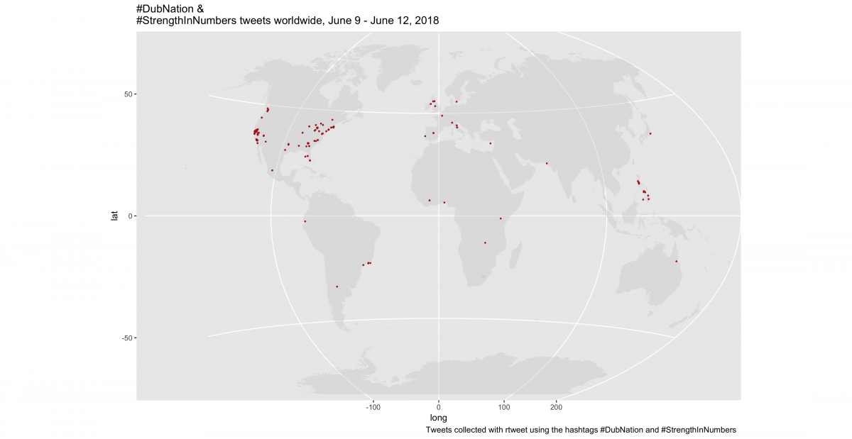
This map is an ok start, but I want to add some additional customization:
- I’ll start by adjusting the x axis manually with
ggplot2::scale_x_continuous()(this gives a full ‘globe’ on the map), - I add the FiveThiryEight theme from
ggthemes::theme_fivethirtyeight(), - Remove the
xandyaxis labels with twoggplot2::theme()statements, - Finally, facet these maps by the query type (
#DubNationor#StrengthInNumbers)
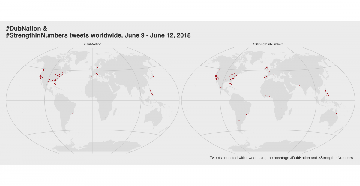
To learn more about maps check out this document put out by the U.S. Geological Survey on map projections. The description provided in the show West Wing covers some of the distortions in the Mercator map, and this video from Vox does a great job illustrating the difficulties in rendering a sphere or globe on a 2D surface.
Animating a timeline of tweets with gganimate
The rtweet package can collect Twitter data over a period of 7-10 days. The data we have in DubNtnStrngthNmbrsLoc ranges from "2018-06-09 09:21:44 UTC" to "2018-06-12 19:39:51 UTC".
I want to see the spread of the #DubNation and #StrengthInNumbers tweets across the globe, but I want to use the point size in this this animated map to indicate the number of followers associated with each tweet. gganimate is the ideal package for this because it works well with ggplot2.
I can start by looking at the number of followers for each account (followers_count) on the observations with location information (long and lat).
DubNtnStrngthNmbrsLoc %>%
    # identify observations with complete location information
        dplyr::filter(!is.na(long) |
                  !is.na(lat)) %>%
    # get the sorted count
    dplyr::select(followers_count, screen_name) %>%
    # arrange these descending
    dplyr::arrange(desc(followers_count)) %>% head(10)
# A tibble: 10 x 2
followers_count screen_name
<int> <chr>
1 27854760 NBA
2 27854705 NBA
3 992680 united
4 992679 united
5 424626 realfredrosser
6 424626 realfredrosser
7 234350 mercnews
8 234349 mercnews
9 143512 LetsGoWarriors
10 143510 LetsGoWarriors
This looks like there are a few screen_names with > 10,000 followers. I can get a quick view of the distribution of this variable with qplot(). But first, we must remove these high-follower outliers that are skewing the distribution.
DubNtnStrngthNmbrsLoc %>%
    # remove observations without location information
    dplyr::filter(!is.na(long) |
                  !is.na(lat)) %>%
    # arrange data
    dplyr::arrange(desc(followers_count)) %>%
    # remove followers with more than 10,000 followers
    dplyr::filter(followers_count < 10000) %>%
        ggplot2::qplot(followers_count,
                       data = .,
                       geom = "freqpoly") +
            ggplot2::theme(plot.title = ggplot2::element_text(
                                                face = "bold", size = 12)) +
            ggplot2::labs(
            title = gg_freqploy_title,
            caption = ggDubWT_cap)
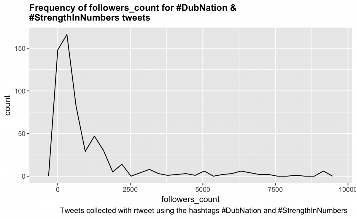
Great! Now I will create another static Winkel tripel map before animating it get an idea for what it will look like. I start with the ggWorld2 base from above, then layer in the twitter data, this time specifying size = followers_count andggplot2::scale_size_continuous(). The range is the number of different points, and the breaks are the cut-offs for each size.
I also remove the x and y axis labels, and add the ggthemes::theme_hc() for a crisp looking finish.
DubAnimateData <- DubNtnStrngthNmbrsLoc %>%
  # remove observations without location information
  dplyr::filter(!is.na(long) |
                  !is.na(lat)) %>%
  # arrange data descending
  dplyr::arrange(desc(followers_count)) %>%
  # remove the follower_count that are above 10,000
  dplyr::filter(followers_count < 10000) %>%
  # select only the variables we will be visualizing
  dplyr::select(user_id,
                status_id,
                screen_name,
                followers_count,
                friends_count,
                favourites_count,
                created_at,
                text,
                long,
                hashtags,
                lat)
DubAnimateData %>% glimpse(78)

ggWorld2 +
  geom_point(aes(x = long,
                 y = lat,
                 size = followers_count),
             data = DubAnimateData,
             color = "royalblue", alpha = .2) +
  ggplot2::scale_size_continuous(range = c(1, 6),
                                 breaks = c(500, 1000, 2000,
                                            4000, 6000, 8000)) +
  labs(size = "Followers") +
  ggalt::coord_proj("+proj=wintri") +
  ggthemes::theme_hc() +
  ggplot2::theme(
    axis.title.y = element_blank(),
    axis.text.y = element_blank(),
    axis.ticks.y = element_blank()) +
  ggplot2::theme(
    axis.title.x = element_blank(),
    axis.text.x = element_blank(),
    axis.ticks.x = element_blank()) +
  ggplot2::theme(plot.title = ggplot2::element_text(
    face = "bold", size = 12)) +
  ggplot2::labs(title = "#DubNation & #StrengthInNumbers",
                subtitle = "Tweets and followers")
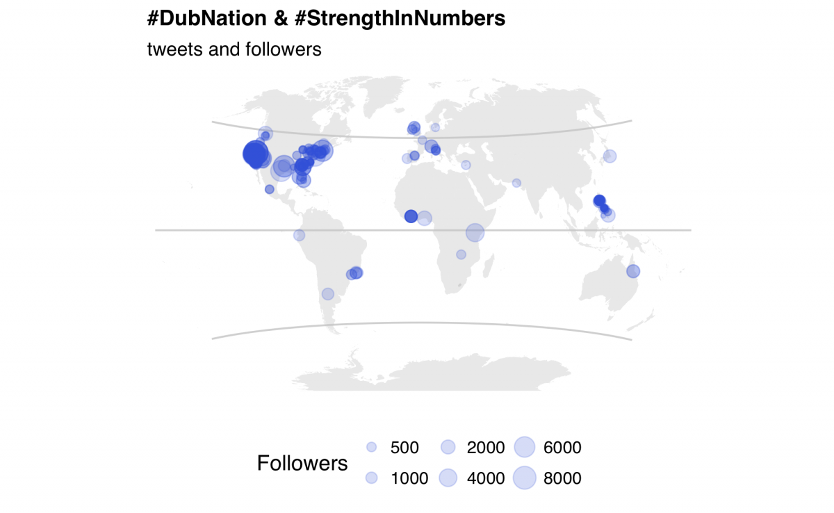
I learned a helpful tip from Daniela Vasquez over at d4tagirl to build two data frames to use for displaying the animation before and after the points start appearing. These are best built using dates just outside the range of the created_atfield.
library(tibble)
library(lubridate)
# min(DubAnimateData$created_at) # "2018-06-09 07:43:46 UTC"
# max(DubAnimateData$created_at) # "2018-06-10 02:36:31 UTC"
# create data frame foe the beginning of the animation
EmptyAnimateDataBegin <- tibble(
        created_at = as_datetime("2018-06-09 07:43:46 UTC"),
        followers_count = 0,
        long = 0,
        lat = 0)
EmptyAnimateDataBegin
# A tibble: 1 x 4
  created_at          followers_count  long   lat
  <dttm>                        <dbl> <dbl> <dbl>
1 2018-06-09 07:43:46               0     0     0
# create data frame for the end of the animation
EmptyAnimateDataEnd <- tibble(
  created_at = seq(as_datetime("2018-06-10 03:00:00 UTC"),
                   as_datetime("2018-06-10 04:00:00 UTC"),
                   by = "min"),
                followers_count = 0,
                long = 0,
                lat = 0)
EmptyAnimateDataEnd
# A tibble: 61 x 4
   created_at    followers_count  long   lat
   <dttm>                  <dbl> <dbl> <dbl>
 1 2018-06-10 03:00:00         0     0     0
 2 2018-06-10 03:01:00         0     0     0
 3 2018-06-10 03:02:00         0     0     0
 4 2018-06-10 03:03:00         0     0     0
 5 2018-06-10 03:04:00         0     0     0
 6 2018-06-10 03:05:00         0     0     0
 7 2018-06-10 03:06:00         0     0     0
 8 2018-06-10 03:07:00         0     0     0
 9 2018-06-10 03:08:00         0     0     0
10 2018-06-10 03:09:00         0     0     0
# ... with 51 more rows
Now I can use these two data frames to add additional layers to the animation. gganimate takes a frame argument, which is the value we want the followers_count to change over time (created_at).
The cumulative = TRUE tells R to leave the point on the map after its been plotted.
DubMap <- ggWorld2 +
  geom_point(aes(x = long,
                 y = lat,
                 size = followers_count,
                 frame = created_at,
                 cumulative = TRUE),
             data = DubAnimateData,
             color = "royalblue",
             alpha = .2) +
    # transparent frame 1
  geom_point(aes(x = long,
                y = lat,
                size = followers_count,
                frame = created_at,
                cumulative = TRUE),
                        data = EmptyAnimateDataBegin,
                        alpha = 0) +
    # transparent frame 2
  geom_point(aes(x = long,
                y = lat,
                size = followers,
                frame = created_at,
                cumulative = TRUE),
                        data = EmptyAnimateDataEnd,
                        alpha = 0) +
  scale_size_continuous(range = c(1, 6),
                        breaks = c(500, 1000, 2000, 4000, 6000, 8000)) +
  labs(size = 'Followers') +
    ggalt::coord_proj("+proj=wintri") +
    ggthemes::theme_hc() +
    ggplot2::theme(
        axis.title.y = element_blank(),
        axis.text.y = element_blank(),
        axis.ticks.y = element_blank()) +
    ggplot2::theme(
        axis.title.x = element_blank(),
        axis.text.x = element_blank(),
        axis.ticks.x = element_blank()) +
    ggplot2::labs(title = "#DubNation & #StrengthInNumbers",
                  subtitle = "tweets and followers")
library(gganimate)
gganimate(DubMap, interval = .2, "DubMap.gif")
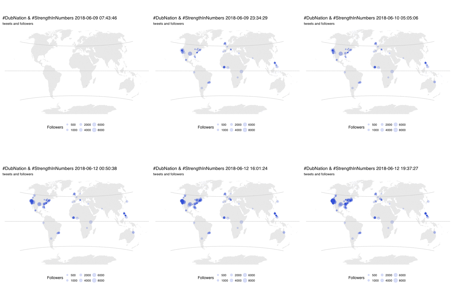
Now I have an animation that displays the tweets as they appeared in the two days following the NBA finals.
Export the data
rtweet has a handy export function for these twitter data frames as .csv files.
rtweet::write_as_csv(x = DubNtnStrngthNmbrsLoc,
                 file_name = "Data/Processed/DubNtnStrngthNmbrsLoc.csv")

rtweet::write_as_csv(x = DubNtnStrngthNmbrs,
                 file_name = "Data/Processed/DubNtnStrngthNmbrs.csv")

rtweet::write_as_csv(x = DubTweetsGame3,
                 file_name = "Data/Processed/DubTweetsGame3.csv")

rtweet::write_as_csv(x = DubAnimateData,
                 file_name = "Data/Processed/DubAnimateData.csv")

rtweet::write_as_csv(x = TweetsDubNtnStrngthNmbrs,
                 file_name = "Data/Processed/TweetsDubNtnStrngthNmbrs.csv")

rtweet::write_as_csv(x = UsersDubNtnStrngthNmbrs,
                 file_name = "Data/Processed/UsersDubNtnStrngthNmbrs.csv")
To learn more check out these awesome resources:
- Getting started with stringr for textual analysis in R - February 8, 2024
- How to calculate a rolling average in R - June 22, 2020
- Update: How to geocode a CSV of addresses in R - June 13, 2020




There is a new process for setting up an API with twitter. See the steps here:
https://github.com/mjfrigaard/rtweet-setup