Tips for communicating complexity: Make the abstract tangible and connect it to people’s lives
Weather patterns, telecommunications networks, human intelligence, social systems, ecosystems, and even life are examples of complex systems that we encounter every day – yet sometimes find difficult to comprehend. Improving methods for communicating complexity can make businesses more efficient, inform our understanding of society, elucidate scientific problems, and aid in the communication of data. As a design problem, communicating complexity poses many interesting challenge.
Complex systems share several basic properties. First, they are interdependent: synergies and feedback loops connect different components and determine how the whole system functions, making it difficult to study any one piece in isolation. This networked effect often spans multiple length and time scales; a change that takes in the span of a minute could have effects that last years, and gradual change is often punctuated by sharp reversals or inflection points. In short, it can be difficult to define a single problem within a complex system, which often leads to disagreements over ways to solve it. Add to the mix differing value systems and cultural framings and it can be particularly difficult to reach consensus.
Designers can help by building infrastructures and methods to visualize interdependence. By creating ecosystems that present data at different scales and from different perspectives, and by introducing considerations of personal values and conceptual framings, designers can help to break the deadlock that results from faulty or incomplete communication.
Data visualization is a fast-growing area that melds traditional, technical data archetypes with more popular forms. Visualizations designed for a public audience can expand the reach of scientific information and can help the public to understand both the results and practice of science. Capturing public ideas and opinions about scientific topics can help scientists to identify important questions, and may even lead to new areas of research.
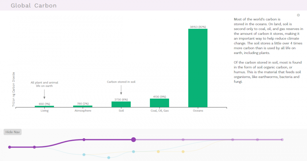
A case study for communicating complexity
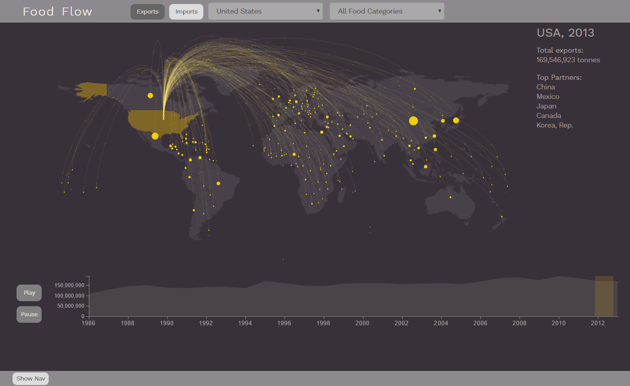
As part of my MFA thesis project at Northeastern, I created a website that relates soil health to population growth, food supply and other human concerns, as a case study exploring how design can support science communication. I wanted the website to be approachable to even a casual user, to support exploration, and to convey the complex interrelationships between food consumption, land use, and soil health.
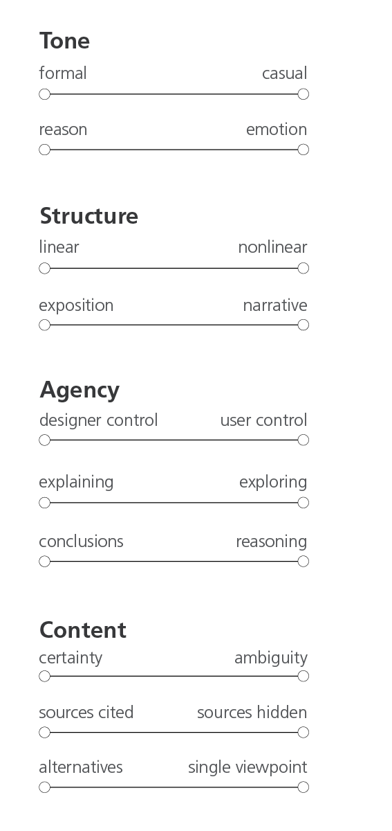
I began by categorizing a range of contemporary visualizations according to their tone, structure and content, the agency that they grant to users, and the kinds of conversation that they inspire. Each visualization was classified using the taxonomy shown above. This informed the specific aims for my project: the tone of website should be casual, and use wonder, aesthetic interest and curiosity to encourage engagement. The structure should support undirected exploration using modular components, but should also provide narratives to guide the user, and show relationships between modules to preserve context. Data should be clearly separated from interpretation, allowing users to see information directly and decide for themselves what it means. The website should support user agency by allowing them to preview selections, switch between narratives, and track their progress, as well as controlling display variables within a particular page. Combined with opinion polling, this data could be collected and visualized as a personal index of responses to individual issues.
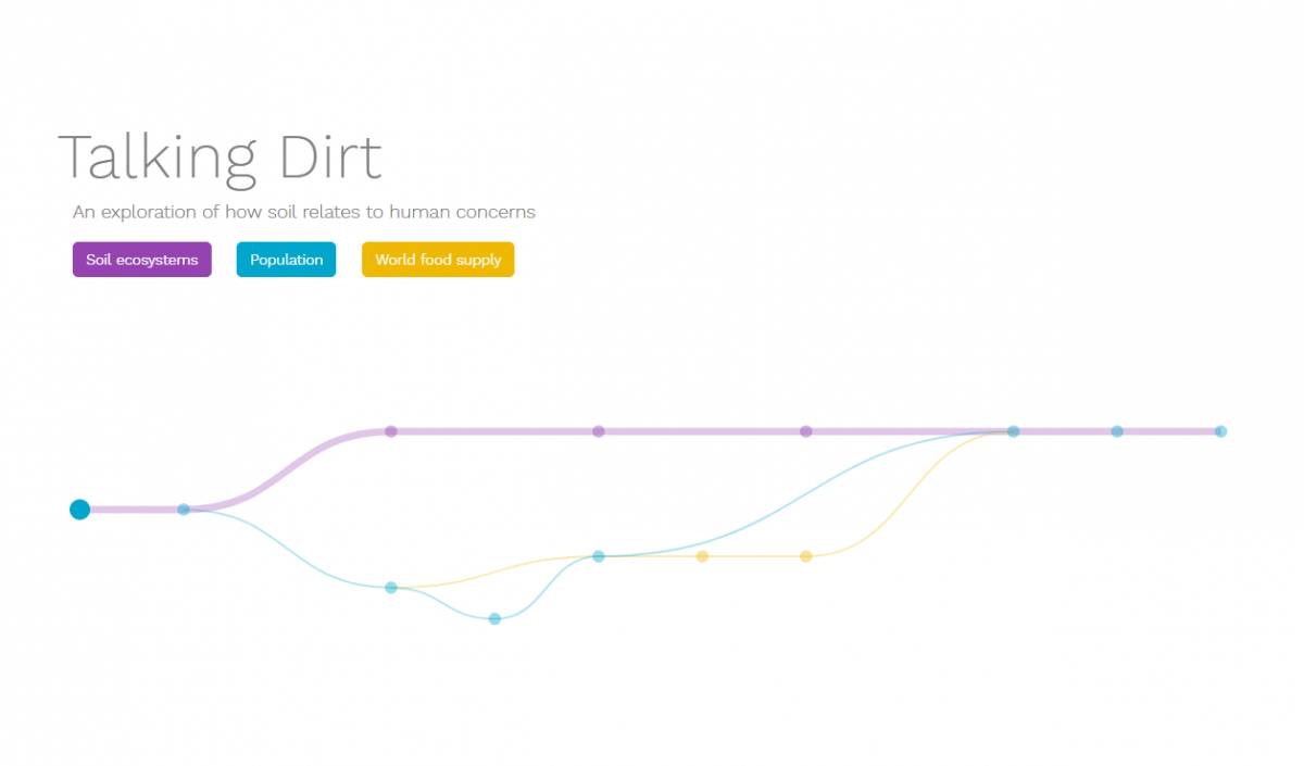
The site overview shows individual modules connected by storylines to guide exploration. This interface also serves as the navigation system for the website. Each page of the visualization shows the user where they are and what they have already seen. In an ideal version of the project, the content of each page would update based on this history, helping to create seamless transitions between modules. Having this consistent reference available helps the user to navigate through the site in a linear or nonlinear manner, while maintaining a sense of progress and orientation.
The individual modules deal with different levels of aggregation and detail. Some provide simple summary information that requires little to no interaction; others are more complex exploratory pieces that encourage the user to explore and play with the data. By interacting with these topics at multiple levels and from several different perspectives, a user comes away with a better sense of how these disparate topics relate to the soil ecosystem.

Encouraging conversation
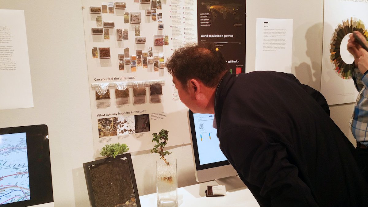
I wanted to focus on incorporating user voices and values into the exhibition portion of my thesis project. I asked a wide range of people to send in a sample of soil that they encounter in their daily lives and to tell me what it means to them. Over a period of about a month, I had conversations with people from all over the country, and collected 30 soil samples from people in 13 states. These samples helped to illustrate that soil is a complex ecosystem that varies from place to place, and the personal stories reflected a wide range of individual values that helped viewers to personally connect with the data shown.
It is here that I believe design can contribute most to science communication. By making an abstract thing tangible and connecting it to people’s lives, we can begin to understand the values and shared beliefs that unite us in the desire to understand and protect the natural world. Combining these different voices with scientific data can guide us in understanding and weighing the options available, and open up new paths forward in discussing and addressing complicated issues.