Visualizing public records appeals in your state
How can visualization illuminate the labyrinthine world of public records requests and appeals? Here at Northeastern’s Media Innovation program, we’ve been using D3 to illustrate the persons and institutions in Massachusetts who have most frequently been involved in public records laws appeals over the past 20 months or so. (Click here to scroll down for the D3 visualization and code.)
Every year, thousands of public records requests are made across Massachusetts. Many get an adequate response from towns, cities and state agencies. But some are greeted with silence, delay, or, in certain cases, direct challenges by government lawyers or assessments of extraordinarily high compliance fees.
Massachusetts has long had some of the weakest public records laws in the country, to the chagrin of citizens, community groups and, of course, journalists. Recently, however, the state’s House of Representatives passed a bill that would nominally improve the situation. That law’s fate remains uncertain, but we thought it was a good moment to look at how data visualization techniques might help explore FOI issues and highlight the public stakes for public records rules.
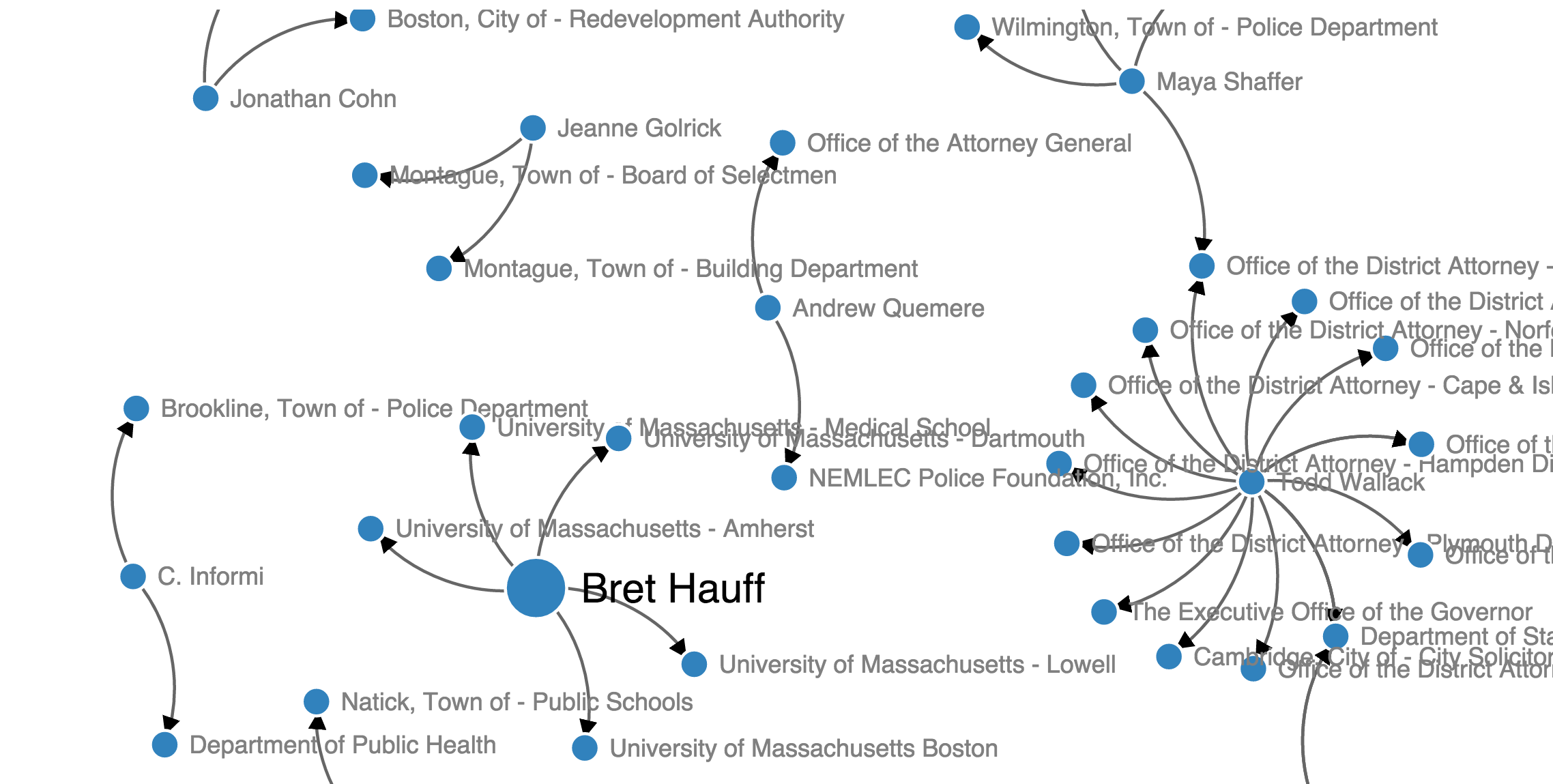
Facing resistance, a select set of citizens, attorneys and journalists exercise their rights to try to enforce the law: They take their case to a higher level–to the Secretary of State’s Supervisor of Records, which reviews cases and, starting last year, posts the verdicts online. (This process varies from state to state.) In Massachusetts, looking at public records laws appeals provides a real window into the mechanics, and the ground truth, of “open records.”
We wanted to look at who exactly shows this kind of extra determination and pursues requests in Massachusetts. In cases like this, after all, the law is only as strong as those advocating for it. For news organizations, visually exploring the patterns of requests can help highlight the constituencies for the law, which include all kinds of people: From those petitioning school boards over special needs cases to those trying to get more information about family in prison, from citizens in property disputes to persons trying to defend themselves legally by requesting arrest records. Please let us know if you use the code and build FOI visualizations of your own!
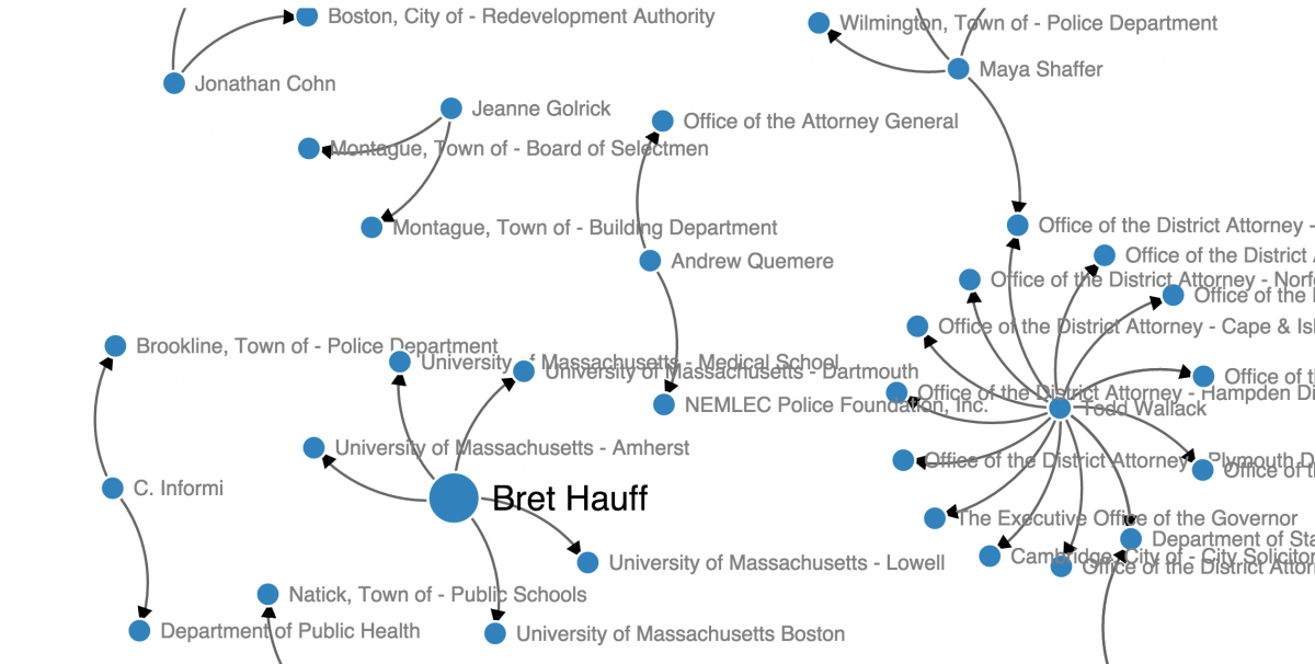
View the visualization fullscreen by clicking here.
Click the graphic for the interactive D3 visualization.
Getting the data into a CSV
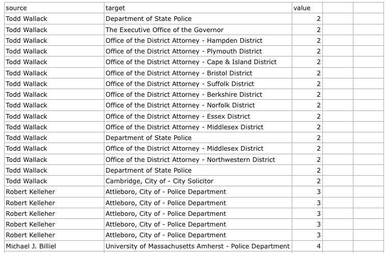
After digging into the data here, we copy and pasted the HTML table into Excel and created a CSV by filtering the top 10 most frequent appellants. To work with our D3 Javascript below, the first row must be titled source, target, and value, all lowercase. For the code we’re using, the numbers in the value column are arbitrary. Click the table below to download the CSV.
Building the network visualization in D3
Next, we put together some Javascript to build a force-directed graph visualization which uses simple math to lay out a dataset’s nodes and boundaries in a balanced manner. We based our code mostly off of d3noob’s directional force layout diagram but stripped a few lines of code out. D3noob has a nice tutorial here. We added some code (borrowed from here) that allows the visualization to resize if the browser is resized and we customized how the circle and text size would change when each node was hovered over.
*Clearly this is a work in progress. Some of the names are obscured and the design could be improved. It doesn’t work very well on mobile, either.
Building the network visualization in Google Fusion Tables
Gurman Bhatia, an investigative data reporting intern at The Palm Beach Post, pointed out that we could visualize the same data with Google Fusion Tables. After removing the “value” column because it would affect the size of the nodes in Fusion Tables, we uploaded it, clicked Add Chart, and selected Network Graph. Voilá.
- Visualizing public records appeals in your state - December 15, 2015