Six things I learned developing an interactive map on the effects of climate change
Every once in a while, newsroom developers and visual journalists get one of those projects that becomes both a big challenge and a great learning experience. That was the case for me last November, when InsideClimate News, a non-profit covering the environment, reached out to me for a freelance job.
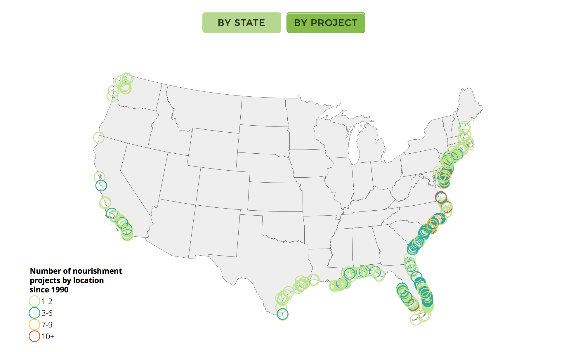
Reporter Nicholas Kuznetz had acquired a comprehensive dataset with beach nourishment projects in the United States and wanted to map them as an interactive graphic for a story he was reporting on Nags Head, a small coastal town in North Carolina that has been suffering from beach erosion. ICN published the Beach Nourishment Boom map, which I created using the Javascript library D3.
I had already had some experience programming in D3, which was perfect. The challenging part was that I had never done any data or visualization project of the scale and complexity ICN needed, nor worked with climate issues at any point in my career. It was, in more ways than one, a learning experience.
It took me about a week or so to code the whole interactive map, which is 100 percent built in D3. Below, six things I learned while working on this project.
Do your homework
Having a good understanding of the story at hand, and a thorough brief from ICN, were some of the reasons I was able to save time brainstorming and sketching, and dive straight into developing. And even with the visualization being only an accessory to the article, it was of the utmost importance I completely understand what beach nourishment was and why it was relevant in the context of climate change.
That is why visual projects, as with any journalistic piece, should start with good research — whatever you can’t discover for yourself, ask reporters and editors.
Have a game plan
Plan in advance the steps you want to take. I like doing that by listing every feature I want to add to the visualization – like tooltips, click actions, zooming, etc. – and spreading them out on a calendar. That helps one meet deadlines and manage freelance hours.
Knowing what and when I’ll be tackling each part of the project is also important to avoid burnout. Javascript is a complicated animal, and things can get messy sometimes. Documentation is key and has proven to be crucial for communicating what I did with other developers.
It is also best practice to account for the unknown. I always try to make room for some troubleshooting time. Again, Javascript can always catch you blindsided with an error that will require a few hours to figure out and rewrite the code. Make sure you have built in time for that.
Bulletproof your data
If there is something an interactive like this can’t live without, it’s data — remember: D3 stands for data-driven documents. The cleaner a dataset is, the more accurate the visual representation will be. Good data also means Javascript is less likely to throw an error. Being acquainted with the dataset before you actually start building something matters.
After that, the next step is data cleaning and wrangling: check for missing data, duplicates (are there two rows representing the same event?), consistency (are equal things named the same or do they have the same latitude and longitude?), and formats (numbers should be “floats” or integers, strings should be strings).
I have used a mix of Excel, Google Sheets and SQL for data exploration in the past and for this project with ICN, but am currently transitioning to Python’s data science packages (such as Pandas, SciPy, Seaborn and Matplotlib). Use whatever you feel most comfortable with to run random checks on the data. If possible, plot quick sketches to see if things are behaving the way you’re expecting.

Think of mobile early on
D3 interactives and mobile aren’t exactly a match made in heaven – at least not yet. That is even more true when it comes to maps. Not conceptualizing my project with mobile in mind, I have to confess, was one of the biggest issues I had with this project. Responsiveness and positioning elements for a smaller screen size took almost two days of code-user-test-code-again to reach a satisfactory product.
If I had to redo the Beach Nourishment Boom map again, I would most definitely start by building a mobile visualization first and then scaling it up, adding fancier features for the desktop version.
Don’t panic when things break
I don’t think I can emphasize enough how often things break with Javascript. It is also very likely that a typo is the cause of that. So, don’t panic.
I live by the motto “debug, debug, console.log, debug,” and it usually is everything I need to find my mistake: a typo, a misplaced semi-colon, or missing parentheses. If I run into a wall I can’t seem to find a way around, Google, Stack Overflow, and Bl.ocks have become my best friends. It’s likely that someone out there has already had an issue like yours – and odds are there’s a solution out there.
Another good resource to think about in these moments – though I didn’t use it for this project – is that other developers usually publish mini-libraries that are easy solutions for hard tasks such as updating data upon scrolling, annotating graphics, or applying quick data filters. Rely on those lifelines. They condense code and save you time.
Backup and iterate
Saving your work is the best practice you can have. Backing up files often can save you some big headaches. If, for some reason, local files are corrupted, lost or the hard drive simply melts, you can count on the files stored in the cloud. I use Github, which also serves as a version control manager, which shows me my series of iterations.
Having a log of the changes I made to my files helped me immensely. At one point mid-developing, I had to go back to a point I was at almost a day before. Github is superb in letting users do that with a few clicks. It even helps you merge different versions of a file into one.
Having all my files on Github also allowed for quick back-and-forths with Kuznetz, the lead reporter, as I could publish the HTML page where the visualization could be seen and tested inside the newsroom. With the feedback I received from him every couple of days, I could always get started with clear tasks to tackle each day.
- SXSW: ‘Excel is okay’ and other tweet-size insights for data journalists and news nerds - March 17, 2018
- NICAR: Data stories from last year that you could be doing in your newsroom - March 13, 2018
- How to scrape Reddit with Python - March 12, 2018