How to do basic distance analysis in Carto using polling locations and Dunkin’ Donuts stores
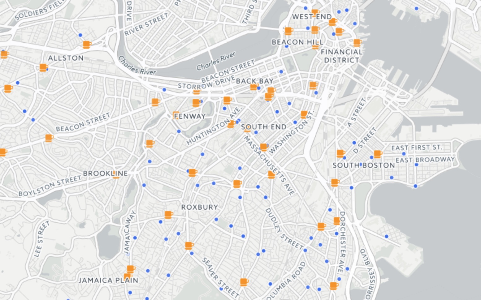
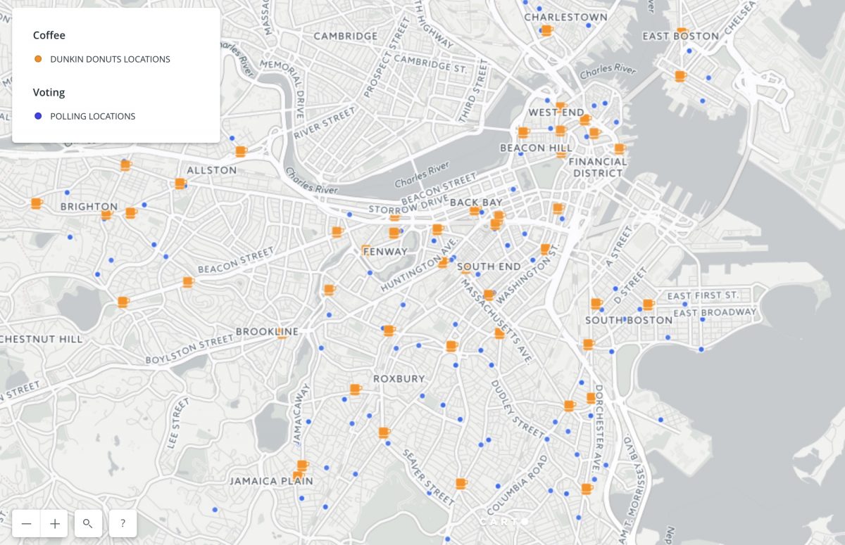
On Tuesday, Bostonians will head to the polls to vote in a mayoral race that has people talking about Tito Jackson’s chances of unseating Marty Walsh. Polls open at 7:00AM and we wondered if we could map polling locations alongside another Boston institution – Dunkin’ Donuts locations. The following tutorial maps the two datasets and then employs a basic distance analysis to find the closest coffeeshops to each polling location.
Download the data
Head to Analyze Boston and find the CSV file of polling locations in Boston. As for Dunkin’ Donuts locations, we found a list of stores across the country on data journalist Andrew Ba Tran’s Github. Download both. Below, versions of the files we’ve hosted for posterity:
Dunkin’ Donuts locations (CSV)
Boston polling locations (CSV)
Upload datasets to Carto.com
Sign into Carto.com and navigate to “Datasets” and click the blue “New Dataset” button.

Upload the polling stations GeoJSON file and click the blue “Connect Dataset” button.
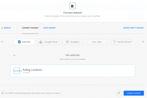
Do the same with the Dunkin’ Donuts CSV. Each time, Carto will take you to a table showing you the structure of the dataset.
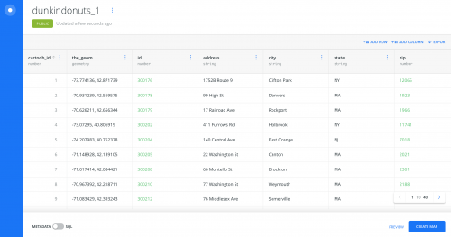
Create a map in Carto
While in the Dunkin’ Donuts table, click “Create Map.”
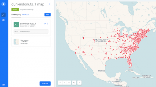
Now, click the blue “Add” button to add the polling locations layer.
Zoom into Boston. The colors of both layers may be the same. We’ll fix that. Click the eye symbol to toggle layers on and off. You’ll quickly notice you have two sets of locations. Good.
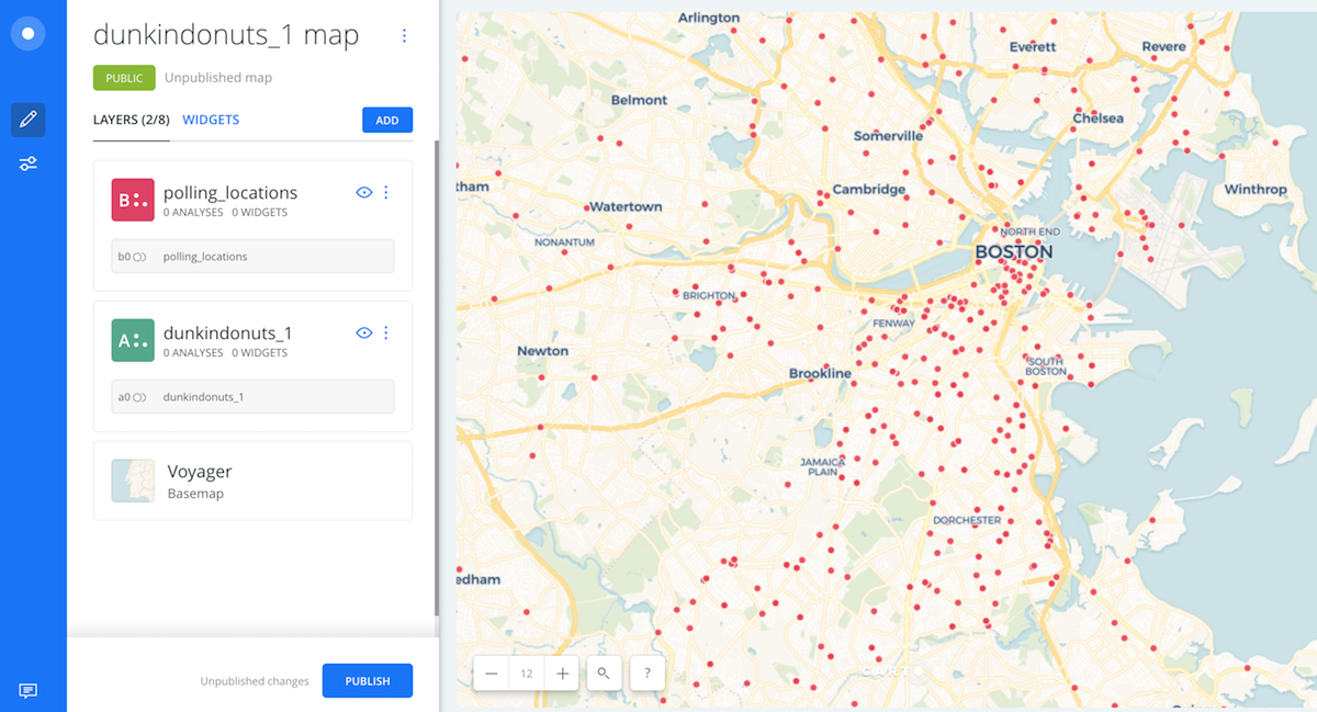
Change the Dunkin’ Donuts locations color
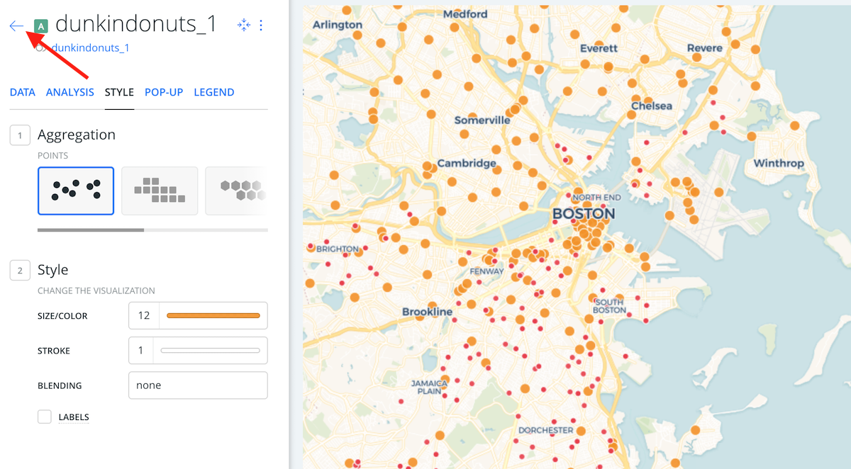
Click the Dunkin’ Donuts layer and click the “Style” tab.
Under “Style,” change the Size/Color to “12” and the color of your choice. We’re using orange (hex code #f7a324).
Next, head back to the main map screen by clicking this back arrow:
Find closest Dunkin’ Donuts to each polling location
Drag your “dunkindonuts” layer to the top. Within your “polling_locations” layer, find the polling_locations tab with the gray background.
Drag that gray tab up above the polling_locations layer (and beneath the dunkindonuts layer) to create a new layer. Rename it “Nearest Dunkins to polls.”
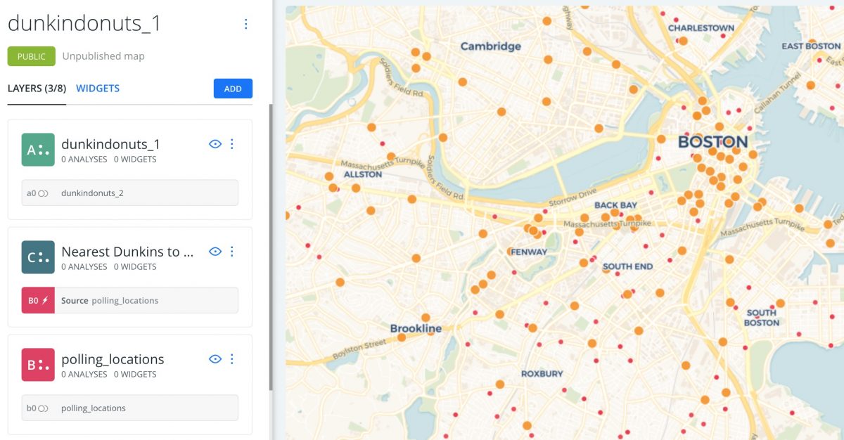
Click Nearest Dunkins to polls layer and enter the “Analysis” tab. Click the blue “Add Analysis” button.

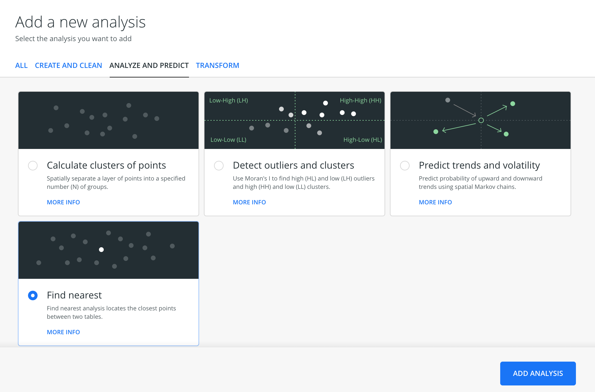
The “Add a new analysis” screen will appear. Click the “Analyze and Predict” tab and click “Find nearest” tab. Click the blue “Add analysis” button.
Under 2) Find nearest, click the empty field next to “Target.”
Select the dunkindonuts dataset. Hit the blue “Apply” button. The analysis will run.
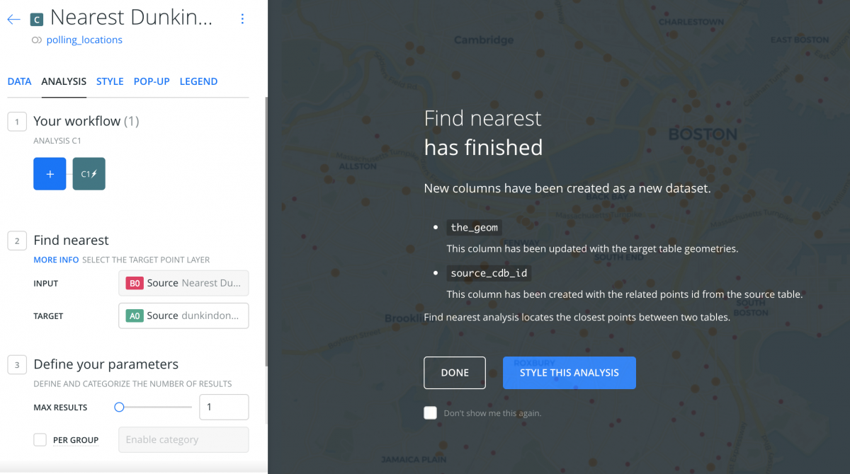
Click the blue “Style this analysis” button. Click the color bar and make this layer blue and the dot size 12. Go back to the main layers page and toggle the main dunkindonuts layer on and off. Turning that layer off should reveal only the closest Dunkin Donuts locations to the polls.

Change the basemap, color the dots, rename layers, and add a legend
Before this map goes live, I need to change the basemap to something nicer. Scroll down past all your layers until you see the basemap. Click it and change to the basemap of your choice.
I changed the dots color under the “Style” tab for each layer and customized the hover and clickable tooltips under the “Pop-Up” tab. To add a legend, click each layers, navigate over to the “Legend” tab and customize the legend.
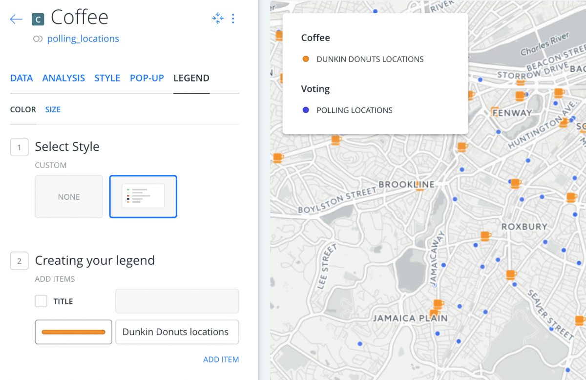
By renaming the two layers “Coffee” and “Voting,” I was able to round out the legend.
Change the coffee dots to coffee cups
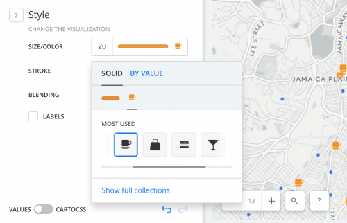
How did I change the icons to images of coffee cups? In the “Style” tab – where I change the colors – I clicked “IMG” and revealed a list of images. I chose the coffee cup.
Finally, click the blue “Publish” button. Done!
