How to shift Alaska and Hawaii below the lower 48 for your interactive choropleth map
Last month, the Harvard Global Health Institute collaborated with The New York Times and ProPublica to publish a model estimating the capacity of hospitals across the United States to cope with Covid-19 infections in the coming months.
Both newsrooms published a series of maps plotting the nine scenarios modeled by the Harvard researchers across more than 300 hospital referral regions, or HRRs, which represent the country’s major hospital markets. The takeaway? “Many parts of the United States will have far too few hospital beds if the new coronavirus continues to spread widely and if nothing is done to expand capacity,” according to the Times.
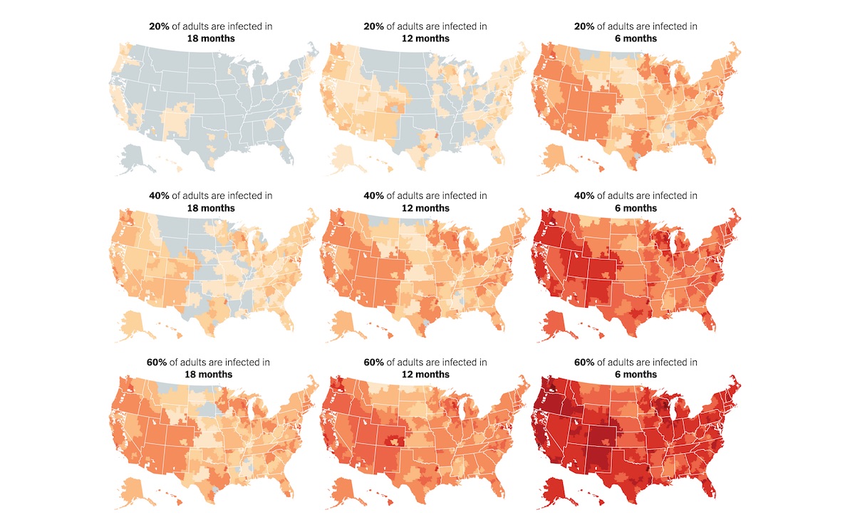
We at Storybench were impressed with the communication of these projections and decided to unpack their methods. The following tutorial explains how to find HRR shapefiles, resize and shift the positions of Alaska and Hawaii, calculate the variables used, and build interactive maps with the leaflet package in R as well as with Datawrapper.
Finding the shapefiles
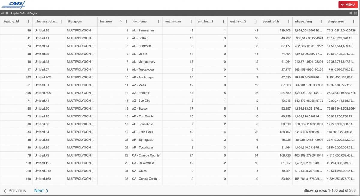
After a bit of Googling, we found shapefiles for U.S. hospital referral regions on the Centers for Medicare & Medicaid Services website. They are available for download via the top-right “MENU” in many formats, including CSV, JSON, TSV, KML, Shapefile, GEOJSON and more. Excellent range of options! We downloaded the Shapefiles zip file and the TSV, too.
Moving Hawaii and Alaska in R
After unzipping and moving the “Hospital Referral Region” folder into my working folder in RStudio, I used the readOGR() function from the rgdal package to pull in the shapefile data. Using plot(), I quickly examine the map:
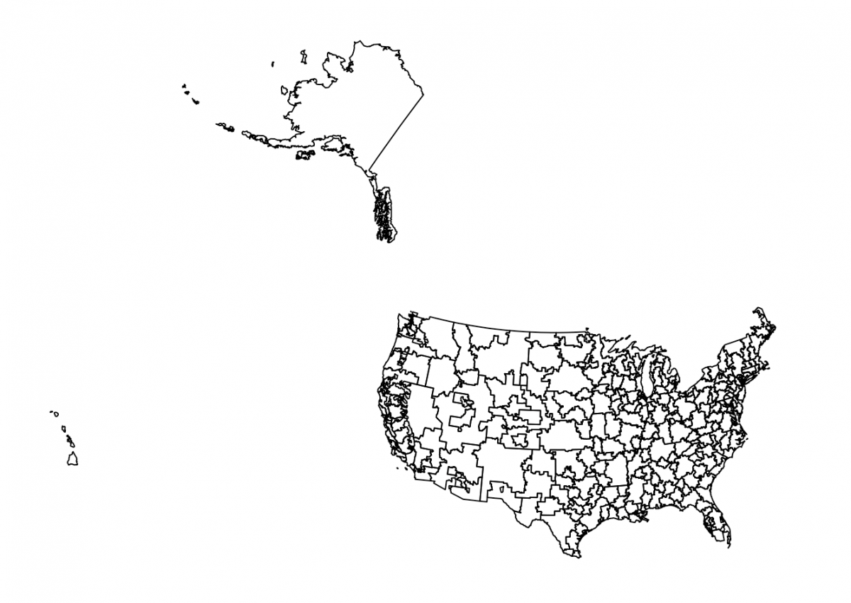
After asking Bloomberg data champ Jeremy C.F. Lin for pointers on projections, I found a helpful tutorial from Richard Careaga that first transforms the shapefile to a Lambert Azimuth Equal Area projection using spTransform().
Next, it resizes and shifts Alaska and then shifts Hawaii. Note the hrr_num number that I use to identify the two states. Play with the shift=c(-2400000, -2500000)) parameters to situate the two states perfectly. Then, we switch out the old Alaska and Hawaii projections for the newly shifted ones. Finally, we use spTransform() again to transform the data into a finished shapefile (thanks to this forum).
library(tidyverse)
library(rgdal)
library(maptools)
library(mapproj)
library(rgeos)

hrr <- readOGR(dsn = "Hospital Referral Region/geo_export_f2138c63-21f1-4332-8a62-9c9e31475b34.shp",
              layer = "geo_export_f2138c63-21f1-4332-8a62-9c9e31475b34", verbose = FALSE)

hrrname_aes <- spTransform(hrr, CRS("+proj=laea +lat_0=45 +lon_0=-100 +x_0=0 +y_0=0 +a=6370997 +b=6370997 +units=m +no_defs"))
hrrname_aes@data$id <- rownames(hrrname_aes@data)
plot(hrrname_aes)

alaska <- hrrname_aes[hrrname_aes$hrr_num=="10",]
alaska <- elide(alaska, rotate=-39)
alaska <- elide(alaska, scale=max(apply(bbox(alaska), 1, diff)) / 2.3)
alaska <- elide(alaska, shift=c(-2400000, -2500000))
proj4string(alaska) <- proj4string(hrrname_aes)

hawaii <- hrrname_aes[hrrname_aes$hrr_num=="150",]
hawaii <- elide(hawaii, rotate=-35)
hawaii <- elide(hawaii, shift=c(5200000, -1400000))
proj4string(hawaii) <- proj4string(hrrname_aes)

hrrname_aes <- hrrname_aes[!hrrname_aes$hrr_num %in% c("10", "150"),] # Remove old AK and HI
hrrname_aes <- rbind(hrrname_aes, alaska, hawaii) # Add in shifted AK and HI

hrrname_aes2 <- spTransform(hrrname_aes, proj4string(hrr))
plot(hrrname_aes2)

# Export HRR map
writeOGR(hrrname_aes2, "hrr_fix.geojson", layer="hrrname_aes2", driver="GeoJSON")
That final plot() shows that I’ve got exactly what I’m looking for:
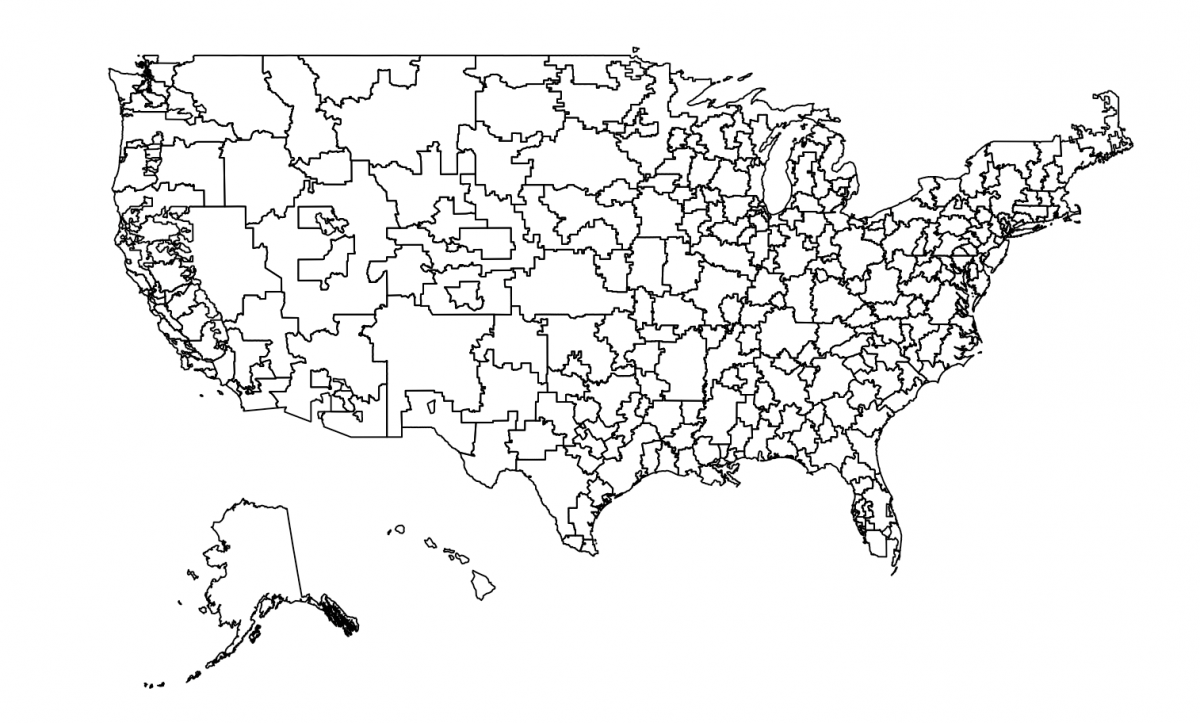
The writeOGR() function allows me to download the new shapefile, which I’ve named hrr_fix.geojson.
Cleaning model data and merging with HRR id numbers
Luckily, the data from the Harvard model is organized and openly published on Google Sheets. I quickly found the HRR-by-HRR data sorted by 20%, 40% and 60% infection rate. (Explore the rest of their data here. Kudos to Stefanie Friedhoff for her work on the Harvard model and for spearheading the outreach and collaboration with newsrooms.)
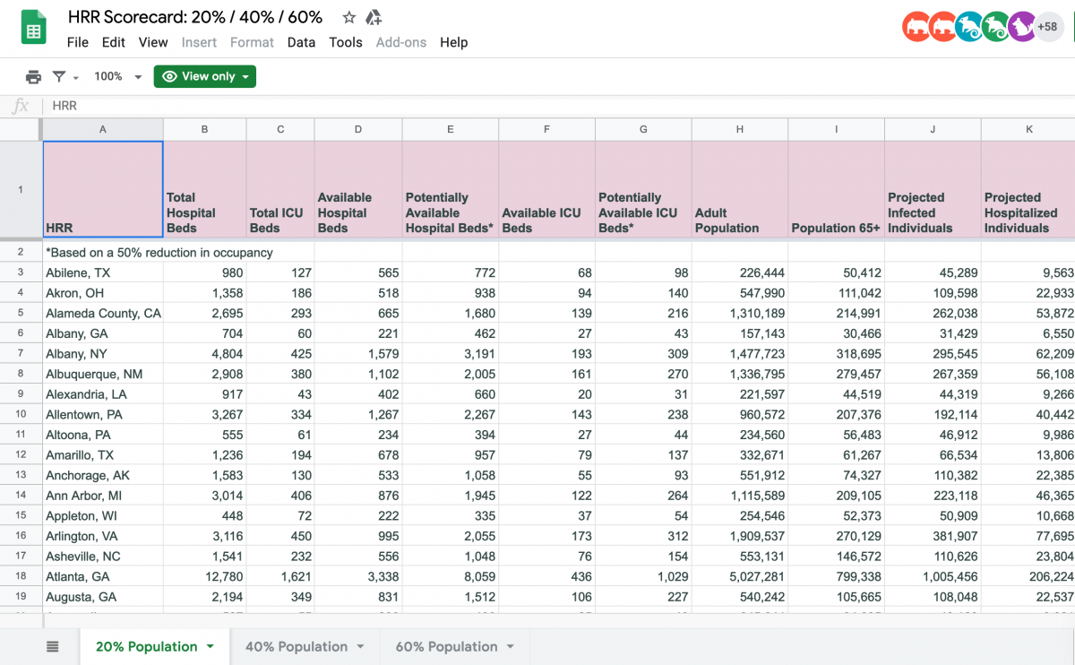
After making a copy of the data, I removed a bunch of columns that i wouldn’t need to calculate the variable the New York Times had used in their interactive map:
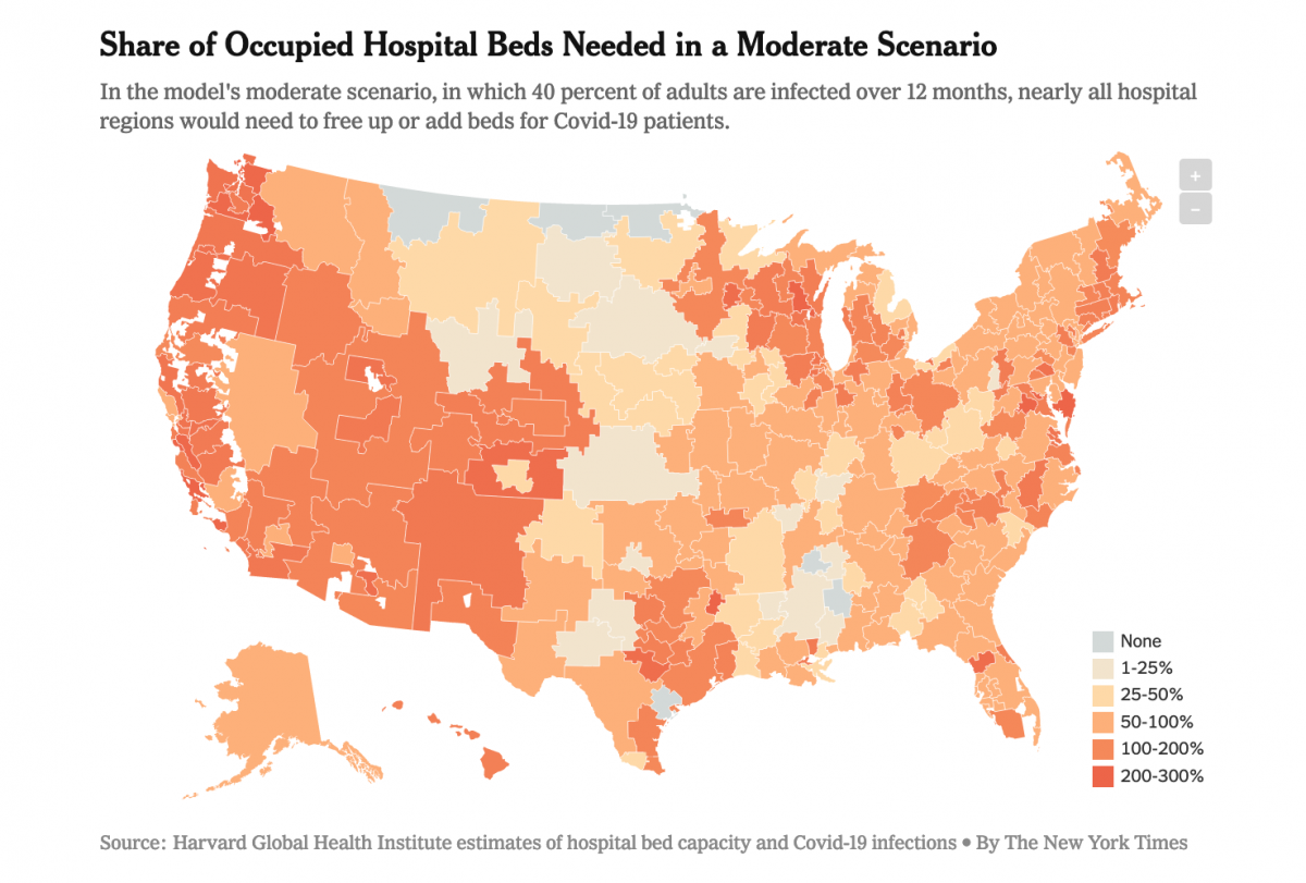
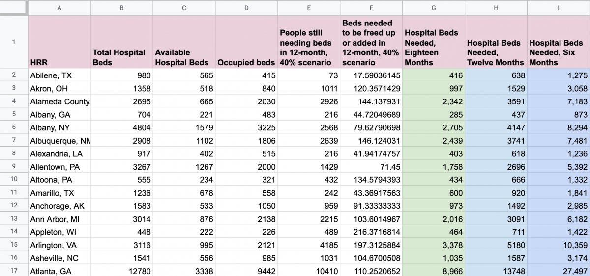
To get to that variable – the percentage of a region’s occupied beds needed to be freed up or added in the 12-month, 40% scenario – I first calculated the “Occupied beds” by subtracting “Available Hospital Beds” from “Total Hospital Beds,” or B2 – C2. Then, I calculated “People still needing beds in 12-month, 40% scenario” by subtracting “Available Hospital Beds” from “Hospital Beds Needed, Twelve Months,” or H2 – C2.
Next, I calculated the final variable I needed, “Beds needed to be freed up or added in 12-month, 40% scenario” by taking ratio of “People still needing beds in 12-month, 40% scenario” over “Occupied beds” and multiplying by 100 to get to a percent: E2/D2*100. See my final spreadsheet here.
Next, I want to merge in the HRR id numbers, so I’ll download my Google Sheet as a CSV, which I’ll name hrr-model-variable.csv, and then bring it into RStudio.
# Pull in HRR data from Harvard model
hrr_model <- read.csv("hrr-model-variable.csv", stringsAsFactors = F)
Now I need to track down HRR numbers for each of those HRR names (Abilene, TX; Akron, OH; etc.). That’s where the TSV file that I downloaded from the CMS website comes in. First, I’ll pull in the TSV with read.delim(), glimpse() it so I get a sense of the columns I want, and then keep those with select(). Then I’ll write it to a CSV and open in Excel to quickly do some surgery on the HRR names (the state and city names are reversed and I’d rather split the text in Excel or Google Sheets than do it in RStudio with something like stringr). After making sure I have the right syntax for the HRR column – i.e. Abilene, TX – I’ll bring that back into RStudio and
# Pull in HRR name and codes
hrr_codes <- read.delim("Hospital_Referral_Region.tsv")
glimpse(hrr_codes)
hrr_codes <- hrr_codes %>% select(hrr_name, hrr_num)
write.csv(hrr_codes, "hrr_codes.csv", row.names = F)

# Open in Excel and clean names so they look like TOWN, STATE_AB from Harvard model spreadsheet

# Bring cleaned HRR codes CSV back into RStudio
hrr_codes_clean <- read.csv("hrrcodesclean.csv", stringsAsFactors = F)
hrr_codes_clean$HRR <- hrr_codes_clean$hrr_name
hrr_codes_clean$hrr_name <- NULL

hrr_codes_clean
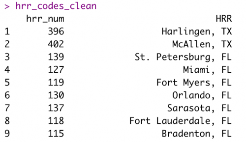
Once I clean up the hrr_codes_clean data frame, it should look like below, which makes it ready to merge into my model data frame, hrr_model.
Then I’ll use left_join() to bring the two data frames together using their shared “HRR” column:
# Join Harvard model data with HRR numbers
hrr_combined <- hrr_codes_clean %>%
  left_join(hrr_model, by = "HRR") # Make sure HRRs columns match
glimpse(hrr_combined) 
Finally, I’ll rename the variable to something simple like “beds_perc_needed” and drop any rows that have NAs before writing the CSV for Datawrapper.de. We’ll build the Leaflet map after that.
# Rename variable we want to map, for simplicity
hrr_combined$beds_perc_needed <- hrr_combined$Beds.needed.to.be.freed.up.or.added.in.12.month..40..scenario
hrr_combined <- hrr_combined %>% na.omit() # Remove NAs

write.csv(hrr_combined, "hrr_combined.csv", row.names = F)
Import GeoJSON into Datawrapper and build interactive map
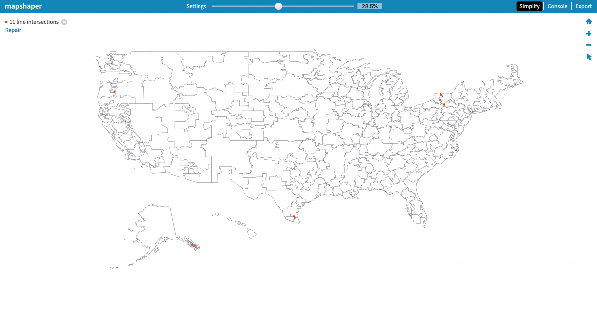
Before we build our map using Datawrapper, we need to reduce the file size (or simplify) of the geojson shapefile. I’ll use Mapshaper, as outlined in this Storybench tutorial, and simplify to 28.5% before re-exporting as geojson, which will download as hrr_fix.json.
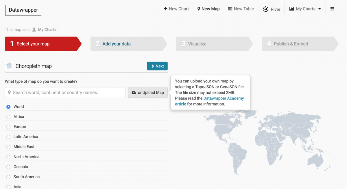
Next, head to Datawrapper, sign up and click through until you’re building a choropleth map. Instead of choosing one of their awesome options, click “or Upload map” and upload the hrr_fix.json file.
Click through and then import your dataset, hrr_combined.csv. Select the “hrr_num” column (which your dataset and map have in common) and then proceed through the steps to map the beds_perc_needed variable. With a few minutes of design work (and by importing your own colors, i.e. #fff4ee, #fdb07a and #ed6549) you can recreate The New York Times map. See our final Datawrapper map here.
Building the interactive map in Leaflet with R
The Washington Post’s Andrew Ba Tran has some great Leaflet in R tutorials and those were helpful in creating and styling my map. Before I got to mapping, I duplicated the beds_perc_needed variable and then rounded it up to 0 decimal places. I’ll be using this for the labels – in order to most closely approximate what the Times did with its tooltips.
hrr_combined$for_label <- hrr_combined$beds_perc_needed
hrr_combined <- hrr_combined %>% mutate_at(vars(for_label), round, 0)
glimpse(hrr_combined)
Next, I’ll use the geo_join() function from the tigris package to merge the hrrname_aes2 shapefile data with the hrr_combined data frame.
library(tigris)
hrr_geojson_and_model_merged <- geo_join(hrrname_aes2, hrr_combined, 'hrr_num', 'hrr_num', how="left")
glimpse(hrr_geojson_and_model_merged)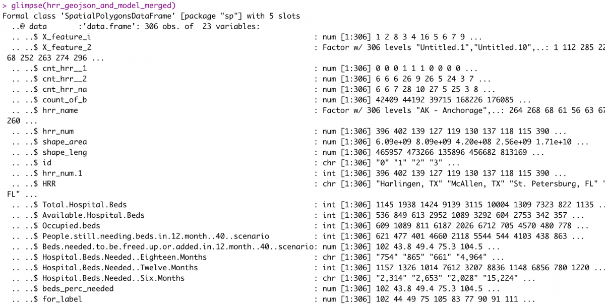
Finally, using the leaflet package for mapping, htmltools for styling popups, and the htmlwidgets for downloading the map as an HTML file, we can create an interactive map in a couple dozen lines. Map here and code below.
For more of an introduction to Leaflet for R, check out the RStudio Leaflet documentation.
library(leaflet)
library(htmltools)

bins <- c(1, 25, 50, 100, 200, 300)
pal <- colorBin("YlOrRd", domain = hrr_geojson_and_model_merged$beds_perc_needed, bins = bins)
popupmap <- paste0("<strong>", hrr_geojson_and_model_merged$HRR,
                   "</strong><br /><br />If <strong>40% of adults</strong> are infected over <strong>12 months</strong>,
                   this hospital region would need to empty or add the equivalent of <strong>",
                   hrr_geojson_and_model_merged$for_label,
                   "%</strong> of its occupied beds.")

HRRmap <- leaflet(hrr_geojson_and_model_merged) %>%
  addPolygons(fillColor = ~pal(beds_perc_needed),
              opacity = 0.8,
              weight = 0.3,
              color = "white",
              fillOpacity = 0.7,
              smoothFactor = 0.5,
                highlight = highlightOptions(
                  weight = 0.4,
                  color = "#000",
                  #fillOpacity = 0.7,
                  bringToFront = TRUE),
                popup = ~popupmap) %>%
  addLegend(pal = pal, values = ~beds_perc_needed, opacity = 0.7,
            labFormat = labelFormat(suffix = "%"),
            title = NULL,
            position = "bottomright") %>%
  htmlwidgets::onRender(
    "function(el, t) {
        var myMap = this;
        myMap._container.style['background'] = '#ffffff';
    }")

HRRmap

library(htmlwidgets)
saveWidget(HRRmap, file="HRRmap.html", selfcontained = T)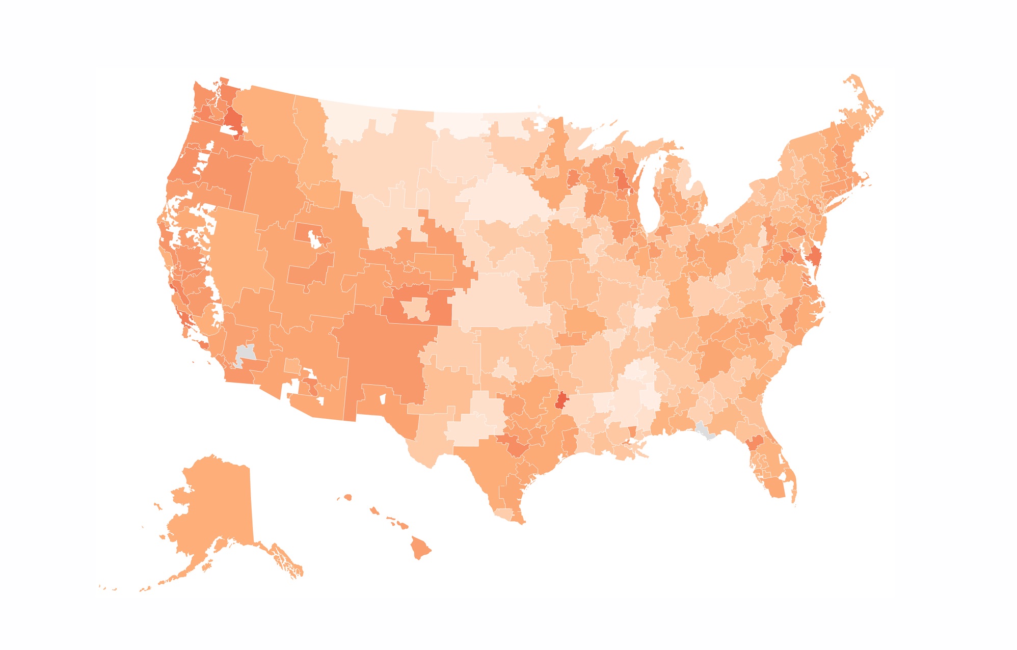



Thank you for this! I’ve conveniently limited my analyses to the contiguous 48 more than I care to admit because of this challenge. Nice work!