
Bike-friendly Boston: These five datasets let journalists track the city’s progress
A bike is a simple contraption, but making cities bike-friendly? Not so easy.
After decades of cars dominating the streets, integrating bike-friendly traffic lanes and traffic patterns is a slow process. Nevertheless, Boston aims to increase biking four-fold by 2030, and there are a plethora of data sources available to judge how well the city is doing. In this round-up, we look into five Boston bike-related data sets, assess their pros and cons, and look at how they’ve been used by journalists.
#1 – Boston Bike Counts
Boston deploys counters to spend up to eight days a year assessing bike traffic at dozens of locations throughout the city. These data are available for the public to dig through, and the city has also created some neat visualization tools that could be helpful for journalists.
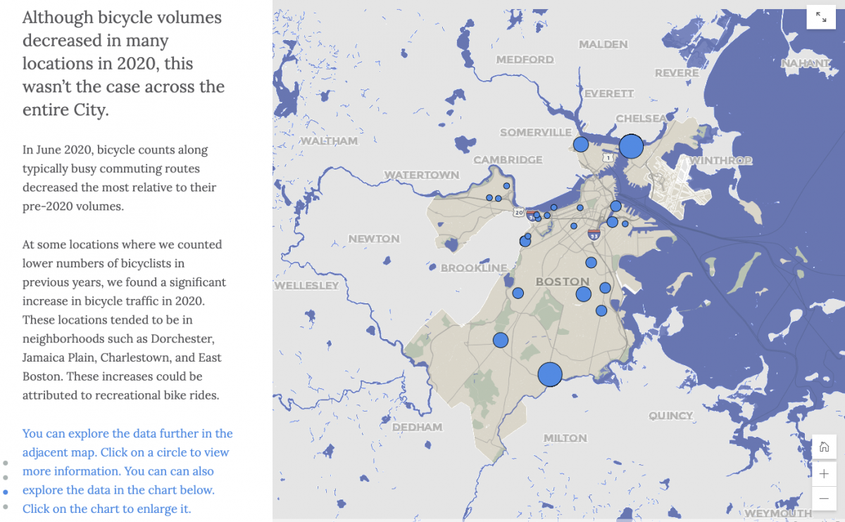
The visualization tools associated with these data are pretty snazzy. An interactive map shows users relative bike frequencies as differently-sized circles. (At least, that’s what we assume the map is showing. The documentation could be better.) There’s also an extensive interactive graphic exploring bike frequency in 2020 — the year COVID-19 upended Bostonians’ daily routines. Bar charts and maps depict bikes as a proportion of total traffic, how many bikes passed each location, and how this compares to previous years.
The raw data are accessible as Excel files, which are well labeled and fairly easy to use. One difficulty is that these data seem to have been collected a little bit differently every year, which could complicate efforts to compare between years. For example, in 2020, counters collected data in all four seasons, whereas the earlier years only have data for June and September. The number of locations sampled also varied over time. A second difficulty arises because locations are not associated with latitudes and longitudes in the raw data, leaving the user to manually pair up locations on a map with descriptions like, “Atlantic Avenue south of Commercial Street.”
In September 2020, STREETSBLOG MASS used these data to make the case that Boston’s bike traffic is heavy enough to justify setting aside more space for bike lanes.
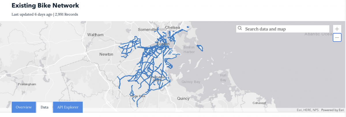
Analyze Boston provides a map of existing bike paths, along with the information needed for journalists to map this information for themselves.
An API lets users hover their cursors over lines describing bike paths and visualize their locations on a map. This works well for longer paths, but it can be difficult to find short paths amid the mass of blue lines. Wide swaths of the city, especially in neighborhoods to the south, appear not to have bike lanes. Perhaps this indicates how far the city has to go when it comes to bike safety, but we also wonder if this might indicate that the map is incomplete.
We applaud Analyze Boston for including a well-conceived metadata file with these data. This helps enormously with understanding the column headings in the data. One tool that would make the data even clearer would be straightforward indications of where within the length of a street the listed bike paths start and end. As it is, this information is encoded in the ROADINVENT field, which is a unique identifier for the road segment determined by the Massachusetts Department of Transportation.
#3 – Boston Bluebikes

Bluebikes is a program that lets users pick up bikes from many stations around the Boston metro area, then return them to the same or different stations. Users have completed more than 12 million trips since this popular service launched in 2011. Bluebikes provides data for every trip a user takes, including the duration, start and end time, start and end location, user’s age, and user’s gender.
The Bluebikes website lists quick facts that journalists may find helpful, like the number of Bluebikes members per year (which has grown steadily since the service launched), the daily, weekly, and monthly records for number of trips, and the most popular stations.
For journalists who want to dive deeper into the data, Bluebikes provides zipped CSVs, each containing one month’s worth of trip data, as well as files containing a year’s worth of trip data. Be sure to check that these files are complete before you use them. The 2012 file, for example, starts on March 13 and ends on November 29, and it’s not clear what happened to the rest of the year.
The column headings are straight-forward and easy to use, and many (although not all) of the files include latitudes and longitudes for the stations. There are a few idiosyncrasies associated with individual files. For example, some have columns for zip codes instead of the user’s birth year and/or gender. It’s not clear if this is the zip code of the user, or the zip code of the station’s location. Overall, however, we give this resource a thumbs-up for usability.
Bluebikes also provides real-time system data in a standardized format called General Bikeshare Feed Specification (GBFS) format. With a little bit of programming, you can get live status updates such as how many bikes are available at specific locations. This page describes a Python package that can help you get started.
Researchers Kate Hosford and Meghan Winters from Simon Fraser University used Bluebikes data, along with similar datasets, to show that women are less likely to use bike shares than men. They wrote about their research for The Conversation.
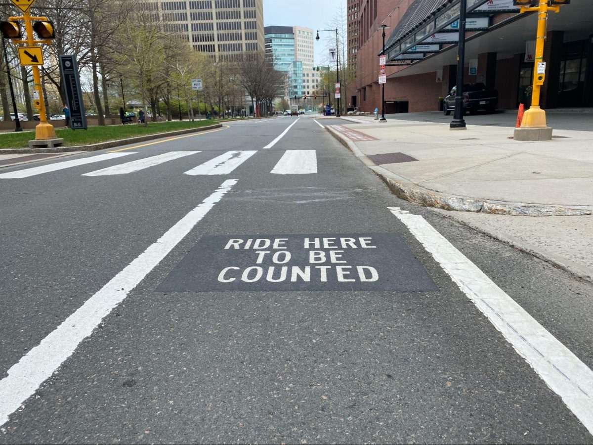
Bikers who ride down Broadway Street in Cambridge encounter a section of the pavement that reads, “Ride here to be counted!” Passing over the indicated spot causes sensors embedded in the pavement to register that a bike has gone by. The City of Cambridge provides these counts in a nicely annotated spreadsheet that users can download in a variety of formats. A convenient data-visualization tool lets users easily estimate how many bikes pass this point every month, or what time of day is most popular for biking.
Overall, this is a simple but valuable resource about bike traffic at a particular spot in the Boston metro area.
#5 – Vision Zero Accident Data
In 2015, Boston joined an ambitious international effort to eliminate fatal and serious traffic accidents by 2030. To track their progress, journalists can use this database of every traffic incident to which there was a public safety response, along with this map of where these incidents occurred.
This dataset is a valuable resource that could be made even better by a bit more annotation. One place where clarification would be useful is the column specifying mode of transportation. Each entry includes only one mode of transportation when accidents usually involve two parties. Consequently, when an accident is listed as having involved a bike, it’s not clear whether a car hit a bike, or a biker simply fell off their bike, or perhaps a bike hit a pedestrian. The dataset also includes mysterious columns called x_cord and y_cord. Latitude and longitude are included elsewhere, so the identity of this second coordinate system isn’t clear.
In 2019, both Patch and Curbed Boston ran stories about a report that the Massachusetts Vision Zero Coalition wrote after reviewing Boston’s accident data. The report concluded that deaths due to traffic accidents were down, but that accidents were still common overall.
Top image: Woman on Bike, by Sascha Kohlmann.