How Nature visualized the impact of overturning Roe v. Wade
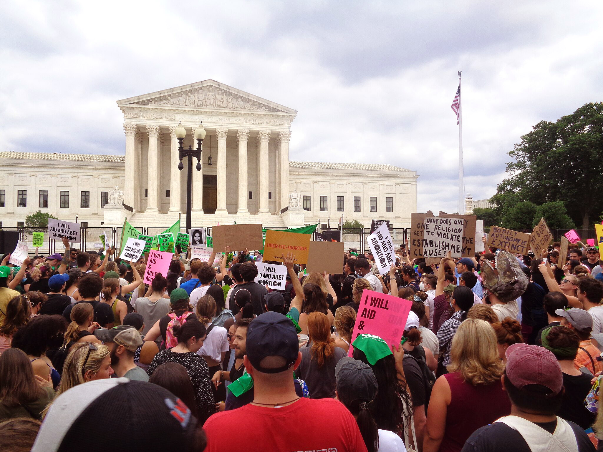
The Supreme Court had just issued the Dobbs decision, striking down the right to abortion, when Nature editor Brendan Maher reached out to me in June 2022. Was I interested in putting together an infographic showing the impacts of the ruling, he asked? I didn’t hesitate — Dobbs showed that the Supreme Court was willing to revoke what many people consider to be a basic human right, and I thought the decision deserved thorough coverage.
Here’s how I researched and reported this award-winning infographic, how Brendan and I decided which data to present and how graphic designer Jasiek Krzysztofiak turned the information into seven charts that show how Dobbs changed life in America.
Chronology as an organizing principle
Brendan and I started with a lot of questions. Some were basic — how many people had just lost access to legal abortion? How would that change the number of people who received abortions (legal or otherwise)? And would more people resort to unsafe abortions?
We also had more subtle questions. How does being denied an abortion change a person’s life long-term? Would abortion access change in states that did not restrict the practice, if people from restrictive states flooded into the clinics? And could we look to history for an indication of what was to come?
Brendan suggested that we organize the infographic into three parts: past, present and future. The first section would describe how abortion bans have historically affected nations, the second would show how Dobbs had immediately limited access to abortion and the third would illustrate what researchers expected to happen over the next few years or decades.
In the end, we didn’t stick strictly to this scheme in the published article. But as I gathered information, thinking of data as illustrating the past, present or future of abortion helped me ensure I was considering the court’s decision from a variety of angles and presenting a full picture of its ramifications.
Reporting the infographic
Having brainstormed a rough “wish list” of charts, I contacted experts to ask if they could provide relevant data. This part of the process was similar to reporting any feature. I spent a lot of time putting keywords into Google and Google Scholar, interviewing the researchers whose work I uncovered and always asking them whom else I should be talking to. Economist Caitlin Myers from Middlebury College was very helpful, as were sociologist Jonathan Bearak from the Guttmacher Institute, which researches reproductive health policy, and behavioral scientist Bela Ganatra from the World Health Organization.
Maintaining an Excel spreadsheet with a separate tab for each graphic we were considering helped organize the dozen or so data sets that I dug up. I gave each tab a concise label so that I could easily reference the data it contained in a draft of the accompanying text. Sometimes, I used Excel’s “charts” feature to create quick-and-dirty versions of what the final graphics could look like. That way, we could start to visualize the final product while we were still in the early stages.
From this spreadsheet, Brendan and I chose seven data sets that we thought were most relevant. Then it was time to vet the data — I called on researchers I’d already interviewed, as well as a few I hadn’t, to offer an independent appraisal of each chart we planned to use. This part of the process was similar to reporting a news article about a single study for each chart included in the final infographic.
Some ideas didn’t work out
I chased a couple of data sets I never ended up catching. The first involved availability of a drug called methotrexate, which is used to treat diseases including rheumatoid arthritis and cancer, but can also induce abortion at high doses. After the Dobbs decision, social media was percolating with reports that women of child-bearing age had been denied methotrexate because it could end a pregnancy — even if they weren’t pregnant and had no intention of becoming pregnant. This was clearly a problem for people relying on the drug to treat serious illnesses.
I would have loved to give readers an idea of how many people had been denied methotrexate, but I could only find anecdotal information. Lots of great articles have been written based on personal experiences with methotrexate, but the topic wasn’t quite ripe for the infographic format.
I also wanted to give readers an idea of how many people died from unsafe abortions in the U.S. before Roe v. Wade legalized the procedure in 1973. But because of systemic underreporting, reliable numbers were difficult to come by.
Prior to the 1970s, abortion deaths were often recorded as something like “infection” (the result of many botched abortions) or “complications during pregnancy” or even “homicide” when abortion was illegal. Eight hundred and eighty eight women are known to have died after abortions in 1945, epidemiologist Christopher Tietze wrote, but he acknowledged that many deaths were likely missed.
By the early 1970s, the Center for Disease Control (CDC) was recording deaths from abortion more rigorously, epidemiologist Roger Rochat told me. Today, Rochat is an emeritus professor in the departments of Global Health and Epidemiology at Emory University, but in the 1970s he worked for the CDC on issues related to family planning.
The problem, Rochat elaborated, is that some states repealed abortion bans or relaxed the rules before Roe v. Wade was decided, and abortion reporting became rigorous. The best available data tells us that 39 women died from illegal abortions in 1972, and by 1974 that number had dropped to five. But those values probably don’t communicate the scale of the problem when abortion was illegal nationwide.
We ended up reporting the numbers from the 1970s, but we didn’t include them in a visual or focus on them as much as we might have if more complete data had been available.
The final product
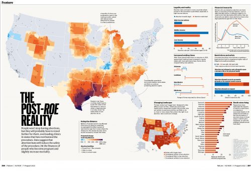
The final product included a two-page infographic spread in Nature’s print magazine and an accompanying online version. A map showing where abortion clinics were still operating took center stage in the print version. Jasiek laid out the graphic using software called QGIS, being sure to obscure the exact locations of clinics so that the map couldn’t be used by people who wished to harm abortion providers and patients. Then he dropped the graphic into Adobe Illustrator, along with bar and line charts illustrating other ways Dobbs changed America, and made sure everything conformed with Nature’s house style.
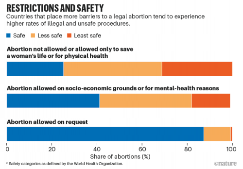
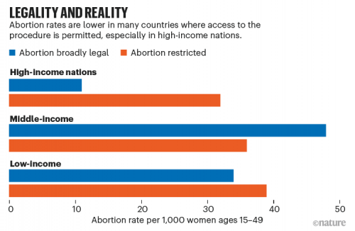
To me, the most striking numbers we reported describe how the legality of abortion affects the prevalence and safety of these procedures. In a chart titled “Legality and Reality,” we showed that laws restricting access to abortion only limit the number of these procedures moderately. Many of the abortions that do occur are less safe, however, as we showed in a chart titled “Restrictions and Safety.”
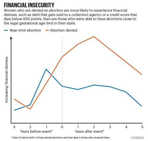
When laws do prevent people from having abortions, the long-term effects can be dramatic, as we showed in a chart titled “Financial Insecurity.” “Financial distress” — a metric that measures events like owing money to a collection agency and having a low credit score — can be much higher for people who are denied abortions, even years later.
It’s been over a year since the Dobbs decision. Some of the effects researchers told us to expect have come to pass — abortion wait times, for example, have increased substantially in some states. Others, like increases in maternal mortality, could take years to become fully evident. When they do, I and other journalists will be here, ready to report the numbers.