Roundup of Ferguson visualizations
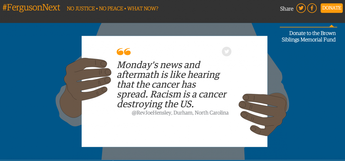
The above, from #FergusonNext, pulls in community voices from Twitter, Instagram, Tumblr, and other sites. The FergusonNext website was built by The Guardian, The St. Louis Post-Dispatch Editorial Page, Ebony.com, Colorlines, The St. Louis American and The St. Louis Riverfront Times.
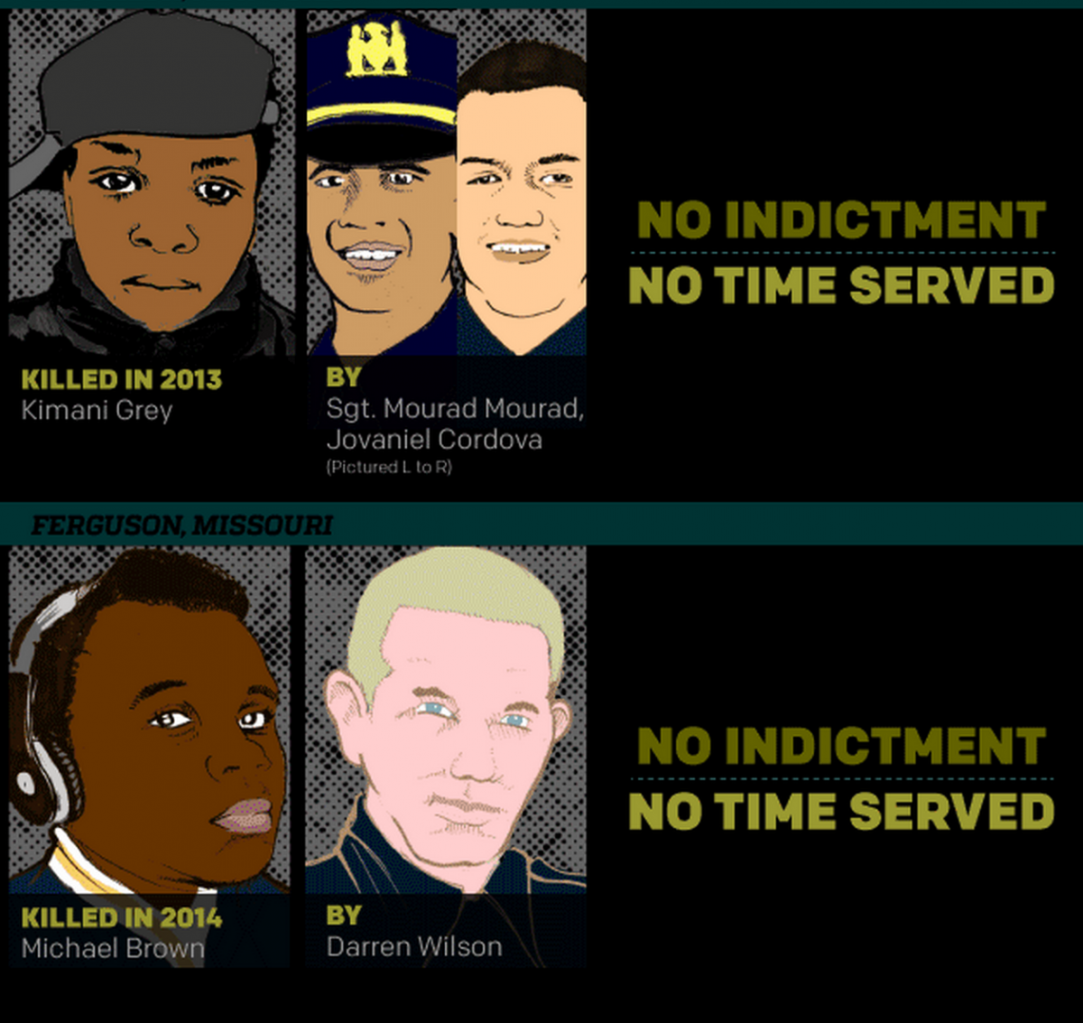
Colorlines drew up an infographic on law enforcement and accountability. They ask “Can law enforcement be held accountable in a justice system that’s set up to support their actions?”
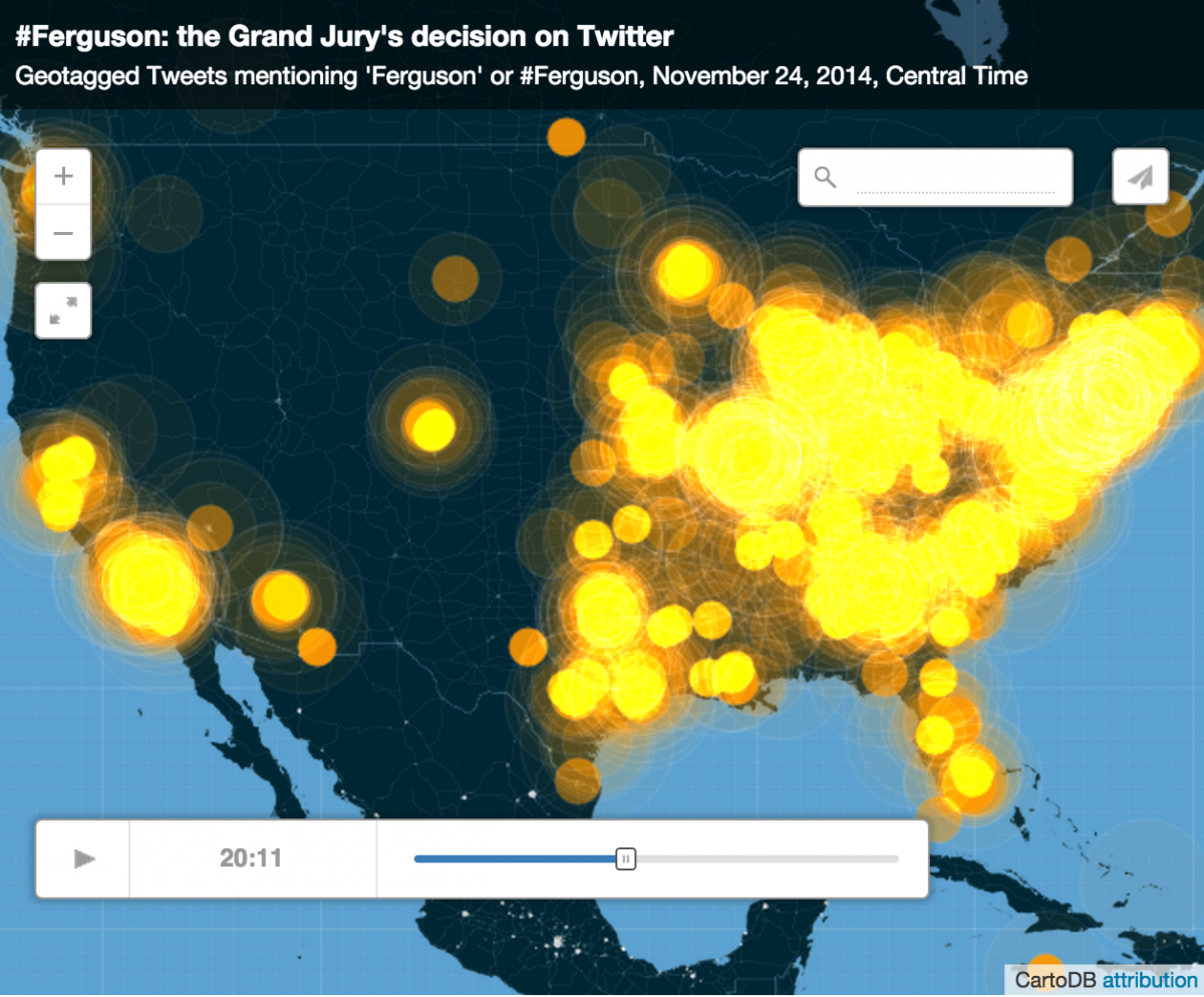
CartoDB built a temporal heatmap showing how the hashtag #Ferguson spread across Twitter following the grand jury announcement. Want to build something like this? CartoDB has paid packages that will let you.
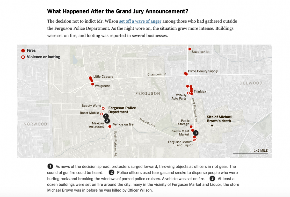
The New York Times combined reporting with mapping to contextualize the Ferguson protests.
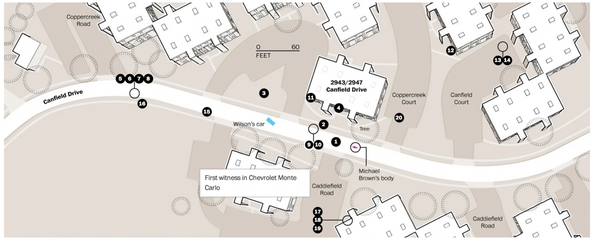
The Washington Post published an interactive map showing where witnesses were located during the shooting of Michael Brown.
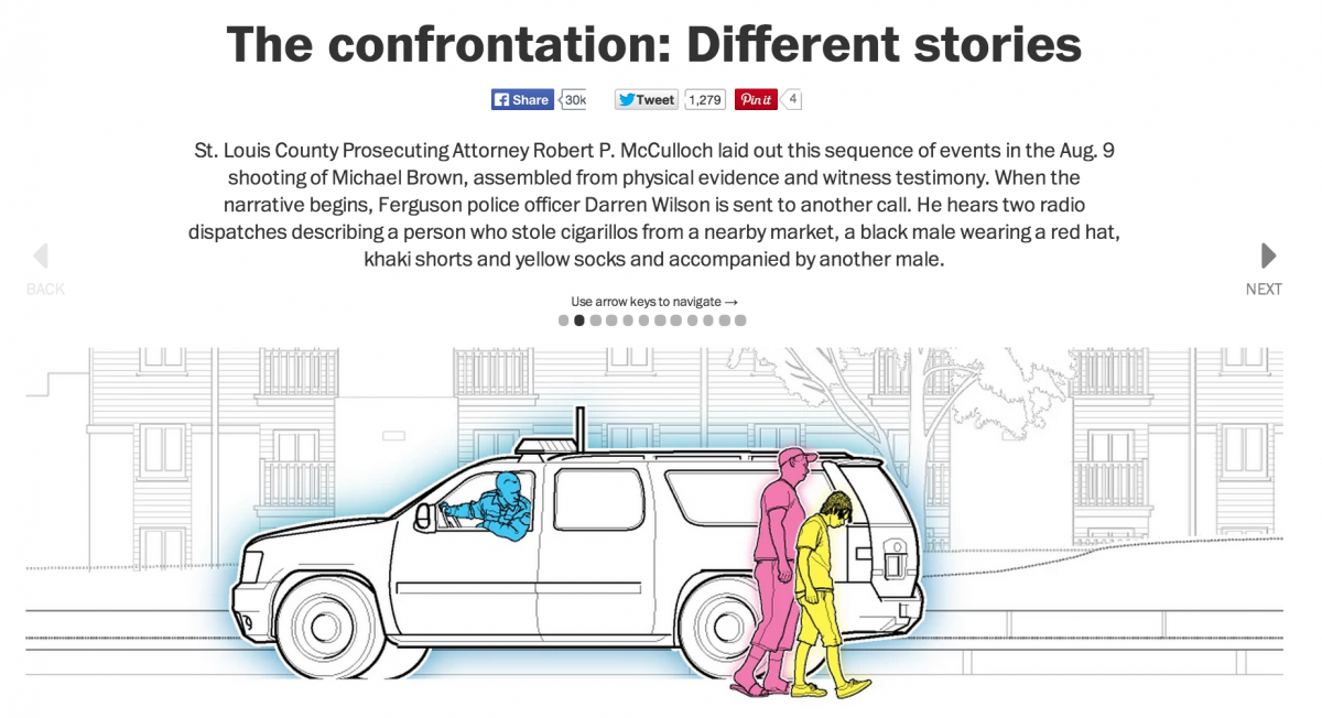
The Washington Post also published an interactive of Brown’s shooting that juxtaposed the accounts of the prosecution and defense.
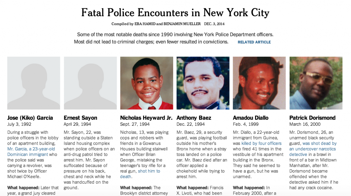
The New York Times also recently compiled a roster of fatal police encounters in New York City.
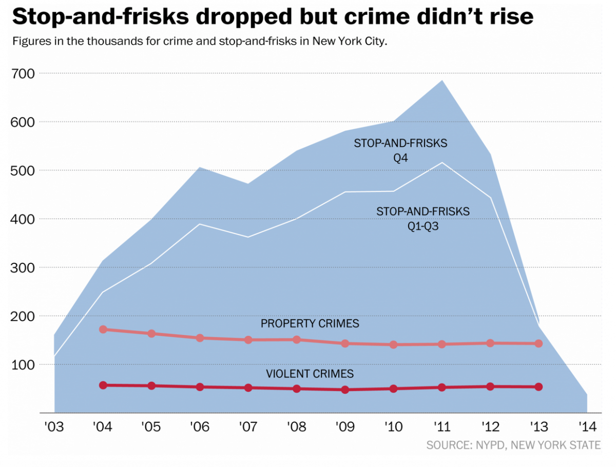
On a related note: some data journalism at the Washington Post crunched the numbers on stop-and-frisk and crime rates. Annual crime data for New York can be downloaded here.
What have you been clicking? Comment below!

