Data journalism? You can do it.
Data is still *hot*, but the new skills, math, and technologies can feel overwhelming. In my experience journalism students and professionals approach learning data journalism with both excitement and trepidation. However, over a decade of teaching data literacy to many types of learners I’ve found that journalists are some of the best positioned to dive into data storytelling. If you’re on the fence about trying data journalism, consider this piece a pep talk. I’m here to convince you that fear is the main barrier. If you overcome it you’ll find that you are well prepared to start working with data, and that there is a robust and supportive community waiting for you.
Increasingly data is central to telling the most important stories of our time, and accordingly the tools and community have matured significantly. Now is a great time to try your hand at integrating data into your stories, creating new ways for readers to understand the issues you cover while simultaneously taking advantage of the popularity of data visualization to bring in new readers.
Your Skills Translate
For an organization with global reach, the UN World Food Programme headquarters are in a rather unassuming office park outside of Rome. About 5 years ago I found myself in a lively discussion there about the meaning of the Spanish word “contar” (with a Colombian attendee of a data literacy training I was helping at). The language of “counting” is a common part of data production; it is quantitative data production. I was describing this with the Spanish verb “contar”, which I intended to mean “to count”. My new Colombian friend reminded me that it also means “to tell”. As this dual meaning of “contar” suggests, from the moment of production data is just us telling ourselves stories. Journalists are storytellers; who could be better equipped to do data work than them? In English the closest analogue is perhaps “account”, where “to account” for something could be the act of counting, while “an account” is often a story of something that happened. This powerful duality in the terms connects the act of recording to the act of storytelling – literally the same word is used for both.
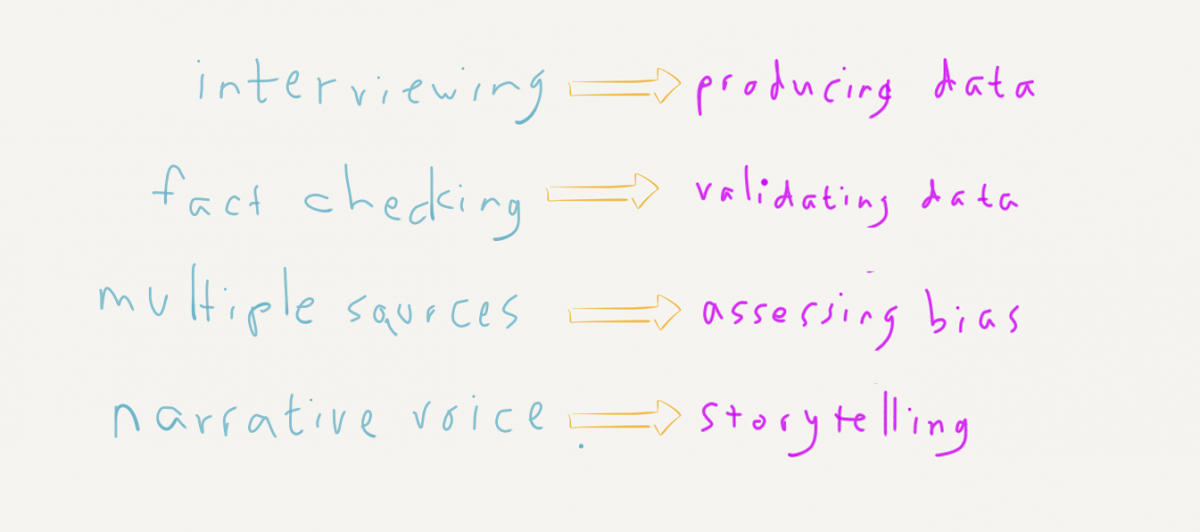
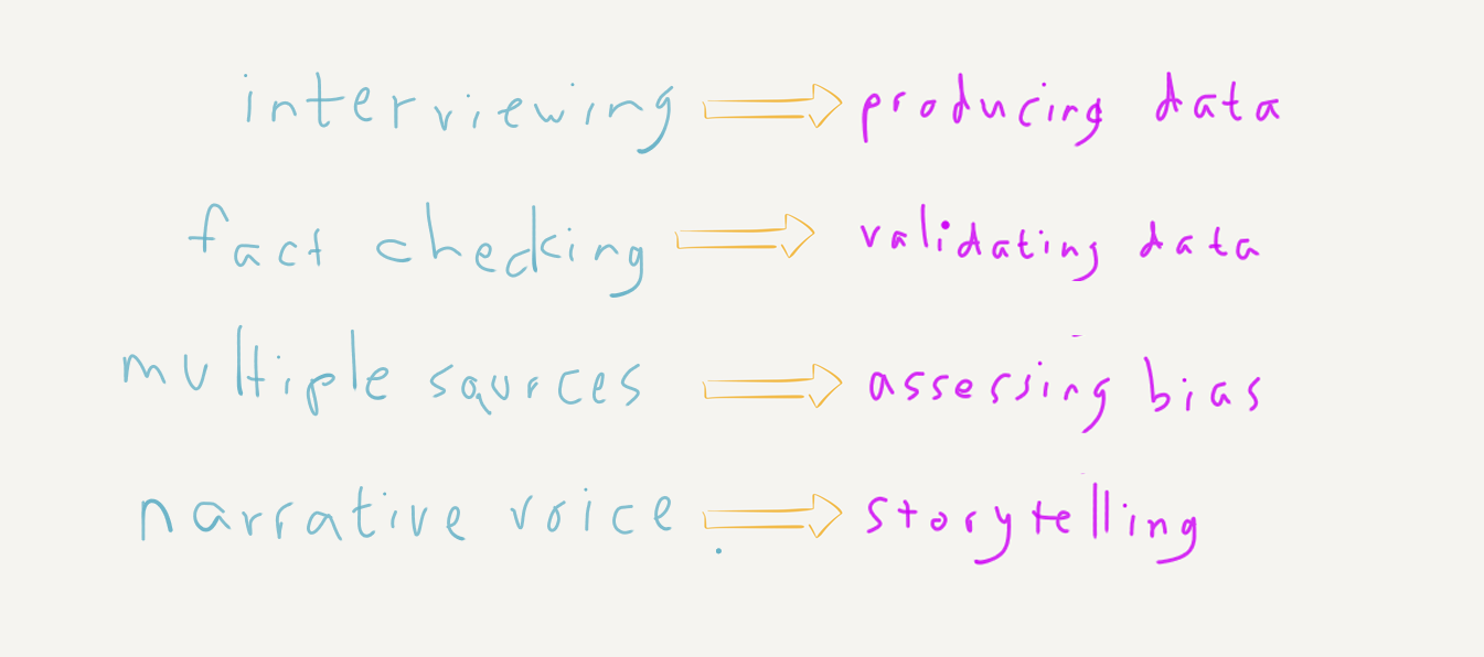
Many journalism skills easily translate to data work. Consider the first step of working with data – creating it. What would you call collecting a set of interviews? I’d call that producing a dataset. Journalists regularly produce and merge multiple datasets as part of their everyday reporting. What about validating a dataset to verify it is accurate? Sounds a lot like fact-checking to me. Newsrooms, and the profession at large, have robust theory and practice for ensuring the accuracy of the data they collect. How about being critical of datasets and what biases they bring? Journalists are primed to be skeptical of sources, to look for multiple viewpoints; yet another skill that translates directly to working with data. Assembling many datasets into a consistent and compelling narrative? Again, we see journalists doing this regularly by pulling in descriptions, quotes, perspectives and more.
Your journalism skills and training translate directly to telling data stories.
You Can Math
Years ago I visited the classroom of someone that helped me on my journey into data science – Professor Allen Downey. His books on programming and statistics are must reads for anyone learning programming and data science, and were particularly valuable for me as I tried to fill in gaps in my own self-taught skills. Allen generously invited me into his Olin College classroom to introduce his students to a different approach to storytelling with data. As I contrasted storytelling with statistical analysis, he jumped in with a way of talking about math that has stuck with me since then. He pointed out that math, at its simplest, is just counting. At its most complex, it can include rigorous statistical methods with lots of Greek letters. But there is, he argued, a LOT of space in-between. The in-between includes many techniques that offer analytic power to non-statisticians. Normalization is just smart dividing. Binning is just basic rounding. Here was someone that wrote a widely read book on programming and statistics arguing that you didn’t have to be a statistician to produce useful and reliable data analysis. I’ve hung onto this idea ever since, introducing it over and over again in workshops.
Knowing when to normalize, when to bin, when to remove an outlier – these are the challenging concepts. Math is not the hard part; most of it is just counting and even my middle school age kids are pretty good at that (although my son did struggle with forgetting that the number 4 existed for a while).
Tools are Getting Better
I wrote a whole academic paper on the challenges of teaching data journalism in a world of “tool overload”, so I truly feel the pain of navigating the overwhelming set of options for working with data online. There isn’t one tool to rule them all, but there are some compelling examples demonstrating how computational innovation is making data tools easier to learn and more widespread in use.
It used to be that you either learned Excel or programming, but now there are robust major tools like Tableau that bridge the gap. While they can’t help you figure out the right standard chart to support your story, chart choosers help you move from narrative form to a chart that can tell that type of story. Check out the DataVizCatalogue for more summaries of chart types and their intended uses. Worried about production value? DataWrapper is a great example of a simple-to-use tool that produces great looking charts online. Want to make more advanced chart types? RAWGraphs lets you just paste in your final data and try out some more novel chart types you might feel intimidated by.
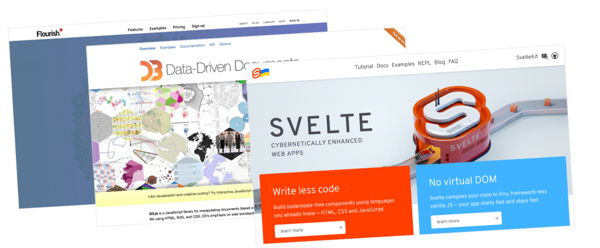
In this industry this isn’t just a story of newsrooms adopting tech startups’ latest products; impactful innovation has come from newsrooms themselves, or intentionally built for them. The Flourish platform for online data visualization was conceived and developed for newspapers. They’ve had so much success that the online design app giant Canva recently acquired them. The key author of d3.js, the go-to technology for creating custom interactive data visualizations, is Michael Bostock. After creating d3.js at the University of Washington he spent years creating award-winning interactive pieces at the New York Times. More recently, the Svelte framework has taken the Javascript developer world by storm, praised by developers for its ease of use. The primary developer, Rich Harris, was a journalism student who learned to code (short documentary). He created Svelte while working at the Guardian.
Still overwhelmed by online charting or analysis tools? Don’t be afraid to return to your paper and pencil like celebrated data visualization designer Giorgia Lupi so often does. I often argue that there’s power in more informal approaches to data visualization.
The Community is Still Growing
You’re not alone on this journey. The community is growing and moving from its technological roots to embrace more diverse sets of data storytelling learners. Reddit’s DataIsBeautiful forum is a great place to get inspired about what to make (or what not to). The Data Visualization Society is a relatively new organization hosting welcoming events for learners of all types. Books like Scwabish’s Better Data Visualization and Fiegenbaum & Alamalhodaei’s Data Storytelling Workbook offer concrete and practical advice and guidance. Here where I teach at Northeastern University our Storybench blog regularly shares tutorials and behind-the-scenes stories from the field to help you see data storytelling in action.
As a journalist, you’re better equipped than most to enter the field of data storytelling. You should try it, because it will make your reporting — and the community itself — stronger.
Thanks to my colleague Meg Heckman for advice on an early draft of this piece.