10 innovative visualizations of Trump’s first month in the White House
A month into Donald J. Trump’s presidency and the media has had more than enough to report on. Amid advisors resigning, a dizzying web of conflicts of interest, and a fair share of distracting tweets (see here, here and here), there is no shortage of stories being explained by researchers and news organizations using timelines, network visualization, charting and videos. Storybench took a look at how newsrooms have used data visualization and interactivity to cover Trump’s administration so far.
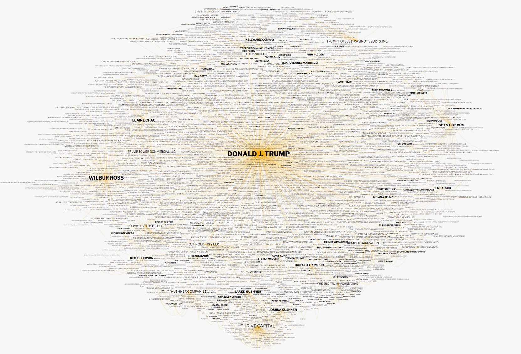
Visualizing Trump’s business connections
Visual researcher and information designer Kim Albrecht came up with “Trump Connections,” a remarkable visualization of President Trump’s business ties. The piece allows interactive exploration of a database of 1,500-plus connections between Donald Trump and companies and businesspeople put together by BuzzFeed’s TrumpWorld project.
“Trump Connections” puts the President at the center of a gigantic network (as seen in the picture below), but also breaks down the ties in a family tree-like visualization.
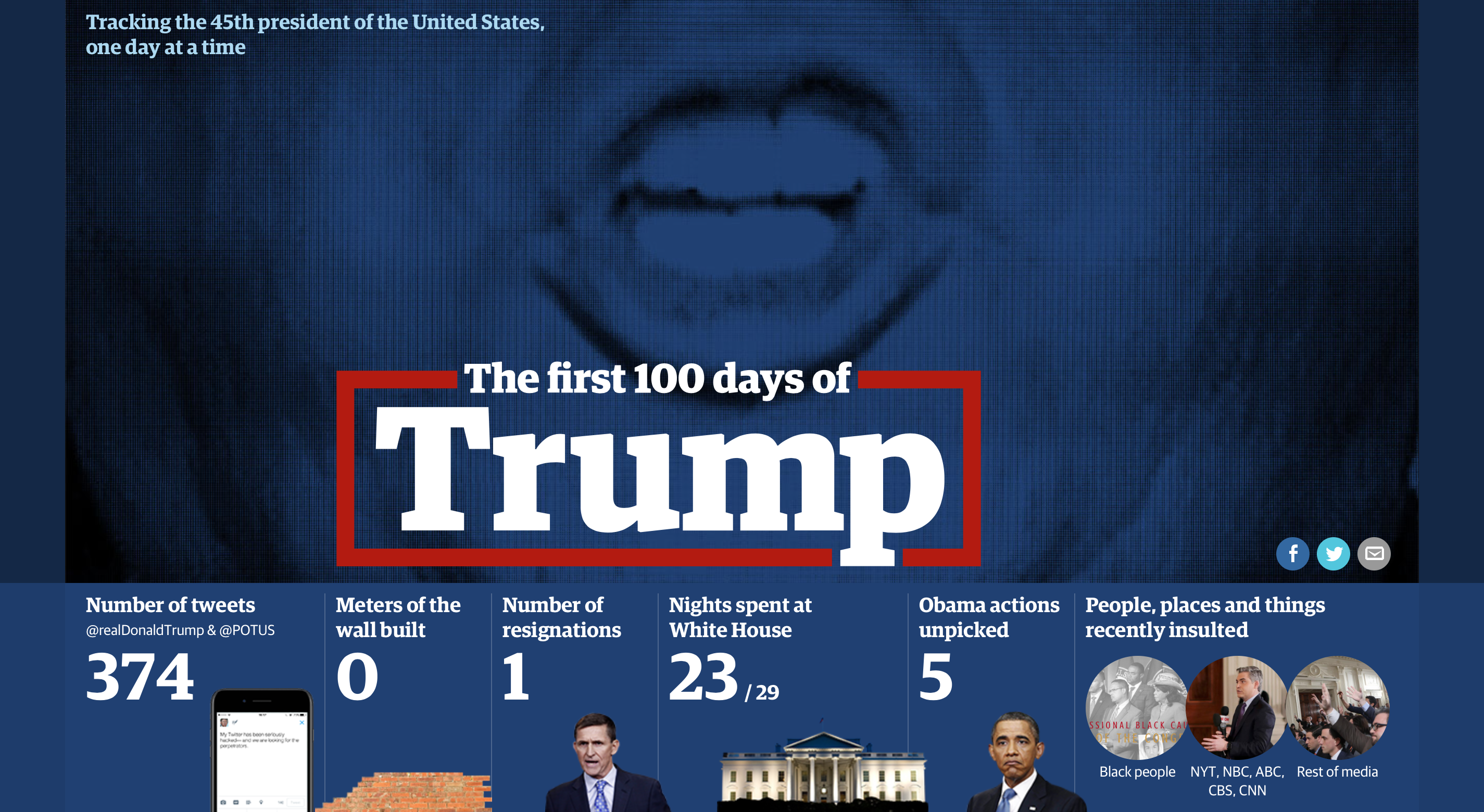
Tracking the President one day at a time
The Guardian US decided to cover Donald Trump’s first 100 days at the White House with daily reports of the administration’s activities. The piece is a timeline of the first month and includes contextual numbers like the number of tweets sent out and the length of the U.S-Mexico border wall so far built.
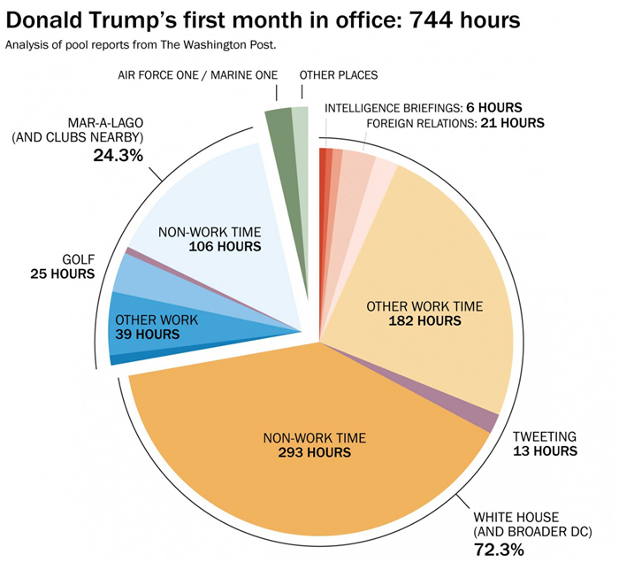
Analyzing Trump’s working hours
The Washington Post scrutinized how the President spent his first 744 hours in office. Tracking the president’s working hours by “call time” and “the lid” – D.C. journalists’ jargon for start and dismissal times at the White House – the piece came up with a thorough analysis of when, where and if Donald Trump was working.
Using data from Twitter, the Post was also able to estimate how much time Trump spent on social media and how many tweets he sent out.
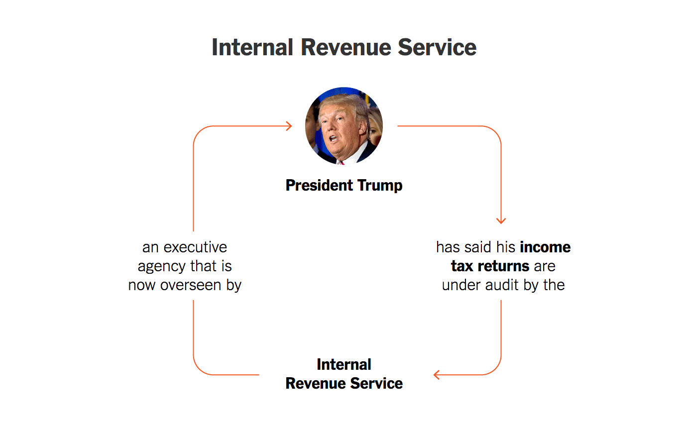
Representing Trump’s conflicts of interest
As soon as Donald Trump was sworn in as president, the ethical questions surrounding the control of his businesses were raised by many news outlets. The New York Times took a visual approach to explaining Trump’s conflicts of interest and put together cyclical representations of how his business ties could raise conflicts of interest.
Blogging about the 45th President
Politico has chosen a blog-like interface for their special coverage of Trump. Several stories from the website’s daily coverage are posted on Forty Five, a “daily diary” that aggregates stories of the presidency in one place.

Explaining Trump
Vox is known for its detailed explanations of current events. In its quest to explain Trump, Vox recently unveiled a video series to break down the strategies used by one of his closest advisors: Kellianne Conway. “Strikethrough” promises to cover the Trump presidency from the perspective of the media industry, which has found itself under attack from the administration.
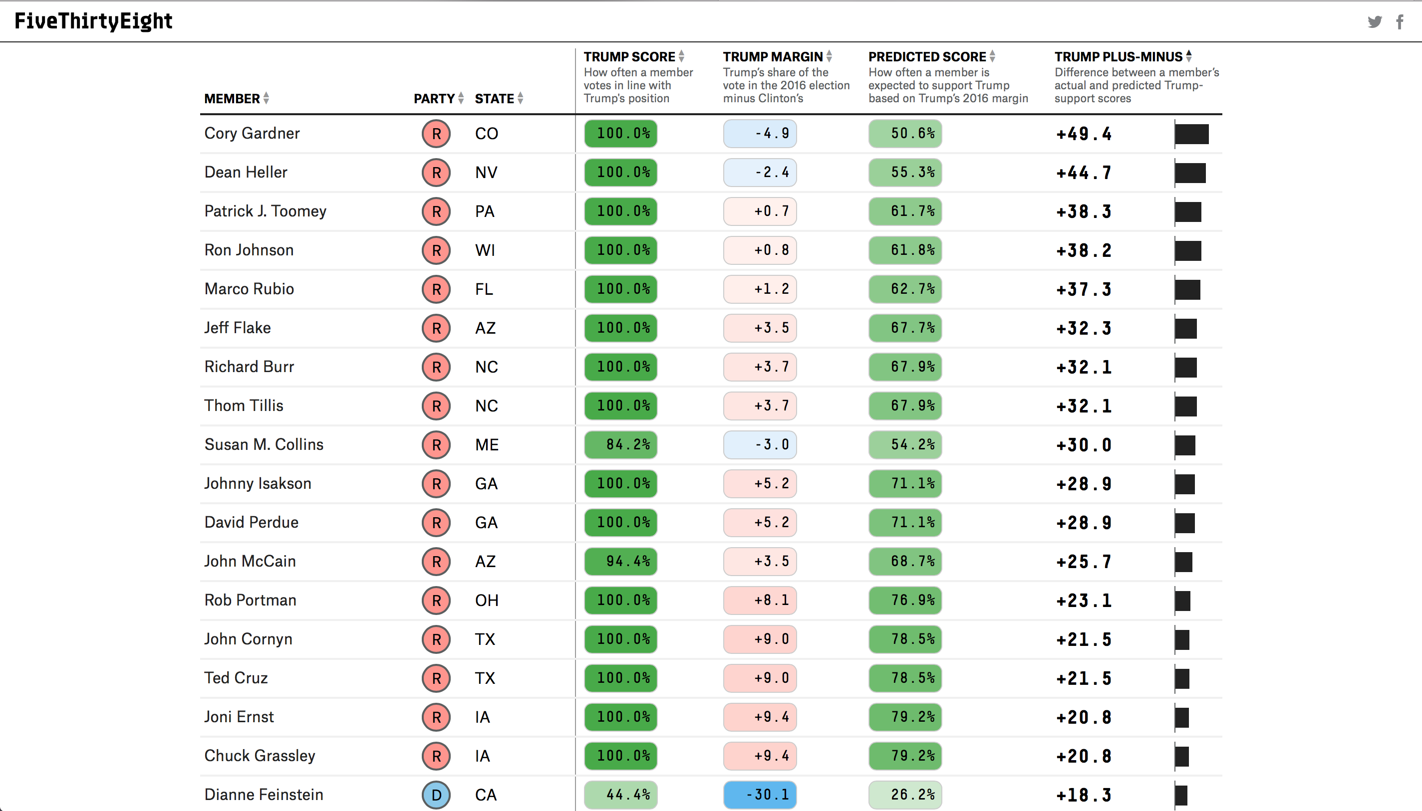
Tracking how the President and the Congress are aligned
FiveThirtyEight has built a data-driven application to study how representatives and senators behave when voting. With data from multiple sources, the website created scores for every congressperson indicating how often they vote with or against the President (on bills and Cabinet nominations). FiveThirtyEight also uses election results to project how often those legislators are expected to support Trump.
Finally, the piece came up with a very sports-like, plus-minus score for every member of Congress, putting into numbers how they each tend to vote. Clicking on any senator or representative will reveal details of individual votes. (Some of the data FiveThirtyEight uses comes from ProPublica’s database Represent.)
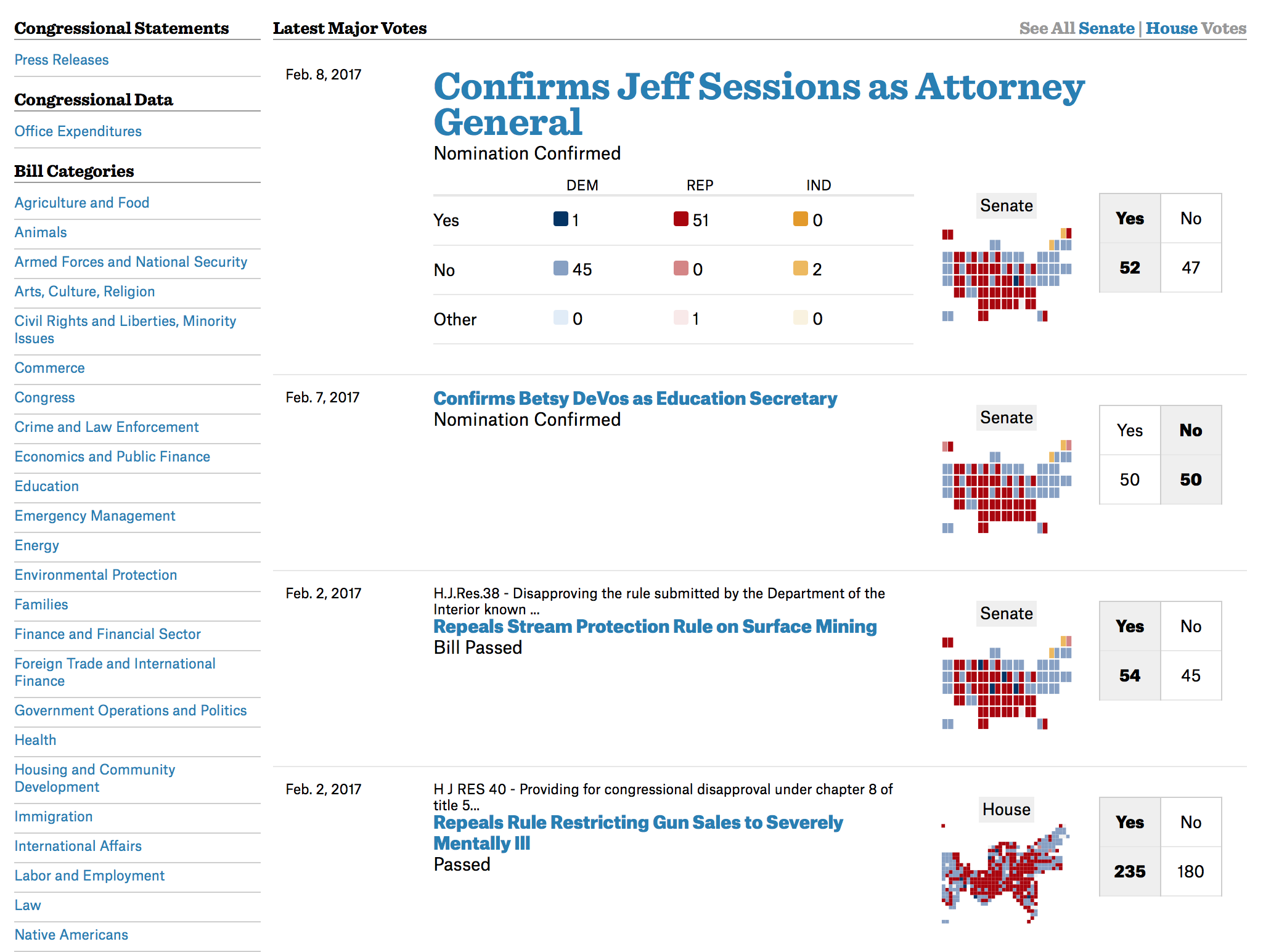
Exploring how lawmakers are voting
ProPublica’s interactive database Represent allows users to explore detailed data on lawmakers’ actions in Congress. The web application provides information on votes, bills proposed, and absences. Users can also search and filter the data. ProPublica also created an API for third-parties interested in downloading the data.
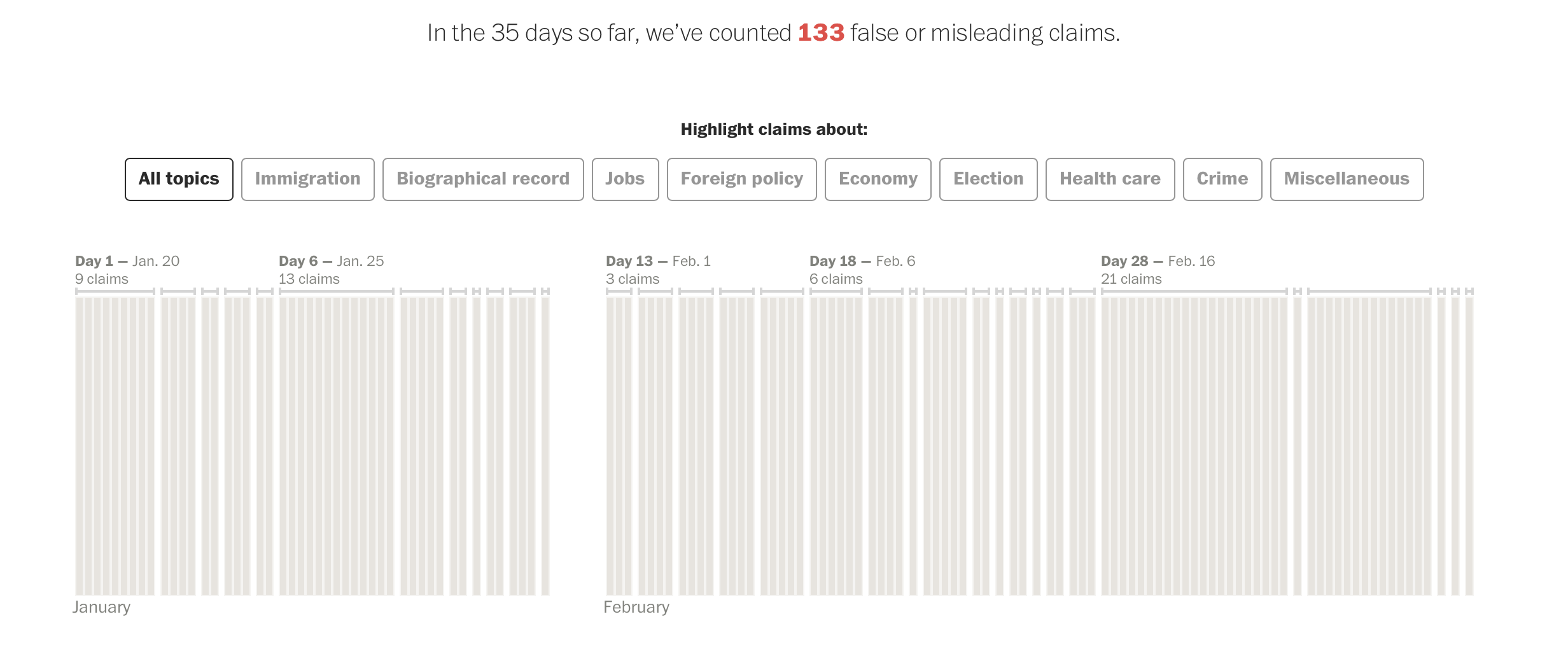
Fact-checking every Trump claim
Following the fact-checking effort during the 2016 election (check it here), The Washington Post is also tracking the truthfulness of every claim Donald Trump makes since Jan. 20. Every statement made by the President—be it on Twitter, interviews or press conferences—is under the scope of the papers reporters that aim to follow and check it all until April, when the administration will be 100 days old.
The piece uses different kind of visuals, including timelines and a calendar. The data can be explored by readers in many ways, including filters that allows users to check the topics of false claims over time and the medium (Twitter, speech, etc) in which Trump evaded the truth. The Post explores in more depth every single claim in separate full stories easily accessible to readers in the full list of contested statements.
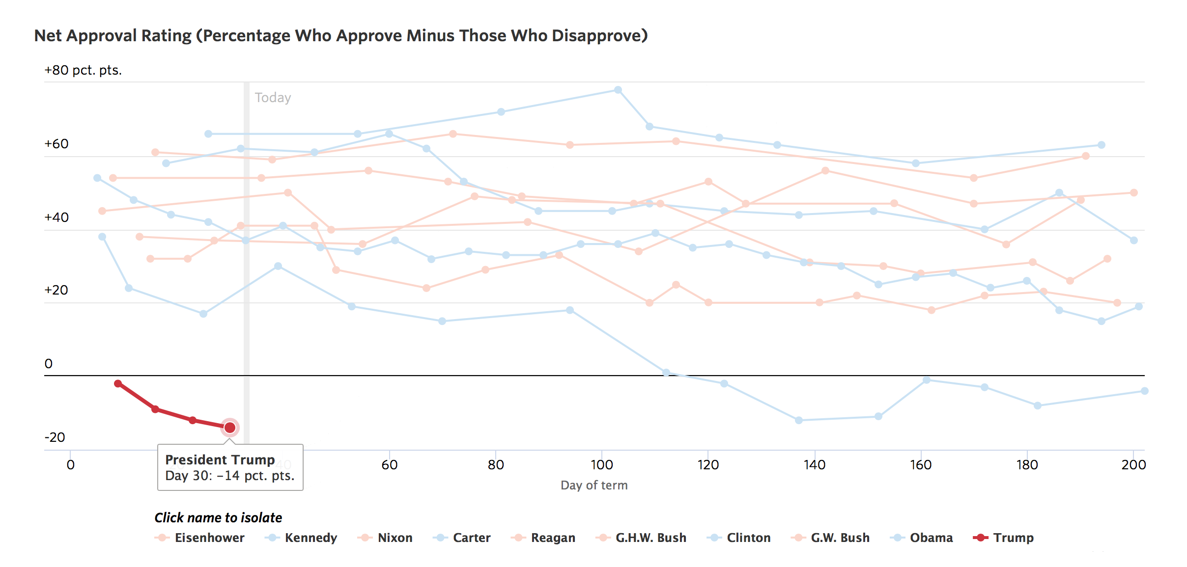
Comparing Trump’s approval
Putting different Presidents side-by-side can be a though job, but The Wall Street Journal took on simple and effective approach to Donald Trump in the White House: follow his public approval rate in comparison to former Commanders-in-chief. With data going back to Dwight Eisenhower, the paper produces two very revealing graphics of how Americans endorse the Trump presidency so far.
Notable mentions
Storybench also found some interesting pieces covering President Trump before he took office worth mentioning:
The New York Times analyzed in detail how Donald Trump’s attorney, Sherry A. Dillon, explained the Trump Organization’s business arrangements and published an annotated piece.
The Washington Post’s The Fix blog developed a tweet fact-checker plugin for Google Chrome and Mozilla Firefox. The tool adds context to Trump’s tweets from @realDonaldTrump while also checking the veracity of his claims.
The Wall Street Journal used Trump’s financial disclosure reports from May 2016 to create this dazzling visualization piece of the 500+ potential conflicts of interest he may run into while in the presidency.
Slow Journalism published an infographic last year showing a timeline of Trump’s campaign and nomination to the Republican ticket.
Feb. 23rd: This post was updated to include three new stories: The Wall Street Journal’s “Trump, His Children, and 500+ Potential Conflicts of Interest” and “Trump Starts Presidency With Lowest Approval Rating on Record”, and The Washington Post’s “100 days of Trump claims”. Special thanks Stuart Thompson (WSJ) and Mark Berman (WaPo) for the tips.
- SXSW: ‘Excel is okay’ and other tweet-size insights for data journalists and news nerds - March 17, 2018
- NICAR: Data stories from last year that you could be doing in your newsroom - March 13, 2018
- How to scrape Reddit with Python - March 12, 2018