Expressive timelines: Microsoft’s Matthew Brehmer on the power of visualizing time
Matthew Brehmer, a data visualization researcher with Microsoft Research, was recently invited by NUVis, Northeastern University’s Visualization Consortium, to talk about the tools he and his team are developing to reinvent timelines.
Brehmer took attendees on a tour of the history of visual timelines and then shared tips and best practices on how visually-appealing timelines can be used to tell powerful stories. Brehmer then presented Timeline Storyteller and TimeLine Curator, two tools he and his team developed for creating expressive timelines. Below, a few takeaways from Brehmer’s talk.
Timelines are more than straight lines
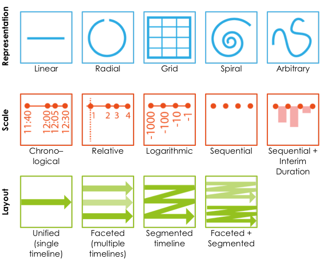
Brehmer opened by explaining the wide possibilities of representation that timelines allow. There’s more to them than strictly linear, chronological designs, he pointed out. “When we think about timelines we first have to think about time itself,” he said, “and specifically about how people use spatial metaphors. Often visualization is the process of mapping time to a spatial dimension.”
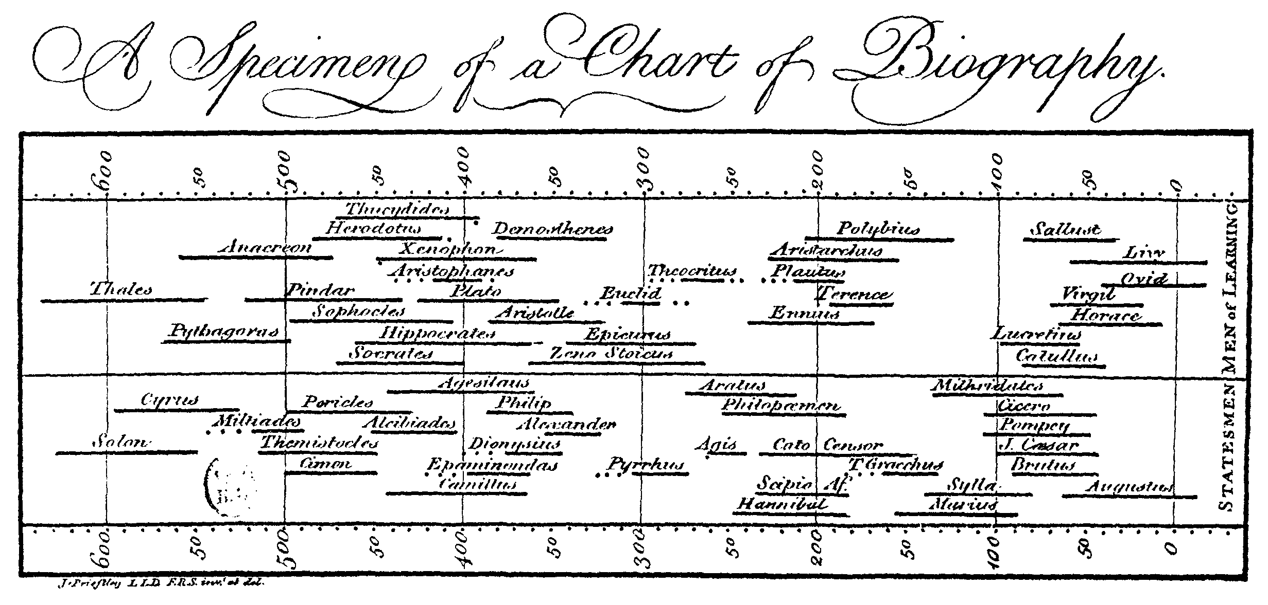
According to Brehmer, that process changes across different contexts and different cultures. Why, he asks, has the left-to-right model dominated timeline designs ever since Joseph Priestley’s Chart of Biography was published in the late 1700s?
Brehmer argued that linear representations are common and still popular because they were created for print. Of the 20 viable timeline designs he has outlined in his research “Timelines Revisited: A Design Space and Considerations for Expressive Storytelling,” nine are linear representations.
Different solutions for different narratives
Brehmer believes that depending on how a timeline is drawn, different types of insights and temporal characteristics can be emphasized, which is at the root of his work and research.
“Radial, analog clock-like timelines are great for representing cycles, things that repeat,” Brehmer said. “Calendars are also useful to show periodicity for things that we socially agree upon, as weeks, semesters, quarters. Then there is also the coil, the spring, when thinking about time as both linear and cyclic.”
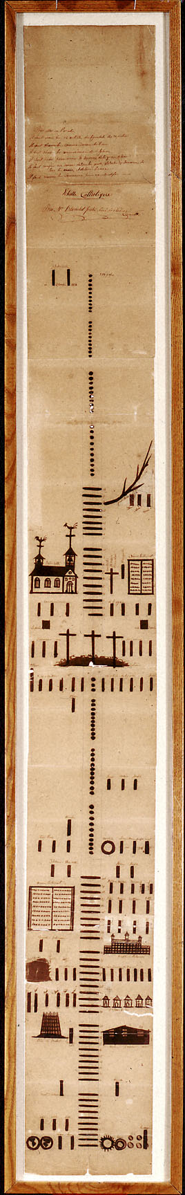
 “Another interesting approach is collapsing time and/or using different representations for different granularities,” he continued, mentioning the Catholic Ladder, a timeline created by missionaries in the 1800s in America to depict the history of Christianity by using dots, ticks and other forms that represented distinct spans of time.
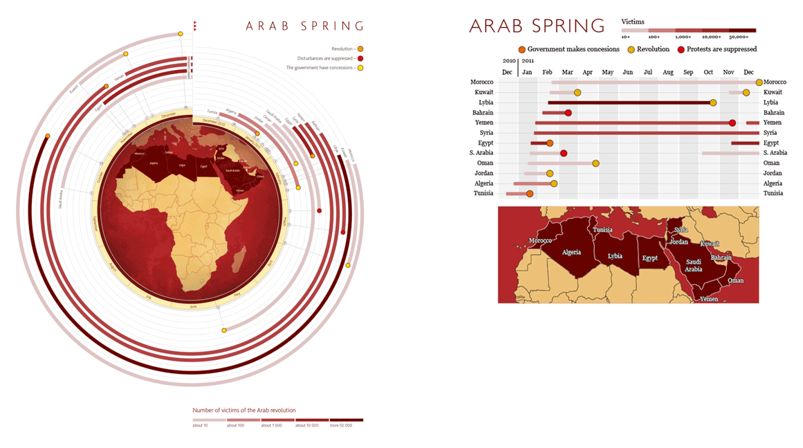
Trade-off is the keyword here. More data and more complexity of information will inevitably put designers and journalists in a bind as they weigh aesthetics and legibility. That very dilemma was a hot topic in the data visualization community in 2013 when Alexander Katin’s and Kir Khachaturov’s timeline of the Arab Spring, which appeared on the Information is Beautiful awards website, was redesigned by information design expert Alberto Cairo. The reactions to the redesign were divisive.
Katin and Khachaturov visually-pleasing radial timeline was in many ways the opposite of the linear and, arguably, more functional version created by Cairo. “We can all agree that Alberto Cairo’s is much easier to read,” said Brehmer. “But not everyone agreed that this was as aesthetically appealing as the original graphic, and it is almost tragically over too soon. You get the point too soon. [Katin and Khachaturov’s timeline] takes time to appreciate.”
Timeline Storyteller and TimeLine Curator
With that in mind, Matthew Brehmer wondered if it was possible to have it both ways: a timeline that was as visually appealing as it was efficient at conveying information. That’s how Timeline Storyteller was conceived. Timeline Storyteller is a versatile application Brehmer developed with Bongshin Lee and Nathalie Henry Riche at the Microsoft Research group.
“We draw the viewer in with an aesthetically pleasing radial representation, but an animated transition [allows us] to effectively reproduce what Alberto Cairo did,” said Brehmer as he explained the tool, which can be used to present datasets in different timeline layouts that can be exported as static images, GIFs or interactive presentations.
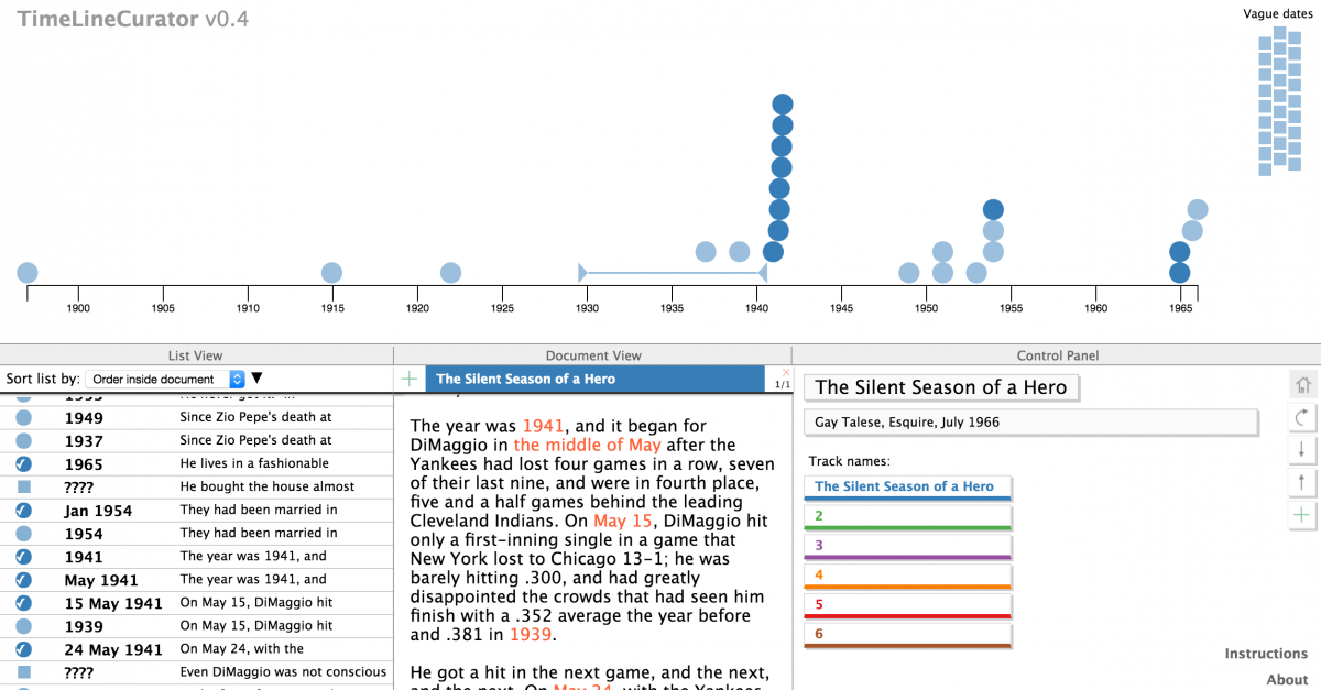
TimeLine Curator is a web-application Brehmer developed at the University of British Columbia with Johanna Fulda and Tamara Munzner. The tool uses unstructured text to create data sets and represent that visually in the form of a timeline.
- SXSW: ‘Excel is okay’ and other tweet-size insights for data journalists and news nerds - March 17, 2018
- NICAR: Data stories from last year that you could be doing in your newsroom - March 13, 2018
- How to scrape Reddit with Python - March 12, 2018


