Five ways organizations are visualizing carbon emissions
Climate change is a global issue and scientists and journalists alike are increasingly making climate-related data more visible and accessible. Understanding the major causes and contributors to emissions of CO2, the most prevalent of greenhouse gases, through data visualizations can help corporations, governments and the public address areas in need of reduced environmental impact. Here is a roundup of visualizations about carbon dioxide emissions data.
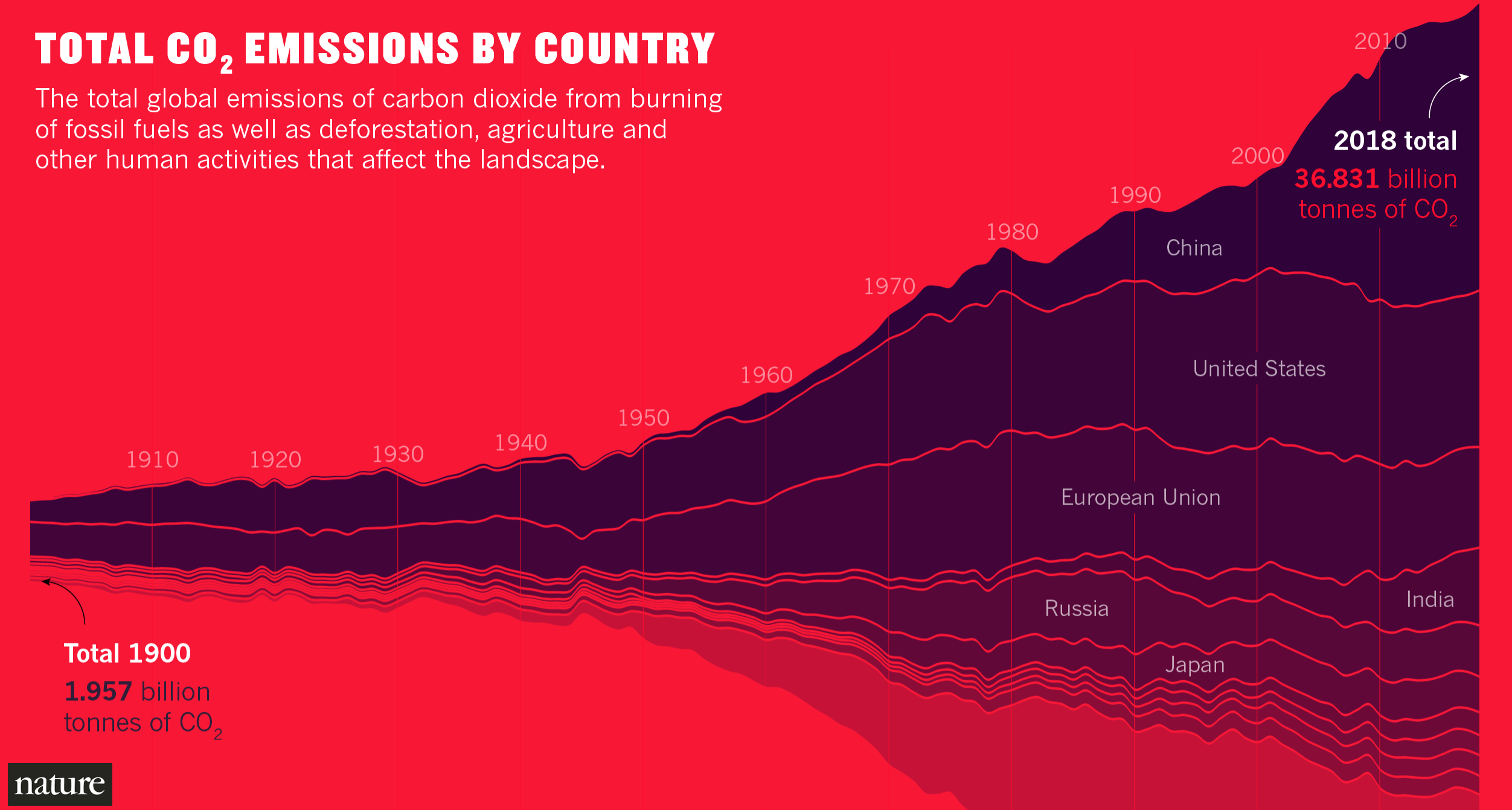
Stream graph of global CO2 emissions
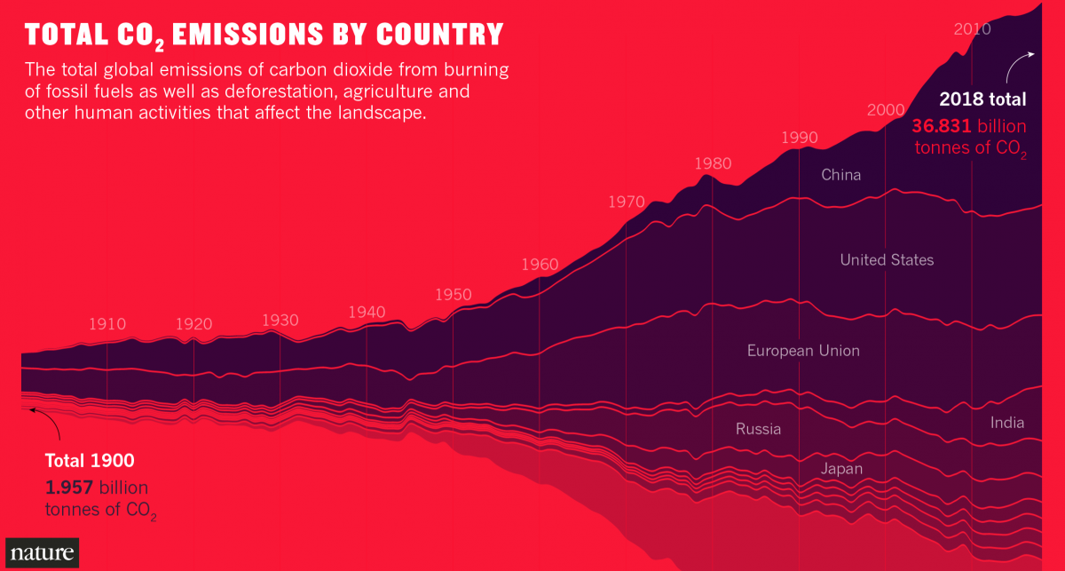
Against a bold red background, Nature visualized global CO2 emissions by country, from 1900 to 2018, using data from the Global Carbon Project.
This stream graph shows CO2 emissions by tons per country across time. The changing height and length of each country’s stream illustrate the changing amount of CO2 emissions in relation to total CO2 emissions each year. Prior to the 1950s, the United States and European Union were the leading contributors to emissions.
Note that the graph shows emissions of the 28 E.U. countries as one group and compares it against other individual countries that are major CO2 emissions contributors.
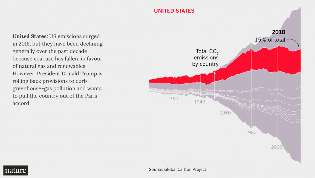
Nature provided a breakdown of each country in an interactive version of the graph. Scrolling will bring up a brief summary for each country’s emissions policy and pledges status, as of 2018. The percentages are out of the total 2018 CO2 emissions, with China (27%), the U.S. (15%) and the E.U. (9%) being the top three leading contributors. (For more on U.S. environmental rollbacks that have occurred or are in-progress under the Trump administration, see this list by The New York Times.)
The full Nature article has additional visualizations, including those about 2018 national pledges toward emission reductions and projected warming temperatures, based on Climate Action Tracker. National Geographic also used Climate Action Tracker data to provide more detail on the progress, or lack thereof, of national efforts to meet their emissions reduction pledges, set during the 2016 Paris Agreement. By 2030, most countries that are major emitters are projected to be beyond the 1.5 degree Celsius limit for warming temperatures.
Treemap of cumulative CO2 emissions
Our World in Data, a data publication, analyzed annual CO2 emissions data from the Global Carbon Project and the Carbon Dioxide Information Analysis Centre for cumulative emissions.
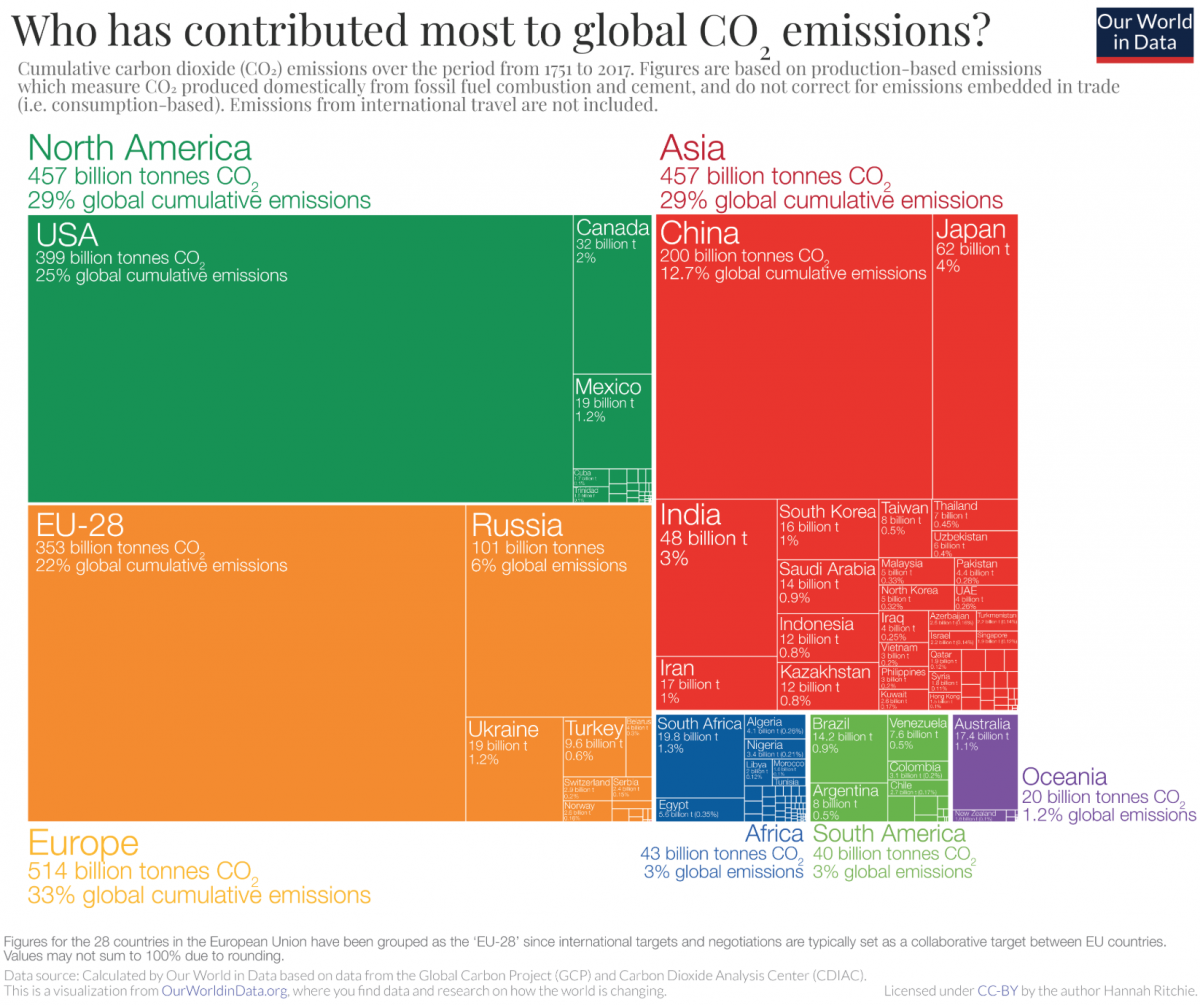
Treemaps can be used to visualize proportions and categories by size and color. By the size of the rectangles, this treemap shows cumulative CO2 emissions from fossil fuels and cement per country from 1751 to 2017. It also visualizes the proportions of total emissions, which allows for a comparison of the cumulative emissions of different countries. Note that North America and Asia both had global cumulative emissions of 29%, and in the graph, the former is positioned horizontally whereas the latter is positioned vertically.
Different colors group countries by continents, or geographic region, in the case of Oceania. Note that the E.U. consists of 28 countries and is shown as one entity.
In the full article, Our World in Data visualized the data in other ways, including animated maps of cumulative CO2 emissions by individual countries and shares of global cumulative CO2 emissions over time.
Animated bar chart of carbon emissions by fossil fuel companies
Climate Accountability Institute researchers examined global carbon dioxide and methane emissions from fossil fuel companies. CAI graphed its findings in this animated bar chart “race,” using Flourish.
The graph shows the accumulation of carbon emissions in millions of tons from 1965 to 2017 for the top 12 companies with the most carbon emissions.
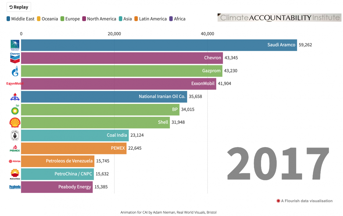
As reported in The Guardian, the lead CAI Carbon Majors researcher Robert Heede selected 1965 to be the starting year as that’s when company leaders and politicians were aware of the harmful environmental effects of burning fossil fuels. The Guardian visualized the same CAI data, but in a different way.
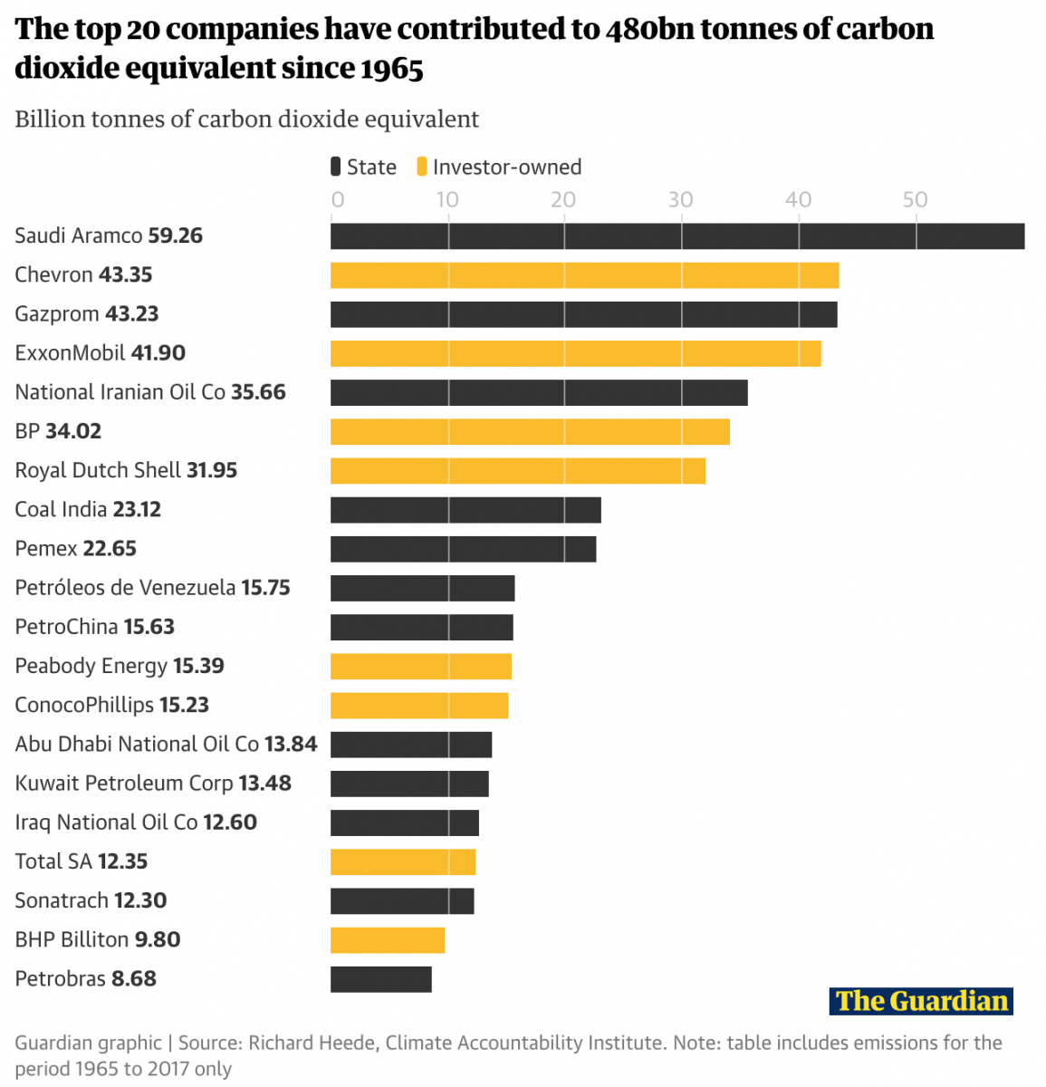
Unlike the animated CAI graph, which focuses on the visual accumulation of emissions over time, this bar graph is static for total emissions. It groups companies as either state- or investor-owned. Note that the carbon dioxide equivalents are shown in billions of tons, instead of millions of tons.
The graph shows the top 20 companies with the greatest cumulative energy-related carbon dioxide and methane emissions, which total to over a third of all such emissions from 1965 to 2017. The Guardian also reached out to these companies, and 8 companies responded with statements about whether they have plans to reduce carbon emissions.
According to a report by Politico, Heede’s research was part of the emerging field of attribution science, in which scientific research is used to analyze and assign blame for climate change. This research has also led to legal action. Several state and local governments have filed lawsuits against fossil fuel companies. InsideClimate News has a timeline of major U.S. climate change lawsuits that is regularly updated.
An interactive map of CO2 emissions from transportation sources
The New York Times published an interactive map of carbon dioxide emissions from road vehicle transportation in major U.S. cities. For this map, the Times analyzed CO2 emissions data from Boston University’s Database of Roadside Transportation Emissions and city population statistics from the National Institutes of Health and the U.S. Census Bureau.

As shown above, with Boston, the selection of a metro area will show the percent changes in total emissions and emissions per person between 1990 and 2017. The extent of CO2 emissions in 2017 is visualized along color gradient roads.
In the full article, the Times also visualized Environmental Protection Agency emissions data by transportation type, and a scrolling line graph provides more detail on total on-road CO2 emissions between several cities, including the selected city from this interactive map.
For more on the behind-the-scenes of this map, check out this Storybench interview of Times reporter and graphic editor Nadja Popovich.
A bar chart of changes in global emissions by sector
On the topic of transportation, The Guardian reported on data from the International Energy Agency, which determined that following global carbon emissions from power, the second leading source of emissions was from SUVs.
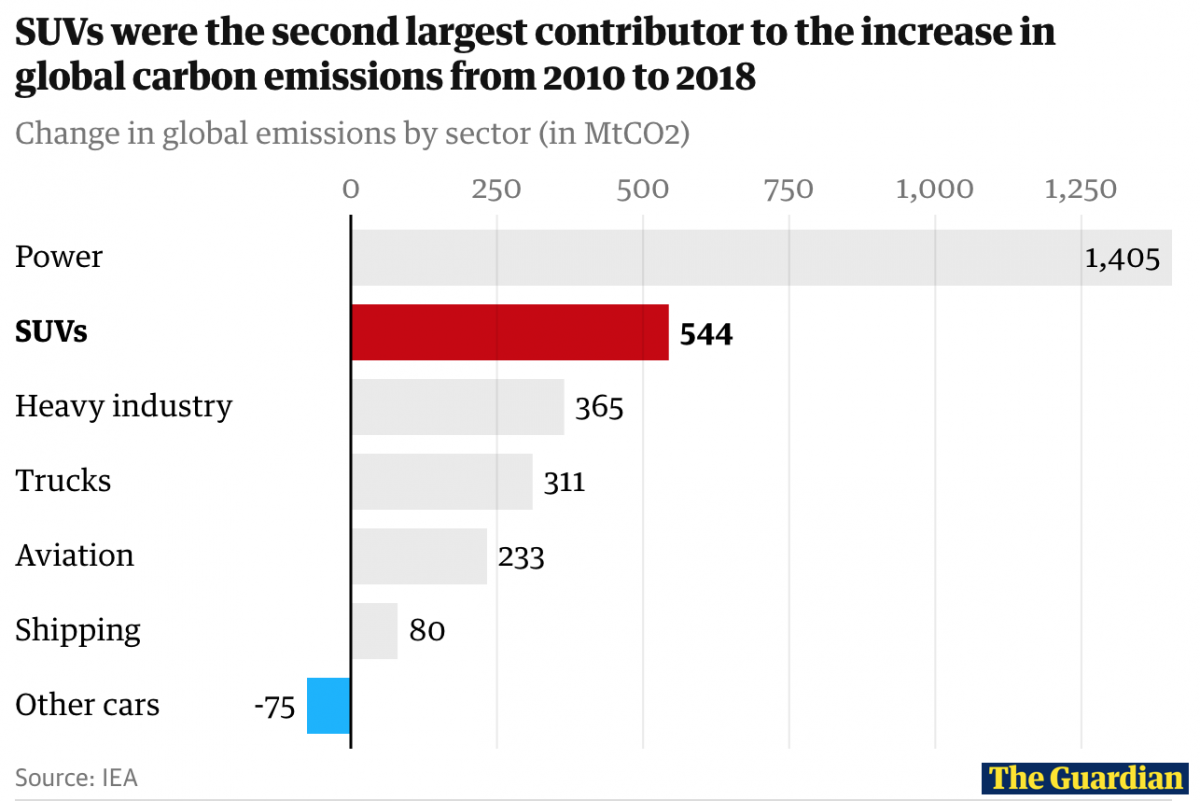
The bar graph shows the change in global carbon emissions in metric tons of carbon dioxide (MtCO2) by different sectors, from 2010 to 2018. The change for SUVs is compared to that of other cars, as highlighted in the graph.
In the full article, The Guardian provided a visual of the growing annual sales of SUVs and a waffle chart of the number of SUVs sold in 2018, of all cars sold per country.
Other resources about CO2 emissions and related climate change news:
- “Climate Change: Atmospheric Carbon Dioxide,” by Climate.gov of the National Oceanic and Atmospheric Administration
- “The Causes of Climate Change,” by NASA
- “Why Half a Degree of Global Warming Is a Big Deal,” by The New York Times
- “Climate Summit Pledges Fall Short, as Big Emitters Skip ‘Honest Appraisal,’” by Reuters
- “More Than 60 Countries Say They’ll Zero Out Carbon Emissions. The Catch? They’re Not the Big Emitters.” by The New York Times
- “Despite Their Promises, Giant Energy Companies Burn Away Vast Amounts of Natural Gas,” by The New York Times
- “Global Energy Growth Is Outpacing Decarbonization” by Global Carbon Project
- Behind the scenes at ‘How to Save a Planet,’ a climate solutions podcast - January 29, 2021
- How the podcast ‘Science Vs’ investigated a 1971 virus conspiracy - January 11, 2021
- How The New York Times visualized racist historical redlining and urban heat - September 17, 2020