How The New York Times broke down the history of the NYC subway map
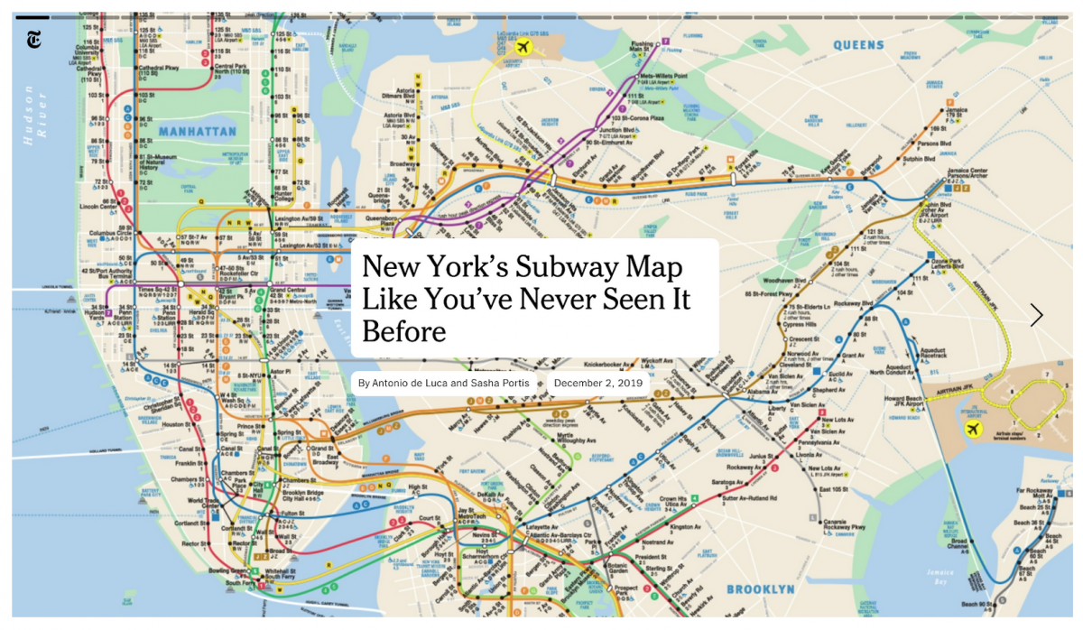
For the 40th anniversary of the New York City subway map, The New York Times created an interactive story that all but places you directly inside the map. Using a click-through format, the story follows the lines of the subway with animation and provides background on certain aspects of the map’s development and past.
All beginning with a behemoth PDF file, Times designers Antonio De Luca and Sasha Portis led the effort to dissect the map and walk readers through it. “There’s a huge history about how this map actually came to be in the political sphere, and we wanted to remove that.” said De Luca on the team’s decision to keep the story focused on design.
Storybench spoke with De Luca and Portis about their process and how they, as designers, called attention to a map that New Yorkers often take for granted.
Tell me about your roles on the project.
De Luca: It’s about a year in the making, to be honest. I mean, really, the work was done between Sasha and I—about 95% of the work we shared equally. The additional contributors were there because they’ve been sort of helping with small bits of the project throughout the year. For instance, Eden [Weingart] helped with establishing a little bit of the movement at the beginning.
So I had this idea of swiping the map. I had a large JPG on my phone, and I was just moving it around with my thumb, you know how you would inspect a large photo. And I was like, “Oh, it’s kind of cool if it was to move like this,” and then Eden sort of simulated that direction. I had it hosted at the beginning on my YouTube channel, privately, and I would share that link with a password to certain people internally to sell the story like, “Hey, I want to do a story like this.” And about halfway through the year, Sasha joined the team.
I presented it to Sasha saying, “I have this story, and no one’s really down to do it because I don’t think they quite understand what we want to do with it. Do you want to work on it?”
I was collecting and reading a lot of material—mostly about the drama around the map and about who created it, who is sort of fighting for the credit? The praise really went to [Massimo] Vignelli, but this map is is superior to Vignelli’s. So I don’t think it actually got the credit it deserves.
Ed. note: Massimo Vignelli designed the previous subway map that the current one replaced in 1979.
Portis: And it ended up being the longest lasting map of any by far—any New York City subway map. And it sort of came right in a moment where design was hugely changing, so it’s grounded in an interesting moment and now it’s continuing to change.
De Luca: Based on these sort of fragmented ideas, I just tried to draw on as many people as possible, and thus crediting their large input or small input into the story. This place usually works like that saying “it takes a village.” It really does. To make something good, and to be seen, the chances of having a bunch of people behind that project is pretty high, regardless of how much input they gave.
Portis: We were using a tool to tell the story in the simple clickthrough format, which is generally meant to host images. We were using it with basically a giant video, cutting it into parts to click through, and that was just not exactly how the tool’s meant to be used. So we had to do some funny workarounds.
De Luca: Yeah, we abstracted that tool. Internally they’ve never done this before, and Sasha developed an entire workflow and integrated a lot of code into the tool that was actually not there. So it really is a first for the Times.
What was it like assembling this “village?”
Portis: Some of the people on the list helped just in the last three days, or even the last day when we’re trying to finally launch it, and suddenly these videos were pixelated. We needed to adjust the tool specifically for the story so that, when it went live, the bit-rate would be higher. The piece would have been ruined if we hadn’t fixed that.
I think one day I was one of the few people left in the office. It was the holiday. And then it was like okay, Scott [Blumenthal]’s here. He’s the head of the task pool and he totally helped figure that out. Then Eden was way earlier in the project, but again, she came up with a huge part of it which was following the actual lines. And even technically how to do that: she showed me this really obscure technique that was like 10 steps and I had to repeat it over and over again. Then there were other people technically helping. So it wasn’t like we were all working together. It was like they were contributing at different times.
De Luca: It’s a little bit like a Kanye West album, where there’s a lot of different contributors and then at the end of the day, we sort of assemble all of their contributions—big or small—or take their lead or suggestion.
But it really started off with this map and dissecting this map, because the MTA map—the PDF/Illustrator file—is a monster. Thousands and thousands of layers. So I gave it to Jason Fujikuni who spent months just organizing all the different layers into folders, all the separate elements. It was painful, but then with that we could begin extracting paths in AfterEffects.
Portis: The act of him organizing the file led to the idea of animating the paths in the beginning, like the first intro animation. And then also just people pointing things out. If I’d start a conversation about the map when I was deep into looking at it, I’d start talking to people just anywhere, and I’d be like, “Oh, did you notice that blah dee blah?” and then everyone would have a different observation about the current map. What’s there, what’s not there—funny quirks about it.
De Luca: And then also, a lot of the time, you’re fending off a lot of input as well. They’re suggesting certain people should write it, certain people should edit it or produce it, or it should be published in this particular section of the Times. And my job really is about just making sure there’s still that space that the idea originated from. That space is the most important space to protect. So we were adamant that it should animate like this, we were adamant that we should write it, you know, spending a year just researching on these details—the very obscure details that, in fact, not too many people know, took a lot of time. And just to simply do all the research and do all the hard work for somewhere else. We were really conscious about that.
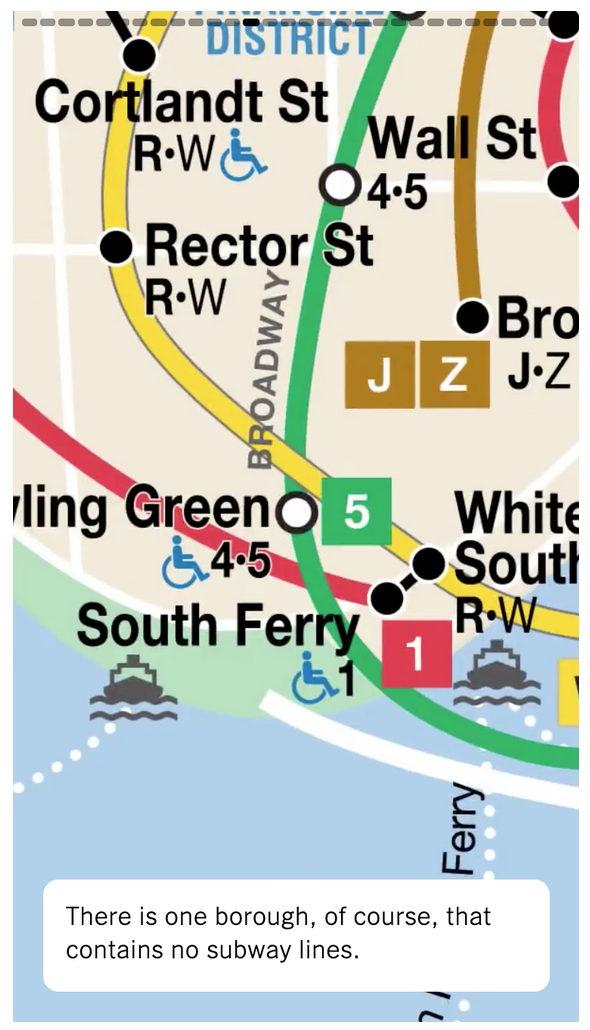
Portis: We’re not showing anything else but the current map in the story. We didn’t want to cut. So we had all these moments like, “Should we show the Vignelli map? Should we show photos?”
De Luca: There’s a huge history about how this map actually came to be in the political sphere, and we wanted to remove that. That’s a different type of story. Maybe there’s plans to write that story, because we’re getting a lot of social feedback, and we want more, so we’re considering doing another iteration of this. That perhaps might be just a story—a written reporting type of piece.
But we as designers, and teachers, art directors, developers, we said to ourselves, “let’s try to just keep it as a design story,” and sort of ward off the tendencies of making this a little bit more than a design story. And that was the hardest part because there’s a lot of temptation. People love drama. They worry that design speech will not attract readers, but in fact I think a lot of people are very interested in reading about design. I mean we’re surrounded by it every day now, and I think we’ve managed to realize the importance of design in our lives, and we can begin articulating why and how it came to be.
There are so many directions that you could’ve gone into. It definitely felt very intentional to focus just on the map.
De Luca: Writing for a general audience is a lot different than writing for a very aware audience because there’s clearly that public, and we respect them highly, that has come out to participate in the discourse of what we managed to do. And by no means are we experts. We’re really relying on on all these people in this community to provide us the information. I mean, we’re reporting here. We’re just trying to uncover things that perhaps the majority of people don’t know.
Portis: Some of the reporting was just literally looking and counting, “How many buildings are marked in this font?” and just factually, there’s no right or wrong answer. You just go, “There are there are this many on Staten Island, this many on Manhattan, this is how many colors are used.” Those things are just self-evident. I counted how many different font styles there are. We don’t know the exact number, but it was over 20. You just count them and there’s the answer.
So going back to the video/map, that’s all from a PDF that you then broke down into layers?
De Luca: Yes. It’s a PDF, vector-based obviously, and then all brought into layers—thousands of them that are then put into sub-folders. For instance, the 123-line would be broken down into the train itself, the labels themselves meaning the stops, the street names, etc. Each one was targeted that way, so when we were animating it we could begin targeting those levels of information. And should we begin from the water and build upwards? Or should we begin with the train and work downwards, etc. It allowed us to begin deciding which levels of information to play with.
And this PDF is accessible to anyone?
De Luca: Yeah, but of course we got license to do it from the MTA, we met with them. Emma [G. Fitzsimmons], that’s her beat: the MTA; she really did a lot of work meeting with the MTA and talking about the story’s coming, because we, meaning the public, have been so critical about the MTA over the years, about the L train. It’s the 40th anniversary of this map. That was that was the incarnation of this.
The layers of the map and the details, all of that allowed us to begin the storytelling. Separating the map, that was a really big revelation—that we should begin targeting different spots.
Portis: It was also interesting because we were writing and designing. It was like a puzzle: writing the piece, figuring out which points to animate to that actually connected without too much time or transfers, and then we had to hit all the boroughs. It was like a crazy puzzle writing to the map, and then mapping the path following that writing and vice versa.
De Luca: Yeah, and when we wrote the piece, we wrote the piece sort of like a through piece. But then when we started to extract those points and place it into that interactive experience, we realized that the writing needed to change, because it didn’t really complement the way one would either be prepared to take the journey and/or anticipate the information if you were to stop. The language just wasn’t correct. So we had to somewhat write to fit the interactive experience, and we only realized that when we started to place the text into our interactive. Should we service the information before the journey of each stop? Should it come after? Should it be foreshadowing something that you might see in a couple stops?
It sounds like you went back and forth between the original map idea, and then writing out the story until you found the right fit.
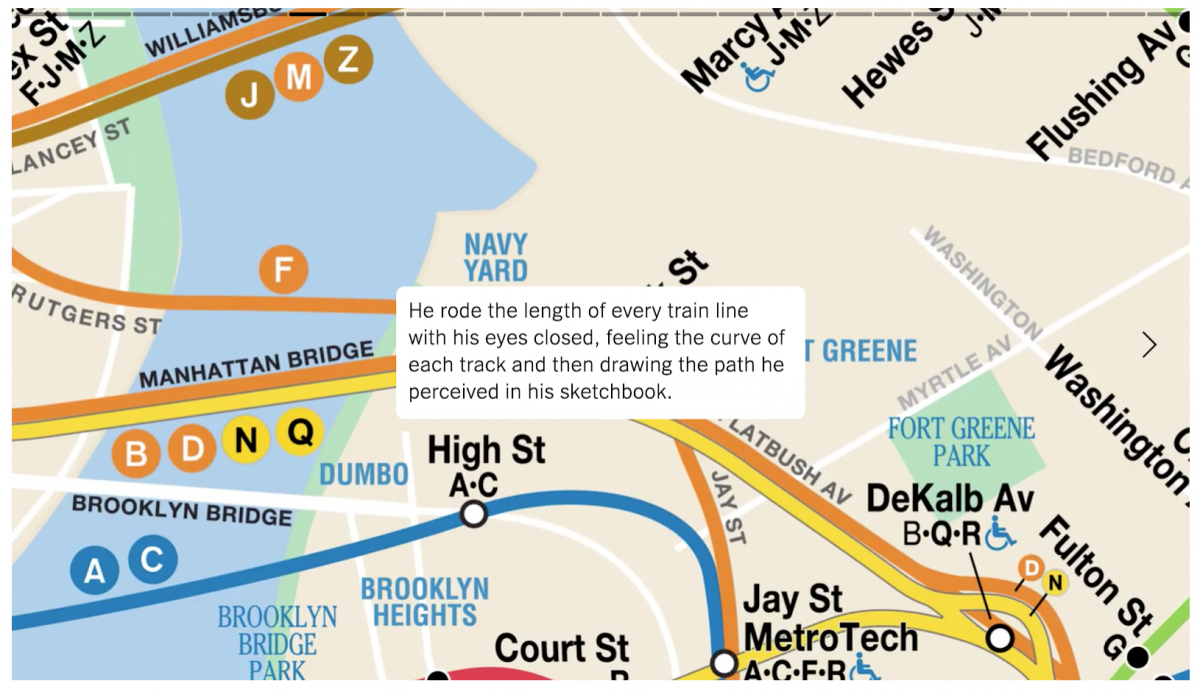
De Luca: Yeah. Originally, I did a screen recording of me moving around a JPEG on my phone. This device is just a small little window into our lives. We end up condensing photography to fit our our mobile screens, and it’s much more interesting if you enact a sensation of discoverability and/or anticipation. I mean, there’s a lot going on in this interactive, a lot of equations that we apply to it. It’s not just simple… like there’s a bit of a carrot that we place, even in the language. Moving to Staten Island, which was a really great feeling: that you would allude to something and then for your reward, you would actually have to tap forward to see it.
How do you gauge how people will respond to these less traditional styles of storytelling?
Portis: Well first, we have to be really excited about it. So if we’re excited, there’s probably other people who will respond well. And just sharing it with colleagues.
De Luca: Once people saw it—the movement—they were like, “Oh, my gosh, that’s really cool,” and then I think it was much easier to have them be a part of it to contribute. In doing so, we thought that there is attraction to this. There’s something. But we didn’t think that it was going to do as well as… well, I mean at least I didn’t.
We tend not to make things based on how well they do. We tend to make things based on “this is a new technique that’s never been done internally.” Pivoting—this is a huge institution—if we can pivot it one degree to the left or right, that’s massive. Because if it’s like a metaphor, it’s like a ship. If the ship gets pivoted one degree to the right, it might not be that big of a deal at that moment, but 100 miles later it’s completely on a different direction.
What what were each of your favorite parts about working on this project?
De Luca: I mean, there’s two points. One for me: working with Sasha was probably my favorite thing about this. It was so great because as graphic designers, we were designing this language. How we could actually, you know… this is part of our degrees. So to begin playing in this spectrum for an institution, I find that very rewarding. And also the movement of the first iteration of Nobu [Siraisi]’s journey from the top of the A-Line moving down, I think that’s my favorite feeling. It’s quite rewarding for me to see it begin.
Portis: For me, looking incredibly studiously at the map. Every time I’d ride the train, while we were in the depths of this project, I was just looking at the map while I was waiting to arrive somewhere. And that was totally fun to see the map in a completely new way—which is the title, the printed version anyways: “The Subway Map as You’ve Never Seen It Before.” And to look really closely at something that we often take for granted. And then also writing it, and similarly becoming super sensitive to language and how to say something as clearly as possible, while also allowing for some moments of metaphor or poetic description. And saying it concisely because we literally didn’t want the text to take up too much room and not feel like a slog to get through, but also trying to have a lot of information in as few words as possible. It’s like a fun puzzle.
- How The New York Times broke down the history of the NYC subway map - December 23, 2019


