How the New York Times visualized auto carbon emissions in the U.S. and your city
When data visualization guru Alberto Cairo visited Northeastern University in October, he said data visualization is not so much about simplifying a complex issue or set of information. Rather, it’s all about clarifying.
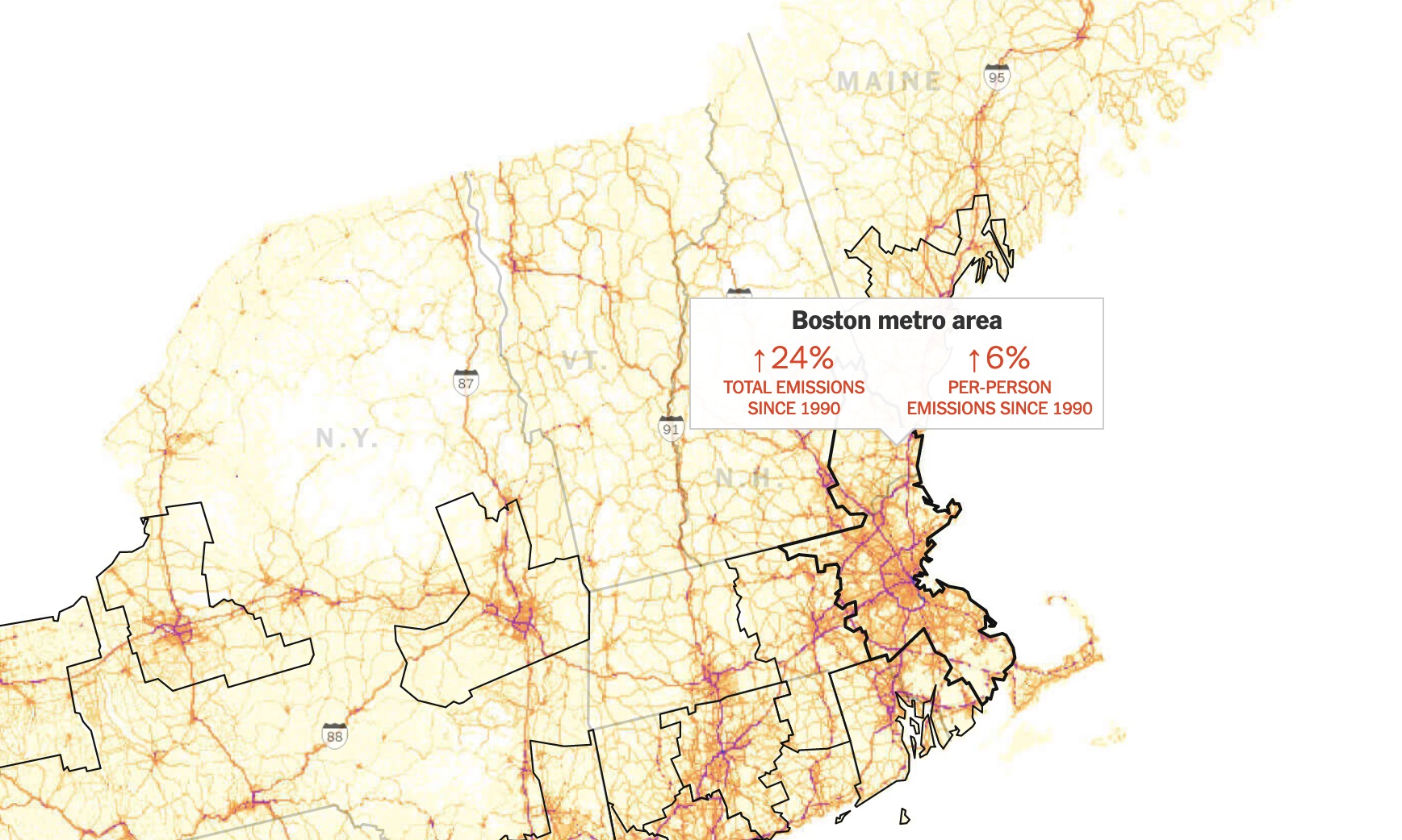
A recent New York Times piece, “The Most Detailed Map of Auto Emissions in America,” does precisely that. Using Boston University’s Database of Road Transportation Emissions, visual journalists Nadja Popovich and Denise Lu built a detailed map showing on-road average carbon emission estimates across the country. Popovich and Lu combined this with census data to better understand the level of carbon emissions on the per capita level, revealing some telling trends about how the characteristics of a metro region ties into the amount of carbon emitted there.
In addition to the deeply detailed map, which is interesting to explore in itself, the story goes several steps farther. Graphics lower in the story show how on-road emissions fluctuated in the last 30 years. But the rates of increasing (and in some cases decreasing) emissions varying between regions.
Popovich, the graphics editor for the Times’ climate team, recently spoke with Storybench about the project. Before reading on, we recommend checking out the story if you haven’t already.
How does data and using different visualizations help tell the story of climate change?
Climate change is a subject that often feels important to people and yet at the same time very abstract. For many people, it can feel kind of far away in both time and space. I think data and graphics have a really powerful role to play in helping bridge that gap.
Most fundamentally, graphics show people all of the data that is coming out of climate science and is related to climate science. One thing that is especially powerful with online graphics is that we can go this extra step: We can take these big datasets that might otherwise remain a little bit abstract and zoom in.
Like, if you’re talking about global temperature change on average over time … we’re talking about this big average over long periods of time, over the entire globe. But instead, last year, we did this project to help localize that idea to individuals. So you could put in what we were calling your hometown – you would put in your location or whatever location you wanted – and we would show you what happens in that grid cell itself, as opposed to ‘Here’s how global temperatures or regional temperatures will change over time.’ And I think that’s really powerful. It’s something that I’ve tried to replicate in my work: Making this very high-level topic, a little bit more specific for our audience.
I want to ask about how you localized this project, but first can you tell me where the idea came from or how you came across the data from Boston University?
It was really interesting just thinking about how to help people understand a little bit more about where the emissions that are warming our planet are coming from. One of the most basic ways you can know this is by looking at the EPA, which publishes this data, and the EIA does as well, on sector by sector emissions: From the electric power sector, from the transportation sector, from industry, agriculture, et cetera.
Last year I focused on the electric sector, and I wanted to then take a look at this other big sector (transportation). The really interesting thing to me was that even as emissions have actually fallen from electric power generation, we’re seeing transportation kind of plateau and start back up. And, of course, that’s at a time when scientists are saying that the curve should be bending the other way if we want to avoid the worst effects of climate change.
Once I decided to focus on transportation, I dug into the data from the EPA that is featured in our piece that shows the overall trend for transportation. If you break it down, freight trucks (23% of emissions) and passenger vehicles (60%) actually make up the bulk of those emissions. They add up to 83% together. Once I knew that, I really wanted to focus on driving.
I found this dataset from these researchers at Boston University, actually through another source who recommended it. Initially, they had this data set out that was only through 2012. I decided to just reach out to the researchers anyway, just to see if it’s possible that they have updated it. And it was this amazing coincidence where they said, “Oh yeah, we actually did just update it as part of this other larger project.” They ended up finalizing this data through 2017 using the same methods they had initially published in a 2015 paper. And we used that data to show this big map at the top of the piece, which shows emissions from our cars and trucks coming from every road in America in 2017.
What kind of analysis did you do with the data, and how did you expand on what the BU researchers had started?
We ended up doing a lot more analysis on it because we didn’t just want to show a map. We also wanted to extract some more meaning from this map for people. I think it’s interesting to take a look at this map, especially up close, the way that we were able to show it here, because I think it really makes an issue that is often quite invisible – CO2 emissions aren’t something we can actually see with our eyes – literally visible. You’re seeing, “Oh, right, these emissions come from our roads and you can see these roads traversing America in these maps.”
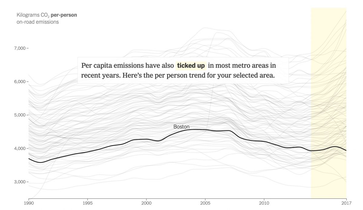
The next step is where we had to write a bunch of analysis of our own because we didn’t just want to show people, “Here are emissions on the road. The end.” We wanted to tell them something about what’s going on with those emissions. And in their initial paper that was published in 2015, these researchers from Boston University, Connor Gately and Lucy Hutyra, identified that much of the rise in emissions has happened in urban areas, so in cities and their suburbs. We wanted to see if that was still the case. What we ended up doing — me and my graphics department colleague Denise Lu — we ran some analysis on this data, looking at all U.S. metro areas. And we did find that, yes, emissions were still rising fastest in those places through 2017.
We also wanted to show, okay, so emissions are rising but how much of that is due to population changing? How much of that is due to the fact that people are driving more and they’re buying bigger cars that emit more? We also wanted to run this analysis per capita, so Denise ended up pulling data from the U.S. Census and the National Institutes of Health, and using that for the counties within each metro area. By combining that with this map data from Boston University, we were able to find estimates of how much total emissions have increased, but also how much they’ve increased per person over the duration of this dataset. That is what ran both as part of the top of the map – when you hover on it it gives you a little bit of information – and it was also reflected in the time-series trend that we have lower down in the piece.
The research team at BU produced its own map with its data, but the one you and Ms. Lu created seems far more comprehensive to the average news reader. What methods did you use?
We spent a really long time determining what we thought would be the best way to display this data. We came up with a completely different color scale than what the researchers used, and then we also added all the nice details, like adding labels and locations and that sort of thing. Beyond that, we also had to run analysis over those rasters, and it was really helpful because the Boston University researchers sent us this data in two ways to both rasters and also files that were aggregated to the census track level. We ran our analysis over both data formats, just to make sure that they were equaling out in order to get the total emissions numbers from metro areas.
This map includes 100 individual metro regions. How did you organize this?
We’re using the 2017 boundaries from the U.S. Census for the metro area. We first ran this analysis using all the U.S. metro areas, and there’s more than 300 of them. We ended up tracking the top 100, A) because the majority of emissions actually does come from the 100 largest metro areas, and B) because per capita trends started getting a little bit wonkier once you got much lower populations. So we thought 100 was a nice neat cut off for what we were going to show people and that would cover a substantial proportion of the U.S. population.
We decided to focus on it this way because it allows us to show people some of the most important trends that are reflected in the data, like the New York versus Dallas-Fort Worth (lines highlighted lower in the piece). But also, it really does reflect that in most of these high emissions areas, emissions are going up and they’re going up in both total and per capita.
When you open up this story, the map immediately zooms in on the region that you are in or near, creating a localized experience for the reader. How did you make this work and why was it important to emphasize local?
We thought all the areas had a certain story to tell that was really interesting. So we didn’t want to just come off with, you know, everyone gets New York and then look up your own if you want to, when we already have the power to locate people themselves, at least as close as we can. This is one of the really powerful things about being able to tell these stories online, which is that we can use these extra tools available to us to tell them in even more personal ways. So what we’re doing here basically is just figuring out where your IP is coming from. It’s very rough, we don’t know your exact location. But for the most part, I think it covers people in the metro region where they are, and then we give you the option to choose another metro. I really liked this approach because why show people the story of another place when you actually have the power to show them the story of their own place? That might provide a much more immediate connection to the overall point you’re trying to make.
There is an interactive time-series chart that first measures total on-road emissions for each metro area from 1990 to 2017. Explanation text glides across the graph, which then pivots to a different view showing per capita on-road emissions, further providing context and understanding to the nuances of this data. How did you build these charts and incorporate the text to make this a more comprehensive viewing experience for the user?
It’s built using D3, and we have a scrolling library that we use at the Times that was built by another colleague, Josh Williams. The charts themselves trigger changes in D3. The scroller is that kind of thing we come back to often when we do want to focus on one single data set and then show change throughout it or highlight different parts of it because you have that object permanence with the background. But then we are able to highlight, “Oh, maybe in this jumble of lines you don’t notice this trend. Well, let us tell you something interesting about it.” So kind of helping people by walking them through, helping them understand what the data really means.
Finally, what advice might you have for other journalists or students trying to build similar visualizations or are trying to break into data and visual journalism?
I want to make graphics that really resonate with people. If that is your goal as a visual journalist, something to think through is just how you can tie data back to a more human experience. To kind of go past the dataset as a dataset and reveal the humanity of it. I think one way that you can do that is by zooming into it in this way. You suddenly don’t just see, “Oh, this line of emissions has gone up.” We set out for a more personal view that says, “You know, you can actually see the roads that you might be driving on every day. That’s where the emissions are coming from.” It ties it back to a much more human experience and makes the data less abstract. Thinking a lot more through how to tie (the data) back to human-lived experiences is something that is really important and really we found resonates with readership.
- Join Us Soon! Computation + Journalism Conference: Data Journalism in an Expanded Field - January 12, 2021
- How the New York Times visualized auto carbon emissions in the U.S. and your city - November 1, 2019
- “Don’t assume that anything’s irrelevant. Trust yourself.” - September 28, 2019