For information designer Tiziana Alocci, it’s all about the process
When Tiziana Alocci sits down to work on a design, she doesn’t start by thinking about the end product. Instead, she begins with the data, the message it all conveys and the discovery that’ll come through the design process.
Alocci, an information designer and data artist based in London, creates robust visualizations centered around everything from data sonification and pop culture to science. Her work, which has been commissioned by Google and the BBC, among others, is meticulously detailed yet graphically beautiful.
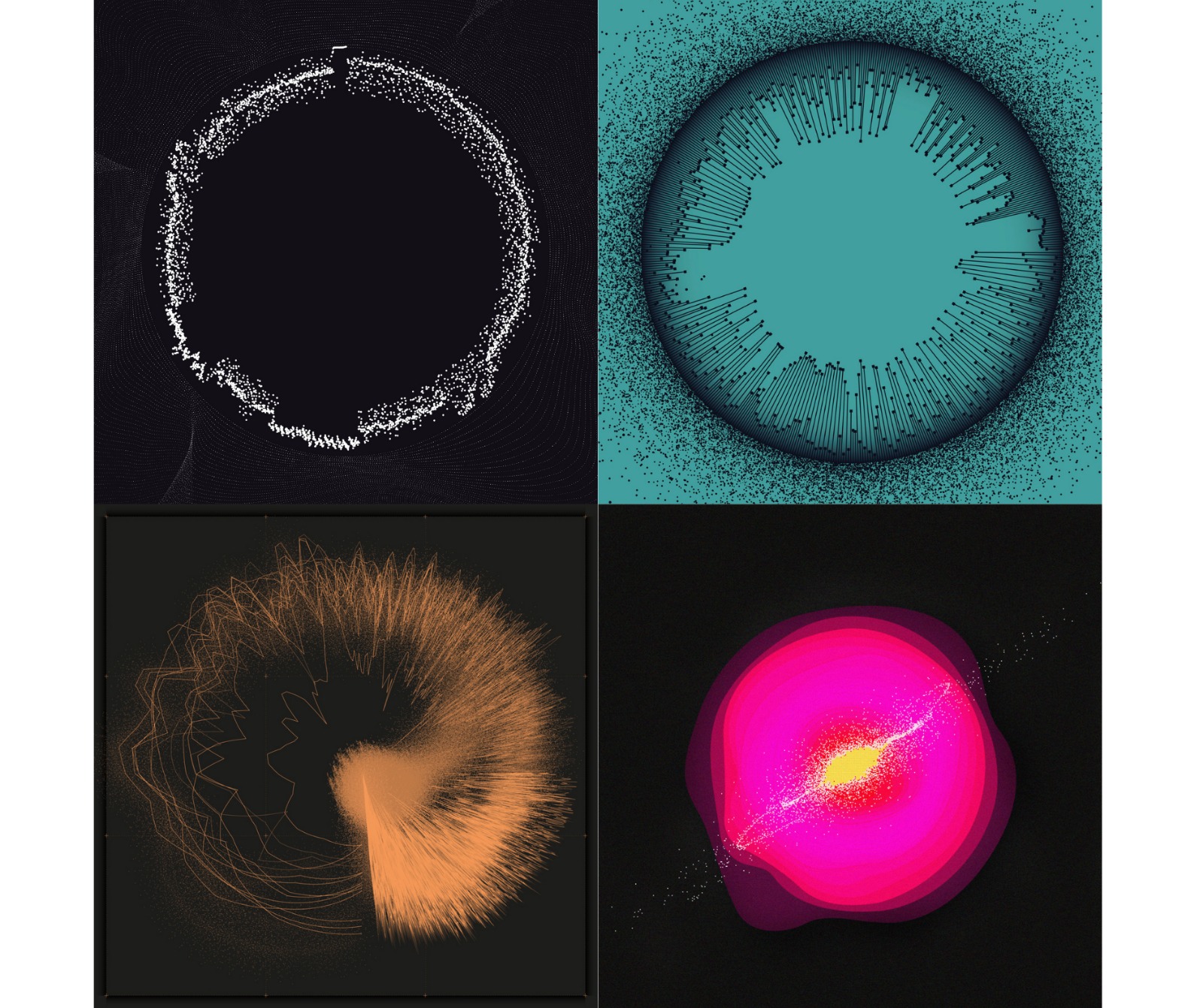
Particularly intrigued by the intersection of electronic music and data viz, Alocci’s most recent work focuses on developing pixel-perfect visualizations of sound. She breaks down the waveform data from songs and visualizes organic art for album covers.

Alocci is also interested in the emotional limits of data — and wants viewers to come away from her pieces having felt some part of the process.
“The best part of this kind of work is the mental snapshot of the emotion arising from a specific song or a specific sound,” said Alocci, who is also an associate lecturer at the University of the Arts London. “That’s what I’d like the viewers to have, a little piece of me visualized.”
Storybench recently spoke to Alocci about the importance of process, the artistic side of data, and the hope for a data-literate future.
How did you first get interested in information design? What makes data visualization and design special for you?
It was a series of happy accidents. I have a background in industrial design and I had just graduated with my B.A. I got in touch with someone [who] was talking about information design and this new course at Milan Polytechnic University. I applied and ended up graduating with a communication design master of science, which was solely dedicated to data visualization and information design. That was 2013.
I found information design close to everything I do, probably because of my background in industrial design, where everything I design [has] a very strong function. It’s all about finding the balance between form and function. I think information design and data visualization really does that job. So everything, every design element, every graphical element that there is on a canvas, on an artwork is there for a specific reason and has a specific function.
Tell me about your design process — where do you start? How do you develop your ideas?
Everything I design needs to have a very strong reason to exist so that it’s really linked to the story that I’m trying to tell or the emotional value behind the data that I’m trying to visualize. My production is split into different streams. I do commissioned work for agencies, startups and brands, and then there is all the other work that I do on my own which is more linked to data art.
But everything has a very strong conceptual origin. I always say that everything that I do data visualization-wise is at the intersection of conceptual art, process art, and ultimately information design. The story, the message, all the value linked to the story and the data that I visualize are the starting point.
Once I nail that and I know the message and what I want to visualize, I work through a specific creative process which is made up of four different steps. It’s very linear and precise, although it has a kind of degree of freedom and flexibility as design is a kind of organic and flexible discipline. That proved to be very, very good, especially when working with clients, especially against a deadline or when the project is quite complex. It’s good to rely on a structure because working with data is a complex discipline. It’s not something that is purely based on aesthetics. You have the message of the data, plus a lot of other rules that you have to take in consideration.
Could you walk me through those steps?
It’s made up of four different phases, and these are split into two macro areas. It takes the structure of the double diamond, which is actually a type of diagram that’s used a lot, especially in service design. We have these two diamonds and the first one, the first part is linked to analysis, and the first phase is called [the] discovery phase, where I usually try to understand the problem that I’m trying to solve, the message that I want to tell, and I start to do preliminary research. Then it’s followed by another phase called define. Let’s say I gather all the materials to cook a meal and I start to write down the recipe — the method for actually making the meal, measuring ingredients and things like that. I do the same with the materials that I have, the data that I have.
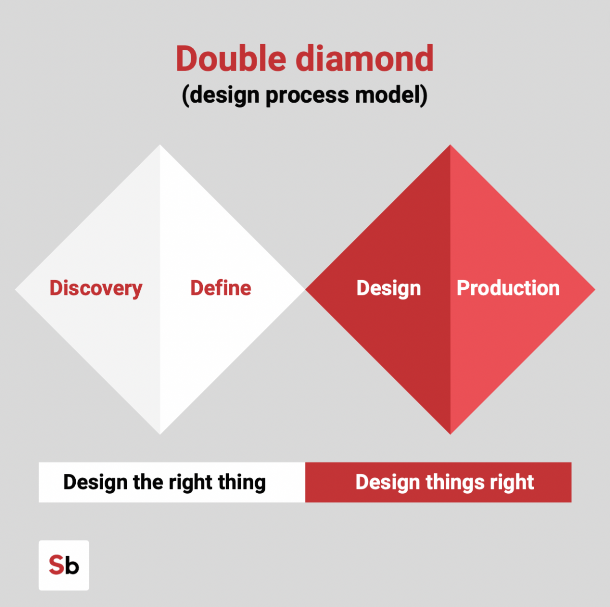
The second diamond covers production, which is more visual and experimental. The first part is called design. During that phase, I explore visual mediums. That doesn’t mean I’m going to land on the final shape, it’s just exploring colors, typography, shapes, visual analogies and the best way to convey the message.
The very last part is called production. It’s where I put everything together, where I’m going to fine-tune all the details and make everything pixel perfect. But that’s just 20 percent of the process. I usually say that the core of what I do is research and sketching, which takes up five to 80 percent of every work I do. The final 20 percent is where I actually make things look pretty. It’s much more about research and investigation analysis and research again.
A lot of your recent work is centered around translating audio into visuals. Where do you get ideas for these pieces? Is this more client-based work or is it personal?
It’s a combination of both. I work a lot for agency studios and newspapers on editorial infographics, so everything that is led by a strong story wins the game with me. Lately, I’m exploring more of not only the emotional side. I’m embarking on this very personal journey to visualize data linked to different mediums because we all think data is just numbers in a spreadsheet. But data is literally everything that can be countable and visualizable.
I play a lot with unstructured data and quantitative data. Sound is one of them. It started as commissioned work for a record label in Berlin. For two and a half years, I visualized the songs of a DJ’s electronic music for their album cover. Now, I’m starting something more conceptual, which is based on visualizing sounds produced in this complicated data sonification. The actual visualization of the song, which is not as abstract as generative art, could be based just on variables and numbers, so the literal one-to-one translation is playing with frequency spectrum and other variables linked to the specific sound class. This is part of a new production that I’m going to release next.
What types of software do you use?
It depends on which kind of output I like to achieve, which most of the time is completely unknown. I enjoy the process more than the final artwork. In an ideal world, a final visualization wouldn’t even exist to me. It’s all about the steps in between — what I learn, what I feel when I make those things. That’s why I document everything I do, taking lots of pictures, photos and videos.
The final shape is usually a combination of different mediums. Sometimes, I play with lines of code, sometimes I use software for audio manipulation, sometimes it’s just as easy as playing with a waveform and applying some filters in [Adobe] Illustrator. But the process is very manual; it takes a lot of time. My laptop crashes every time because the files are huge and the graphics are physically impossible to move. But that’s what I enjoy — the time that I take to craft them and changing the shape, playing with colors and things like that.
For a few of your projects like the Invasive Alien Species project, you’ve hand-drawn the design details, which brings another element to the piece. What role do you think good design plays in good data visualization?
I don’t like to define myself as a data visualizer or an information designer; I’m much more of a communicator. I communicate using data because it suits the way my brain thinks. Graphic design and the aesthetic component is very important, and we understand that sometimes that’s linked to embellishment, but things need to look balanced — not beautiful — but balanced and harmonious and organic.
Sometimes, that is achieved by playing and fine-tuning with some aesthetic elements. There is nothing wrong in making something look beautiful if it helps to convey the message and communicate the data better.

Information design condenses huge datasets into digestible, beautiful graphs, which can feel daunting. When you’re looking at big data sets, how do you dive in?
It’s definitely daunting, especially because we are managing two worlds which are very different — statistics and creative graphic design. That’s two things that usually don’t stay together. But why not? My idea is to approach things step by step. Having the story, the focus, the message very clear in your mind. What’s your concept? What do you want to do? Then you use the data either to support that theory, that story, or to debunk myth.
Data can be complex, it can be scary. Approaching big, scary, ugly datasets can be like that overwhelming feeling when you are in a grocery store and you need to buy some food but you don’t know what to buy. You have plenty of choices, but you know what you like, what you don’t like, what you’re going to make. It’s pretty much the same approach. Of course, we play with data, so we have to be very ethical in our process and in the way that we communicate information and our message.
Sometimes fractioning a big data set in small chunks, or playing with filters, or deciding to focus on a small geographical area can lead to finding more stories. But remember, when you change at a scale, you change the story and you change the message, so you should always be mindful when you make these decisions.
How do you want viewers to feel when they see your audio visualizations?
I would like them to grasp the emotional side of it, to have a glimpse of my feelings and sensations when I was making that.
The best part of when I do this kind of work is the mental snapshot of the emotion arising from a specific song or sound. That’s what I’d like the viewers to have, like a little piece of me visualized, but that comes from something that’s not visual. It links to my idea to make every medium a little bit more accessible, like making music accessible to people who can hear music. It’s a very conceptual idea of making music tangible, something that you can touch, feel and see. That’s what I’d like the viewers to get: a different experience from a sound.
Information design and data viz has boomed, especially in the past few years, with COVID-19 charts and graphs and visualizations becoming part of the everyday news cycle and consumption. What do you think this means for the future of information design?
I think it’s much more positive for the entire society than for the world of data visualization. The more we normalize having facts reported based on official data, the more we can avoid fake news or miscommunication — but also the more we can educate the public to read charts and play with numbers. We are in a moment where, especially with COVID, charts, data, numbers, ratios — it’s very popular. It’s very mainstream. But what is not mainstream is the level of media literacy. It’s very confusing sometimes for the general public to have a proper, genuine understanding of what’s going on.
I really think and I really hope that all this conversation will push a higher interest in statistics and data literacy and, in general, math for the younger generation. When I was in high school, for example, mathematics was very overlooked because it was taught in a very old-school way. But if we make numbers relatable to shape, everything would be easier. I really liked geometry when I was in high school because it was a [form of] visual mathematics and I could relate to that.
Mathematics is still very abstract and very obscure for many. I really hope all this conversation will push more in improving data literacy, improving playing with numbers, understanding how numbers work and what they need.
- For information designer Tiziana Alocci, it’s all about the process - February 25, 2022