
Federica Fragapane on Using Minimalistic Shapes, Lines and Tree Branches to Convey Powerful Stories
Editor’s note: This is the second of two stories featuring information designer Federica Fragapane. This article focuses on design choices for her Hearts and Minds, Key Workers and The Stories Behind a Line projects, and maintaining harmony in data visualizations that accompany stories.
It’s no secret that political and media narratives influence public perception of world events, including immigration.
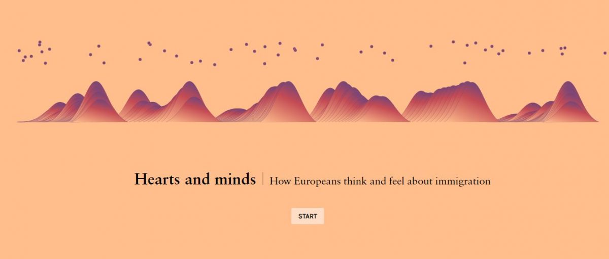
Hearts and Minds, a project co-visualized by Federica Fragapane and led by the Overseas Development Institute, or ODI, maps such narratives about refugees and other migrants in Europe with the goal of building empowerment and challenging power structures, as well as to convey nuanced public perspectives.
Fragapane’s other well-received projects, Key Workers and The Stories Behind a Line, also provide a visual narrative of migrants and their experiences.
“People don’t have a polarized view all the time, and their perception on migrants can change according to events,” said Fragapane. “But also according to how the media portray the topic in different moments during the years.”
Fragapane integrates data elegantly, allowing participants to see data visualization as not something “too far” from daily life. In utilizing few of the design tools to open the door for data embodiment, Fragapane is mindful in creating space for careful reflection of vulnerable emotions that may arise in the process.
Her organic use of visual shapes like “lines” or “branches,” helped her understand her interviewees on a deeper level and thus come up with the minimalistic yet engaging visualizations. Fragapane not only creates unique visual shapes, but acknowledges that visualizations of personal stories, especially those of hardships, have a few missed fragments.
“Imperfections in these projects are inevitable and I think that’s right,” she wrote.
The following conversation with Fragapane has been edited for brevity and clarity.
Since Hearts and Minds is an ongoing project, how did you factor in scalability in your design?
I’m a co-designer of this project, together with Alex Piacentini. [Scalability] is something that we took into consideration since the beginning. We thought about the layout and how the countries and the overall project can be explored, knowing that we will have more countries. We were thinking about something that can grow with time.
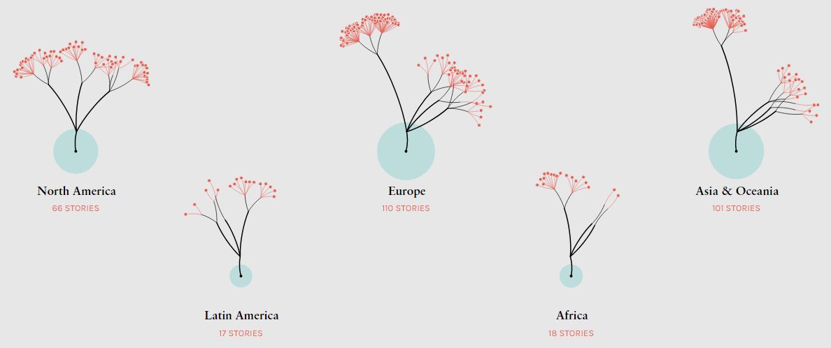
For the Key Workers project, was there a specific reason why you chose to visualize it as a tree with branches?
I was contacted by Marta Foresti from ODI in April 2020 and I started sketching a few ideas. The first draft was a world map and a few curved lines that were coming from an abstract point in the page on the screen. They were connected to the points where the stories were taking place, to their geographical locations.
The ODI team told me the problem with this draft was that the stories were coming from an abstract point. But, they are stories that come from within because they are coming from migrants who were already there, maybe for years. I started thinking about something that is rooted in something coming from within. This is why I started working on the tree concept, because these are contributions that are coming from the roots, something that is rooted in those countries or cities.
I also wanted to show something growing, the branches growing, the trees growing. What’s growing is not actually their contribution, but our awareness of their contribution. It is a contribution that has always been there, it is our awareness that changes.
Were you involved in dealing with the missing data? How did you factor that in the visualization?
The dataset is built by ODI’s researchers. We were aware [of a] few blank cells, so we focused on the information we had for every story. Then we decided that there are a few variables that are going to be shown just for a few stories.
We thought about an interface with few elements that could have been present or not, and this wouldn’t have affected the overall structure.
You used different shades of blue in The Stories Behind a Line to define the route taken by the asylum seekers arriving in Italy: longer the lines, harder the trip. How did you think of using a simplistic component like a line to explain the bigger picture?
The Stories Behind the Lines is a personal project. As soon as I decided I would like to tell the stories, I had the lines image.
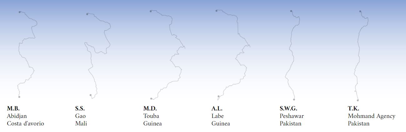
I had this idea because my boyfriend at work met a boy from Somalia. He shared his journey with my boyfriend about the [timeline of] migrating to Italy by crossing. I immediately had the ‘lines’ idea in mind.
Another huge impact was the storytelling and storytellers. I met the narrators and asked them about their journeys. The way they [narrated] their journey was extremely calm and rational, even if their stories were extremely painful. That really had an impact on the overall style. Even if I think that my project has a strong emotional component, I wanted to pay homage to their narrative style too.
You have a unique style of using different shapes for your stories. Tell us about your inspiration for your projects
Sometimes, [the shapes come] into my mind after I’ve done the research and looked for inspiration. I don’t always use visual methods first. I don’t force myself to use very clear metaphors if I think it doesn’t make sense or if I don’t find them.
I often use organic shapes, for many reasons. The most basic one is that I like organic shapes. I think that they can engage people more, and it is a way to invite them to my pieces without having something scary. When I work on graphics, I am in layers of information for many days. It is also a way for me to reflect on the non-neutral nature of data and on the data fragility.
A few years ago, I visualized data on violence against women [for] a personal project. I think it is important to communicate stories of violence against women but also be aware of the fact that there will be thousands of stories that are not being collected because there are many issues in collecting these datasets. Those numbers are fragile as they are collected from someone else because of the fact that they can tell stories but that they will be inevitably incorrect. Working on organic shapes helps me to consider this aspect.
How important do you think it is to maintain harmony when we are using visualization aspects in a story?
I think it is important. Most of my projects are exploratory, so I don’t want to prove a point. Having something that can be harmonious to see is important to engage people and help them reading [the piece].
It is very important as a designer to declare my human intervention. As I was mentioning, there is human intervention behind the data, but there is also human intervention behind the selection of certain datasets. When I work for a printed magazine, sometimes I don’t have enough space in the page that allows me to visualize all the world’s countries, for instance. So, I select top 50 countries according to this specific data. I think it is always important to declare it. I always write a short text describing not only what is happening on the page but also the selection process and the criteria behind selection.
- How investigative journalists followed the money in the Pandora Papers - March 4, 2022
- Federica Fragapane on Using Minimalistic Shapes, Lines and Tree Branches to Convey Powerful Stories - February 28, 2022
- Of Data, Theater and Healing: The Art of Federica Fragapane - February 21, 2022


