How a small data design company visualized the world’s scientific collaborations
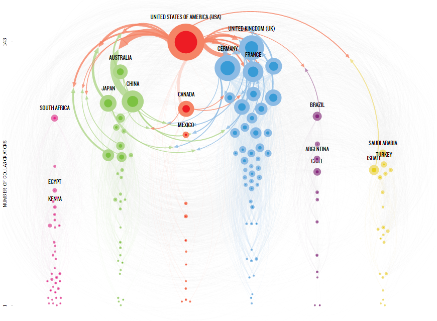
Cuban scientists tend to partner up with Germans, but so do French researchers. The Kenyans work with South Africans. But, unsurprisingly, the global all-stars of scientific collaboration are the United States and China. An interactive map recently published by Nature revealed this web of collaborations to visualize the entire globe’s scientific partnerships.
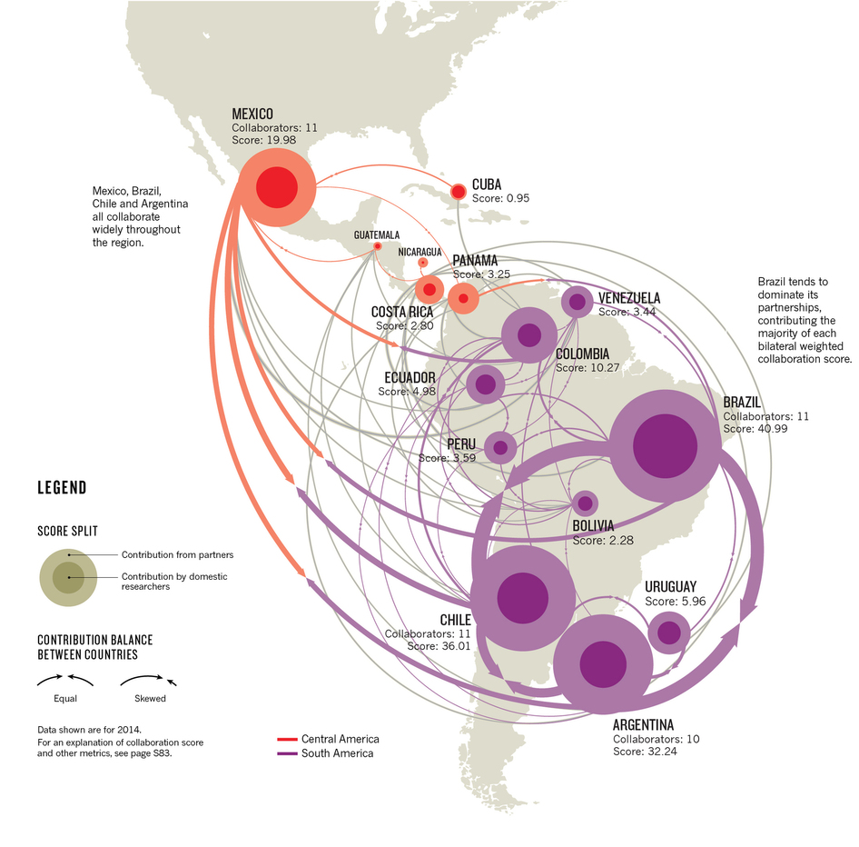
Made up of a constellation of colorful dots superimposed over a world map of interconnected lines, Nature published the interactive in November 2015. The project, “Connected World: Patterns of International Collaboration,” looked at international collaboration in the year leading up to October 2015 between over 150 countries organized into regions like South America, Africa and Western Asia. Each country was given a score denoting the extent of its collaborative scientific output and this score is reflected in the size of each country’s dot. Different arrows show the balance of scientific contributions between countries. The visual can be further understood by looking at it through filtered subject areas such as region or collaborators which provides a better sense of who is collaborating with whom and where research resources are concentrated.
In lieu of designing it in-house, Nature assigned the project to Small Multiples, an Australian company founded in 2011 by Andrea Lau and Jack Zhao, data visualization specialists versed in design computing, bioinformatics, interaction design, and electronic arts.
Understanding the magazine’s goals
Nature first briefed Small Multiples on the collaboration data and the magazine’s goal for the story they wanted the visual to tell. For Small Multiples, the first step was to complete an analysis. For this, Lau says, they needed to look at other projects with similar scientific collaboration data or goals in order to get an idea of how they could visualize these specific kinds of data. After seeing similar work, Small Multiples brainstormed several different concepts for the visual before presenting some to Nature for feedback.
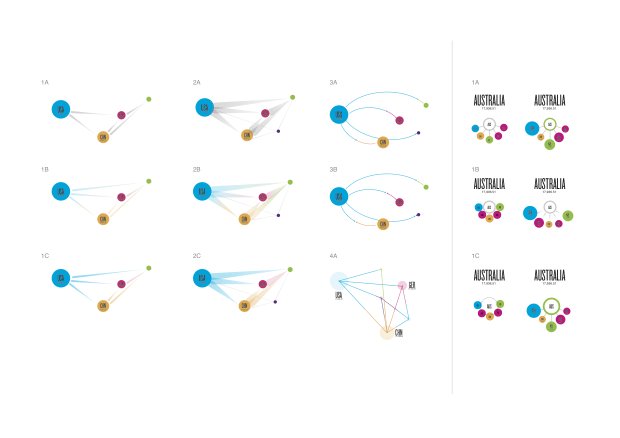
At this point, a concept was chosen: A force-directed graph to show the high levels of collaboration between countries in high proximity to each other. A prototype was created using D3, a JavaScript visualization library, to create the interactive. [Learn to build your own D3 force-directed graph here.] However, once real data was applied to the model, it ended up being too complex and required some revision. The second prototype is what became the final visualization. It groups together the different regions of the world on the x-axis and puts the number of collaborators from each country on the y-axis. This, Lau says, puts results in a more orderly fashion and works better than the force-directed concept.
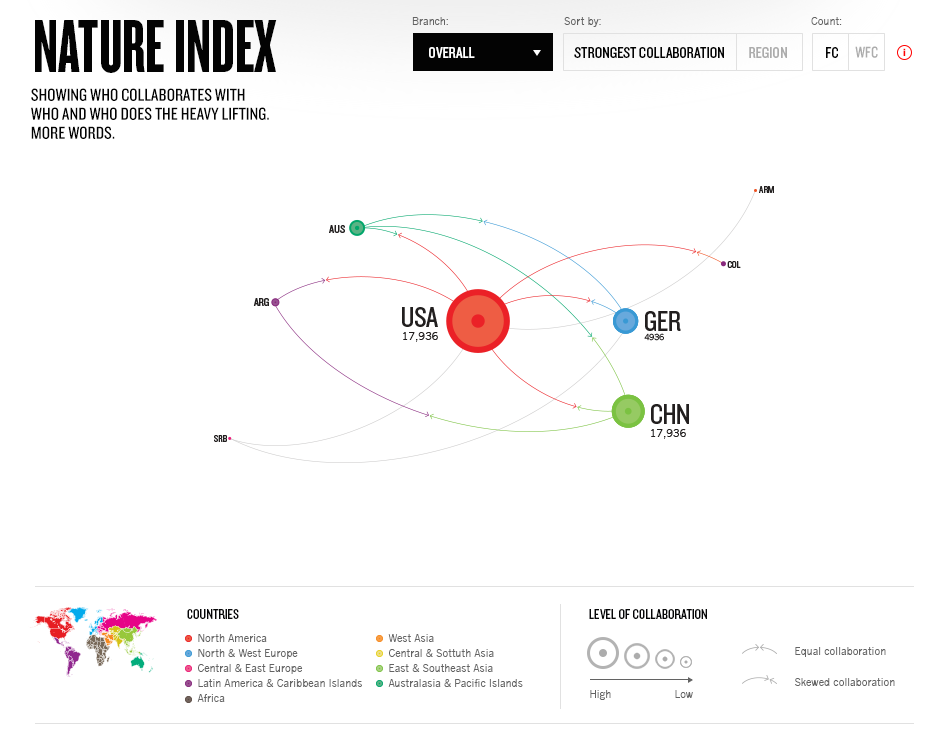
After Nature approved the wireframes for the final prototype, Small Multiples built the visualization in Scalable Vector Graphics (SVGs), which formats graphics to be interactive and animated. This visual was given back to Nature to be finalized through editing and the addition of annotations and descriptions. Once complete, it was published on Nature Index and is updated every month with new data.
Tackling data-driven stories
Small Multiples has worked on many visuals similar to this over the past four years. Their goal with every job is to be able to “tackle a data-driven story from beginning to end,” says Lau. They work across several major Australian publications and broadcasters, like ABC and The Guardian. For inspiration, Lau says, Small Multiples looks at books, blogs, news, podcasts, films, galleries and museums to find ideas in places outside of traditional data visualization publishers.
But creating a bespoke data visualization is challenging. Lau describes some of the complications their teams often run into: “Once you’ve got the data and understood the brief, the biggest challenge is coming up with the visual solution. This is common across all projects and the best thing about them; trying to solve the problem!” she says. Specifically, Lau remembers a visual where it was difficult to complete a visual concept because the data kept changing. “I think we got up to version 20!” From a technical point of view, Lau says the only challenges once the visual is created is to optimize the visual for mobile devices.
One of the most important parts of any visual is to properly verify data and figure out how they should best be represented. Small Multiples does this by using certain resources like the Australian Bureau of Statistics and looking for completeness, reputable sources and accessibility in any data they are given, as data requirements can change from project to project. From there, the data can be represented in many ways. “Representations are a reflection of the data itself and the story that is being told. Is it quantitative or qualitative, serious or can we have a bit of fun,” Lau says.
As for advice for students pursuing data visualization and journalism, Lau recommends a few things: “Stretch your skills into the different facets of data visualization: the storytelling and communication, the data research and analysis, the design, and the development. And then go deep in one area and make that your core. This means you can be a multidisciplinary practitioner who can make things independently, and also as a specialist when working more interdependently with a team.”
That’s the kind of sound advice any digital storyteller can appreciate.

- Europe’s migrant crisis: A roundup of visualizations - May 24, 2016
- How a small data design company visualized the world’s scientific collaborations - January 5, 2016