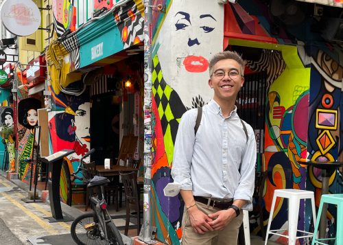
How Alex Lim visualized the colors of Singapore for The Straits Times
How do you break a country down into a color palette?
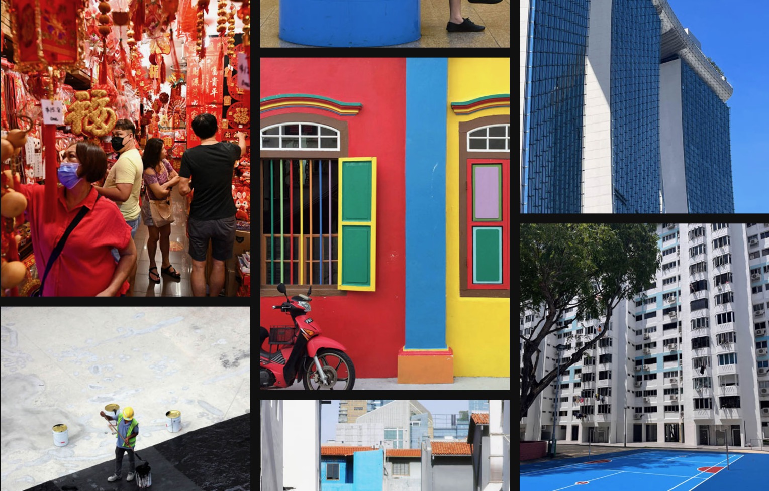
For Alex Lim, it took five months, thousands of photos and intricate coding and data visualization skills. Lim, a data visualization developer at Singaporean newspaper The Straits Times, created an innovative scrollytelling piece that describes and celebrates Singapore’s wide-ranging colors, from Lion Dance Red to Monsoon Grey.


Published in August two days before National Day — Singapore’s independence day — “Singapore in Colour” is an interactive visual story where readers scroll through the individual colors across neighborhoods through an analysis of 2,000 pictures.
Now based in Australia, Lim has gained a wealth of data visualization experience since graduating from Northeastern University in 2020, including tracking COVID-19 data for The New York Times and designing interactive storytelling pieces for Stuff, a New Zealand news site.
Lim spoke to Storybench about his experience developing it, alongside collaborators Charlene Chua and Roman Sverdan, including how they gathered pictorial data and what difficulties they faced in its execution.
The following interview has been edited for clarity and length.
How did “Singapore in Colour” come about?
Lim: It’s inspired by my personal experience in moving to the other side of the world during COVID. I happened to be traveling during the Olympics, and I did a stopover in Tokyo. On the flight from Tokyo to Sydney, there were about a dozen Australian Olympians, dressed in full green and gold — the national colors of Australia.
Once I settled down in the suburbs of Melbourne, I started going on my daily little walks where I’d notice these green gumtrees and gold wattle flowers, and I just saw these colors — green and gold — pop up over and over again. It was just one of the lenses [through which] I started to learn about the place and experience the place through. I could see these colors everywhere.
Last year, when I started this job, I spent about five days in Singapore, and I was just looking at it through color and saw how vibrant, and multicultural especially, the city is.
Color is something that’s universal. There is a meaning that we associate with color, like the red is loud, and black and dark colors can be more foreboding or serious. It’s simultaneously universal, but also can be very personal.

What was the process of creating this piece?
We have a pretty big team in Singapore, so we dispatched the whole team and said, “You take this neighborhood, you take this neighborhood. Go out, and try to find some color.” We didn’t know what to expect or what we’d get from it. But once we assembled the dataset and were able to poke through it, we could actually see some differences between the neighborhoods.
We thought about limiting the scope. Should we just look at iconic Singapore locations, like the Merlion, Marina Bay Sands or Supertrees? Should we look at things like daytime versus nighttime? There were really just a lot of directions to take it, and that was a little bit of a challenge.
What is the angle? How much is this exploratory versus a narrative? Is this a tool for the user to just have at it or is this something that we’re walking them through and finding a narrative? I spent quite some time trying to build the structure that we were going to work with.
Why do you think it was important to tell this story? What impact did you see?
It was nice to bring that extra perspective as an outsider and say, “Look! Stop and smell the roses. There’s actually a lot of beauty and color out in the city, if you go and look for it.”
I happen to live with two Singaporeans in Australia, and they were really eager to share it around with all of their family and relatives back in Singapore and abroad. Their aunties and their cousins were saying, “Wow, I didn’t realize how beautiful, how colorful Singapore could be” — that idea that sometimes people might take for granted that little things about where they live.
What are your tips for budding journalists?
Don’t feel like you need to learn every new library and technology that’s out there because they’re not going to stop coming out. There is always going to be a new version of D3 or a new library that’s going to make visualizations for you.
It’s important to keep in mind not to get too bogged down by implementation and think more about, “What is the story you’re trying to tell, and are there new ways to tell it?”
- Here are Nathan Griffiths’ takeaways from his career journey experimenting with different mediums - June 17, 2024
- Here’s a look inside the data team at the Associated Press - February 13, 2024
- How Alex Lim visualized the colors of Singapore for The Straits Times - September 28, 2023


