How the Marshall Project dug into the FBI’s new crime statistics collection program
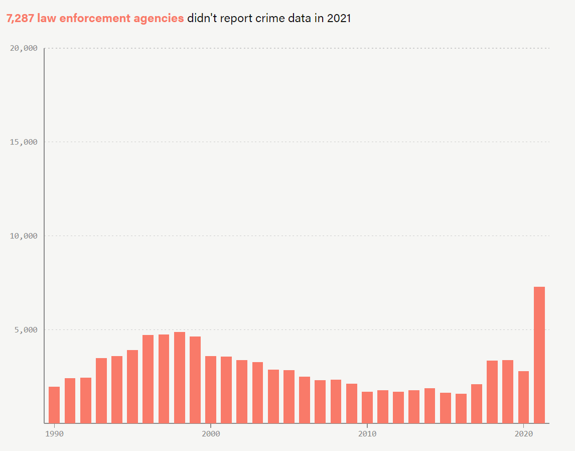
The process of how crime data is collected by the FBI has significantly changed in the past year. This change has caused an increase in law enforcement agencies not submitting any data, leaving a gap in information that can be exploited by politicians, especially in campaigns.
Weihua Li is a data reporter for The Marshall Project, a nonprofit news organization that strives to create a sense of national urgency about the U.S. criminal justice system and its problems. She shared her insights with Storybench on the effects of this new crime reporting system and the data dynamics behind it.
This interview has been edited for clarity.
What pushed you to write the article “What Can FBI Data Say About the Crime in 2021”?
We have been to the point where the FBI is planning to make a transition of their data collection program. So initially, over the summer, we wrote a story about how the transition is going, and through that process we learned that nearly 40% of law enforcement agencies across the country just simply didn’t give the FBI data. After publishing that story, the FBI was going to release data in the fall, and we were preparing for what kind of numbers they might get. The report basically said that we didn’t know if the data given had gone up or down or stayed the same. For the first project, the Marshall Project used the data for analysis to tell a story.
What was the process of designing the article like?
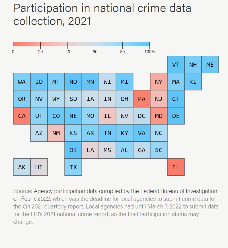
I think when it comes to visual storytelling, from stories with graphics, the process is the same as stories with written words. A lot of what we think about is what we are trying to show and what is the story. I would make a visualization that can be used to fill in a sentence or in a paragraph and from there I think about what the best visual is to express it. In the story that we published in the fall, we included a map component that shows people where nothing happened in the country. We wanted to show first of all how a lot of agencies export data, and second, that the distribution of this data is not going to help increase overall reporting.
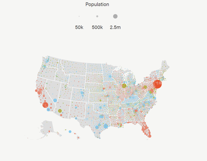
We also created an interactive data visualization where people can search for their own communities and see which police department in their community in the states have submitted and which ones haven’t. And for that one, our goal really is to take the story to another level and enable people to [hold] their local governments accountable. So that’s kind of our process; we want to communicate this message.
Did you have any challenges while designing the article?
I think one of the challenges for stories like this is how to communicate the gap between research and information to the public. For example, in a research community in the criminal justice world, it’s pretty well known even before the FBI releases their statistics that the data quality is not going to be as good as previous years. The way we are challenged as journalists is how do we translate that level of concern to the public and how do we explain the issue in a way that our readers will also understand the gravity of the problem.
What made you decide to use data visualizations throughout the article?
I think it comes naturally with the kind of stories where we’re trying to tell the story about the data and we have felt like, instead of using numbers to show readers, it would be a lot more powerful to see it in a bar chart or see on the map. And it’s my firm belief that people find data very hard to remember and process, but we’re really good at seeing the data.
How do journalists make sure their visualizations are engaging and are displaying good storytelling?
I tend to think that engaging visual storytelling is the way that we write to communicate and attract attention, so it has to be clear and precise. It has to be aware of our readers and appreciate their attention. Our goal is always for someone to leave a story feeling a little bit smarter and a little bit more knowledgeable about our criminal justice system. For me, it’s a lot of iterations: Building a draft and then getting feedback, and revising on the draft — and revising the draft over and over again.
What are your thoughts on using data visualizations and how the area of using them is growing?
I think we live in society right now where data is being gathered in our daily life every single second, and the industry is catching up by gathering, analyzing that data, and telling interesting stories. Data visualizations are a natural tool that everyone uses, even in the data analysis stage of the project. It is only natural that we package them for publication, and I think it’s a natural progression. I’m really excited to be joining a group of analysts who are really paving the ways for what it means to be a reporter or journalist.
What are some reasons for using data visualizations in journalism?
The advice I usually tell my colleagues is if you have a paragraph that you feel like it’s so packed with numbers, or if you have a paragraph that you feel like it’s bogged down by how many numbers you have, then there is probably a good indication that we could do a chart in place instead. I think the fun part usually is thinking about the differences between visual language and written language and think about what will fit the data or written words.
How has the use of data visualizations been increased because of our digital world?
There are a lot of tools out there nowadays that are pretty easy to use. For example, Google has Excel spreadsheets, and it has pretty powerful plotting tools. There are other platforms where people who are interested in displaying data can be picked up pretty easily. The direction we’re going in our newsroom is to understand what is it, what is the value of data, what is the value of a transition — and think about opportunities where those can be rhetorical dishes for a story.
In what ways can you see the world of data visualizations growing as a result of the influence of media?
I think people are getting better at reading charts, reading visualizations, because it has become a part of our daily life these days. So, naturally, it may be a more compelling place for journalists to use visualizations as something that can unpack a lot of valuable information in a short time span.