How Dadaviz is bringing you the news, visually
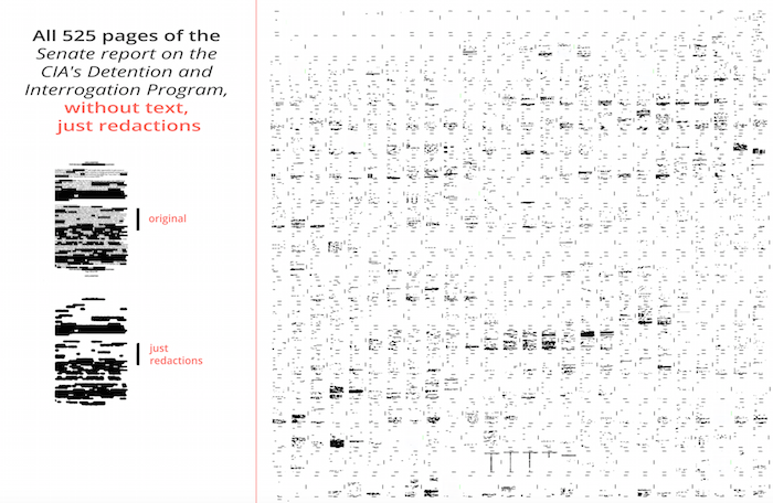
In December the U.S. Senate report on the C.I.A.’s “enhanced interrogation” program was released and news organizations found creative ways to report on the findings. Dadaviz, a data visualization outlet, also moved quickly to analyze the report and publish a different angle to the story. The result was a visualization of 525 pages of the report stripped of all visible text while keeping its blocked out redacted sections. It was an artistic and fresh take on the story that communicated just how much of the report was too sensitive to make public. It was popular, too. The graphic attracted more than 13,000 views.
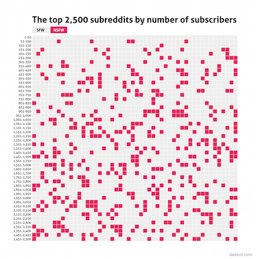
Dadaviz is a data visualization company based in Tel Aviv, Israel that publishes original charts, maps and other graphics several times a day. Operated by a team of three editors who all pitch, source and design stories, Dadaviz tries to find fresh, data-rich angles to visualize the news of the day. Responding to the news over Reddit’s censorship policy, for example, Dadaviz visualized the number of Reddit groups that were labeled “Not Safe For Work.”
 Dadaviz was founded last June in Tel Aviv by Jishai Evers, Ole Filippov, Gilad Manor and León Markovitz. (Dadaviz’s name is a play on the avant-garde art movement of World War I Europe. [inlinetweet prefix=”” tweeter=”” suffix=”via @storybench”]To @Dadaviz’s founders, data visualization is soooo Dada[/inlinetweet].) Originally a website that curated data visualizations from news organizations around the web, Dadaviz has been exclusively publishing its own content since March. It’s regularly featured on Reddit’s DataIsBeautiful and has been featured on The Washington Post. Dadaviz also collaborated with Vocativ.
Shareable, sometimes funny, stories
“When we saw that it was our content that was the most shared, we focused on creating all our data visualizations in-house,” says founder León Markovitz. Dadaviz also found, not surprisingly, that a lighthearted approach to stories also engendered a lot of sharing. And the stories have to communicate effectively. “[inlinetweet prefix=”” tweeter=”” suffix=”says @LeonMarkovitz”]If you don’t understand the story in 15 seconds, the visualization isn’t doing its job[/inlinetweet],” he says.
With a skeleton crew of three editors, two engineers and an intern, Dadaviz needs to work quickly to publish close to nine visualizations per day. “We try to work like a newsroom,” says Markovitz. “We do a brainstorming session every morning looking at the news of the day. We look at what data angles are being covered and then decide what to create that is interesting and what we’d share personally.”
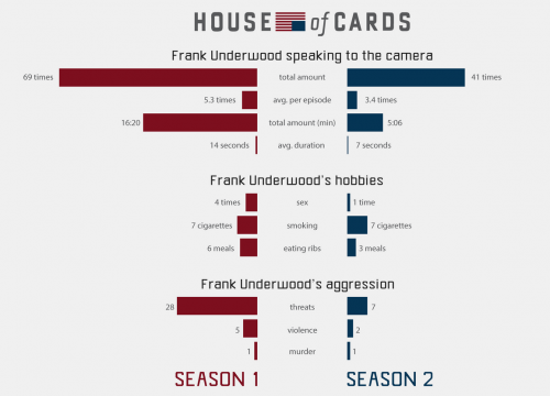 Most of the data Dadaviz uses is readily available and published as a link accompanying the visualization. For deeper, more analysis-heavy stories, Dadaviz scrapes data and analyzes it in-house. “These have been some of our most popular,” says Markovitz. Some examples of stories that took several days (and how many views they’ve received): To win on shark tank it’s best to be on a team (118,506), The hair color of our leaders (835,669), and Frank Underwood’s threats, screen rants and rib feasts on House of Cards (56,682).
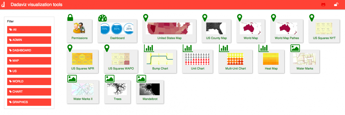
The engineers on staff have built an internal visualization dashboard that streamlines the data visualization process. Much like Chartbuilder or RAW, the Dadaviz dashboard allows editors to select a type of chart, input their data, and customize their design.
Figuring out the business model
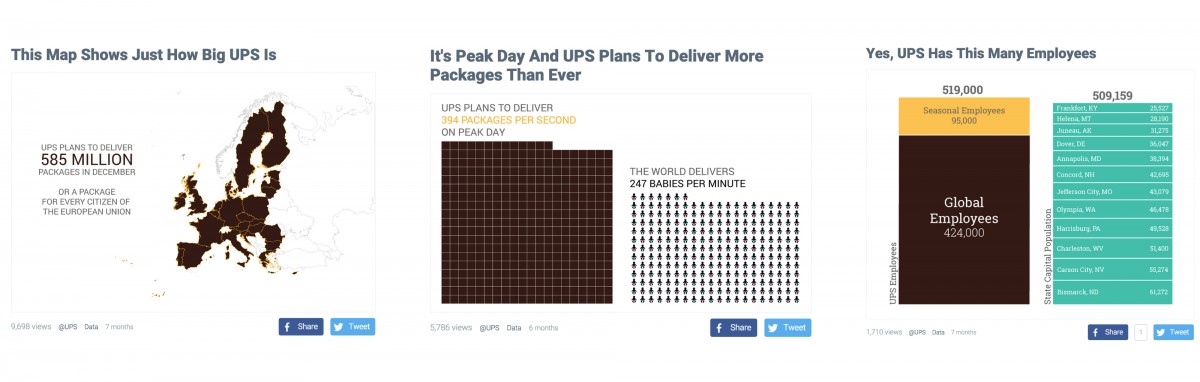
How does Dadaviz make money? In addition to running ads on their website, Dadaviz has begun designing native advertising campaigns and running them on Dadaviz.com. When U.P.S. wanted to boast about its optimal route-calculation algorithms, Dadaviz built a map and graphic to explain the technology. It attracted more than 63,000 views.
Though Dadaviz has entered into a few collaborations building visualizations for news outlets like The Washington Post, Business Insider and Vocativ, they haven’t officially syndicated their work. Markovitz says they’re happier gaining exposure than charging fees, at least for now. Meanwhile, Dadaviz consults for various media companies that are interested in their technology and workflow.
Markovitz is hopeful that more news organizations will recognize how lean and nimble Dadaviz is as a company and newsroom. If they can do it, with five employees and an intern, surely a large newsroom can, too. “We want to show people that it’s not that complicated.”