How I visualized “Trump” mentions in hip-hop songs using D3
Hip-hop is often brutally honest about controversial issues in society – money, guns, drugs, sex and, of course, politics. I found a dataset collected and cleaned by FiveThirtyEight containing the number of 2016 candidates’ names mentioned in hip-hop songs between 1989 to 2016.
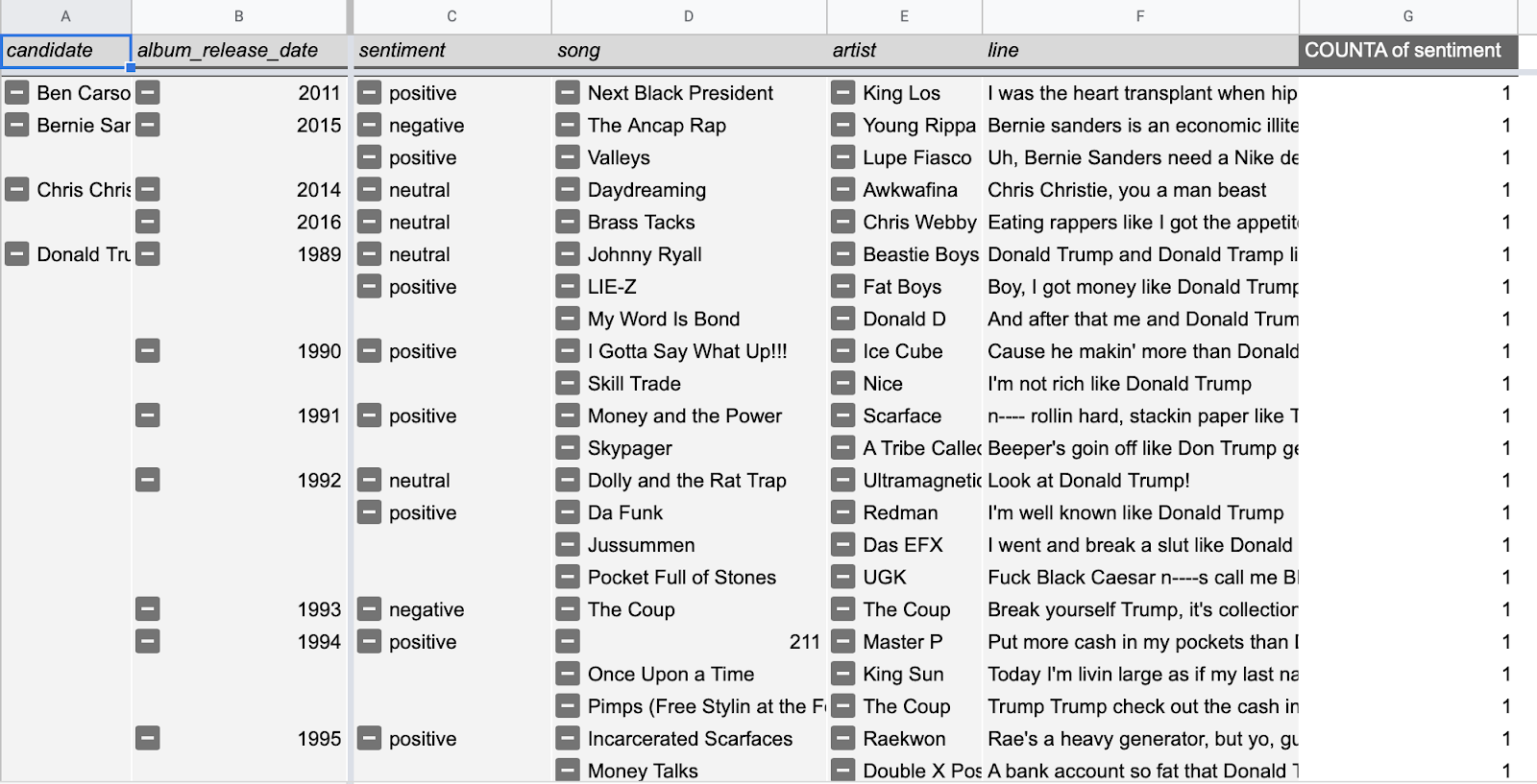
FiveThirtyEight also collected the name and artist for each song, the lyrics containing the candidate’s name and the sentiment of the lyrics, in part with the help of Genius.
As an international student from Taiwan, the U.S. presidential candidate I’m most curious about is definitely Donald Trump. That led me to inspect the number of Trump mentions in hip-hop songs and, in a sense, recreate some of the graphics FiveThirtyEight published with this data back in 2016. The following is an outline of my process from Google Sheets to the Javascript library D3.js.
Organizing the data
First, I used the pivot table function in Google Sheets to organize the data.
Noticing a shift in sentiment
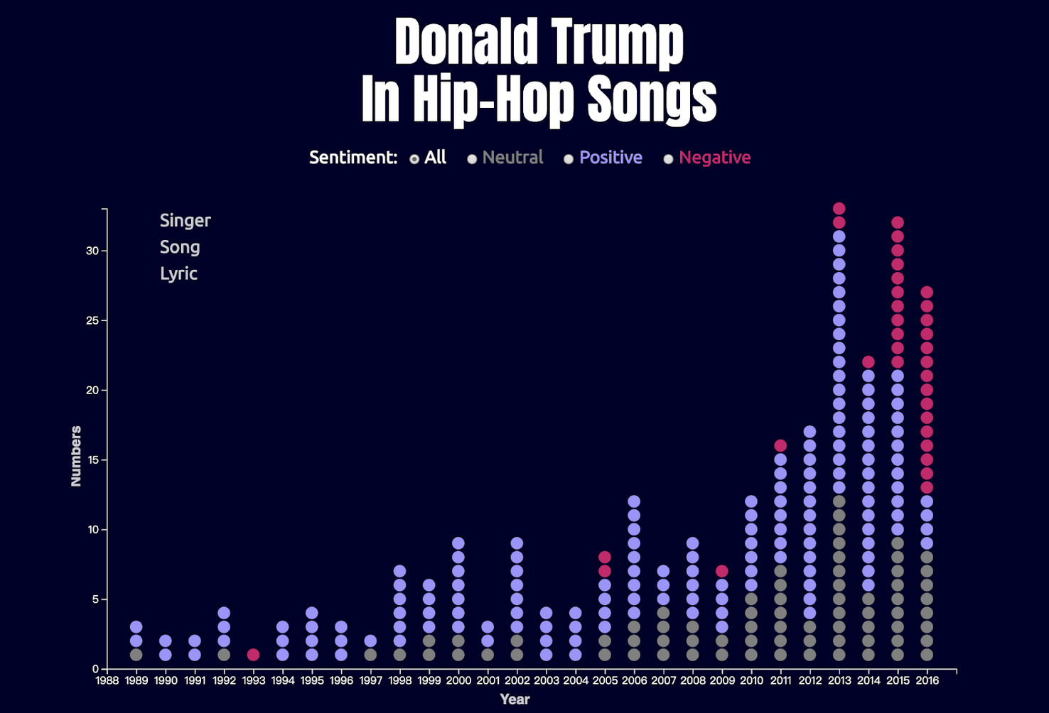
Before 2016, Donald Trump was the most mentioned candidate in hip-hop songs with most of them portraying him in a positive light regarding his fortune and fame. The big turning point, however, came in the election that sent him to the White House. The number of Trump mentioned in the hip-hop songs with negative sentiment rose evidently.
I wanted to showcase this sentiment transition in an interactive data visualization created with D3.js. In this project, users can clearly see the number of hip-hop songs mentioning about Trump and interactive with every dot to know more about the singer, the song, and the lyrics. User can also select songs by different sentiments regarding the lyrics.
(Link to my github to see the full code.)
How I made the chart in D3
The chart is a combination of a stacked bar chart and a scatterplot. Each dot represents a song with different colors signalizing the sentiments. Although it looks more like a stacked bar chart, it is coded as a scatterplot, meaning that every dot has an x and a y value, where x is the year and y is the count (of songs mentioning Trump).
In the HTML file, I divided the <body> section into three areas, including header, chart area, and the footer. The chart area will be the place where I put my chart.
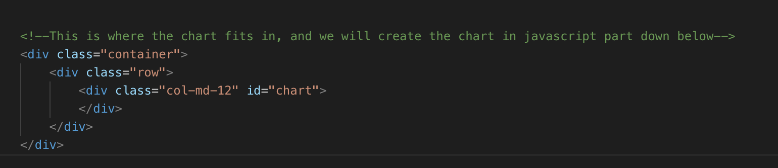
Note: I use Bootstrap to design the layout easily and quickly. That’s why you’ll see the class named col-md-12.
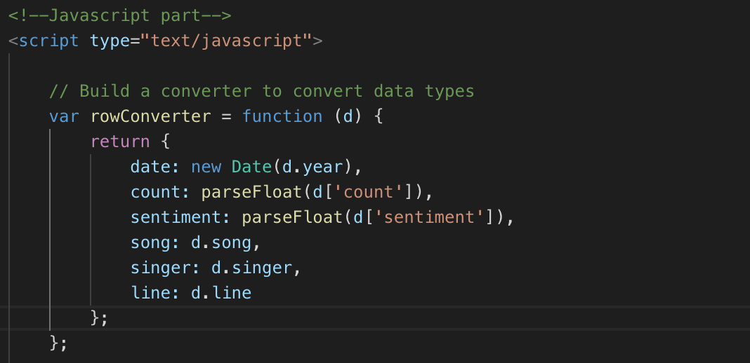
Next, in the Javascript part, I start with building a row converter which makes the data types readable to D3.js.
I then read in the CSV file with the converter and do some settings around the height, width, x scale, y scale, x-axis, and y-axis of the chart.


After that, we set the position, width, and height of the chart and set the position of the text that indicate details like the singer, the song, and the lyrics.

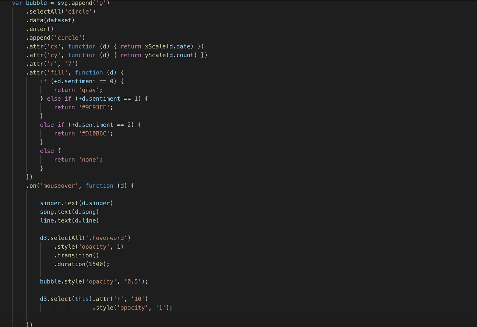
Here comes the fun part – drawing the dots. I created SVG circle elements by binding the dataset we just uploaded and indicating the x and y position of the center of each circle as well as the radius. I set different colors by conditional statements based on the value of the sentiment column. I create the hover responsive effect by setting functions triggered by a mouseover event and mouseout event and a class I called “hoverword.”
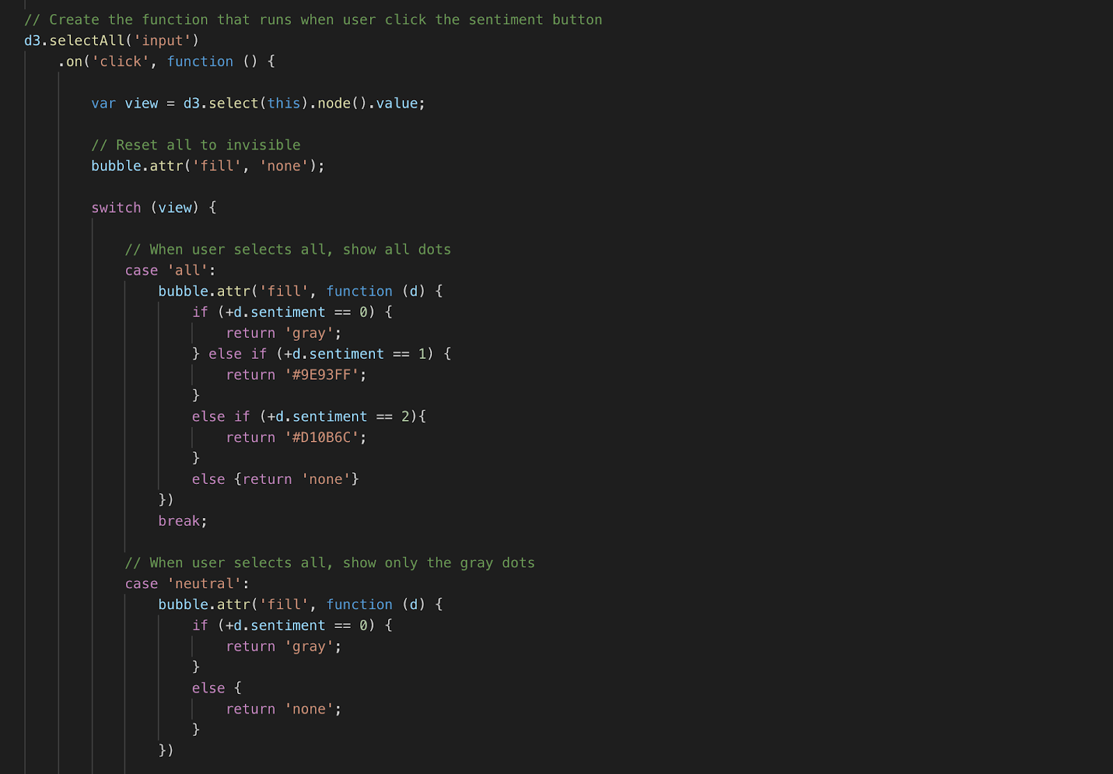
Last but not least, I create a function which will be fired when the user clicks the sentiment button to tell D3.js how to change the colors according to the selection, again, by conditional statements.
What can be improved
There is room for improvement on the color, the font, the layout, the interaction and many other parts. I figured that not until I explained the interaction did people know they could hover over the dots to see more details. I also considered changing the colors of the web page since the gray, and purple dots can’t be seen too clearly.
Any advice on this data visualization? Feel free to let me know!
Link to my github to see the full code.

- How designer Nadieh Bremer teaches herself new skills to continue visualizing data in new ways - October 31, 2019
- Jaime Settle on how social media polarizes America - October 17, 2019
- How I visualized “Trump” mentions in hip-hop songs using D3 - September 23, 2019


Very cool idea and toolsets. Do you have a link to the live D3 viz? Thanks!!
Just embedded it. You can see it here, too: https://storybench.org/d3plus/trumphiphop/d3trumphiphop.html