How I analyzed two months of climate change coverage
For a long time, climate change seemed to me to be neglected by the media. There always seemed to be this knee-jerk reaction to treat environmental stories as niche. But I see climate change as a threat that deserves round-the-clock, page one attention.
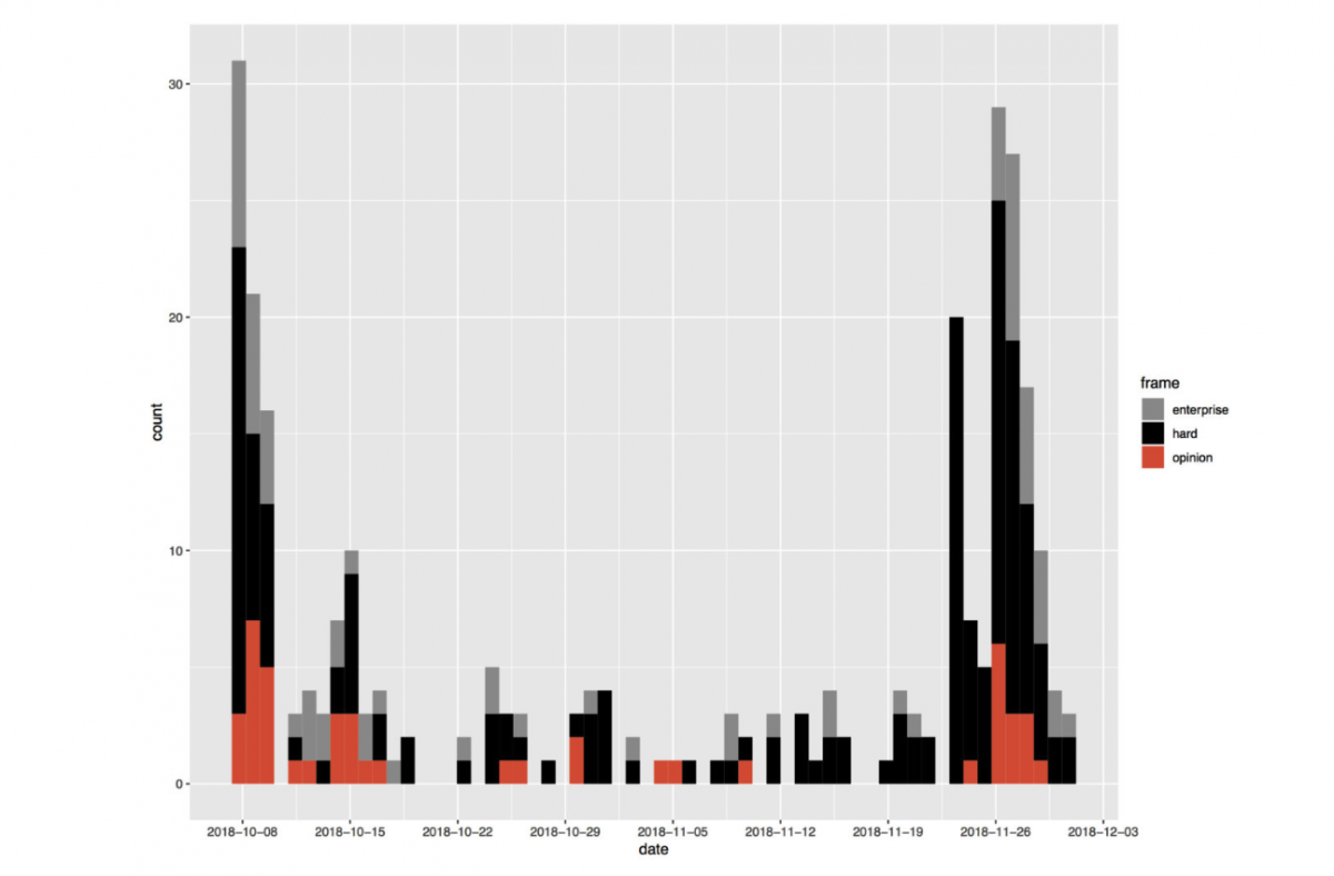
In early October, when the IPCC released a bombshell report on the devastating global catastrophes we may face in ten years without action on climate change, I saw an opportunity to monitor journalistic coverage of the issue. Then, when the U.S.’s National Climate Assessment was released roughly a month later, I had the chance to measure the media’s response to that, too. And compare.
I used Media Cloud to analyze stories using the keyword “climate change” and “report,” looking specifically at the timeline from October 8 (when the first report was released) through December 1. With a CSV file in hand, I then filtered out irrelevant or unrelated stories, which cut the number of stories spit out by Media Cloud in half.
With the remaining articles – roughly 650 from outlets like the Washington Post and Forbes, NewsMax and Breitbart – I went through and classified each article by its “frame,” either opinion, enterprise or hard. This was a way of tagging how each publication delivered this news to the public. Loading the CSV into R, I created a few simple histograms (and ran some sentiment analysis for fun.)

Then I wrote up my analysis and pitched it to Columbia Journalism Review, where it was published yesterday.
- Emily Atkin is pissed off about climate change. Her new newsletter Heated says we all should be - October 1, 2019
- How to grow your brand as a photojournalist and commercial photographer - August 1, 2019
- Six digital skills all new journalists should consider learning and a road map to unlocking them - July 15, 2019


