How Felippe Rodrigues at New Zealand’s Stuff brought to life a chart of Earth’s changing temperature
In conversations about climate change, climate skeptics frequently raise the point that the temperature has always fluctuated and has been on the rise for millennia. In fact, this is true. But the average temperature of the Earth has never risen so drastically or as quickly as it has during the last 100 years.
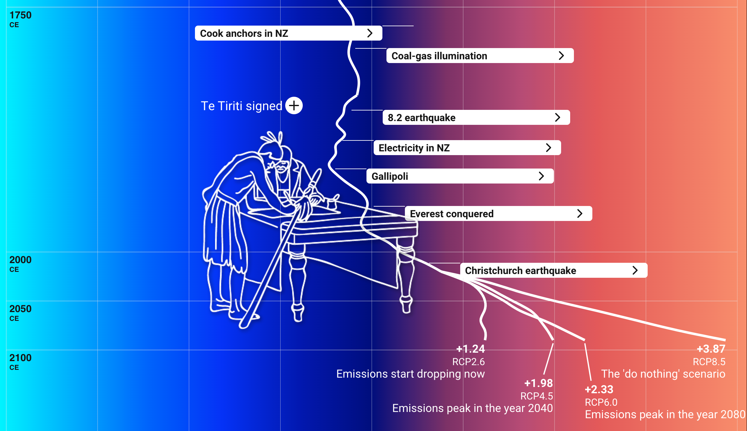
Felippe Rodrigues, a data reporter at Stuff, a New Zealand news publication, created a digital, interactive chart that traces the average temperature of the Earth back to 20,050 BCE. The project, “A reconstruction of 20,000 years of Earth’s temperature (Or what we’re doing to the climate)”, is a scrollable temperature chart that contextualizes the 20,000-year long timeline with historical events and developments in human civilization.
Seeing this comparison to Earth’s temperature today and the predicted rise in temperature over the next 100 years makes it difficult to believe that the rise in average temperature is not a man-made phenomenon—which was precisely Rodrigues’s intention.
Storybench spoke with Rodrigues, a Northeastern School of Journalism alum, to learn more about the inspiration behind this piece and to discuss how this visualization has contributed to the conversation surrounding climate change.
This interview has been edited for clarity and length.

Where did the inspiration for this story come from?
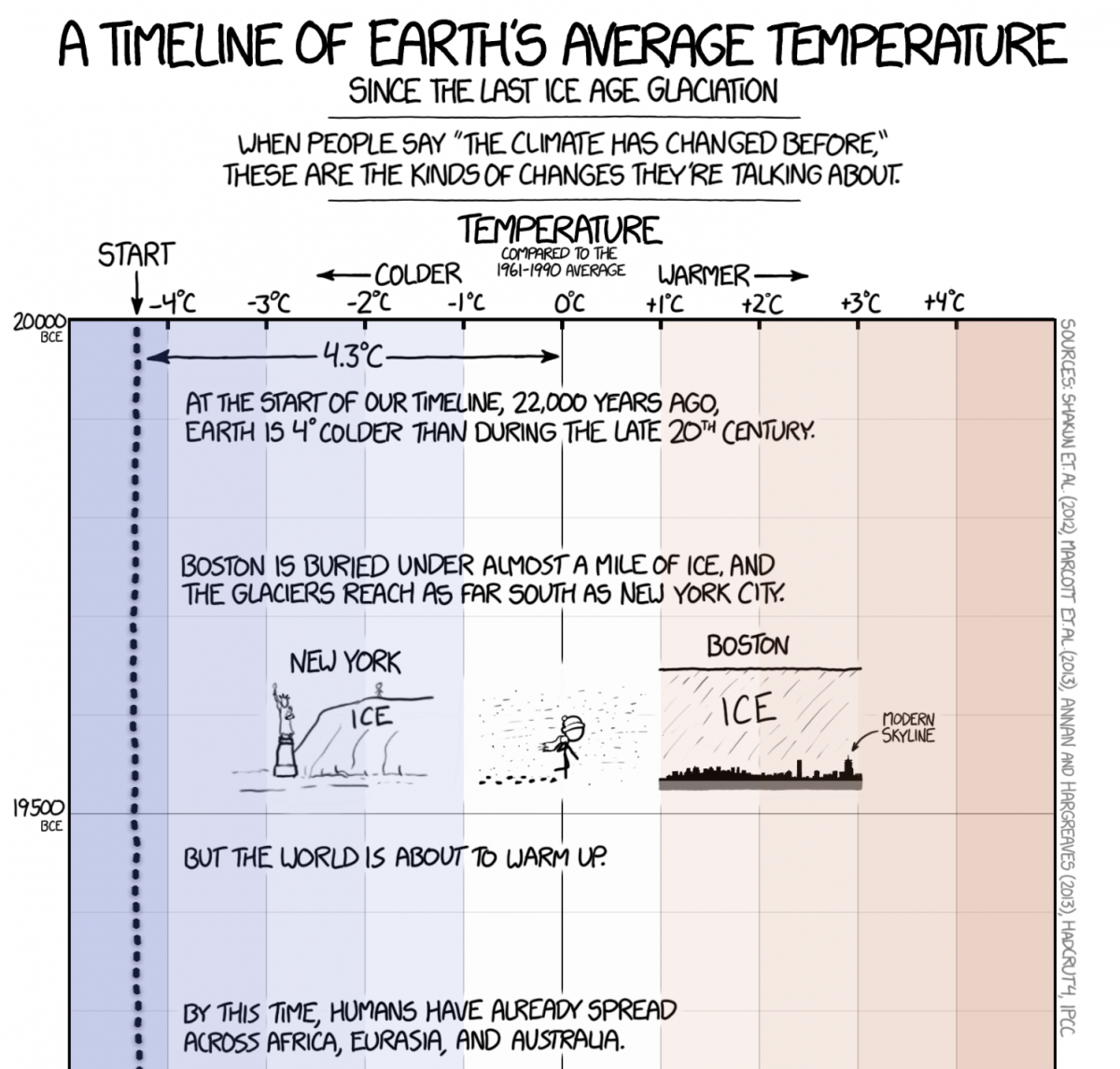
It was an XKCD comic, which is a thing here for us. The other data journalists on the team and I, we constantly laugh about and share XKCD comics between ourselves, and sometimes they spark story ideas. This one, it’s quite an old one, and it had been a few years at that point, and I was trying to figure out a way to show exactly that thing that I saw in the XKCD comic, which pretty much has the same format as the story. It’s just a long strip going vertically down, and it shows the famous hockey stick chart but in a very elongated way. So that’s how it came into my mind, and then it took me a few years to find the perfect placement for it — and also to convince an editor to let me do it.
The title of the piece is “A reconstruction of 20,000 years of Earth’s temperature (or what we’re doing to the climate).” Can you explain the meaning behind “or what we’re doing to the climate”?
Stuff is the biggest news organization in New Zealand, and we have a project called the Forever Project, which is an initiative that started around 2019-2020 to address and cover climate change for what it is: Which is an undeniable truth and a problem that must be faced if we as human beings want to be on this planet forever. So, the working subtitle there was actually “or why climate change is real,” but one of the editors suggested the new phrasing. I think it is quite clear once you see the chart, it’s quite obvious, that the magnitude of the effects that modern human civilization had on our climate is undeniable. It’s not a fluke; it’s not something that has happened before.
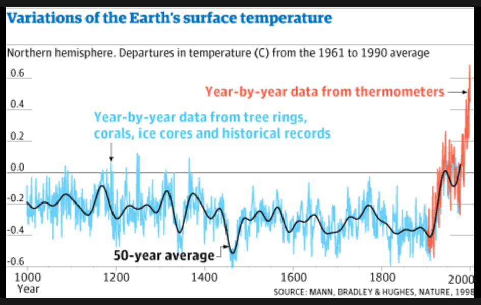
That chart goes back 20,000 years, and over that period of time we’ve had things called the Little Ice Age or the Medieval Warm Period. Those are periods where temperature deviates less than a degree from what the average temperature is. The average there — I think it’s 1961 to 1990, I don’t remember exactly, but one of those 30-year averages that are standard in climate data analysis — we are seeing at this point projections that put us at two, three, four degrees of change by 2200, which is just 200 years. It is undeniable that this has been caused by the emission of carbon into the atmosphere by the burning of fossil fuels, and agriculture also impacts that with methane in cows and other bovine animals. But that’s what we meant there. Once you see this graph, you will understand that we are making the temperature rise at unprecedented levels that have never been seen before.
Where did the data for this project come from? Was it the same data used in the comic?
I used pretty much the same data sources as [was used in] the comic because they are the only ones that exist; there are no others, at least at this level of precision and specificity. I think I used three studies that trace the temperature back tens of thousands of years, and then I just tweaked it slightly to add newer projections when compared to the comic. But it’s pretty much the same analysis. When you’re joining together those datasets you kind of have to do a little bit of massaging to make them match because they have two different reference points. So you have to make them match one way or the other. That’s why our data looks slightly different than the data in the XKCD comic. But the trend stays the same, absolutely the same.
In terms of the cultural conversation around climate change, it’s pretty vast. What do you think that this project is adding to the conversation?
The hockey stick chart has been around for a while, but I don’t think it has ever been put into a screen, into such a digital format. We’re not doing anything innovative in terms of the substance of the article because we’re just making a point that the comic has made before. And the comic is making a point that the hockey stick chart has made before in the late 90’s. But what I wanted to do is bring the comic, which is a JPEG that is not responsive, into the digital age. So we just recreated that using modern technology that allows anyone using a phone, a desktop, a tablet, anything like that, to consume that project and really understand what we’re talking about.
Also, there’s a second element to what we did, because we are a New Zealand news organization. We adapted the facts in the piece to be New Zealand-specific facts — things that make sense to a New Zealand audience and things that bring forth a side of history that’s often not really considered in the Western world. Even here in New Zealand, the Polynesian origins and the history of the Māori, the indigenous people of New Zealand, are often obfuscated by the focus on the Western world and Western-driven history, which says James Cook came here and discovered New Zealand. Well, people had been here for like hundreds of years before that happened, right? So, we wanted to highlight that in this piece.
Why do you think it was important to personalize and contextualize climate change issues for your audience?
We are a New Zealand news organization, so we try to look at things through that lens. But we also found that it was important to tell people things that they understood, but also things that they didn’t know. They were learning new things about the history of the people that populated New Zealand first, learning about how that ties to the Māori myths. We as a company, we have another initiative parallel to the Forever Project that tries to address things actively, and that means thinking of world affairs or national affairs or local affairs through a Māori lens too. We thought that was important, and it is important in every story that is written on this website.
Do you think that creating stories using data visualizations is especially important when you’re covering climate change?
I’m very biased because I am a reporter who does graphics so I will answer “yes” for sure. But I think it’s a space in journalism that lends itself really well to data visualization. It’s something so based in science that it’s hard to put into words; research, findings that come out of research, that’s actually best expressed as a graph. You can write 1,000 words, but it’s often the chart that people are going to remember, because it’s visual and encapsulates a lot of information.
What do you hope that audiences learn from your project? Have you received any feedback on it?
People really enjoyed it. You know, sometimes it’s hard to tell, hard to know in this digital age. It’s hard to pierce through the bubble. People who are really going to enjoy the visualization are the people who do not need to be convinced about anything. As a journalist, it is my job to convince people that climate change is real, but it’s also really hard to pierce through that bubble and get through to people who are inclined to not believe in it.
You know, I work on a on a huge array of topics but when I’m working on climate change things, I do everything aiming at just convincing anyone who has doubts about it, who doesn’t believe it’s a thing — that it actually is. That’s my main goal there. I don’t want to preach to the choir. I want one person who has doubts about climate change to see that graphic and change their mind or at least take the first step to rethink their beliefs and understand that this is probably the biggest challenge that we are going to face for the next 100 years, 200 years. If we don’t take action now this will completely reshape humankind; it’s already going to, but if we don’t take action now, if we don’t take action as soon as possible within the next 20-30 years, this takes humankind onto a completely different path. I think we owe it to the billions of people that are going to be born in the next 200 years, 300 years — we owe all these people the same Earth that we were born into.
