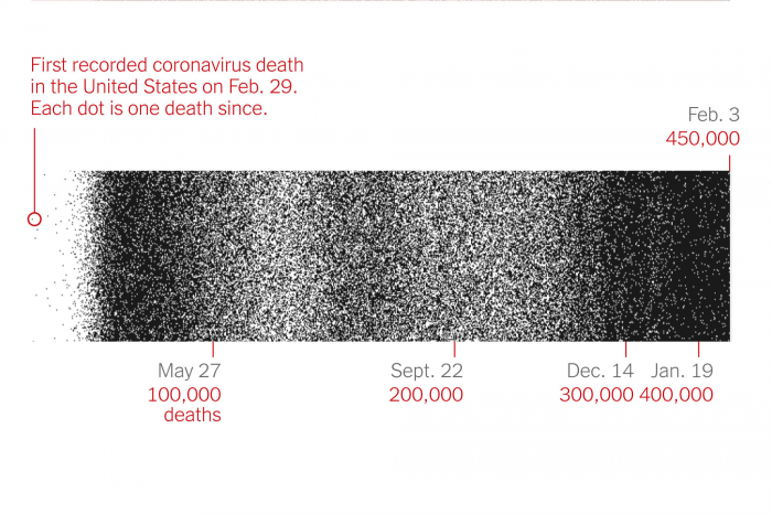
How Lazaro Gamio of the New York Times visualized the COVID-19 death toll
As the number of Americans who have died of COVID-19 has climbed beyond 500,000, it’s become increasingly difficult to conceptualize this number. The New York Times has been tracking COVID data throughout the pandemic, and turning these numbers into graphics we can comprehend. In early February, the Times published “How 450,000 Coronavirus Deaths Added Up” by Lazaro Gamio and Lauren Leatherby, which visualizes these deaths. Each dot on this scrolling timeline represents one person’s death, and lines mark every 25,000 deaths. When the death toll reached 500,000, a version of this graphic was published on the front page of the Sunday Times.
Storybench spoke with Gamio to talk about how he and Leatherby created this visual, and why it’s important to continue framing the effects of the COVID-19 pandemic in understandable ways.
This interview has been edited for length and clarity.
To start off, how did your career path lead you to making visualizations for the New York Times?
I actually didn’t study journalism – I was an art major. I got into journalism by doing layout graphics for my student paper. I entered the Miami Herald around 2010, which is famously right after the Great Recession, and also when papers started bleeding money. I started off as a freelance graphics editor, and three months later, they laid off all the freelancers. But they wanted to keep me around, and I somehow stayed in the game while finishing my degree. Then I did internships at the Seattle Times and National Geographic Magazine. I eventually got hired at the Herald and just did work, mostly longer-term enterprise stuff for investigative series, until I went to a national paper, the Washington Post. Some of this was just writing really bad JavaScript in a vacuum, learning by myself. And then slowly, I started getting better and doing things that were more ambitious, failing, and often making really bad graphics that thankfully nobody can find anymore.
How did you come up with the visualization for this story, and why did you choose this format?
We wanted to show two main things: the numbers and the pace. When we reached 100,000 deaths, we took up an entire front page of the Sunday paper with names of people who had died. I think we had 1,000 names on the front page of the New York Times. And that felt like an unimaginable milestone, right? One hundred thousand Americans had died of this virus, and it was maybe the middle of the summer. Now we’re at more than four times as many. So how do you even contextualize that? It’s more than the number of Americans that died in World War II, for example. And I think something I’ve noticed is that we’ve been beaten down by the pandemic – six months ago if you’d read a headline that said “1,000 Americans have died today from the virus,” you would freak out. Now, it’s like, “Oh, it’s only 1,000” – 1,000 deaths now is good news. So that was part of the motivation to do this – to recontextualize the fact that things seem like they’re winding down, when in fact, they’ve really only peaked.
“There’s a big disconnect between when it felt urgent and when it actually was urgent.”
For the form we decided on, we wanted to take advantage of the fact that the internet is a vertical medium, especially on phones where everything is portrait. We wanted to just force you to scroll. The act of reading is the act of experiencing the graphic, and seeing the density of the dots is what’s supposed to affect you. We also wanted to focus heavily on the pace between milestones. So I think an important annotation here is that it took 44 days to reach the first 25,000 deaths, but then that interval shrunk. This spring wave was maybe 10 to 13 days. And then it got to where we are now, where it’s actually slowing down. But it became as little as seven days to accumulate 25,000 deaths. What we experienced in mid-January was worse than any other point in the pandemic, even though we were all fatigued and having a hard time understanding it.
There’s a big disconnect between when it felt urgent and when it actually was urgent. I have this theory that human beings will get accustomed to pretty much anything. As a populace, we’ll just get used to death and suffering and abject sadness, where it just doesn’t faze us anymore. It has to be like some sort of survival instinct for self-preservation. But it’s important to contextualize that this is as bad as it’s ever been. I published something recently — cases are going down, but the number of daily cases that we’re seeing now is still twice as high as anything we’ve seen over the last year. And now, half of all deaths have come since November. Half of all total deaths; we’re at 460,000 dead (at the time of this interview), and half of that is just in the last three months, even though it doesn’t feel that way.
Over the past year, you’ve had to immerse yourself deep in the data about the COVID-19 pandemic. How has it been reporting on that?
I mean, I think it’s like anything in news. I think around 2015 — I can’t even count how many mass shootings there were, and every time there was a mass shooting, you had to do something. You know, there’s an issue more broadly about, like, general PTSD with journalists. Granted, I’m a desk jockey. I just make visualizations, but you learn to deal with it almost coldly. You just have to present the facts and not necessarily let it affect you.
After the holidays, my editor had assigned me to cover the virus data more regularly. Something that struck me when looking at it with fresh eyes after not having worked for a week or two was that it’s still really bad. I think at the beginning of the pandemic, this was a very different story. It was the novel coronavirus; we were like, “Where is it?” And that’s a much easier question to answer than the question that we have now, which is more like, “Where isn’t it?” It’s everywhere — how do you cover that? So it’s been about finding new ways to contextualize it.
I saw that you retweeted a piece that a reader made which puts your visualization to music. What are your thoughts on the translation of data into visuals and visuals into sounds?
Yeah, it’s Carni Klirs’ work. I think what he responded to was that whole pace idea, which was what we really cared about. Our piece takes a step back from the daily death counts and just focuses on the feel of it. The sonification piece renders that build-up between the 25,000 death markers really well. Like I mentioned earlier, we’re still kind of at peak, and you can hear it in the music.
Can you talk a little bit more technically about how you made this visualization?
Sure. We use Svelte a lot at the New York Times, which is a fantastic front-end framework. We maintain our own database, so we know the number of total deaths. For each day, we have the cumulative deaths. So we have this time series data, and we wrote some code to bucket days into these 25,000 death benchmarks. Then we counted the number of days it took to reach that benchmark – that’s how we knew where to draw the line. The dots were rendered in Canvas. It’s a pretty naive little structure, where you have a certain area and pixel dimension, and you write code to render, for example, 600 dots. You do that for however many days there are, and then do the unload. Each time you load this, it’ll be slightly different, but that’s essentially it.
The one technical thing here is that the actual death figure that we used was the rolling average, because that provides you with a much smoother gradient. If you use the actual death count, there’s a lot of noise when deaths are reported by day. For example, Sundays and Mondays are always really low, because nobody works on Saturdays and Sundays. So when we show death counts or case counts, we use the daily new cases and deaths and the seven-day rolling average, which smooths out those reporting kinks.
Obviously, no one was an expert on COVID-19 at the beginning of the pandemic. What is it like, both with COVID and in general, making visualizations on subjects you may not be very well versed in yet?
Luckily, at the New York Times, there’s an expert for everything. We’ve got people who are brilliant and have been covering the pandemic since the very beginning. So you can always rely on them to tell you whether something is a good or bad idea, and have their editing process to back you up. My role is more of a designer/data visualization person, so the writing I do is mostly based on what I find in the data. I’m not exactly making assertions about deaths being high because of a certain policy — I don’t have the reporting expertise to say that. But I am pretty handy with data. I know enough about this coronavirus data because I’ve been doing stuff with it since March. My expertise is in interpreting the data — the data analysis itself is what counts as expertise here. It shows the what, not the why.
“The data analysis itself is what counts as expertise.”
For our coronavirus data, there’s a team of dozens of people who actually are the experts. They wrote the scrapers to go get it from counties and states. They normalize it, they clean it up, they maintain it every single day. If you go to one of the coronavirus tracking pages and scroll down to the bottom, there’s a credit line. Last time I counted, it was like 80 people who have contributed in some way or form to the tracking effort. Because of those people, I’m able to make this thing — I’m building off the work that they’ve put in since January of last year. It’s pretty amazing that the Times is doing this tracking at an institutional level. I feel like I’m essentially playing with house money here — the data is already nice and formatted, which is a huge thing that I don’t have to worry about.
It definitely sounds like a team effort to create this.
It absolutely is. Lauren provided the wonderful narration here to contextualize where you are in this timeline. If you were to imagine this graphic without that narration to guide you through it, it would be a poor experience. With graphics, it’s the visuals plus the text that help provide the context.


