C+J 2021: How the COVID-19 pandemic has shaped data journalism
As COVID-19 cases surged throughout the last year, so did data visualizations. Graphical concepts like flattening the curve became household terms, and even non-epidemiologists began talking about R numbers and exponential growth.
“It was the first time I had seen data journalism and visualization making their way into everyday language,” said multimedia journalist Javier Sauras.
Sauras and other data-minded scientists, journalists, health care providers, and philanthropists came together (virtually) during a late afternoon session of the 2021 Northeastern University Computation + Journalism Symposium on Feb. 19 to discuss how the pandemic and data journalism have shaped each other.
Maps have become the go-to tool for displaying distributions of COVID-19 cases, deaths, and, more recently, vaccinations. One of the most sophisticated cartographical representations of the pandemic is the US COVID Atlas, made by the Center for Spatial Data Science at the University of Chicago. Dylan Halpern spoke about this tool along with his colleagues Marynia Kolak, Xun Li, and Qinyun Lin.
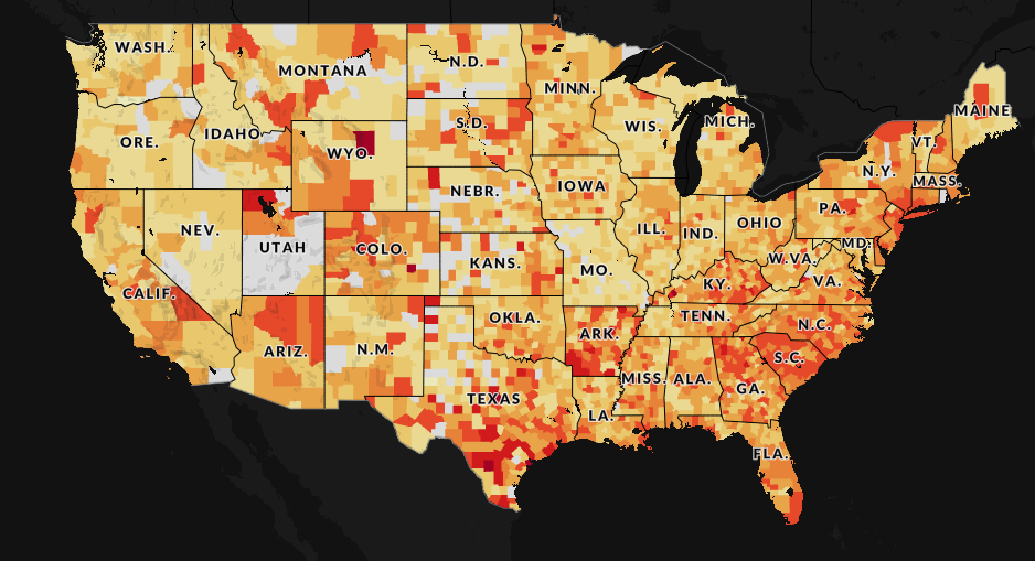
The atlas shows the number of COVID-19 cases per county, normalized for population, to provide a visualization of hot spots. Scrubbing through a timeline lets users see how the distribution of cases has shifted over time. To make their data as accessible as possible, the atlas’ website includes an API that allows users to interact with the data and draw their own conclusions.
“This pandemic will not be our last, and so having these sorts of accessible tools is critical,” Halpern said.
Adrián Blanco from the Washington Post and Javier Sauras from Columbia University wanted to know which other forms of visualization join maps in defining the “grammar of graphics of the pandemic,” as Sauras said. They surveyed more than 50 data journalists, graphic reporters, editors, and visualization experts from media newsrooms around the world to ask what challenges they’re facing, and which tools they’re using to solve them.
Survey respondents reported that in addition to maps, bar charts and line charts were among their favorite tools for describing the pandemic, and that purple and orange were their go-to colors. Many of the journalists who were interviewed felt that the pandemic had shown their coworkers the importance of being able to put visualizations together — a silver lining for those attending the conference.
Some survey respondents, particularly those from small newsrooms, said that finding reliable experts who could help them make sense of COVID-19 data had been challenging. Access to experts allowed journalists to break away from formulaic storylines and report novel information, while those without found themselves playing catch-up.
The survey also revealed that communicating large numbers is one of the biggest challenges facing data journalists. A statement like, “Almost 500,000 people have died of COVID-19 in the United States” slides by readers’ eyes without making a strong impression. THE CITY, an independent, non-profit newsroom in New York City, aims to address this through a project they call, MISSING THEM.
THE CITY’s Director of Engagement, Terry Parris Jr., described this collaborative project along with Anjali Tsui from the Stabile Center for Investigative Journalism and Derek Kravitz from the Columbia Journalism School. MISSING THEM aims to collect the names of New Yorkers who have died from COVID-19 and write obituaries for those who otherwise wouldn’t have them.
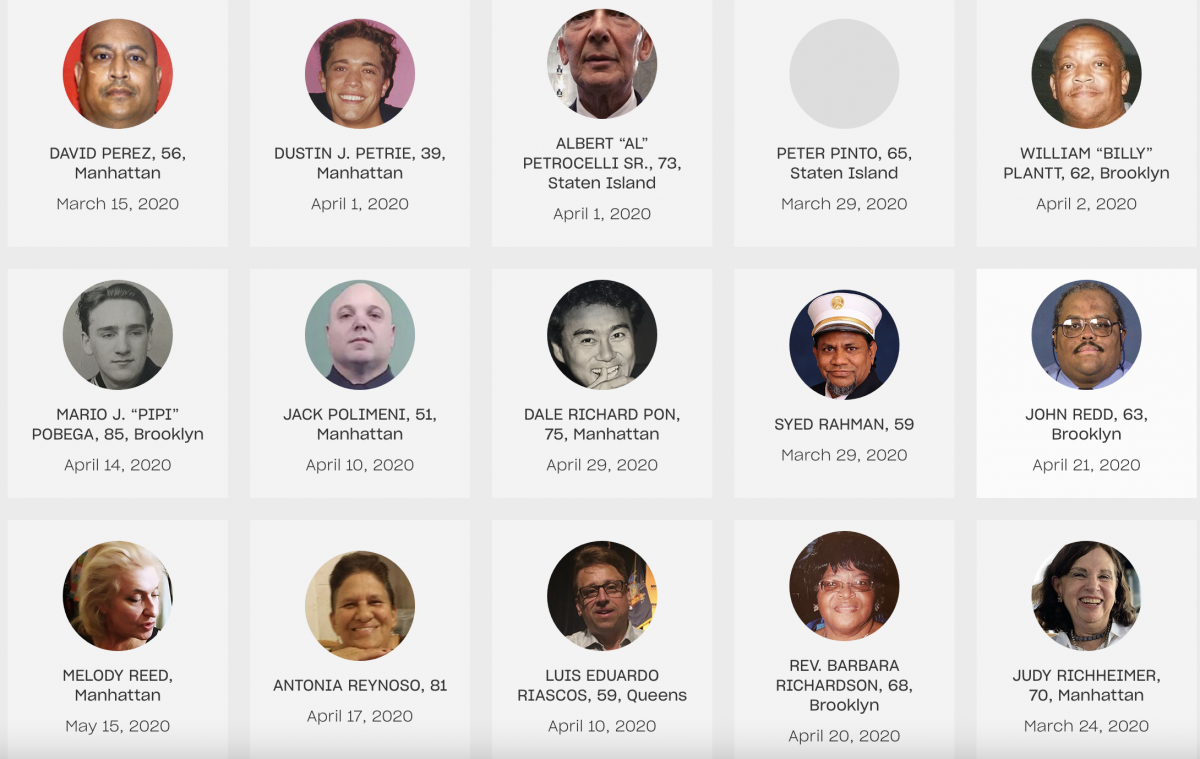
“An average obituary in the New York daily news is about $600,” Parris said. Perhaps because of this steep cost, he said that 70% of the obituaries of COVID-19’s victims in New York belong to white New Yorkers. “Even in death, there’s discrimination in how someone can be remembered,” he said.
THE CITY combed through other news outlets, lists that unions made public, and data from the city’s medical examiner to find names for the deceased, and also crowd-sourced a list of names using a Google form embedded in their website. So far, the project has collected almost 2,000 names, almost 500 of which were crowd-sourced. Trained journalism students and volunteers have written free obituaries for almost 300 New Yorkers who otherwise would not have had them. The racial make-up of the free obituaries parallels the racial profile of COVID-19-related deaths, with only about 25% belonging to white New Yorkers.
Vaccine roll-outs provided hope that THE CITY’s volunteers will soon be writing fewer obituaries, but vaccination campaigns come with daunting logistical challenges. Scientists Kate Miller and Rebecca Weintraub from the health systems innovation center Ariadne Labs, Vilas Dhar from the McGovern Foundation, and Stuart A. Thompson from the New York Times Opinion spoke about a collaboration that led to an equitable vaccine distribution model. This model can aid governments in forming vaccination plans as well as fostering understanding in people waiting to be vaccinated.
As governments prioritize high-risk individuals for vaccination, figuring out how many people fall into various high-risk categories, and how much overlap there is between categories, involved “some complex data wrangling,” Miller said. Defining the overlap between different high-risk populations revealed that many older people will be eligible for vaccination earlier than health officials may have expected. “By the time you get to this age group, age 65 plus, 85% of the group will have already been vaccinated because they already fell into one comorbidity, two or more comorbidities, or elderly and long-term care,” Miller said.
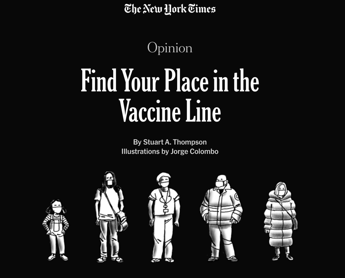
To help the public visualize this complex data set, Thompson from New York Times Opinion built an online tool that allows users to visualize their place in the vaccine line based on their age, occupation, and health conditions.
Vilas Dhar, the president of the McGovern Foundation, said he hopes this tool will help the general public feel a sense of agency in a situation that is largely outside their control. “At the end of the day, data, in all of the complexities and the abstractions with which we engage it, matters because of the way that it affects people,” he said.