How Media Frame Climate Change
Climate change is everywhere in the news. Maps, charts and interactive projects try to explain how fast the planet is warming and what that means for the future. But the same data can tell very different stories, depending on how it is framed.
Some newsrooms focus on what warming looks like in a single city. Others zoom out to show bigger shifts, like climate zones moving across the map or tree species changing where they can grow. Some invite readers to explore future scenarios themselves, while others use maps to show the scale of what is already happening. It’s an impressive demonstration of storytelling tools: the data, visuals and structure that turn one global problem into many different narratives.
Climate change, told through one place
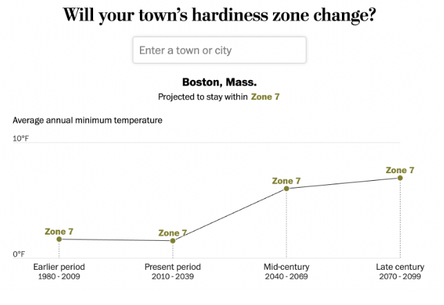
In the article “How Much Hotter Is Your Hometown Than When You Were Born?,” Nadia Popovich and a team at The New York Times localize climate change through one clear metric: the number of days above 90 degrees Fahrenheit in a specific city, in the past and in future projections. The story is built around a simple interaction. You enter a hometown, for example, Boston and add a birth year. The main chart reshapes itself around those inputs, turning the trend into a small climate timeline for one place.
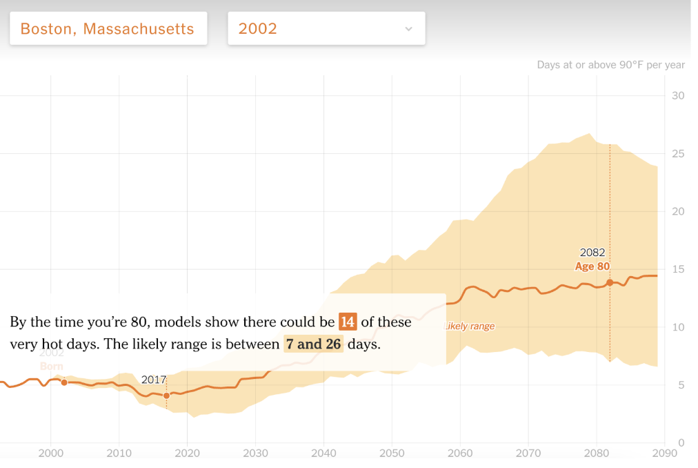
Once the birth year is added, a marker appears on the line and the chart separates into past observations and future projections. As the page scrolls, the text highlights how many 90 degree days the city had around the birth year, how many it experiences today, and what conditions may look like later in life.
Later, the story briefly zooms out to place individual cities within a broader global pattern. The structure stays the same, while the data changes. This framing keeps the focus on lived experience, using a simple visual language to make long-term warming easier to grasp.
From one city to a global system
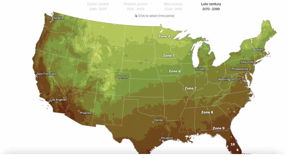
Instead of focusing on temperature counts in one place, Derek Taylor’s project in The Pudding, “Climate Zones: How Will Your City Feel in the Future?” looks at how climate categories themselves are changing over time.
The project is built around the Köppen climate classification system, a widely used method for grouping regions based on long-term patterns of temperature and precipitation. It opens with a world map divided into broad climate zones. As the reader scrolls, the view zooms into regions such as Europe and breaks those large categories into smaller sub-types, showing why cities that fall under the same general label can still feel very different.
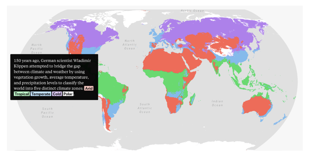
The map automatically switches between what is currently available and what will be available in 2070.
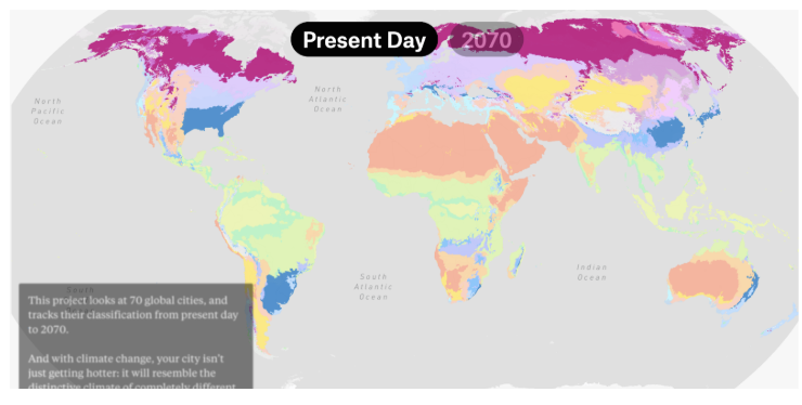
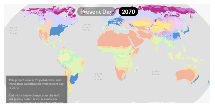
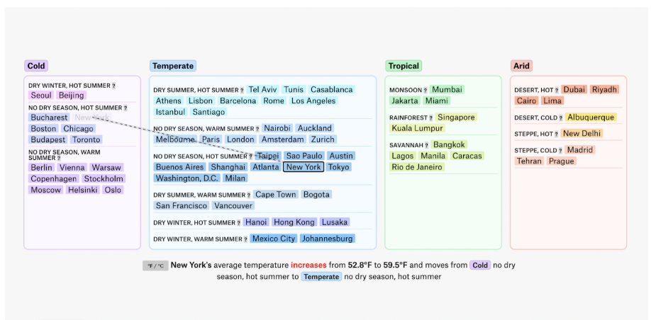
The geography stays fixed while the climate zones move across it, making the shift easy to see. In the final section, the focus narrows to individual cities. Selecting a city shows how its climate classification is expected to change, along with a short note about the projected rise in average temperature.
Rather than turning climate change into a personal timeline, this project frames it as a reorganization of a global system. The emphasis is on structure and patterns, showing how warming reshapes the categories used to describe climates around the world.
Climate change through decisions
After looking at climate change through past trends and shifting systems, the Financial Times takes a more active approach. In the article “Can you reach net zero by 2050?,”?,” created by Sam Joiner, Alexandra Heal, and Leslie Hook, climate change is presented as a series of decisions that shape what happens next.
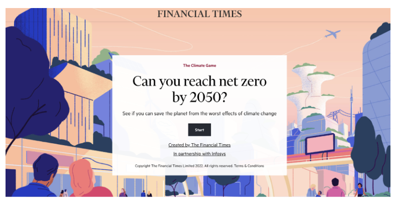
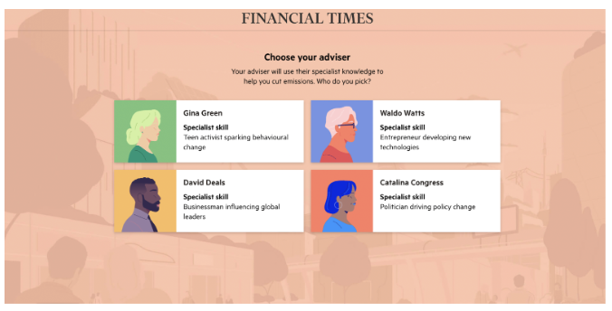
The project is built as a game. Readers take on the role of a decision-maker and choose actions across different sectors, including electricity, transport, buildings and industry. Each choice affects future emissions and comes with limits, costs, or side effects, which become more visible as the game progresses.
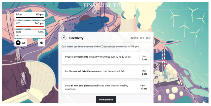
Instead of showing results, the consequences of each choice build over time. Early choices influence later options, and it quickly becomes clear that there is no single solution that works on its own.
Here, climate change is framed not as something to observe, but as something to manage. The focus is less on what has already happened and more on how different paths lead to very different outcomes.
From visible impact to global reach
Not every climate story focuses on explaining systems or guiding readers through choices. Some projects instead show what climate change is already doing, either through visible consequences or through scale.
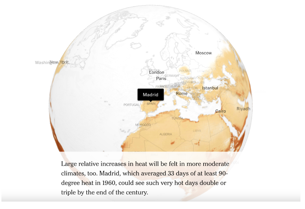
In its reporting on tree species, Harry Stevens at The Washington Post focuses on how warming is already changing where certain trees can grow. The story follows specific examples and shows, through maps, how some species are projected to move north while others disappear from areas where they have long been common.
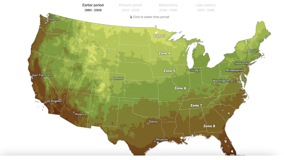
When a reader enters a city, such as Boston, the interactive shows how local growing conditions are expected to shift over time, linking climate change to a familiar place.
The project also allows readers to enter a specific tree species and see how its suitable range is expected to change. When entering “Fraser fir”, the map highlights areas where the tree may no longer be able to grow by mid- or late century, alongside regions farther north where conditions may become suitable. This again highlights climate change.
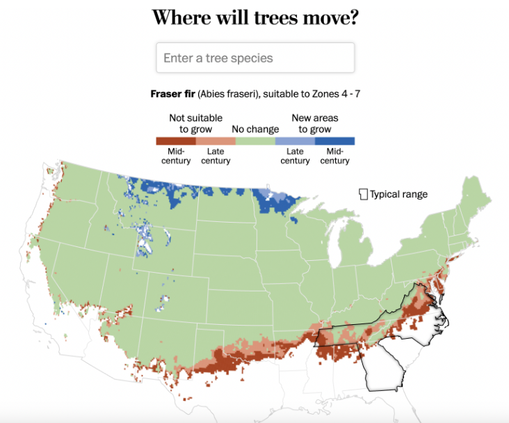
Instead of showing climate change as numbers on a map, this story connects warming to changes people can actually see. By focusing on where different trees can grow, it shows how climate change slowly reshapes familiar landscapes. The shift is not abstract. It happens around people, through the environment they live in and recognize.
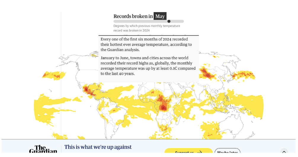
The Guardian looks at the same problem from much farther away. The story, produced by Pablo Gutiérrez, Tural Ahmedzade, Ashley Kirk, Ajit Niranjan, and Niels de Hoog, maps where monthly temperature records were broken in 2024, using global satellite data to show how much of the planet experienced extreme heat at least once during the year.
Together, these stories show a different editorial choice. Instead of guiding readers through a system or a decision, they focus on evidence: what is already changing in the environment, and how large the impact has become worldwide.
Seeing climate change in different ways
The story of climate change appears in different forms, but it keeps returning to the same space: everyday life. Some articles focus on cities people live in, while others look at landscapes, trees or choices made over time. The angles are different, but the problem is the same.
To hold attention and make the issue clear, journalists use different storytelling tools. They choose different visual styles and structures like maps, charts, and interactive elements, and sometimes games or concrete examples from the natural world. So, climate coverage is less about explaining data and more about making change visible.
- How Media Frame Climate Change - February 3, 2026
- Best No-Code Tools for Data Visualizations - November 18, 2025
- Battle of the Bots: Which AI Translator Is Best? We put three to the test - September 30, 2025