How Northeastern’s Samuel Scarpino built a live map tracking the coronavirus outbreak
Samuel Scarpino, an assistant professor in Northeastern’s Network Science Institute, built a map that monitors the outbreak of the coronavirus. He has collaborated with many other scientists to track the spreading disease. Scarpino spoke with Storybench about how he built this live map.
Are there any predictions as to whether the virus will continue spreading?
That’s something that everyone is still trying to figure out.
There has just been a report from a large collaborative group in Hong Kong that showed that the coronavirus has similarities to SARS because they’re closely related. And the thing that happened with SARS was it caused quite a bit of morbidity and mortality.
In the areas where it emerged, there were some cases that were introduced around the world and there were some small outbreaks, but it was containable by public health. And I think everyone is still optimistic that this can be largely contained. I think the global public health community is also trying to be prepared in case it can’t be contained so that we can respond to it.
Who have you partnered with to gather this data and build the map?
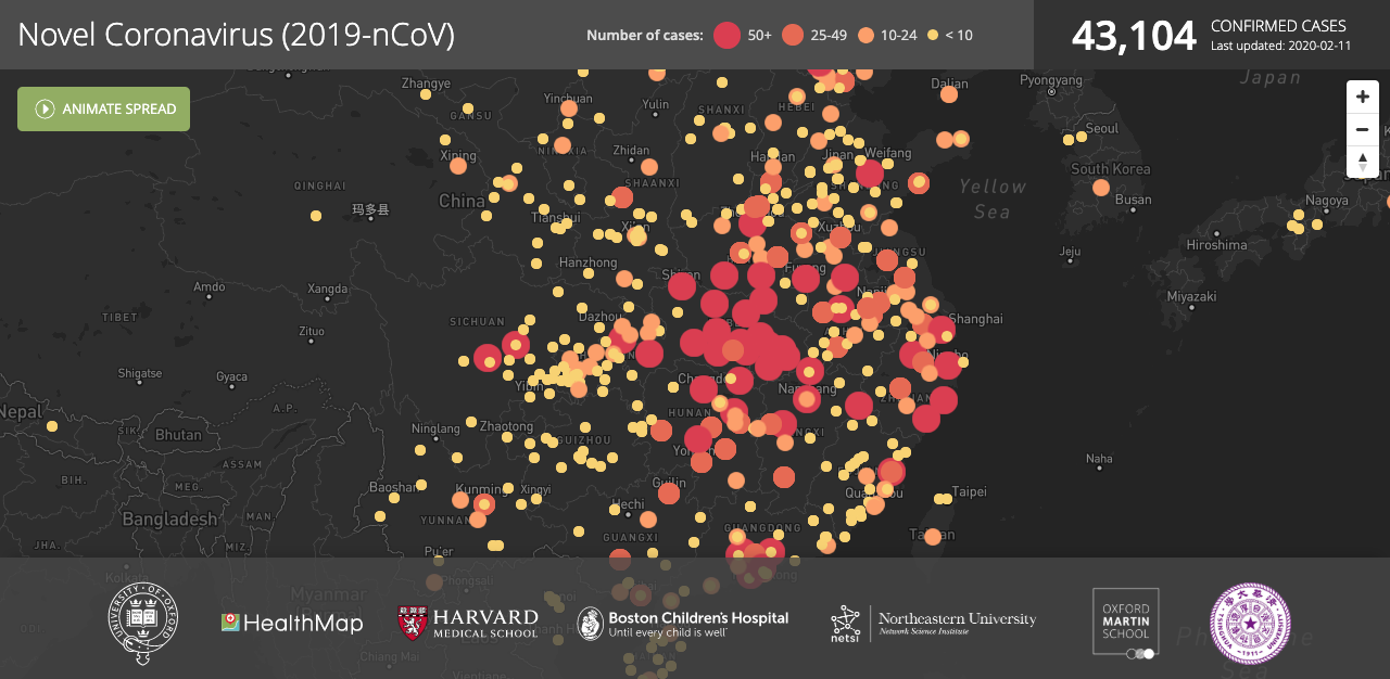
It’s a large international group of people that are working together to build the data set powering that map. We’ve also recently merged with this group called Health Map and Boston Children’s Hospital to create a second map that has a lot more computational power behind it so it can handle much bigger traffic volume.
(Follow this link to see a list of individuals who made it possible to create the map with specific data contributions.)
It is suspected that there are far more cases than have been officially confirmed. What do you think about that and what is depicted in your map?
We have a mix of both confirmed and unconfirmed cases, but these are still only cases that have been reported either through a news service or through a public health agency. There has been a number of preprints or reports posted from places like Northeastern University’s lab, and they’ve published estimates of the total infected population size. All these lead to a much bigger number of people that are contained in our dataset.
There are about 5,000* confirmed cases but it’s estimated that there are around 30,000 cases.
Those 30,000 cases are in the ballpark of what people have been projecting, but those are based on statistical and mathematical models using the reported case data. So, there’s also quite a bit of uncertainty in those numbers. It’s very hard to tell because one of the things that happens when there’s an outbreak like this is you get floods of people coming into the hospital, some of whom are sick with the coronavirus, some of whom are sick with something else and are worried that it’s the coronavirus, all sorts of other pathogens that normally wouldn’t be in the hospital. And then on top of that, you also have a whole other group of people that are showing up just because they’re worried. One really big problem with trying to get an estimate of how many people are infected, especially with on-the-ground reports about hospital crowding, is it is very likely that most of those are not normal coronavirus cases but those are people who have something else. We’re seeing the numbers around 6,000 – that’s probably lower than the true number of infections. Also, probably a lot of the infections that we are missing are much less severe. Every day this situation is evolving very rapidly. I think we’ll know a lot more in the coming days about what the total number of infected people looks like.
*(Editor’s note: At the time of publication, this number had grown to 43,000, according to Scarpino’s map.)
Let’s talk about the making of the map. Did you code the whole map yourself?
The original map I wrote myself. Lots of pieces of code for similar maps are on the internet and there are large code libraries. That has made it a lot easier.
What coding languages did you use?
It uses two main languages: R and R Shiny. R Shiny has a mix of JavaScript and R.
Can you explain how it works and how the map is coded?
The data that we have is sitting in a Google spreadsheet and there is a line of code that grabs the spreadsheet and brings those data into the computing environment. Then there’s a bunch of code that processes the data. It pulls out the latitude, longitude, all those kinds of things. And then there’s some code that builds the front end of the scene, the browser that has the map and click buttons for the filters and the pop-ups and all the things that you’re interacting with there. Then there’s another set of code that applies those filters to the map. That’s the basic setup.
When you thought about the design of the map, did you have to have something specific in mind?
Not really, there are a lot of maps that look like this online. I think trying to communicate the information as accurately as possible is what’s important with any data visualization. I’m by no means an expert in geographic information systems or mapping, but you want to show where the cases are occurring. Use color to try to communicate more information. I did the best that I could with what I knew how to do with what examples I saw that I liked.
Do you think a map is the best way to monitor the virus and to show people what’s happening?
I think it contains a lot of information. There’s obviously a lot that’s not there. What’s happening to those people. Are they hospitalized? Are they recovering? How fast are the cases showing up? We can have some kind of slider or animations, you can see the cases so we’re losing that temporal component, which is really important for these outbreaks. The age distribution, so how old are these people that are getting infected? There’s a lot of information that isn’t in the dataset that we have and that’s not in the map.
But, you know, I think the advantages of maps are that most people understand them and understand how to read them, and they provide a lot of information about where the infection is and where it is spreading.
Has anything positive come out of this situation?
One of the amazing things, in terms of the outbreak response, has been all of the international collaboration, all the people that have been working hard to make data available to build these maps. I think just acknowledging the kind of open science and open data, the importance of this international community in terms of the response, is the good news story of all of this — how quickly and openly everyone’s been working in trying to understand what’s going on.


