The proof is in The Pudding: How one online publication is using cutting-edge data visualizations to tell meaningful pop culture stories
The Pudding is a digital publication that explains ideas debated in culture through visual essays. Founded in 2017, The Pudding dives deep into issues and topics surrounding popular culture and reports on them using cutting-edge data visualizations and interactive design.
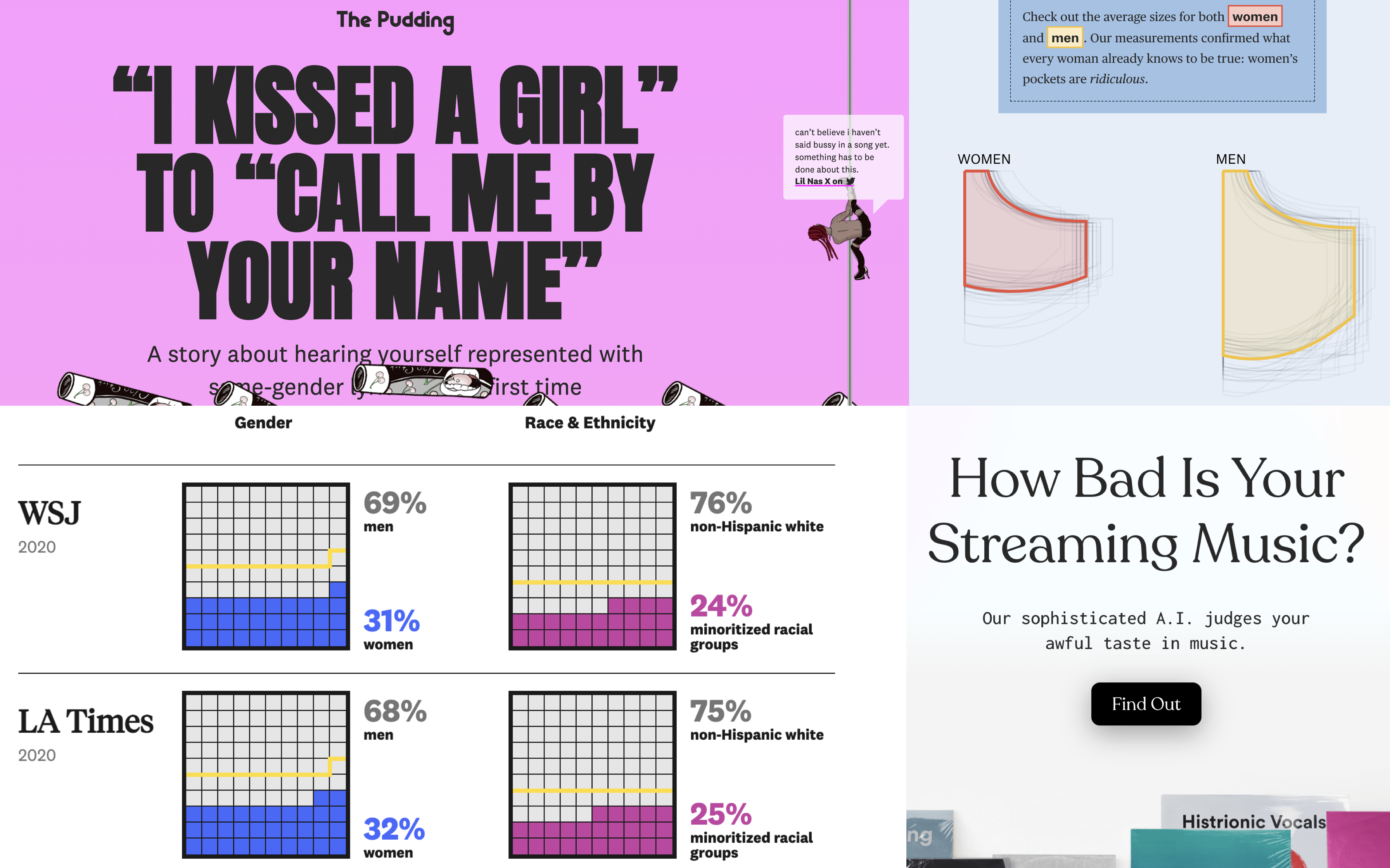
Using longform data journalism, the publication is known for interactive and experimental stories like “The Birthday Paradox Experiment” by Russell Goldenberg or the viral project “How Bad Is Your Streaming Music?” which roasts the esoteric music taste of users with sophisticated A.I. trained by Mark Lacher and Matt Daniels.
The Pudding staff is comprised of a small team of journalists with unique backgrounds like computer science, engineering and data analytics.
Storybench spoke with Michelle McGhee, a journalist-engineer at The Pudding, about her experiences within the world of data visualization along with her hopes and expectations for the future of the field. McGhee studied computer science at Stanford University. Since graduating in 2018, she has worked as a software engineer at a Bay-Area startup, interned with KPFA Radio in Berkeley, Calif. and worked as a visual journalist at Axios. McGhee recently joined The Pudding in August.
This interview has been edited for length and clarity.
Tell me about your position at The Pudding. How did you get there and what got you interested in visual storytelling?
My title is junior journalist-engineer. The job involves a mashup of those two things and a lot of different skills. That is sort of what drew me to this world a couple years back. I studied computer science in college and that was always something I liked to do and was interested in, but I also had interests in storytelling and [the] more creative [side of] things. I was always looking for ways to combine those in interesting ways.
I discovered this world of data visualization, especially in journalism, and how the process of creating [visualizations] is something that combines a lot of the ways I like to use my brain with the ways that I like to problem solve — getting to make things, getting to think about structure and stories and how to teach someone something, but also the technical stuff behind how you actually create those things.

What is your process for approaching stories that don’t necessarily lend themselves to graphics?
Our whole thing at The Pudding is making things visual, and usually we get excited about an idea because we think it lends itself to being explained visually. That is always the puzzle. I think a lot of things can be explained visually; whether it be through a chart or more of an interactive experience where you’re using the tools of a website to make something immersive and that makes [a story] stick more. There are a lot of things to try when it comes to making something visual. If it’s really not working then maybe it just isn’t meant to be.
Have you ever really wanted to do a story but struggled to find a way to tell it visually?
It’s not always just that I can’t think of a visual way to show it, but maybe it’s also like I’m still settling on the framing or the angle. It does depend a lot on making earlier decisions of what [a story] is trying to say. Who is this for? What should it feel like? I think if you can answer those questions then it’s usually pretty easy to figure out how you visualize it, but it’s hard when you don’t have answers to those questions.
The Pudding does an excellent job with visualizing lifestyle and culture coverage. These topics are often under-represented in other visual and data storytelling publications. What is the motivation in highlighting this coverage?
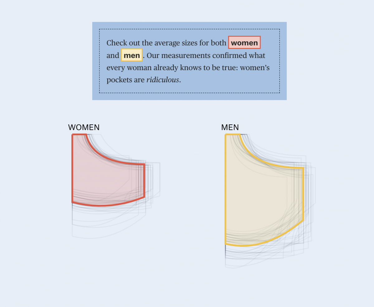
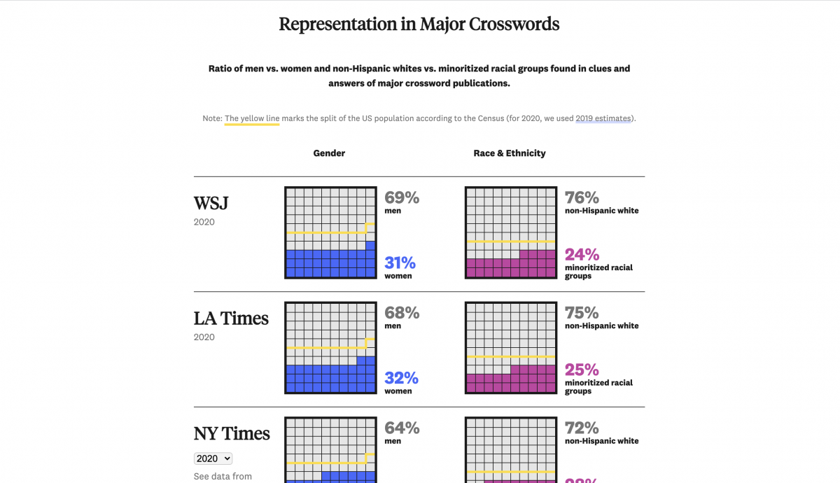
The New York Times makes some great data visualizations about a lot of serious, newsworthy, in-the-news-cycle topics. But there’s not as much on things that are in the pop culture realm. People are interested in that too, and those [stories] have value too. Also, those [topics] can definitely connect to important issues. Thinking of the women’s pockets piece, that’s kind of a fun thing, but it’s also an important topic. I made a piece on crossword puzzles called “Who’s in the Crossword?”, but it was also about representation. So sometimes these pop culture-y [stories] can be entry points into important topics.
How does data visualization and visual storytelling in general make stories easier to comprehend? Do you think data visualization really helps readers understand stories in more dynamic ways?
There’s a big difference between reading a big page of words versus seeing it in a well-designed [interactive] visualization that really highlights the main points and insights. I think experiential learning is one of the best ways to really internalize something. Obviously, you can learn things from just reading text, but I think a lot of the time things stick more if you can experience [interactive design]. I really like the pieces that do that — that let you be a part of the article and sort of play with it and say ‘Oh, well what if I did this? OK, it does that.’ That’s the stuff that I feel like, at least for me, sticks more.
In your story “Who’s in the Crossword?” there is a lot of data and different sources. How did you manage that?
That one was a bit of a beast because the data was manually collected. I went to look at five different publications and ‘x’ amount of crossword puzzle clues per publication. Then we needed to filter it down to the clues that include people, because it’s all about who is in the crossword. There’s not really a clear programmatic way to do that, so you’re going to be manually going through the clues. If there’s a person in it, you’re tagging it, and then you’re researching that person for their gender and their race. Then once you have all that data it’s a big task to decide ‘OK, what is the main thing I’m going to say with this?’ Because I could say a hundred things, but I’m telling a story so it needs to be engaging and have a clear message. That really requires doing some exploring in the data, seeing what catches your interest and brainstorming the different ways it could go.
In the “‘I Kissed a Girl’ to ‘Call Me by Your Name’” article, there is a lot going on visually, yet it doesn’t feel overwhelming. How do you make sure the line of giving readers too much isn’t crossed?
I think it’s all about knowing where you want the person to be looking. What’s the most important thing that they should be gravitating toward? If there’s something else that’s actually drawing their attention, then that’s likely a problem or maybe there’s too much happening.
Why should readers care about data and digital storytelling?
I feel like people should care about data and digital storytelling because they make things easier to understand and more interesting to look at. I’d much rather live in a world where things are represented in a variety of different ways that are interesting and easier to understand and that I also like interacting with instead of feeling like it’s a slog to learn about a new complex topic.
What is something you want to see more of in data and digital storytelling?
I’m learning a lot about accessibility in data visualization which is something that I don’t know a ton about. I’ve been following people who talk about it and have a lot of good resources for making data visualization specifically more accessible. That’s really important because the point of data visualization is to make information more accessible. So if you’re making inaccessible data visualizations, you’re kind of defeating the whole point of what you’re trying to do. People with disabilities have different situations and it matters how you present [information] with the ultimate goal of reaching as many people as possible. Not everybody is on your exact type of computer with your exact vision and your exact tools. It hasn’t really permeated [the industry] yet — everybody isn’t an expert in how to make things accessible. It feels like that’s still sort of a new thing that some people are really good at and other people don’t care about. That’s something that I anticipate will progress and that I’d like to see progress.
- Visualizing Uncertainty in the Time of COVID-19: New York University’s Enrico Bertini on the role of uncertainty - December 14, 2021
- Visualizing Uncertainty in the Time of COVID-19: The New York Times’ Josh Holder on leading with questions when demonstrating uncertainty - November 17, 2021
- Visualizing Uncertainty in the Time of COVID-19: The Washington Post’s Chiqui Esteban on the Power of Words - November 8, 2021