How I visualized hundreds of ballot proposition outcomes with R Shiny
Most years, San Franciscans vote on ballot measures determining whether or not police should carry tasers, to allocate $50 million a year for homeless services, or to impose a fee on ride-hailing apps to support public transit. In some years, voters make decisions on over 30 propositions at the local, regional or state level. And these propositions are no small matter; they direct lots and lots of funding. A 2017 report found that in the next five years, the city will spend $1.5 billion on voter-adopted initiatives. That’s why I decided to build an interactive app to explore the outcomes of these ballot propositions over the last four decades. Here’s how I did it.
Goal of the historical proposition explorer
Given the impact that ballot propositions have on San Francisco, I wanted to help people better understand past ballot propositions and their outcomes. I started out with a few use-cases in mind.
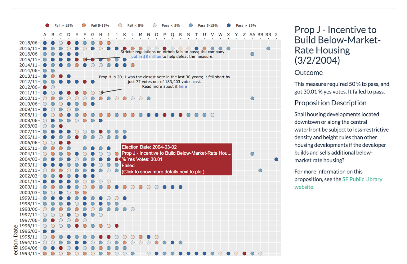
- A reader should be able to find “interesting” past propositions they didn’t know about – but an “interesting” proposition is hard to define. If one almost passed or barely passed, that might be an interesting one to read about. On the other hand, if a proposition was overwhelmingly supported or not supported, that could also be interesting. Our visualization should make it easy for someone to find various types of “interesting” propositions.
- A reader should be able to find a specific proposition that they remember reading about, voting on, or otherwise being engaged with.
- A reader should be able to learn more details about any proposition that they find interesting.
With these goals in mind, there are three primary dimensions that I decided should definitely be shown in the visualization:
- Date of the vote
- Proposition letter
- Whether it passed
Beyond those dimensions, I also wanted to visualize:
- How much support the proposition had
- The title of the proposition
- A short description of the proposition
There are of course many other potentially interesting dimensions – the “type” of proposition (e.g. a charter amendment, an ordinance, a policy declaration); the “source” of the proposition (e.g. did the Board of Supervisors place it on the ballot? Was at an initiative that required gathering signatures from voters?).
I decided not to show these dimensions in the visualization. While they are certainly relevant context, there are already six dimensions per proposition I wanted to show. And since they’re concepts that readers are less likely to be familiar with, they could make the visualization less approachable.
Visualizing the data
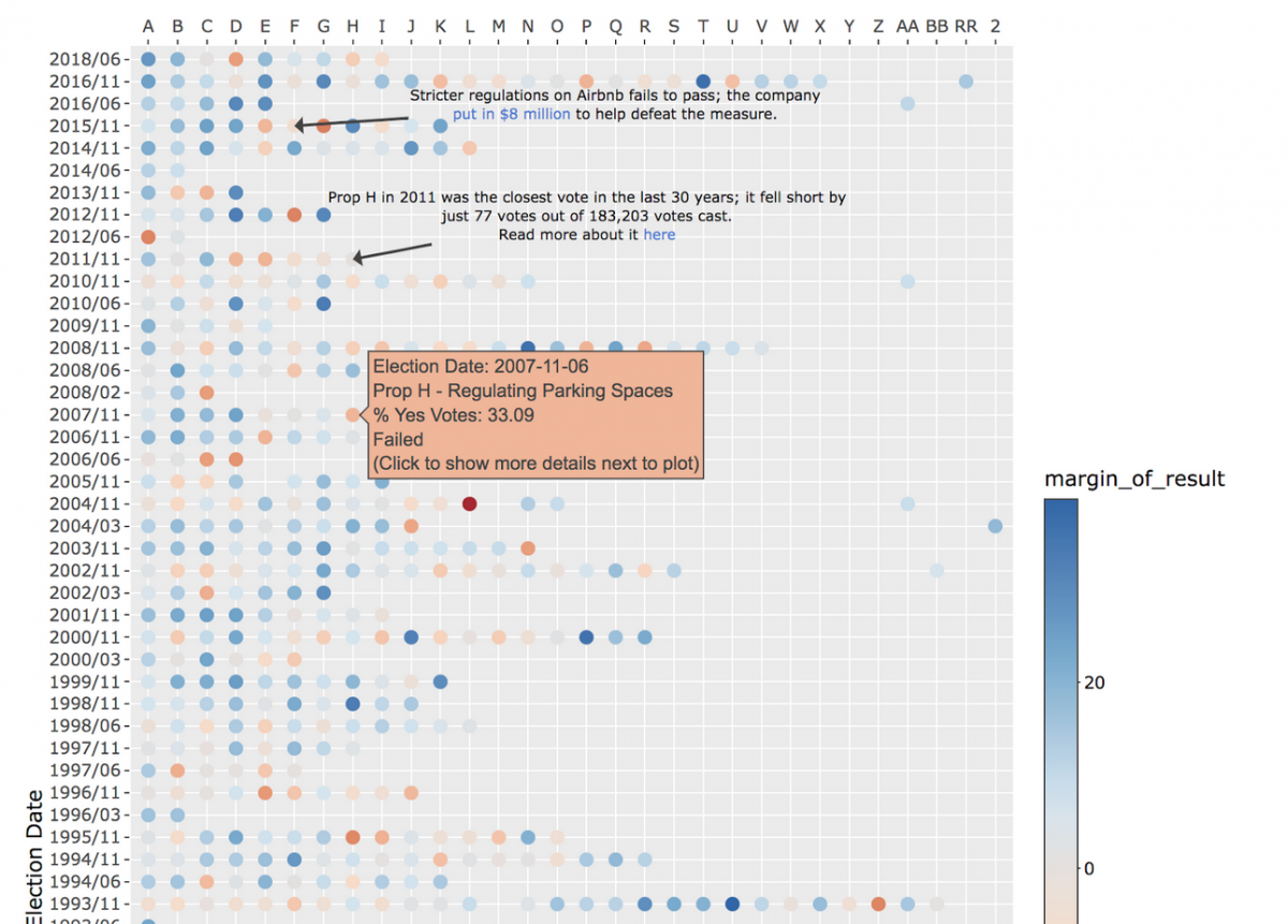
In visualizations with a date element, the date is most often shown on the x-axis. In this case, however, there were a few reasons I put the date on the y-axis. First, there are over forty years of proposition results, making it difficult to fit horizontally the entire time span on a normal sized screen. Using a vertical axis allows the explorer to show a much longer period of time, as users can scroll down to see later years. Second, readers are more likely to be familiar with recent propositions and this layout puts those at the top.
Using bucketed colors to show outcomes
There are two possible outcomes for a proposition – it either passes or not. However, not all propositions require the same level of support – certain propositions require a simple 50%+1 majority, while others require a “supermajority” of 66.6%+1 support in order to pass. Displaying the percent of people who voted “yes” does not capture this nuance. A more fair comparison is by how much a proposition has passed or failed. This gives a better idea of how close a race was; one that required 50% support and received 51% will now be displayed the same as another that required 66.6% and received 67.6%.
While this dimension is continuous, picking an appropriate continuous color scale proved difficult and created a slightly overwhelming graphic. Datawrapper wrote a fantastic color guide, which describes the issue well: “If you work with gradients, your main concern is making sure that the differences between your color steps are large enough. You want your reader to be able to clearly differentiate between a light green and a …lighter green.”
After struggling to create a gradient that made it easy to differentiate outcomes, I chose to bucket the outcomes into discrete colors. While this means we lose some information (now a proposition that passed by 2% has the same color as one that passed by 1%), it also makes it easier for readers to distinguish between various results.
I also considered using the size of the point to display how much support a proposition had – intuitively, we could display a smaller point for propositions that had less support, and a larger point for ones with more support. I decided against this for a few reasons. First, the plot is already very crowded – trying to vary size in a meaningful way on a crowded plot was causing points to overlap in odd ways. Second, varying the size inherently means that some points will be very small, especially on a crowded plot. Since some people may find propositions that had very little support interesting, we don’t want to make it hard to find or read such propositions.
Sidebar to display individual proposition details
Each proposition has a lot of data associated with it. Some of that data maps nicely to a scatter plot, but displaying a multi-sentence description of the proposition isn’t going to fit on the plot. In order to accommodate this extra information, I decided to split the visualization and include a sidebar where a reader can access more detail about a selected proposition. This led to a nice separation between the “exploring” overview of the scatter plot, and the “details” view of the sidebar.
Note that the sidebar updates when a reader clicks on a point, not when they hover over it. Given that there is rich content in the sidebar, including links to the SFPL’s page about the proposition, a reader may want to click on the content in the sidebar. Consider a scenario where a reader wants to read more about a proposition on the left side of our plot. If they move their mouse from the left side of the plot to the sidebar on the right, they’ll inevitably hover over another, different proposition on the way, losing the original proposition they wanted to read more about. As a result, I opted to only update the sidebar when a user explicitly clicks a point.
Adding annotations
At this point, I felt pretty good about the overall look and experience of the explorer. However, for someone who has thought less about ballot proposition results, it’s unclear where to begin. To make the visualization a bit more approachable, I decided to annotate a handful of propositions that I thought were particularly memorable – they serve as a good starting point to contextualize the rest of the plot. The annotations were also useful when creating a screenshot of the explorer (as shown at the top of this post), as they provide more detail about what is shown in the rest of the plot.`
Choosing R Shiny and Plot.ly
The ballot proposition explorer was built in R – using Shiny, ggplot2, and plot.ly. All of these tools were fairly straightforward to set up and get started with. However, in retrospect, using R for this particular visualization may not have been the best choice. Although it was great for prototyping and building simpler versions of the app, building highly customized visualizations became difficult. The mix of ggplot2, R, Shiny, plot.ly, HTML, Javascript, and various custom event handlers got a little cumbersome, especially when trying to tune the final details of the visualization. Using a Javascript-based visualization library, such as D3, would have required more work upfront to get a simple prototype working but may have made all of the later customization easier.
All of the data and code used in this visualization are on Github – the R Shiny code specifically can be found here.