How The New York Times designed Harriet Tubman’s path to freedom
Before she became a senior communications designer at Slack, Angelica Rogers was a digital designer and front-end web developer at The New York Times, producing compelling interactive pieces like Harriet Tubman: Path to Freedom. That piece was chosen as one of The Times’s top visual and graphic stories of 2017.
Storybench sat down with Rogers to chat about the project, which was one of her last with The Times.
How was this story pitched?
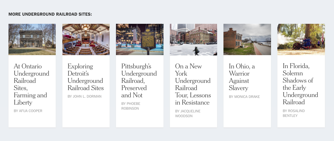
I must give a shout out to the travel editor at the time, her name is Monica Drake and very recently she was promoted to Assistant Managing Editor at The New York Times which is a very big deal because she is the first African American woman to be promoted to the masthead. Me and Monica worked together on some previous travel pieces and she had told me three weeks before Black History Month she was considering putting together a whole section on just the underground railroad. You’ll see at the end of the piece all the stories we linked to are about other cities that have underground railroad paths that you can learn about.
We built that custom because normally we auto-generate [recommended] stories but these were hand chosen so it could feel like a section, almost like a newspaper. I talked to my boss and knew that February was a big month. I thought it would be interesting to spend time with this piece. For Monica, we wanted to pitch it on the home page and I thought this would be a really great story for our readers on the weekend and we were able to get it out there.
Who narrated the story throughout the piece?
Ron [Stodghill] narrated the piece, but he basically took Harriet Tubman’s path as it was told and I think it was her autobiography, one of his sources, but he was recalling her story as it was told through the research he had done into her background. He did a lot of extensive research, reading a lot of books about her, devouring articles and any research that he could find about her and about her journey through Maryland so that he could put together a road map of that journey.
How was this piece built?
At The New York Times, I was the visual design lead for this piece and the art director and I worked with a developer/designer on this project and it was very collaborative. When you work at a company, you build lots of pieces, especially at The Times where you build a lot of stories. We sometimes take bits of code from one project and put it together with another project, but we use Github and we basically have an internal system that we use where we get a scaffold of an article. We can customize that article ourselves within The New York Times environment, so that way we get the banner at the top so you don’t have to rebuild the banner every time.
“You realize at the core of everything is storytelling”
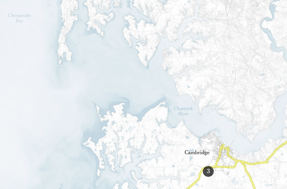
You basically have a little shell and then you start to build your code in your shell then we save all our work to Github. With this project a lot of people could be working on the code at the same time. Designers at The New York Times, especially digital designers, typically code, especially front-end. So, I would basically do the CSS stylings and collaborate with my developer. It was me and then Umi Syam [graphic/multimedia editor] who was the main developer for it and I would basically work with her while she was doing a lot of the interactive details. So, we would talk about how we wanted the page to the flow, how we felt the spacing should be and everything like that. We had a robust graphics department and one of the guys, Tim Wallace [graphics editor and geographer for The Times] also coded parts of the map, so he would draw the maps and code them and I would consult with him and talk to him about the color scheme I wanted the project to be in and talk about how we wanted to display the terrain.
Did you always meld code and design at the Times?
I only moved to the digital side of The New York Times in 2015 and before then I didn’t know any coding. I studied advertising and graphic design in college so I knew I was artistic and knew I wanted to do something commercial with graphic design but I didn’t think I would be coding or think I could make more interesting things quickly and so I transitioned from doing more print-based news page design to digital interactive pieces.
Do you consider an interactive article art?
I consider it artwork. I think it’s contemporary almost like throw away art or transient. I think that’s the way I would look at it, it’s almost like a snapshot of a piece of time because code is always evolving like the machines that we run the code on are always evolving. Even though this piece will be fond to me especially about the subject matter and the story that it tells, but if I were to look back I would think of new ways to tell the story. Even though it’s art, you must think of it as transient and it being transient it can give us a snapshot of a certain time in our technology.
Why the footage at the beginning and not at the end?
When I talked with my editor about how to develop storytelling along with a map, what I felt was interesting was how much this landscape had not changed. You can almost feel what it would be like for Harriet to go through this terrain. What if you looked at this footage and it was of buildings and houses and stuff, it might not seem as difficult to go through.
What does this article mean to you?
I think for me this would describe my last year at The New York Times. Working there in the last year I had been spending a lot of time working on pieces that really spoke to the diverse community. I was the founding member of the Race/Related team, which is The New York Times newsletter about race and race relations in America. I was working on a lot of pieces for that and was trying to write more instead of just being a visual designer who has a passion for journalism since you realize at the core of everything is storytelling.
“It is almost a disservice to not really invest in the stories of people of color.”
I really felt like when you are at an institution like The Times that has a great reach, that it is almost a disservice to not really invest in the stories of people of color. I felt as a person of color in an institutional environment that skews mostly white that I must be that voice of making sure that these stories are told and that they are also given the resources. We might tell stories of color, but do we give them these interactive inventive fields? I think with the political environment at that time with Black Lives Matter, all the deaths, there was a lot going on. For a person working in media it was very heavy, and I was personally looking for ways to contribute and make sure these stories got a digital uplift and to me that’s why I think it’s one of my proudest pieces.
- How The New York Times designed Harriet Tubman’s path to freedom - February 14, 2018


