How one French data visualization studio is bridging narrative and statistics
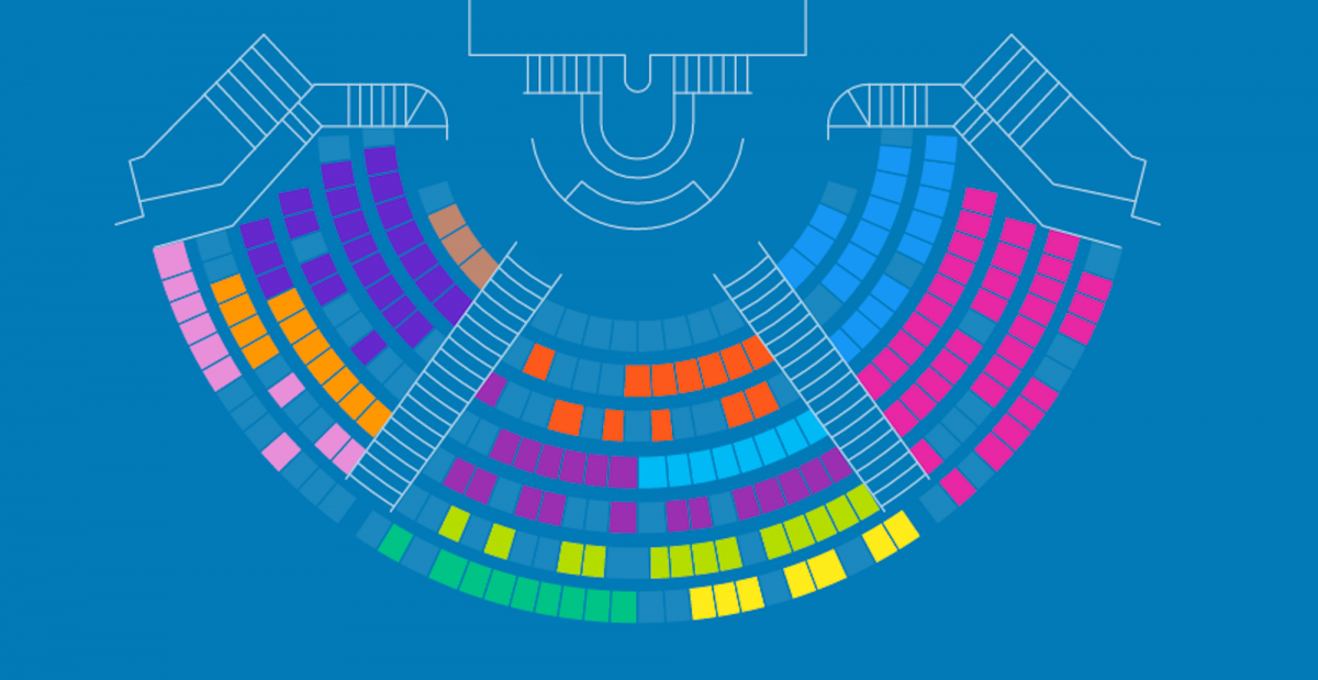
Could a quiz help explain the massive amounts of money controlled by Fifa, the international soccer organization? Could a visualization help French citizens imagine the makeup of a future government? And what if community leaders could understand their city’s environmental impact by answering a few simple questions about energy use?
These are the kinds of projects spearheaded by Karen Bastien, a data journalist passionate about the intersection of data and narrative who co-founded Wedodata, a Paris-based data analysis and visualization company. Wedodata brings together data scientists, journalists, developers, and designers to create web applications for media outlets, non-profit organizations, and scientific groups.
Bastien spoke with Storybench about how her team is telling stories with data, bridging the gap between statistics and narrative, and forming partnerships with news organizations.

How many people work together on one data visualization project?
We are now six in the full-time team. There are three or four freelancers work with us every day. Their skills are diverse. We have data journalists, data scientists, developers, and designers. We are in an agile cooperation because data visualization projects need a complementary way of working. What is essential is information and content. Design and interactivity are always constructed to serve the message.
What’s your relationship with news organizations? What’s your creative process like?
Our relationship with news organizations resembles the one between an agency and its clients. They call us for a project, we make a proposal and if it fits their ambition and budget, they order us.
Some of our projects last one month, others one year. It depends a lot on the dataset. Sometimes it comes from open data, others from crowdsourcing, from a private database or from an entire manual work. As a journalist, we take the time to analyze the source of the dataset, the way it has been collected and spend time with experts of that issue. It’s a crucial moment because it’s the departure of the storytelling.
After the data journalists and data scientists explore and clean the sources, we clean it with Google Refine (which is called Open Refine now) and Excel. When we have the story, we tell it to the graphic designers and find together the way to present it through our common creative references. Graphic designers make wireframes and we develop prototypes to test it in an agile process.

The Carbon Story is very impressive. What’s the context of this project?
It’s a long story. We were contacted by an international group of climate scientists. They wanted us to work on the open data from the historical database which are about the worldwide carbon emissions from 1960 to now. But they did not want to put just excel files on a website. They had the ambition to propose a graphic interface to explore this database. So we worked on a dashboard that offers six different graphics for a professional group, like journalists, NGOs, politicians, etc. But it seemed to us that we did not go far enough. On this crucial subject, we really wanted to share this information with a greater group of audiences in a more pedagogical way.
So we proposed to them the outreach view of the past which mixes a timeline of the human’s impact on carbon emission, a data visualization which shows the emission and its origins at the present and an interactive view that contains different scenarios of the future.
It wasn’t an easy exercise with scientists because they are used to synthesize such a mass of information for a mainstream audience. But they are really interested in this project that has been used in schools all over the world. As a matter of fact, this website is translated into five languages, including Chinese.
Using an example from Wedodata’s portfolio, what has been the biggest challenge with trying to distill data into a succinct visualization?

One of the biggest challenges is not really to distill data but to create something that catches the attention of the readers. So our challenge is to find the good data, of course, but chiefly, the question that can attract the reader.
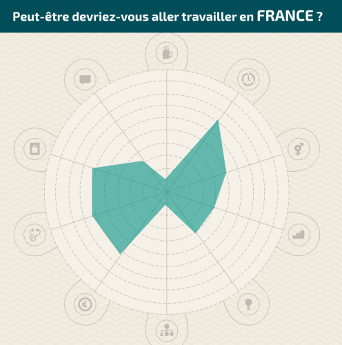
For example, in the web product on the right, the subject is a social portrait of the European Union.
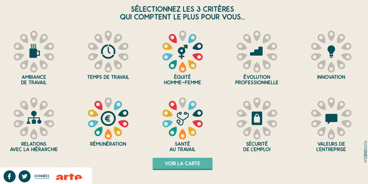
But how do you attract people on this interesting subject which is not very “sexy”? People don’t wake up in the morning motivated to read about such a theme. So we concentrated on the storytelling, on how we could attract readers on all this data from Eurostat, a statistical office of the European Union based in Luxembourg. Thanks to interactivity, we were able to propose a very personal experience. The social portrait of the European Union is finally the social portrait of your working conditions.

So we are able to answer the question: In which countries would you be happiest at work? By answering one question, we are able to distinguish the three countries that live up to your hopes for your daily working conditions. Then, after discovering these three countries, you can access to the social portrait of each one.
That’s our challenge: a good angle.
What are the core qualities you want in a new hire?
Humility is the first because there is no star in the team. Our creation is collective. We always have to learn new things, because our tools are updating, and the others’ teams are also creating new things. It’s a really stimulating ecosystem.
What advice would you give to journalism students who are interested in data visualization?
If you are sensible to design, not afraid by the technical, and not really obsessed with having your signature at the end of the article, data journalism and data visualization are for you. Take time to understand the world of statistics, its history, and its philosophy because data is not a mathematical thing, it’s political.
What kinds of tools are used by your team members?
– Data journalists:
Google spreadsheets / Excel / Open Refine (formerly Google refine) / Outwit / Tabula / Carto DB / Google Maps
– Data scientists:
Outwit / Tableau software / Regex / Tabula
– Developers:
D3.js / Highcharts / Python
– Designers:
– Coordinators:


