How The New York Times used illustrations to look at how NYC gets its drinking water
In the wake of the Flint water crisis which saw thousands exposed to lead in the drinking supply, cities around the United States have been mounting campaigns to understand the provenance and quality of their tap water.
Last month, The New York Times ran a story, “How New York Gets Its Water,” that uses illustrations and energetic reporting to tell the story of the origin and transport of the city’s water, arguably one of the country’s best tasting – or at least the best water for making pizza dough and bagels. On mobile, which is how half of readers engaged with the story, the experience was custom built to beautifully and effectively present the illustrations and text. Storybench spoke with reporter Emily Rueb and designer Matt Ruby, who confided they didn’t know what the story was going to look like until, as Rueb said, “pretty late into the reporting and writing process.”
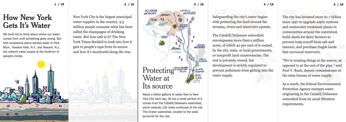
How was the story pitched? Did you know the end product would marry illustration and text?
Rueb: My beat is a digital-first beat. As a reporter, thinking about new storytelling formats that go beyond the traditional 800-word story, I had pitched this as a seven-step process. The way that I had brought this to Matt and the design team was as a very crude prototype of the information I thought would be interesting and informative of the process. I had brought them a Google Doc with charts and graphs because what I can do on my own is somewhat limited. I brought them a very, very rough sketch that was still being reported out and I was lucky enough that Matt was looking for a guinea pig to experiment with this mobile-friendly, flip-book style presentation.
In terms of design, what direction did you give illustrator Josh Cochran? What stipulations did you have for text?
Rueb: Turning around a plane in J.F.K. was kind of like an early version of this distilling a very complicated process of system. What’s hard about this was how it was an evolving process. Matt was still figuring out what design would look like as I was reporting.
Ruby: In hindsight, I would have tried to steer the illustrations more dimension-wise. We didn’t really take into consideration the way the dimensions of illustration would fit. As for Emily and her editor, we were pushing them to write less, to cut a lot of words out. It seemed to work for us and I think the whole piece benefited from it.
What exactly did you ask the illustrator to do, aesthetically?
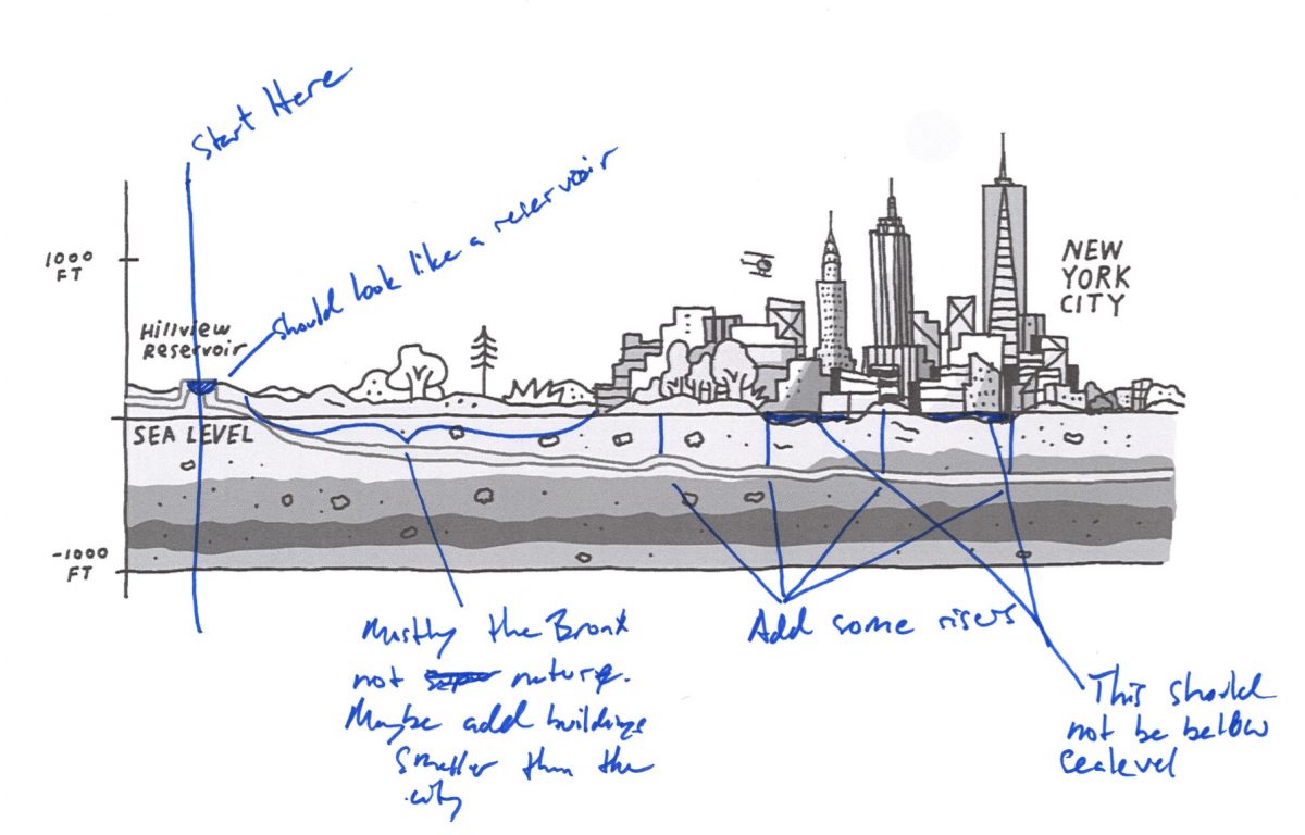
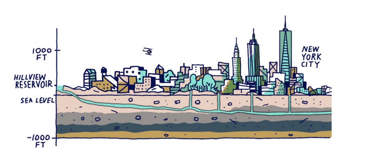
Rueb: We sent him a lot of D.E.P. guidelines and old New York waterways maps. A lot of schematics, diagrams and photos. He was working in the Google Doc, too. He was watching as I was adding text or additional graphics. I told him to take liberties and make things fun where he saw an opportunity. I think it really benefiting from his personality and style.
Ruby: We gave them pretty strict guidelines. We had been working on it for almost two weeks before they could see what we actually had. We wanted to be accurate but also fun. We went back and forth trying to do those two things. The diagrams are fairly accurate. But we also wanted them to be stylish, fun and playful.
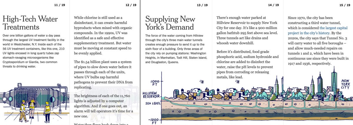
How did it all come together?
Rueb: As the sketches were coming in, they were slowly being replaced with Josh’s sketches. I was literally reporting and writing to the Google Doc. We had to play with a mini-intro and I had so much material, it was really hard to shoehorn everything in. It was a leap of faith, we didn’t know what the story was going to look like until pretty late into the reporting and writing process.
How did you envision and build the story for mobile?
Ruby: Mobile was the driving idea behind this. How could we put good New York Times content into this format? This was trying to make more of a feature-style piece into a short, snappy thing. We built it from the ground up. We gave Emily and her editor very strict direction on word count. That was weird because, I was thinking, was it offensive to have someone from a visual standpoint cut what they’re advocating for?
Well, the teamwork seemed to pay off. Nice work. Any advice?
Rueb: When you have a good idea with potential for a very cool design, the key is to involve everyone very early in the process. From the moment we started working together, it was fluid but always evolving.