How the Wall Street Journal visualized the issues that split the Republican vote
To help explain this stormy primary season in American politics, The Wall Street Journal recently published an interactive project to answer the question: What do the voters in the two parties look like?
Using data from a Wall Street Journal/NBC News poll, the paper visualized how voters coalesced around issues like immigration, gun rights, and political ideology and showed who those groups were most likely to vote for. To do this, WSJ’s visualization “How Sanders Happened” uses bar graphs and nimble annotations. But the paper’s visualization of the social conservatives and establishment voters split between Ted Cruz, Marco Rubio and Donald Trump is more impressive. The reporters and developers deftly use human figures to illustrate the polling data that is too often presented in too dry a manner.
Storybench spoke specifically about the Republican visualization, named “How Trump Happened,” with WSJ’s Aaron Zitner, the paper’s national politics editor, Randy Yeip, a graphics editor, and Julia Wolfe, a news app developer.

Can you tell us about the Republican voters in this poll and what trends you were seeing?
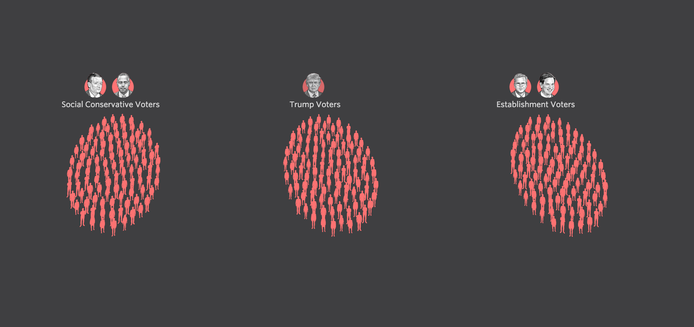
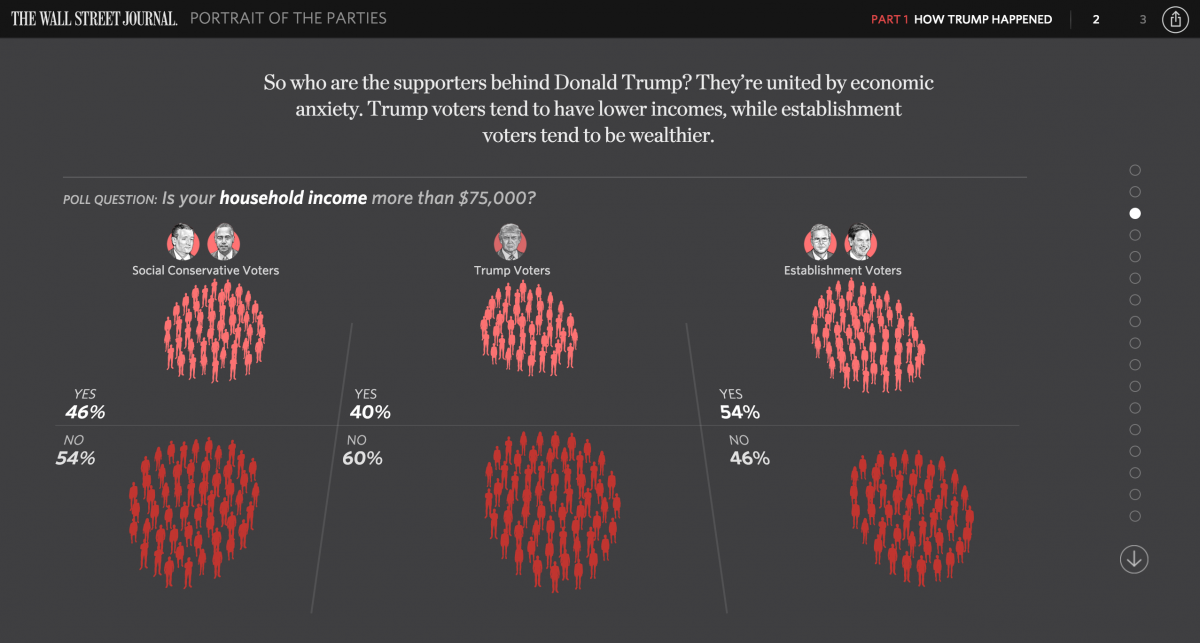
Aaron Zitner: The Wall Street Journal/NBC News poll has built a wealth of data about Republican primary voters. We asked a set of questions that aimed to segment the party: what subgroups within the GOP can be grouped by common interests. As it happens, one of the subgroups is quite familiar — social conservatives, who are animated by the issues of abortion and gay marriage. They tend to back Ted Cruz and Ben Carson. We found a grouping of more centrist Republicans, often called establishment Republicans, who tend to support free trade and increased immigration. And then we found common characteristics around voters who tend to lack college degrees, tend to earn lower incomes and are worried about free trade and oppose increased immigration. Those folks also tend to support Donald Trump.
Randy Yeip: I think we kicked off this process by asking ourselves some broad questions about the electorate as we enter primary season. What do the two parties look like? How is that different today than years past? And in trying to answer those questions, we found a lot of rich detail in the polling data Aaron describes.
Early on in the brainstorming process, what did you want this project to achieve?
Randy Yeip: One of the things that was high on my priority list was that we come up with a visual concept that was scalable, since this is a series. We thought about the broad strokes, looked at a lot of work from outside the Journal that caught our eyes, and most importantly what graphic form was appropriate for the data.
Julia Wolfe: One of the strengths of this project came from iterating over several graphic types. We knew early on that it would be some variation on a bubble chart, but that took several forms before we settled on the final visual. We were able to take the time to make several options until we hit on something we all felt served the story.
How did your team organize the data from the polls?
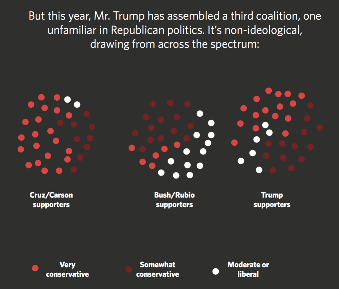
Aaron Zitner: The paper’s Washington bureau works closely with our pollsters, a Republican firm, Public Opinion Strategies, and a Democratic firm, Hart Research Associates. Much of the data came from the polls we do every four to six weeks. But we also asked for additional questions and special analyses to better understand the GOP electorate. We used that to write a script that used the data to tell a story about who the Trump voters are and how they’ve created a “third lane” in the party, along with social conservatives and establishment-centrists, and which will complicate the nominating process. The script was drafted and then improved collaboratively with Julia Wolfe, Randy Yeip and Stuart Thompson of our graphics team, who then did an outstanding job of making the data come to life in our visualization.
What was the biggest challenge with pulling off the voter crowd animation?
Julia Wolfe: A lot of the animation magic here is being done by D3.js, a common charting library. Using the library’s “force layout,” we were able to create the nice effect of the people moving from one group to the other, and rearranging themselves as needed. You can see an example of the force layout here.
The specific code he uses is:
I used a variation on this code in my tick function. In the above code, Bostock pushes any even nodes down. I just pushed any nodes greater than the ‘yes’ amount.
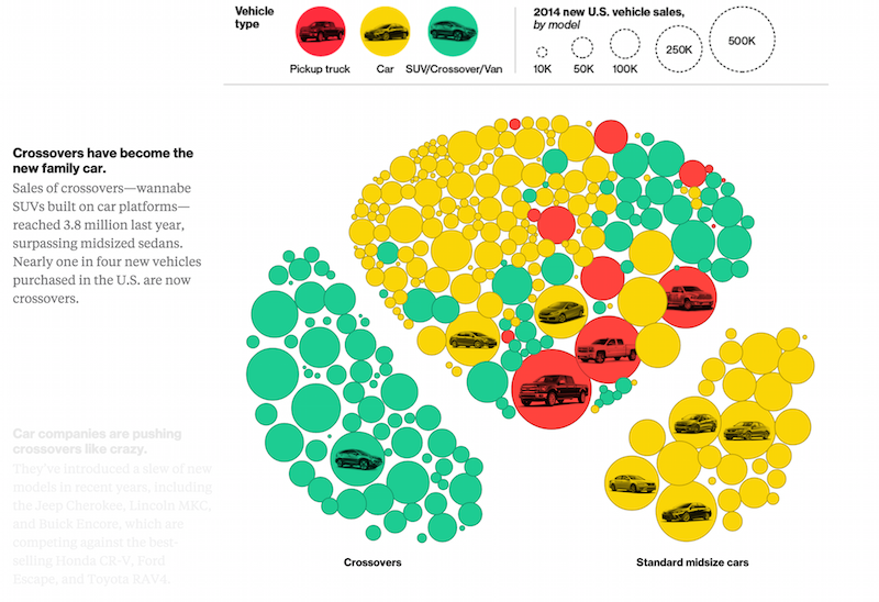
One piece that inspired me personally was the use of bubble charts in this Bloomberg feature on the auto sales in the U.S. They also used force layout there, and did an excellent job guiding users through some rather complex data.
What does this project not show that you wish you could have fit in?
Randy Yeip: As Aaron described, we have a wealth of data from our polling, so there’s plenty more that’s not here. But in this case, I think the goal was to distill our findings into just the essential points. And there is more data on the Democrats, plus the divisions between the two parties, that we’ll surface in parts two and three (coming soon!).
Julia Wolfe: I would have loved to end with a “play with the data” slide. Ideally, we would have given users a drop-down of poll questions to choose from. Unfortunately, it was a little tricky to pull off with this particular project given time constraints.