How The New York Times used comics to illustrate stories of death row
“On May 5, 1993, he and his childhood friend Alford Goodwin were set to rob this A.T.M. with a single .32 pistol. Something went wrong.”
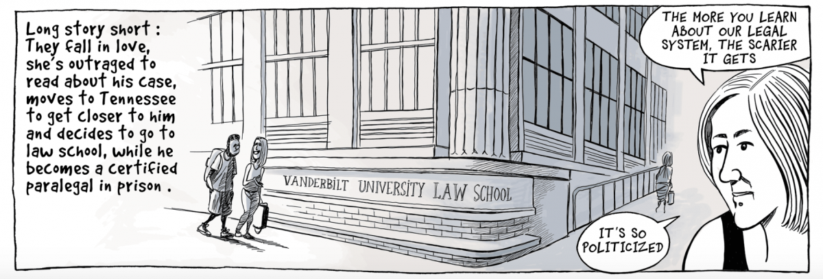
That’s a slice of the complex and devastating story of how Kenneth Reams from Pine Bluff, Arkansas ended up on death row at the age of 18. Last Sunday it ran in The New York Times in comic book form.
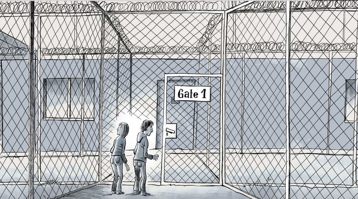
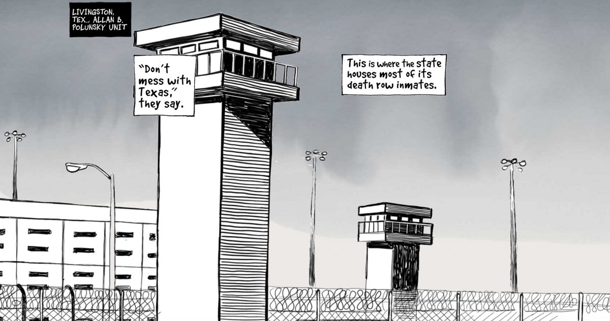
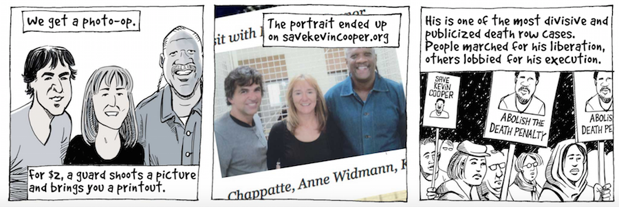
Over the last few years, Patrick Chappatte, a political cartoonist, and Anne-Frédérique Widmann, a Swiss investigative journalist, have been interviewing death row inmates and asking them to draw their paths to prison and death row. After debuting the art in an exhibit at the University of Southern California’s Annenberg School of Communication in Los Angeles, the project was adapted as a five-part graphic journalism series for The New York Times’ Opinion section. The stories and artwork were transformed into comics that leap off the page.
Storybench spoke with Chappatte and Danny DeBelius, a graphics and multimedia editor in digital news design at The New York Times, for an under-the-hood look at the impressive project.
Can you tell us about how this project got started?
Chappatte: The starting point of this series was research and reporting we did with my wife, Anne-Frédérique Widmann, an investigative journalist and documentary filmmaker, in 2014 and 2015. While gathering artwork from prisoners on death row for an exhibition project, Windows On Death Row, we visited four maximum security prisons across the United States, had contact with more than 20 inmates and met a dozen of them. This brought up incredible personal stories, as well as enlightening revelations about how justice works – or doesn’t.
How did you select the interviews that made the final cut?
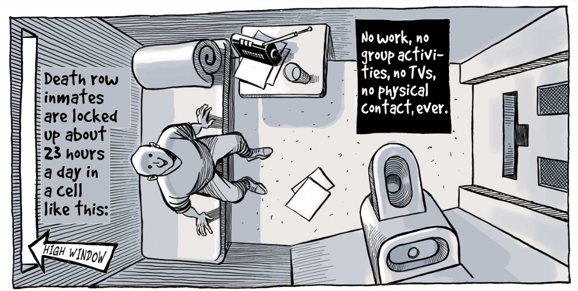
Chappatte: The more you look into the issue, the craziest it gets. I chose these particular stories, for each shed a different light on a world people have no access to, and not much information about. One informs us about the harsh practices of U.S. prisons, where solitary confinement over a long period of time is common.
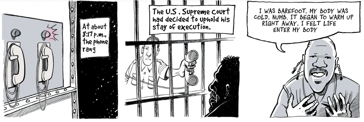
An inmate tells us how he saw death in the eyes, when his execution was suspended three hours before the lethal injection.
We learn how an innocent (person) was saved, and came out of this place no one leaves alive, death row, thanks to a woman and dozens of lawyers putting in thousands of hours of pro bono work over twenty years.
These are not stories about crime. They are about justice, atonement, punishment. It’s not about the monstrous acts committed by some, but the collective response we give as a society. We’re not trying to give answers here, but to turn on the spotlight and raise questions.
These illustrations and the stories trapped in speech and thought bubbles jumped off the page of my Sunday Times. What did kind of emotional response did you want to elicit from readers? It is, after all, published as an Op-Ed project.
Chappatte: The first effect I was hoping for is precisely the one you describe: to have that thing jump off the page at the reader. I’ve been involved in this form of storytelling – some call it comics journalism, other say graphic journalism – for some 20 years, exploring the many ways news stories can be told in the form of graphic novels, in print, on the web and in animation. One of the strength of this developing genre is that precisely it can bring readers to a story they might not have been attracted to otherwise. Contrary to a common prejudice, comics can help address serious, difficult issues. This form allows, if not requires, the reporter to be part of the story he tells, both as a narrator and a character.
I don’t shy away from showing things happening behind the scenes, from telling anecdotes that sometimes say a lot about the situation you are trying to describe. Personalized narration is a way of stating honestly from what perspective you are speaking. The formal simplicity of drawings can help see and feel and understand, it lets you approach broad issues from the small angle of the human experience. And it’s a precious storytelling tool. You take the reader by the hand, along with you, and show him what you saw with your eyes in places where cameras are not allowed, like death row. A low-tech form of virtual reality, if you want.
I suspect serial art is well suited to be coded up onto a screen. What made playing with this medium particularly interesting?
DeBelius: As a digital editorial designer, my world largely revolves around the application of type, so it was an interesting change of pace to work through a project where the raw material was primarily images rather than text. It was a lot of fun to spend some time on a project that felt like such a blank canvas in so many ways.
What challenges did you face in taking such a powerful story in such a powerful medium and translating it all to digital?
DeBelius: When designing reading experiences focused around blocks of text designers rely on leading and measure length to establish a comfortable rhythm for the reader. 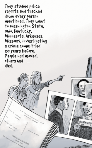 The joy and challenge of this project was in creating a similar momentum as readers progressed through this collection of illustrated stories. At the tablet and desktop viewport size of the project our rhythm is largely dictated by the layout of the artwork as defined by Patrick’s six-cell grid. We believe the artwork adapts well to the size and shape of those displays.
Compared to the large-screen experience, the phones required a higher-touch approach to arrive at a navigation pattern that made sense for such a small viewport. At the phone size, we establish that rhythm through a simple navigation scheme of vertical swiping to animate between cells, progressively revealing caption text and panning across frames larger than a single grid-cell. We do all this with the goal of establishing a rhythmic forward motion in the interface that encourages users to keep swiping through to the end of each story.
How did you achieve that “slow zoom” into the illustrations?
DeBelius: The zoom animations you see in the desktop interface are accomplished through a simple combination of the transform and transition CSS properties. Here is a quick CodePen demonstrating the technique. One thing to note about the demonstration code, I am relying on Autoprefixer to generate all the necessary vendor prefixes for the transform and transition properties to reach as many supported browsers as possible.
What was your reaction when you saw the final product, optimized for the screen?
Chappatte: I was amazed at how Danny, one of the coding wizards at The New York Times, managed to make the final product so elegantly adaptive. You get a totally different experience from the desktop layout, made of landscape-oriented pages, some of them slightly animated, to the mobile experience where you swipe your way down a dynamic succession of images and speech bubbles. It’s fantastic!
Where do you look for inspiration? Besides Joe Sacco, who else should our students be reading?
Chappatte: Joe Sacco is indeed the towering figure of comics journalism. At the crossing of historical fiction and graphic novels, I was fascinated by an iPad app called Operation Ajax. In the U.S., students should also check out the work of Dan Archer, Matt Bors who edits The Nib, and comics explorations at The Cartoon Movement. My own previous stories can be found at Graphicjournalism.com, including a short animated TV documentary, “Death in The Field,” that was aired on TV. In France and Italy, where the culture of graphic novels is well established, the genre has made more forays into mainstream media. The monthly Revue XXI, for example, uses it regularly alongside other forms of reporting. The future for illustrated storytelling is bright.
