How to analyze the screen times of presidential candidates
Who and what is being discussed on cable television news can reveal a lot about our current media landscape or political state of affairs.
The Stanford Cable TV News Analyzer, built by Stanford University’s Computer Graphics Lab and John S. Knight Fellowship Program, provides the data for us to look at trends in cable news — without us having to analyze hours of it ourselves.
In this tutorial, we’ll show how to get data from the TV news analyzer and then how to use R, Rawgraphs.io and Adobe Illustrator to chart how much screen time each of the 2024 Republican presidential candidates is getting on cable news.
Getting the data
The TV analyzer supports many different queries, but we’re going to focus on screen time by name and network.
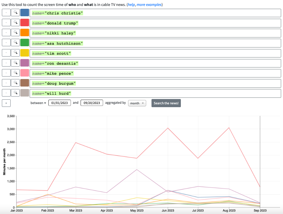
NPR maintains a tracker of all of the current 2024 Republican presidential candidates. We’ll use only their names in our TV analyzer query, and we’ll set our time frame to be between Jan. 1, 2023 and Sept. 20, 2023. Typing “name=’candidate’” for each candidate will give us an up-to-date graph with everyone’s screen time. Interestingly, there are no appearances from Vivek Ramaswamy.
You can download the resulting graph as a .PNG or embed it into a website, but we’re going to click on the “download” link to export the data as a .CSV file so that we can style it differently.
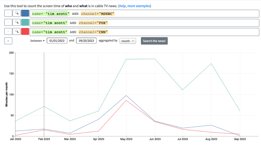
For candidates’ screen time per network, we need to add a channel field to each of our original queries. The only channel options are Fox, CNN and MSNBC. We have too many candidates to get this data for all of them at once, so we’ll break up these queries by candidate and download the data the same way as before.
Cleaning the data
Our data is already clean enough for our bump chart, so there’s no need to manipulate it. For our small multiples charts, we’ll use R to get it into a usable shape. We could also use Microsoft Excel or Python to clean the data.
First, we need to attach (or install and then attach) the Tidyr and Stringr libraries. Next, we’ll use the rbind() function to vertically merge all of our files on each candidate.
all_candidates <- rbind(read.csv("asa_hutchinson.csv"), read.csv("chris_christie.csv"),
read.csv("donald_trump.csv"), read.csv("doug_burgum.csv"),
read.csv("mike_pence.csv"), read.csv("nikki_haley.csv"),
read.csv("ron_desantis.csv"), read.csv("tim_scott.csv"),
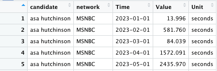
read.csv("will_hurd.csv"))Our “Query” column contains each candidate’s name and the network.

To make graphing easier later, we’ll use the separate() function from Tidyr to split each “Query” cell into two columns called “candidate” and “network” at AND. Then, we’ll use the gsub() function to get rid of our filters and quotation marks and Stringr’s str_trim() function to remove leading and trailing whitespaces.
# separate query column into candidate and network
query_split <- separate(all_candidates, Query, into=c("candidate", "network"),
                        sep="AND")
# cleaning new columns
query_split$candidate <- gsub("name=", "", query_split$candidate)
query_split$network <- gsub("channel=", "", query_split$network)
query_split$candidate <- gsub('[^{:alnum:} ]', "", query_split$candidate)
query_split$network <- gsub('[^{:alnum:} ]', "", query_split$network)
query_split$candidate <- str_trim(query_split$candidate, "right")
query_split$candidate <- str_trim(query_split$candidate, "left")
query_split$network <- str_trim(query_split$network, "right")
query_split$network <- str_trim(query_split$network, "left")
Now, we have two new, clean columns to work with.
Candidate bump chart
We’re going to create a bump chart to visualize how much screen time each candidate has gotten rather than a line chart. Bump charts and line charts are functionally similar, but a bump chart will emphasize the candidates’ rank and overall screen time more effectively. And they’re more fun to make.
We’re using Rawgraphs.io for this. After importing our .CSV file and selecting “bumpchart” as our chart type, we’ll label our chart variables as “Time” for the x-axis, sum of “Value” for size and “Query” for streams.
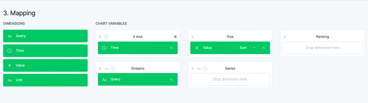
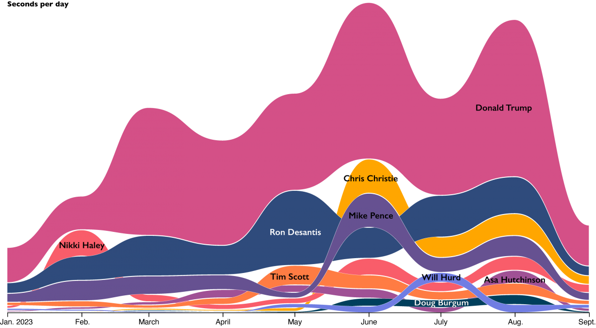
This is the resulting graph. We could edit the “Query” field of our .CSV file to only contain the name and then export this image as is. But instead, we’ll export this as a .SVG file to style in Adobe Illustrator so that we can make sure our two graphs are somewhat stylistically consistent later.
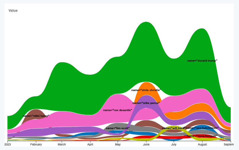
In Illustrator, we’ll change the color of each stream, delete the search filters and add a thin (0.25 points) white outline to each stream. We’ll also move some of the names to make them more readable and change the font.
Network charts
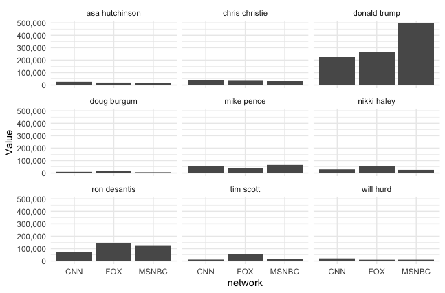
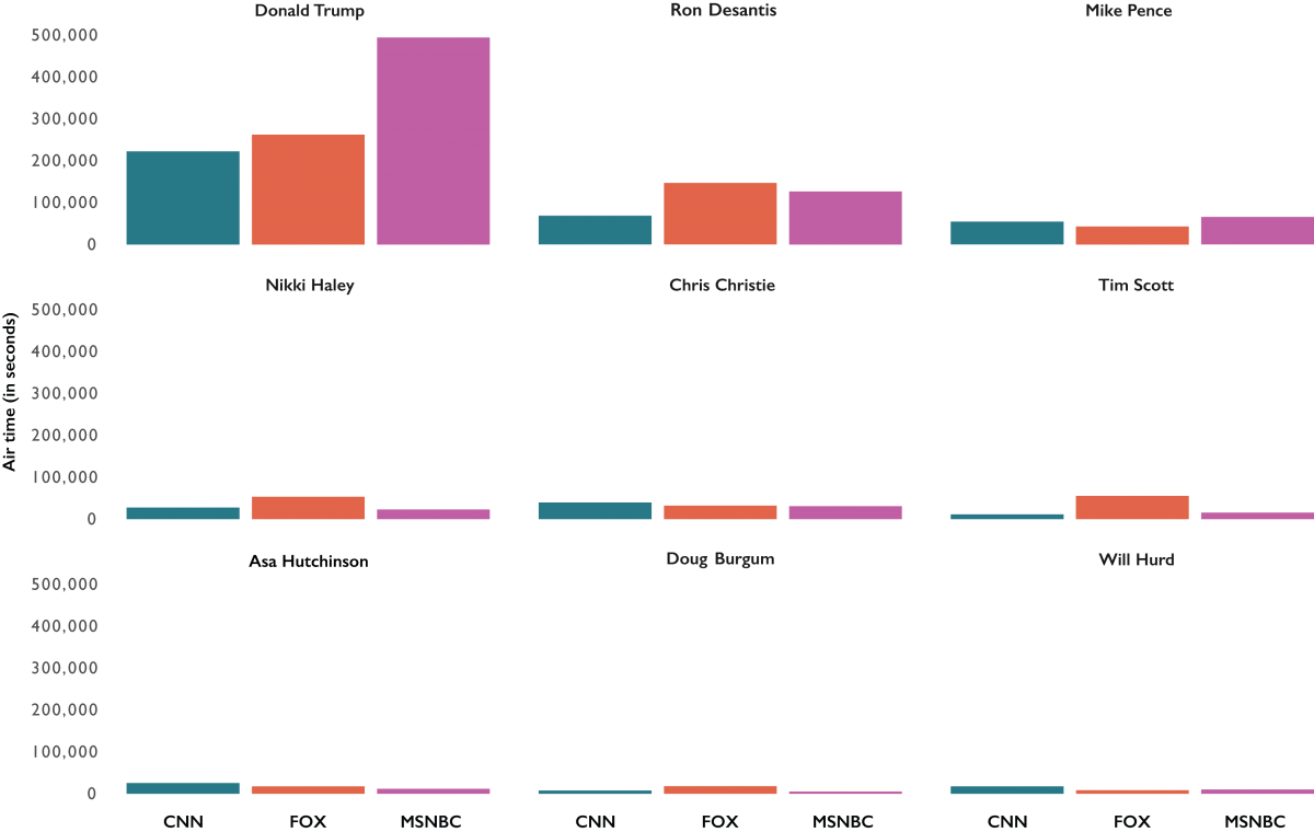
We’re going to use R’s “ggplot2” package to generate small multiple bar charts of each candidate’s total screen time on each network.
The main way that making the small multiples charts differs from making a single chart is that we’ll use the facet_wrap() function to create a string of bar charts for each candidate variable.
#facet plot
facet_plot <- ggplot(data=query_split, aes(x=network,y=Value)) +
geom_bar(stat="identity") +
facet_wrap(~candidate) +
scale_y_continuous(labels = label_comma()) +
theme(axis.text.x = element_text(angle=90)) +
theme_minimal()
This is our plot.
If we attach the “Svglite” package, we can use the ggsave() function to export our plot as a .SVG file to style it in Illustrator.
ggsave(file="facet_plot.svg", plot=facet_plot)In Illustrator, we’ll just change the colors, adjust the labels to match our bump chart, remove the grids and reorder the charts in order of each candidate’s screen time.
Stanford’s Cable TV News Analyzer puts years of cable news data in your hands. Use it!

- These tools will take your data to a new level — or decibel - January 4, 2024
- How to analyze the screen times of presidential candidates - October 31, 2023


